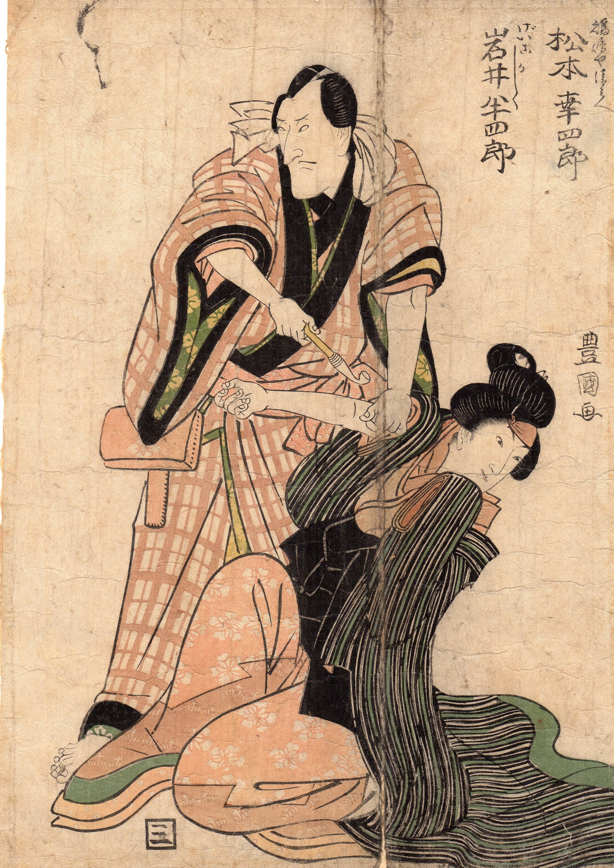
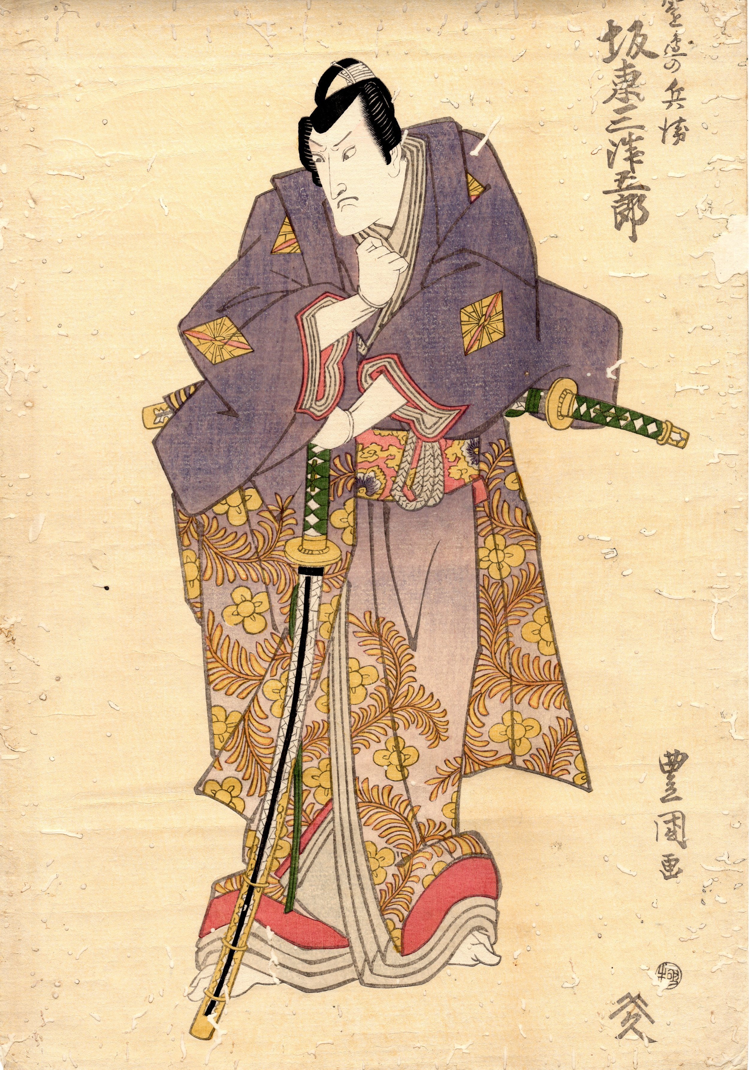
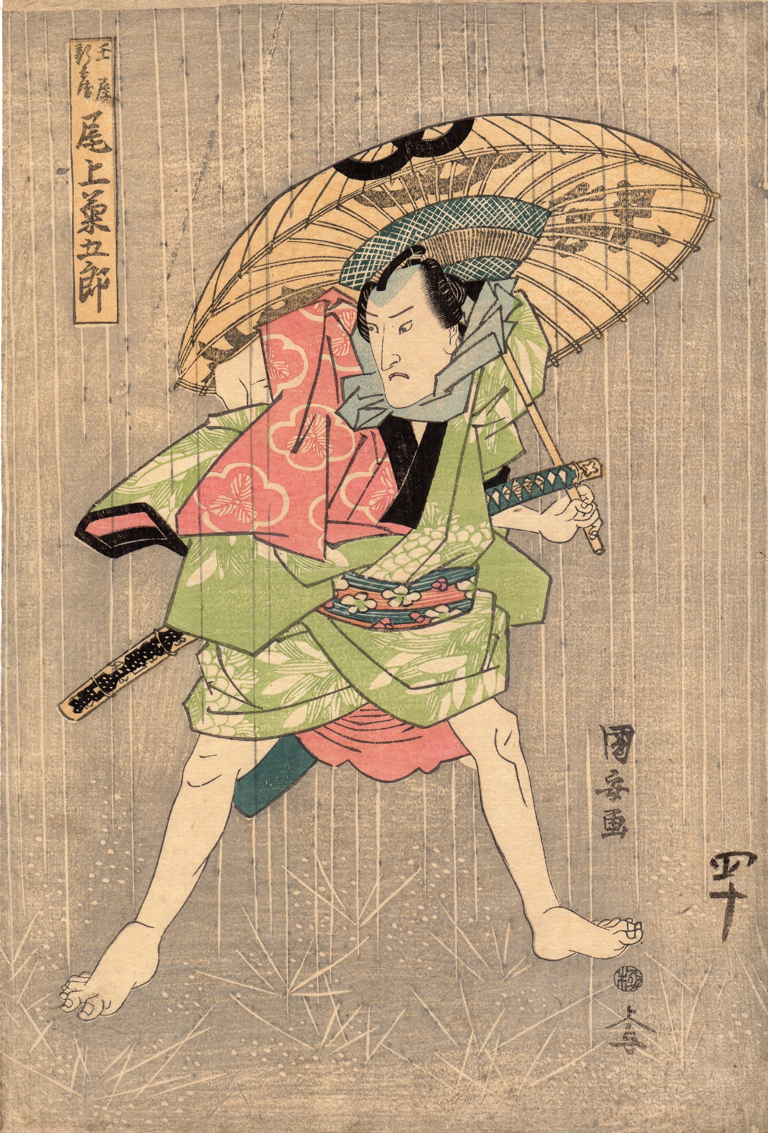
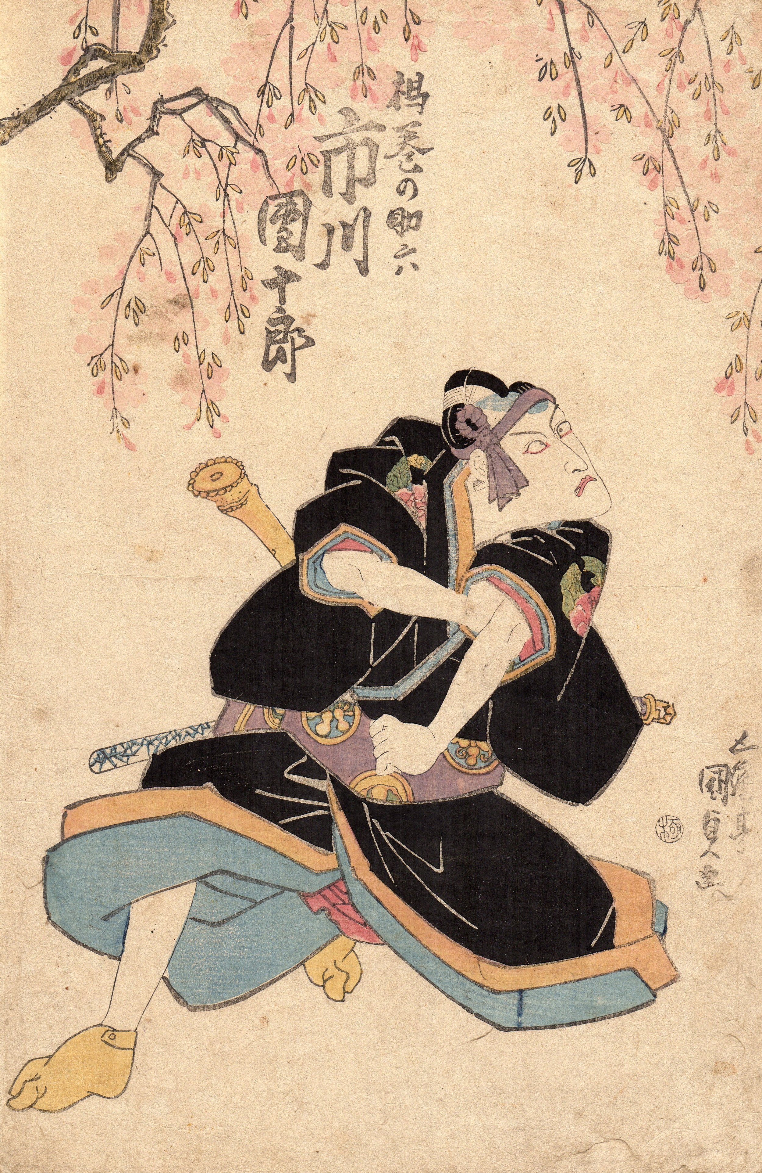
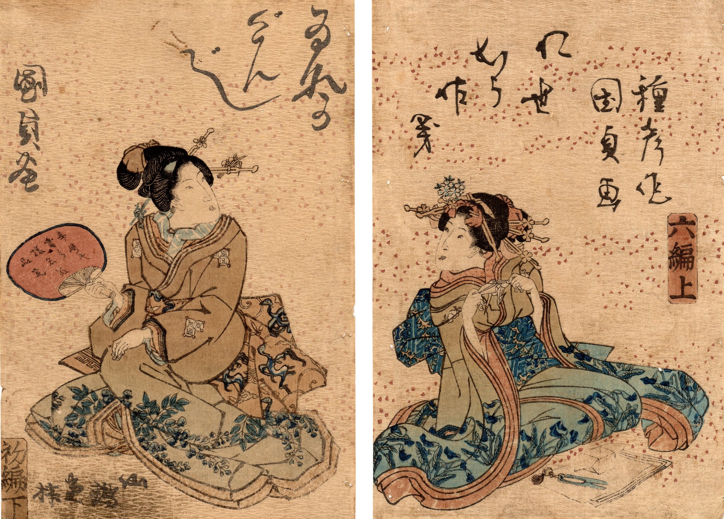
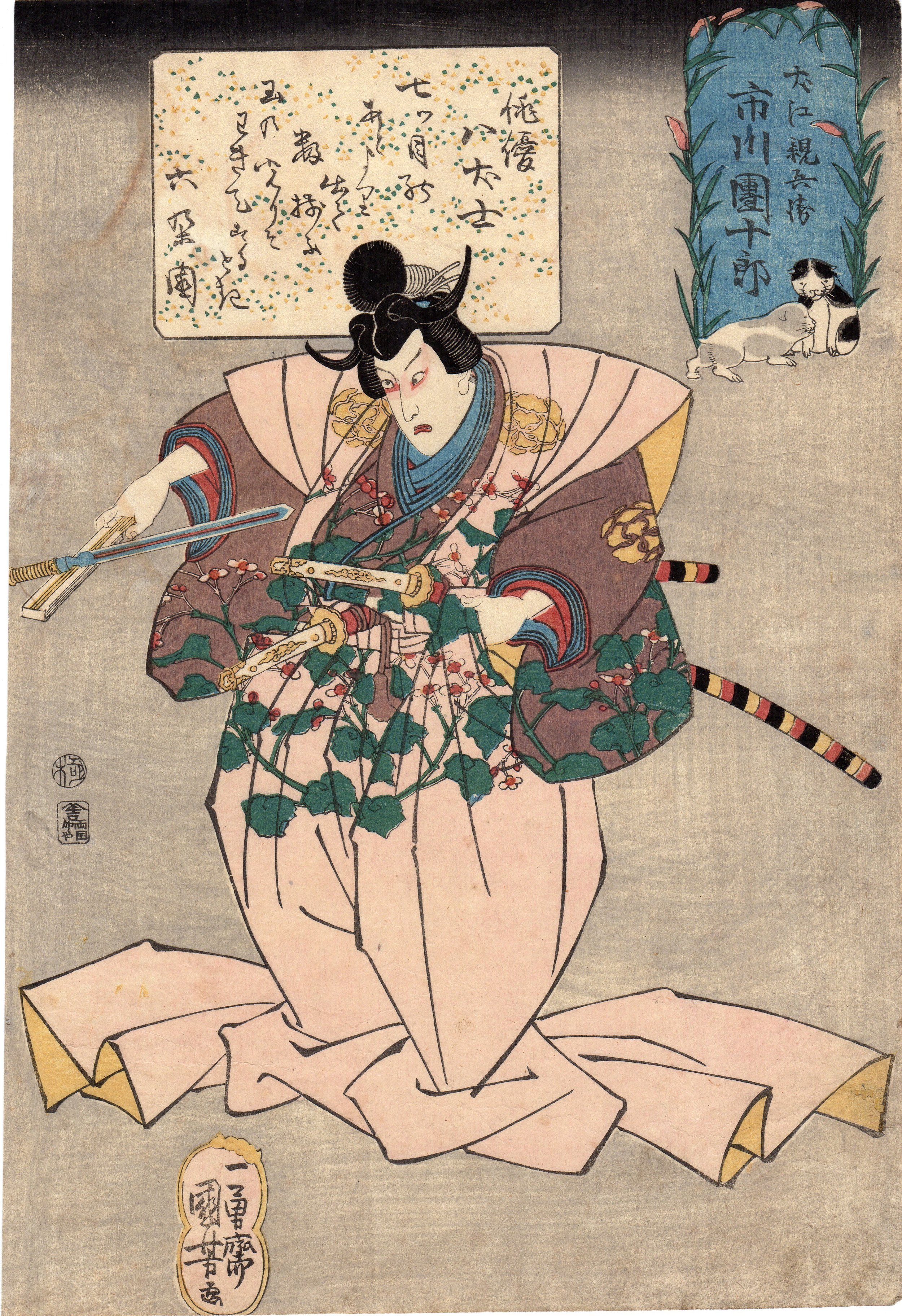
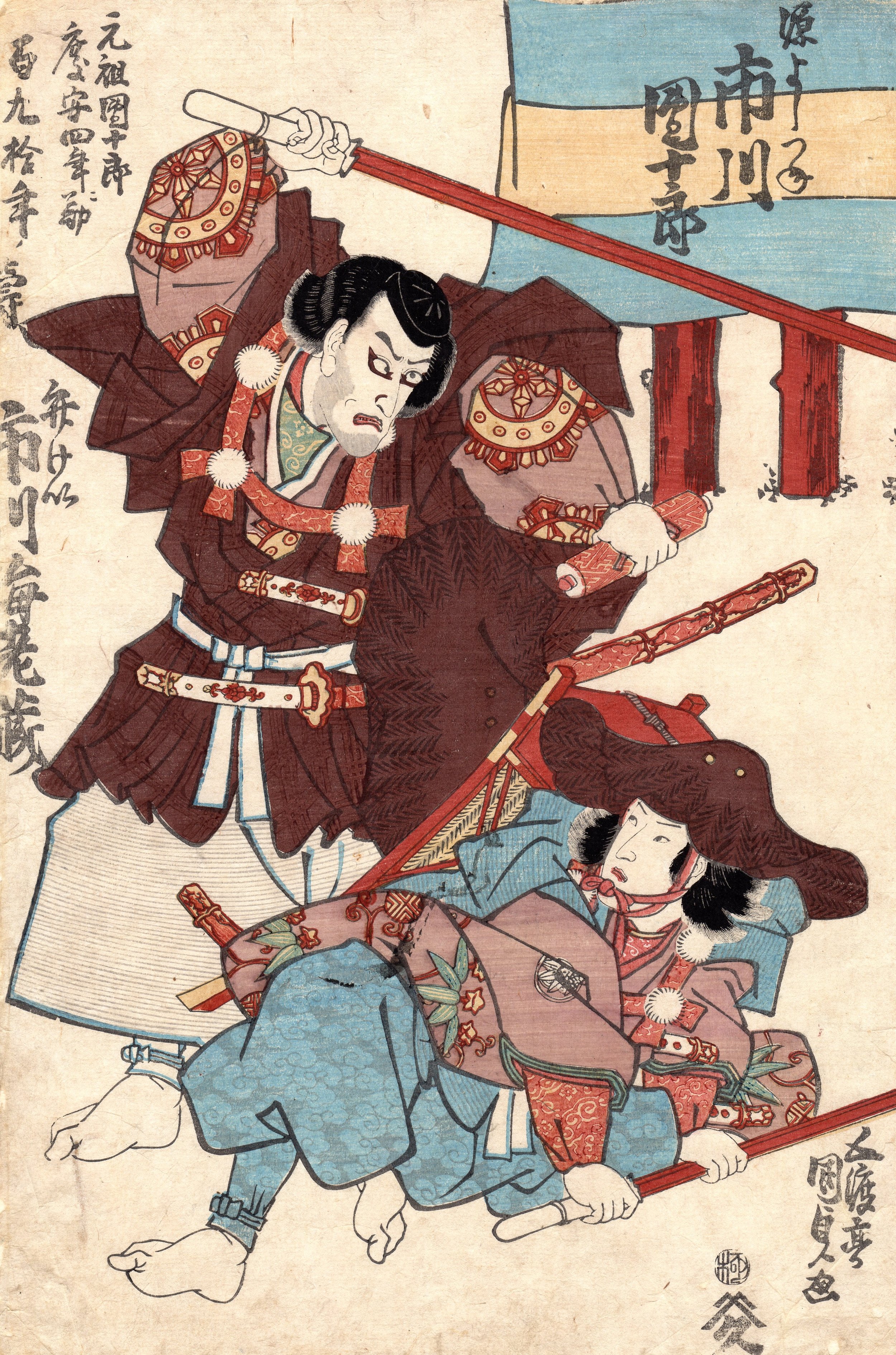
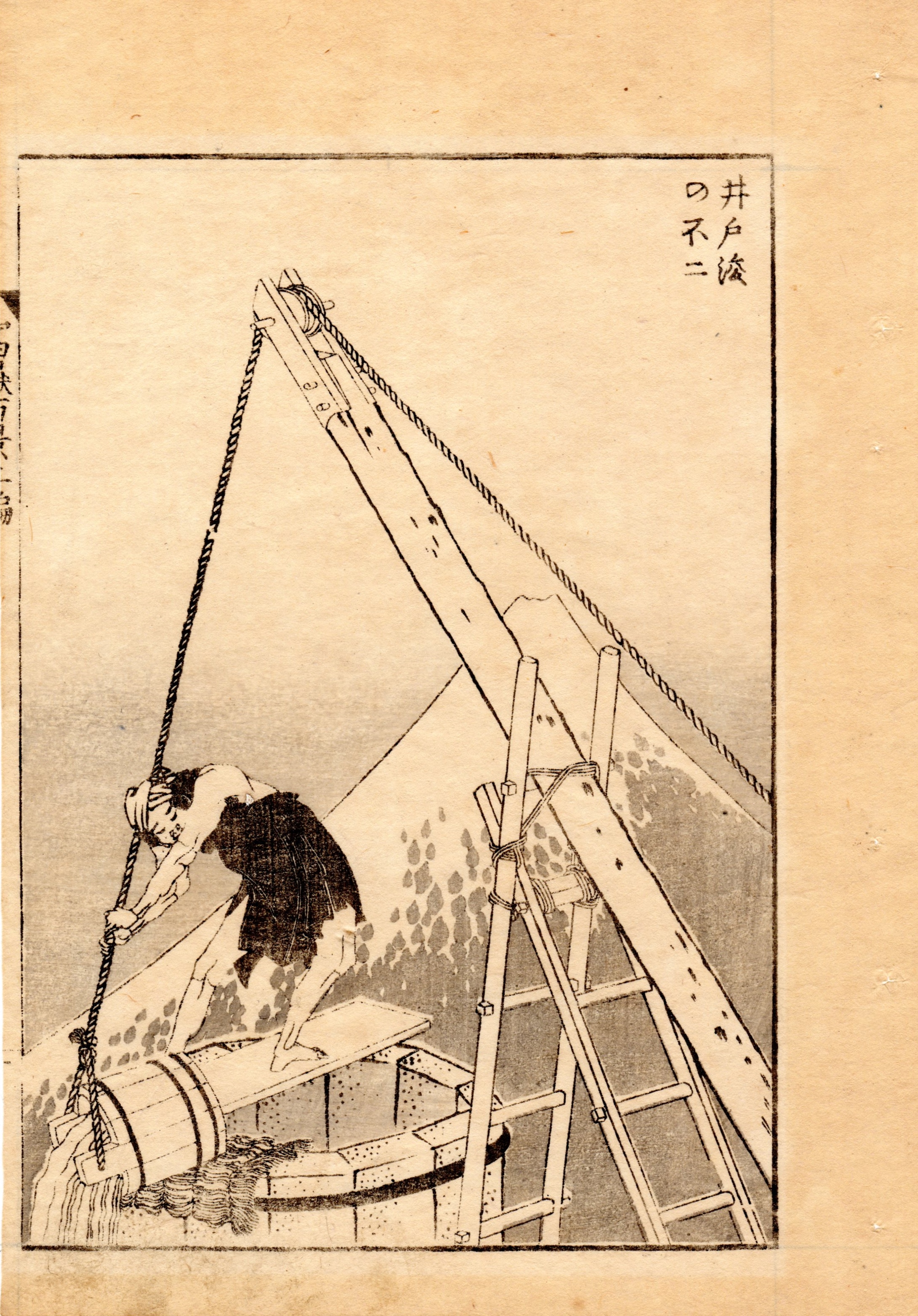
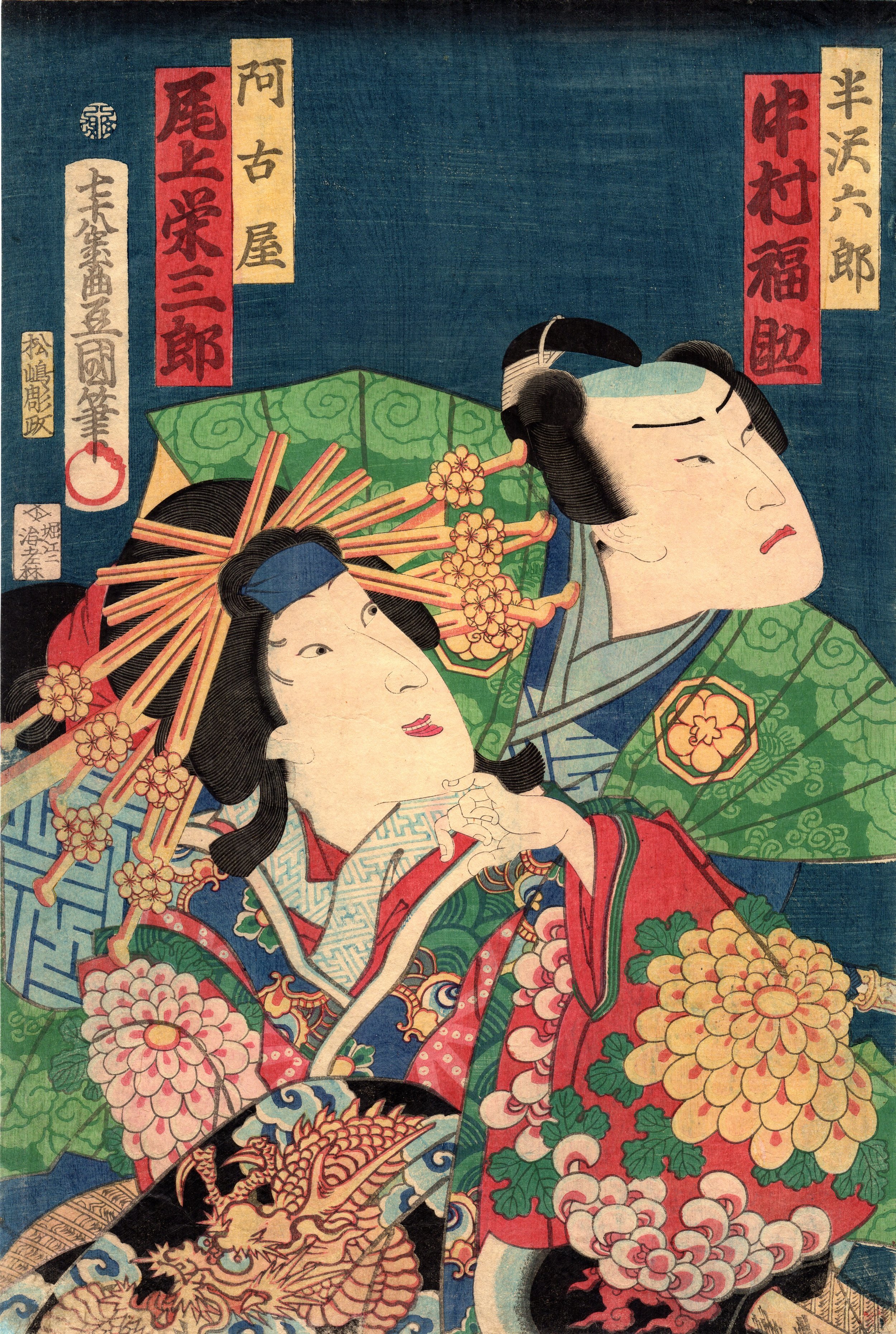
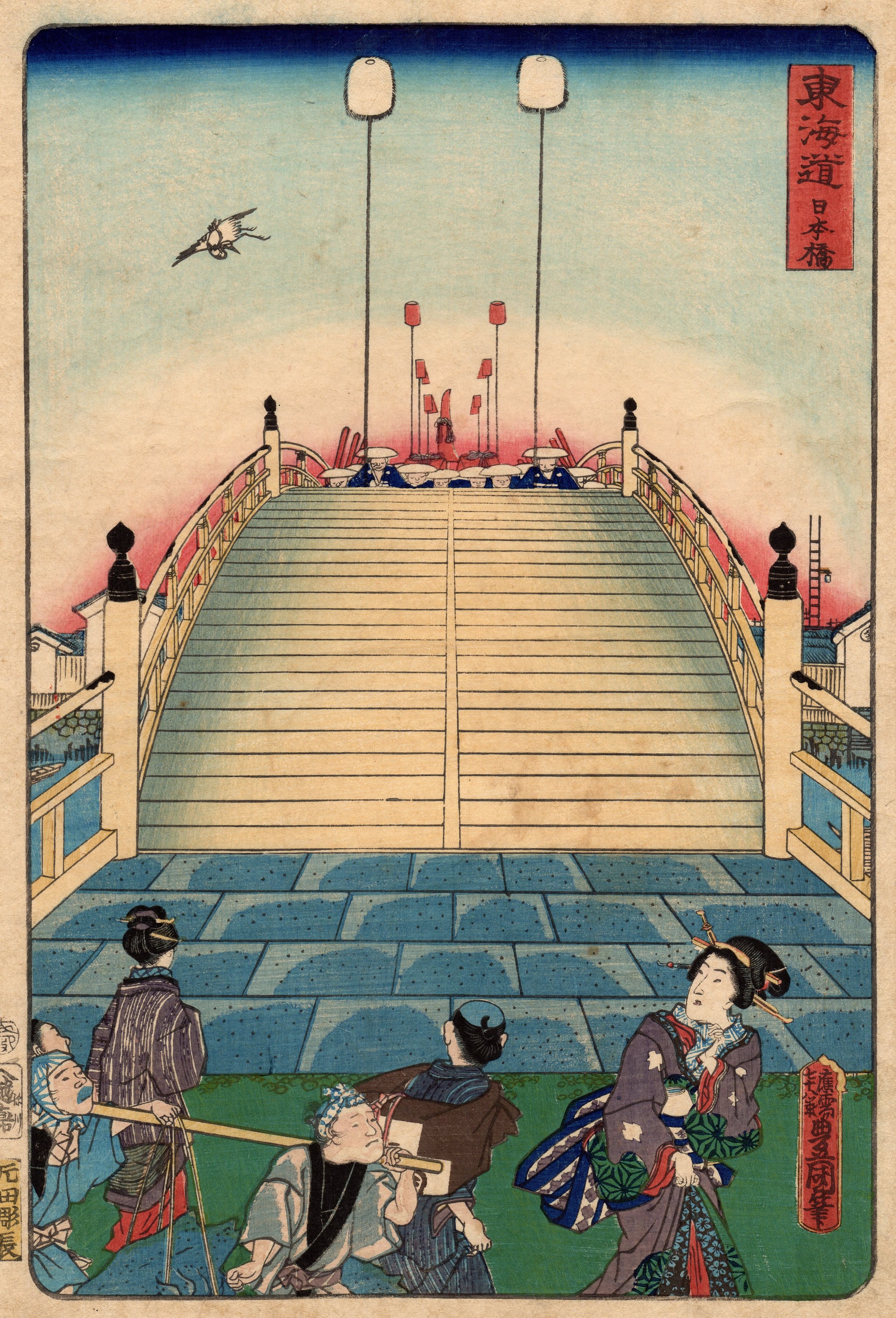
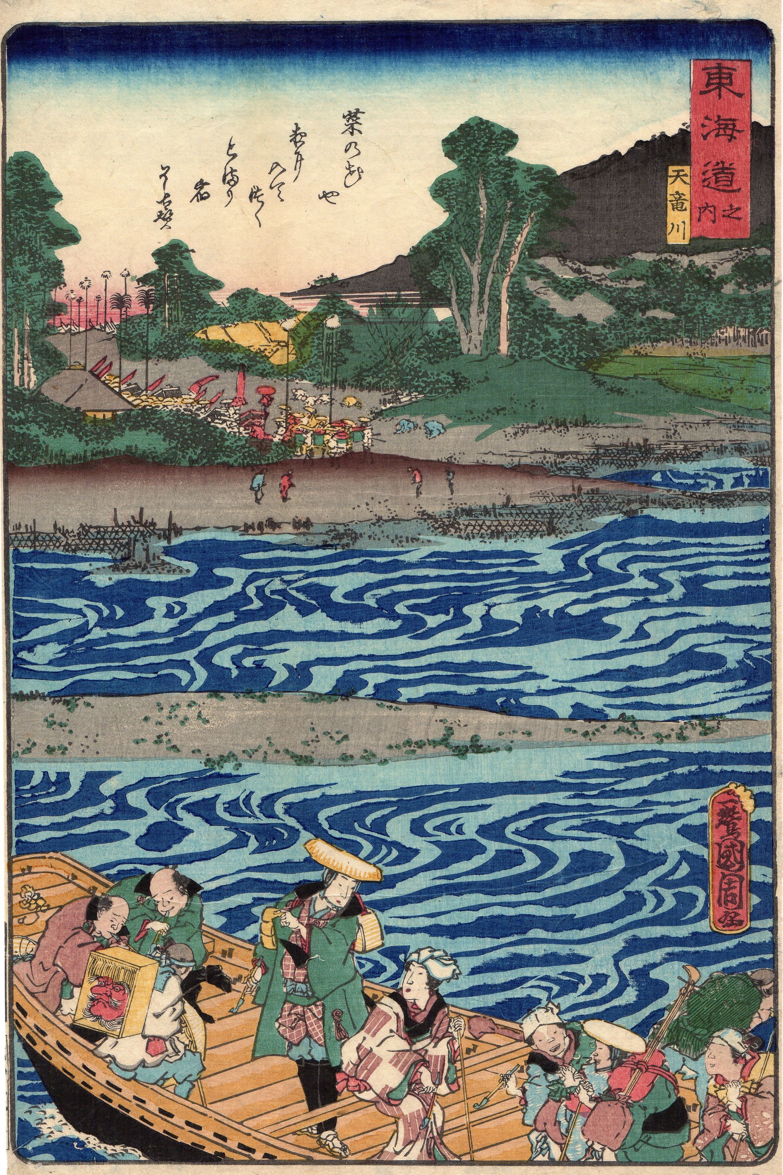
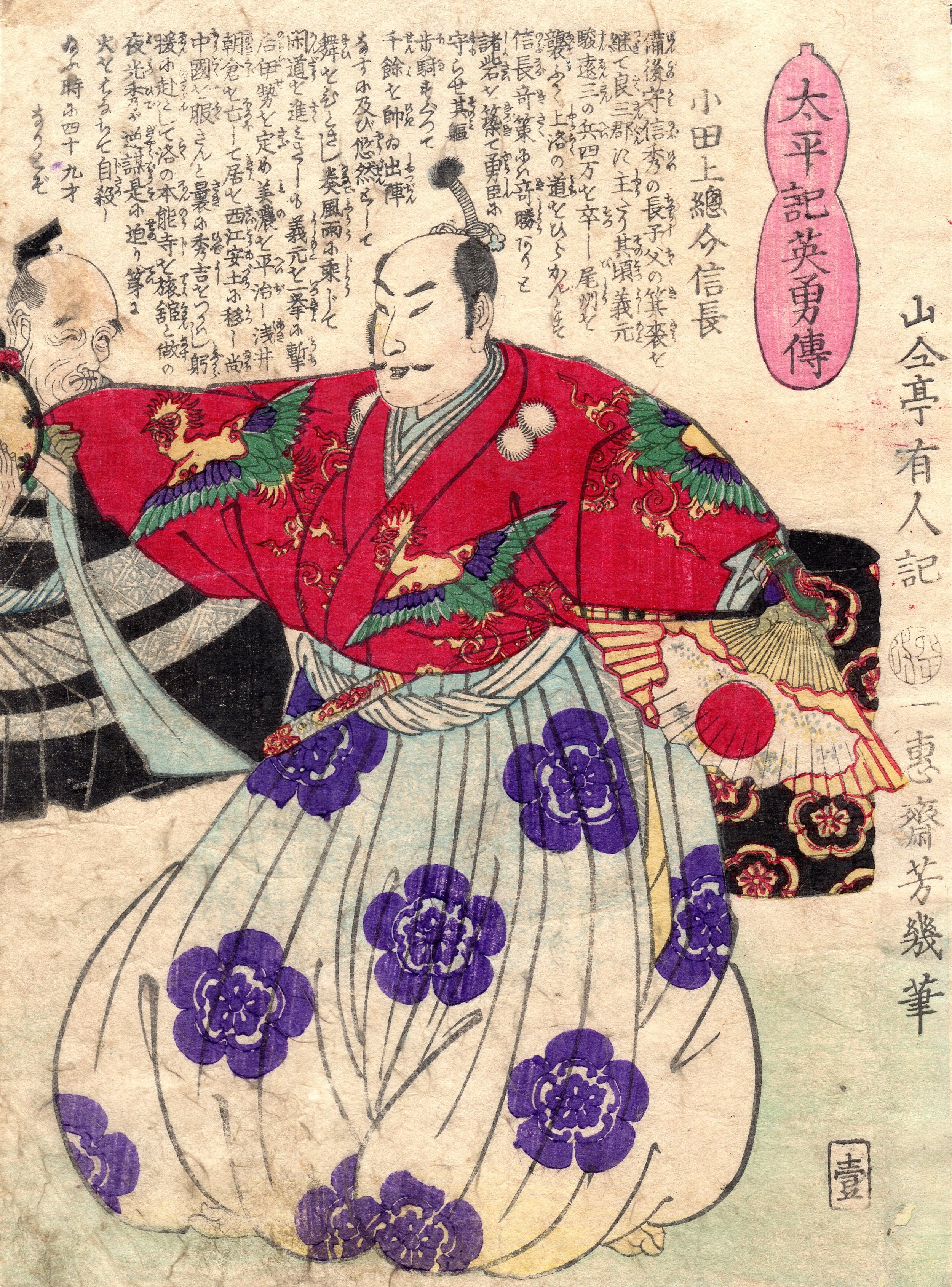
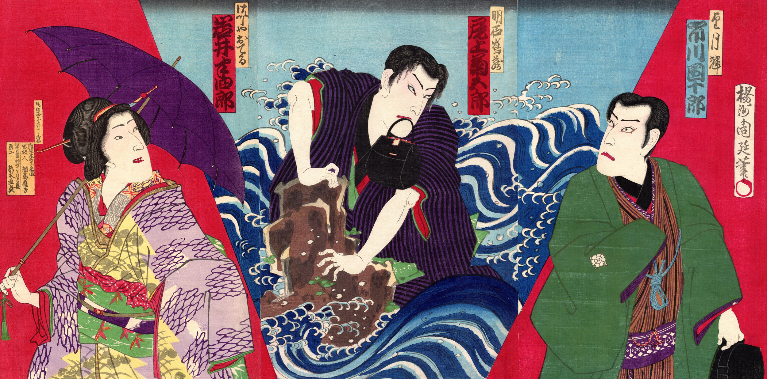
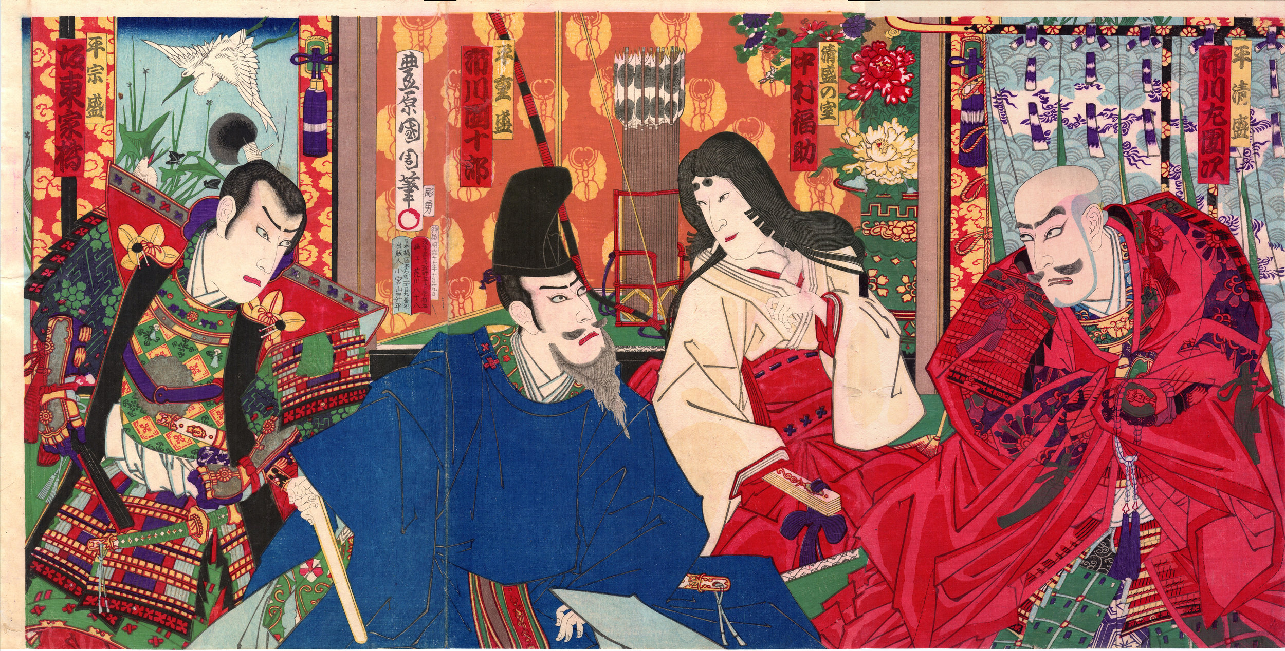
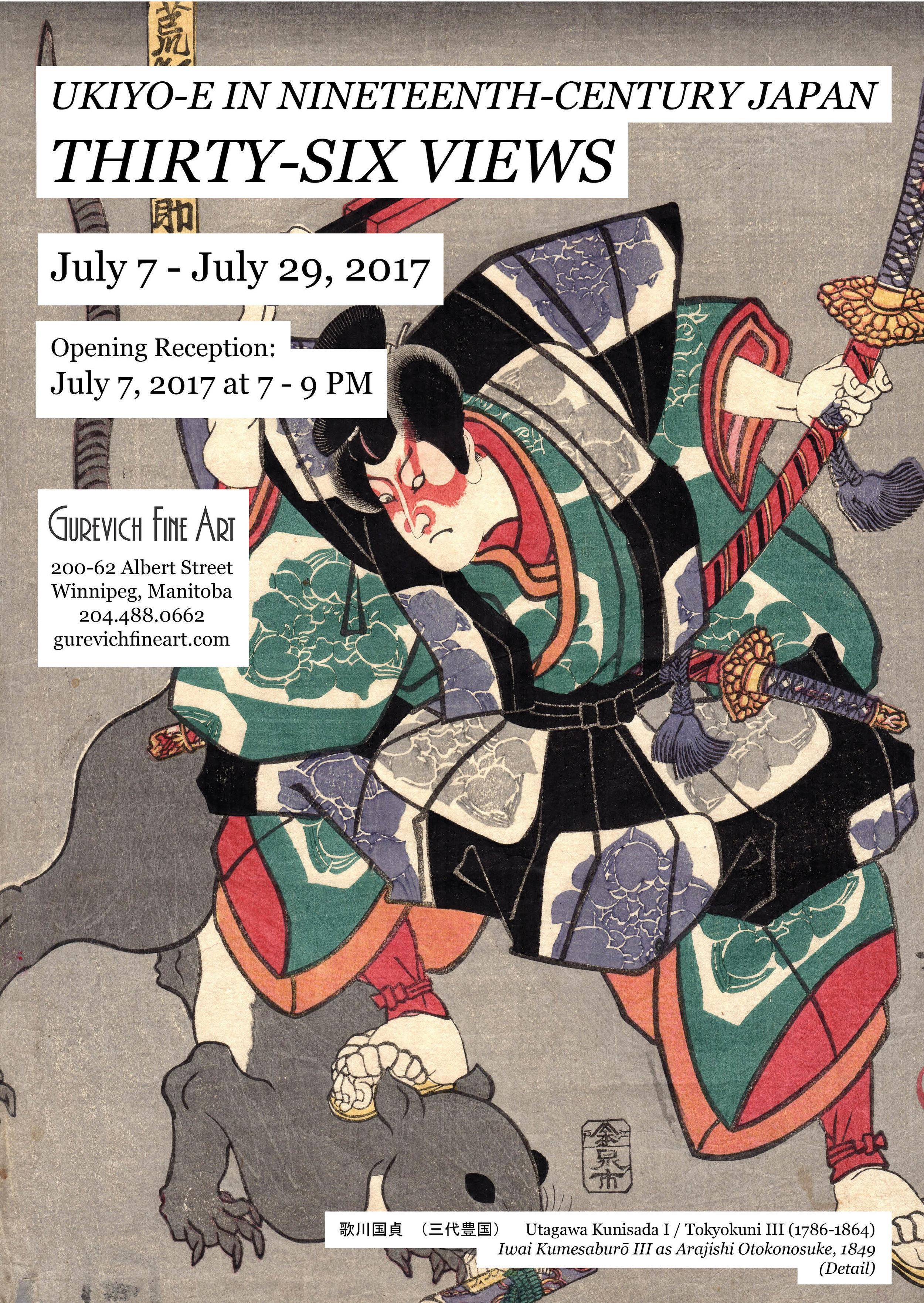
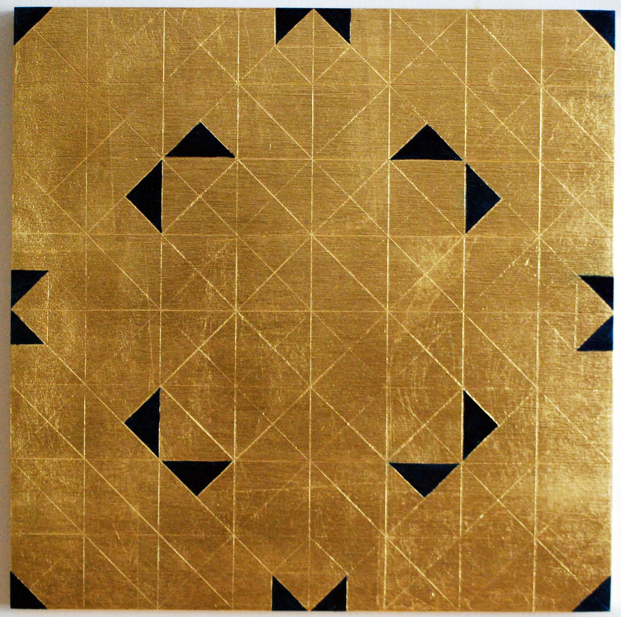
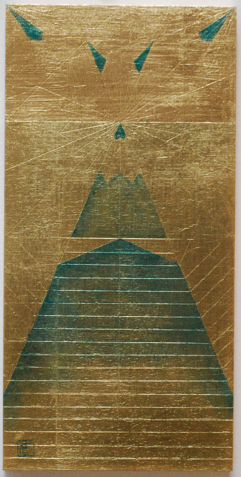
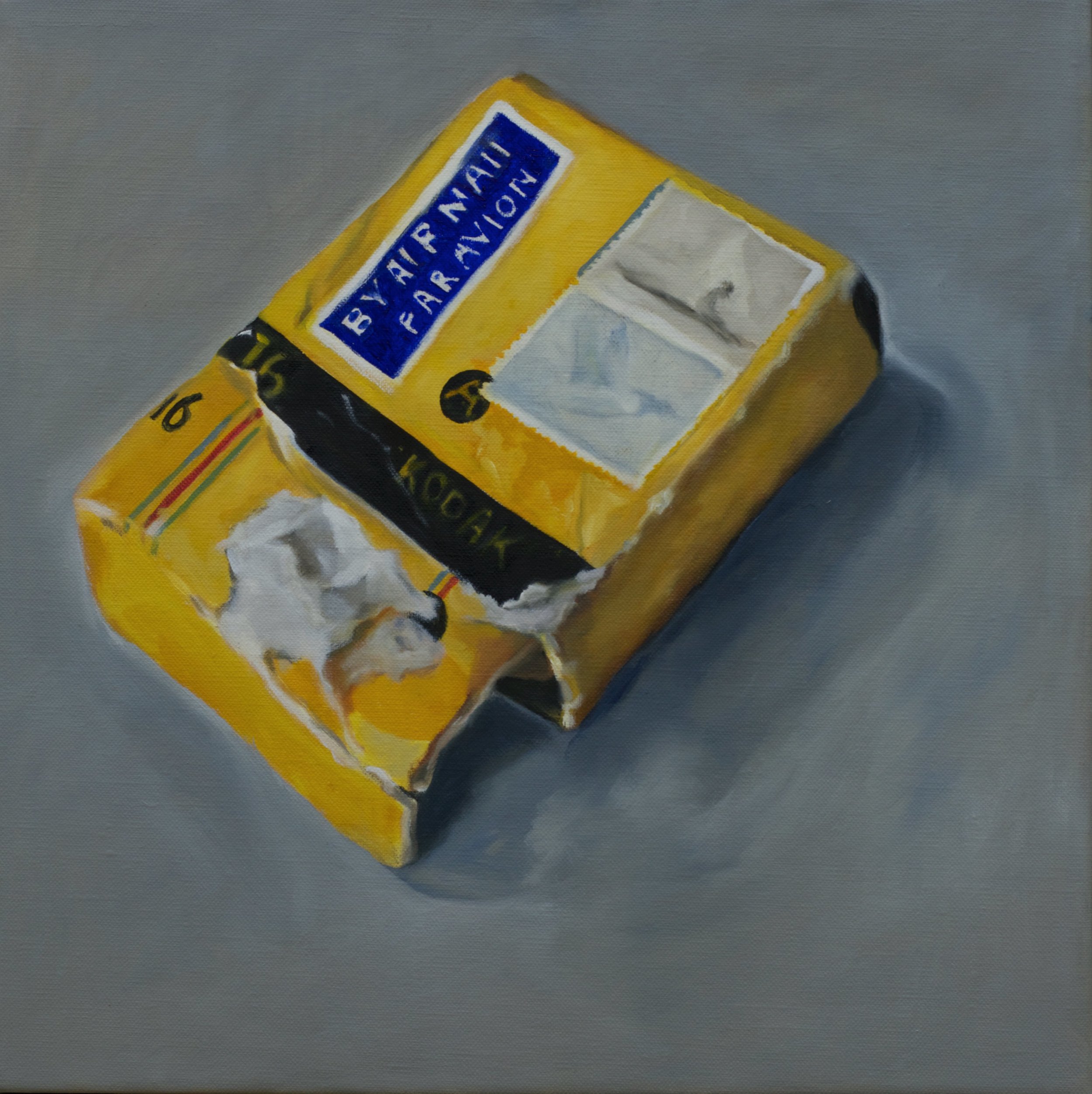
Opening Friday, July 7th, 7 PM at Gurevich Fine Art, Ukiyo-e In Nineteenth-Century Japan: Thirty-Six Views. A curated collection of 36 striking nineteenth century Japanese prints.
The exhibition runs in its entirety at Gurevich until July 29th.

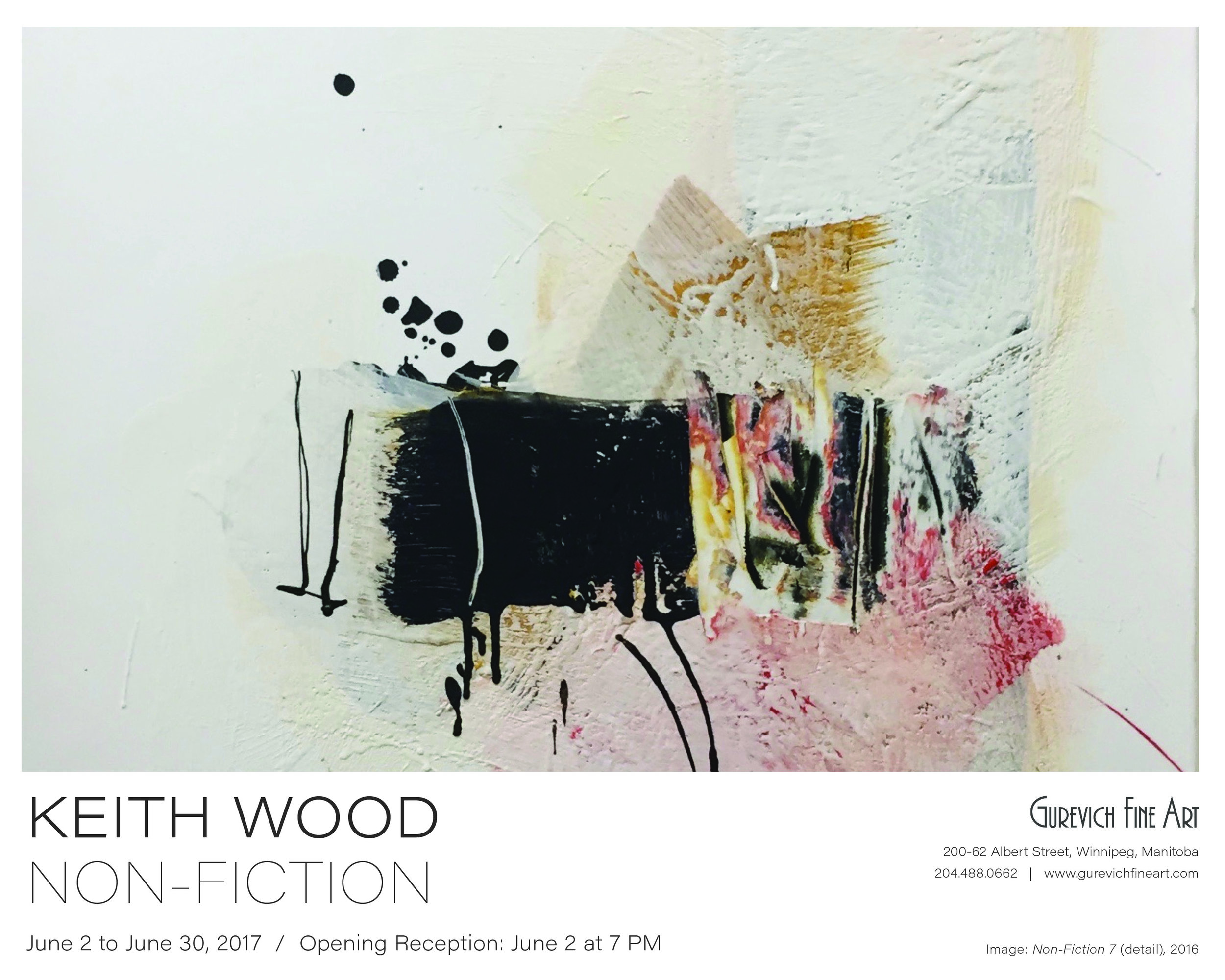
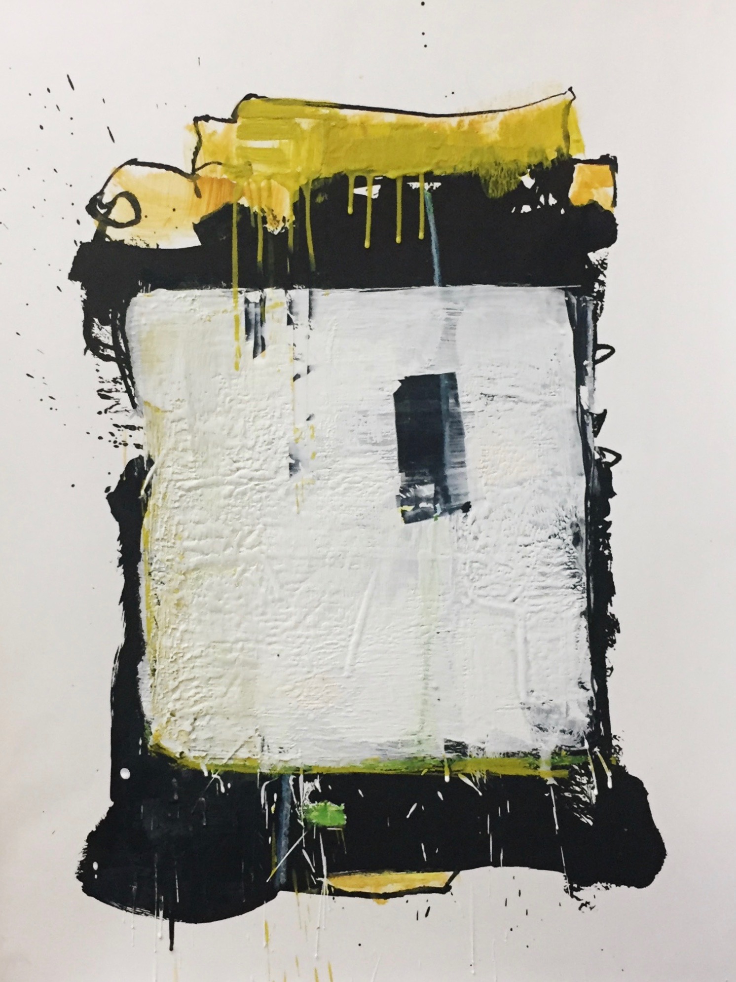
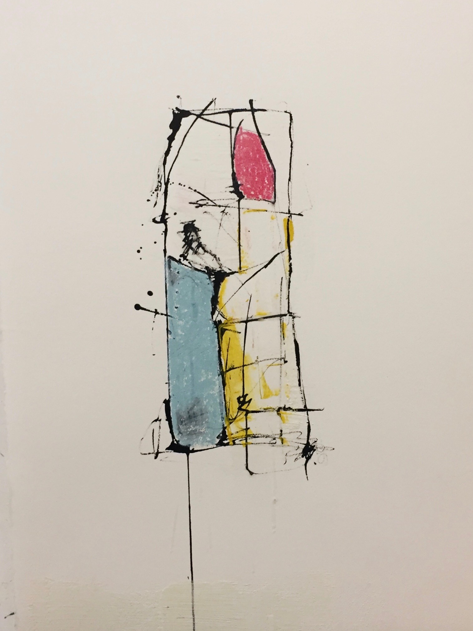
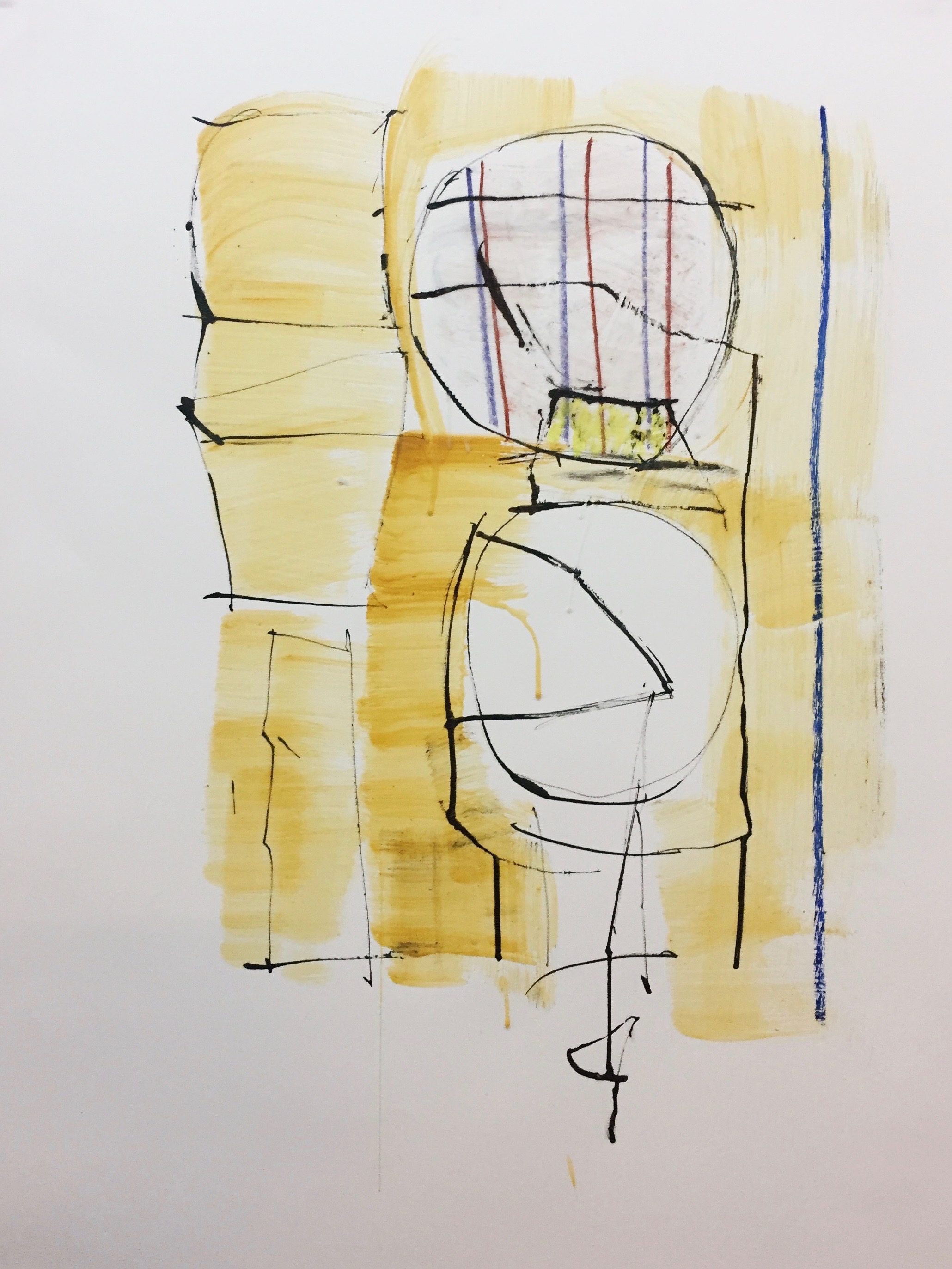
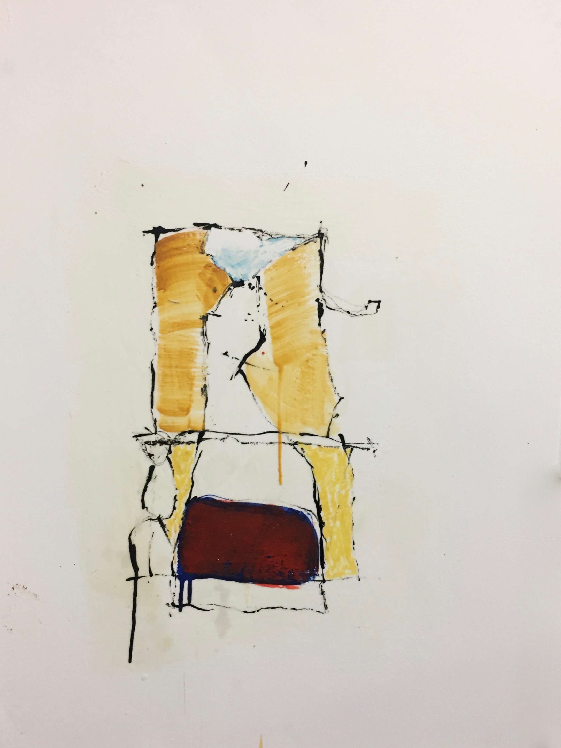
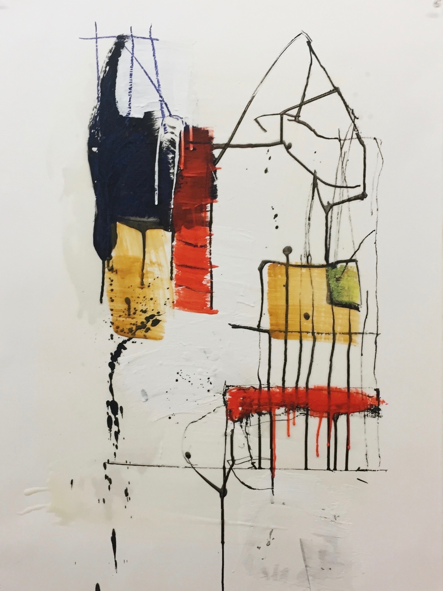
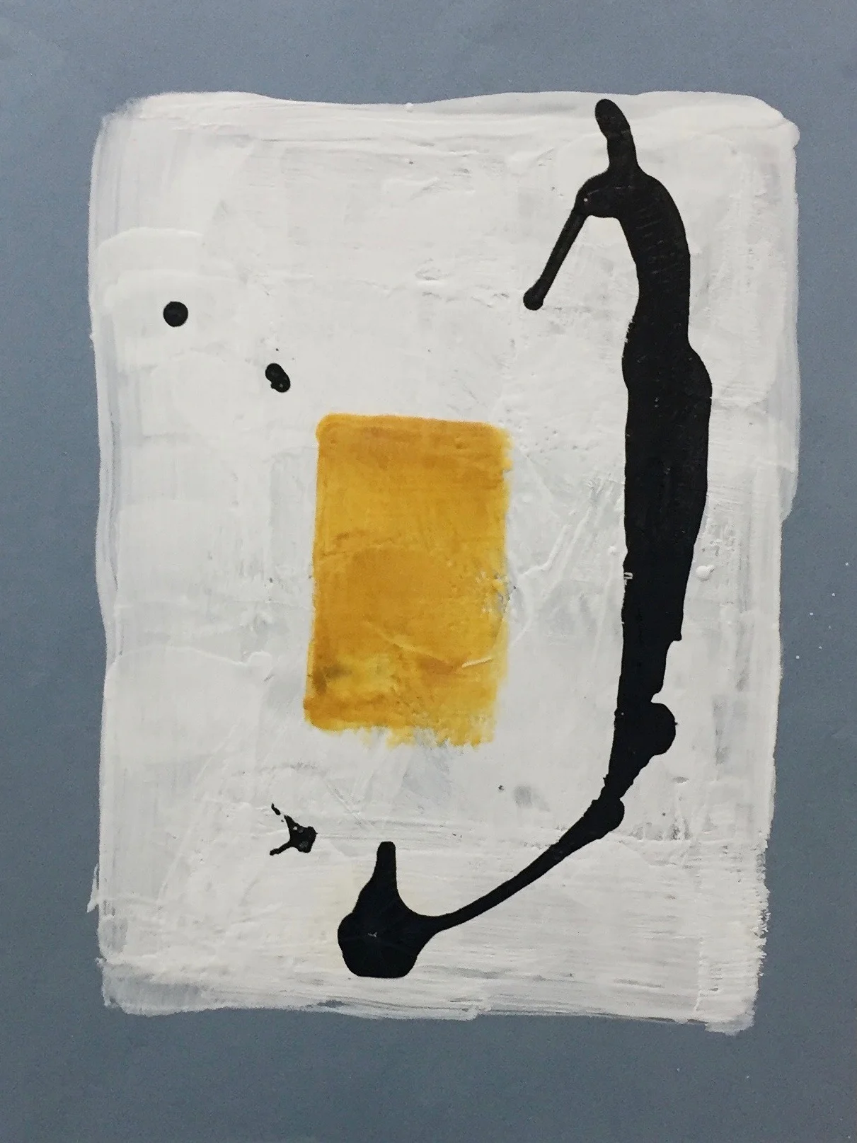
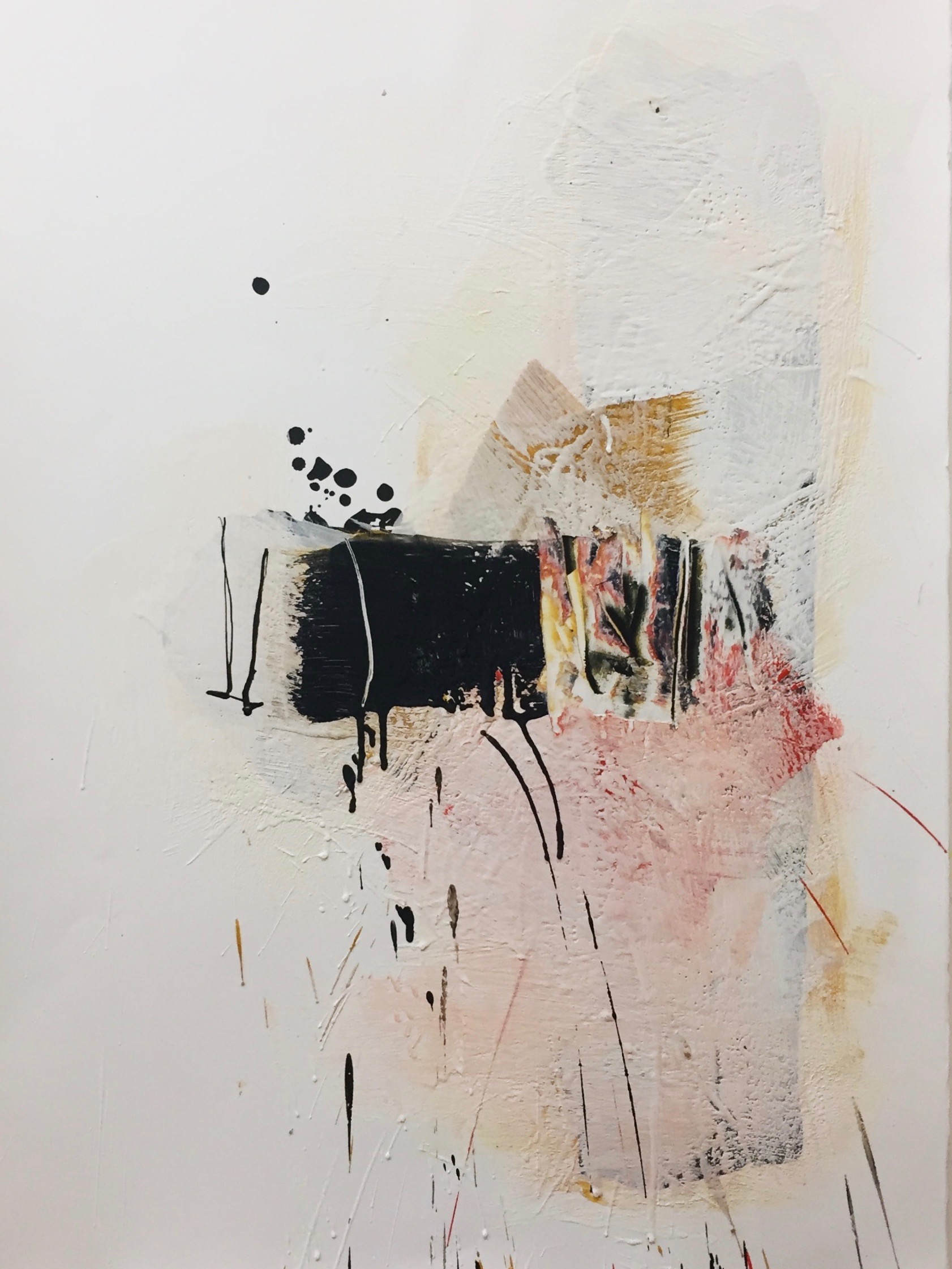
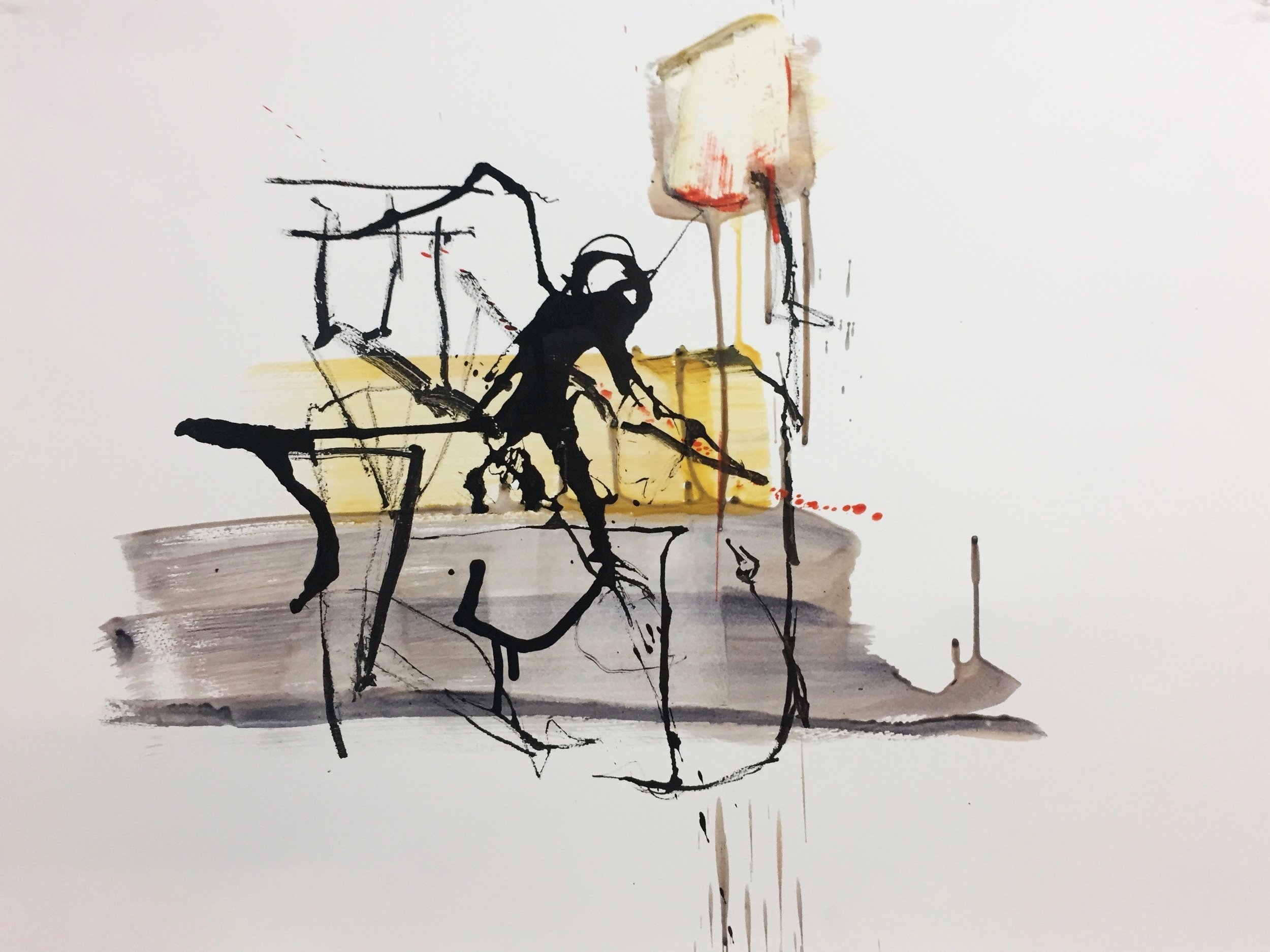
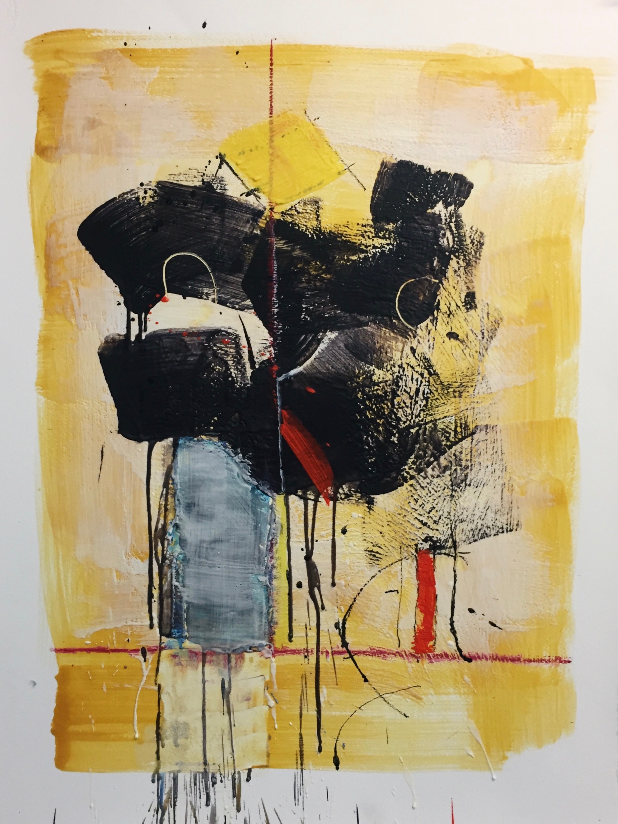
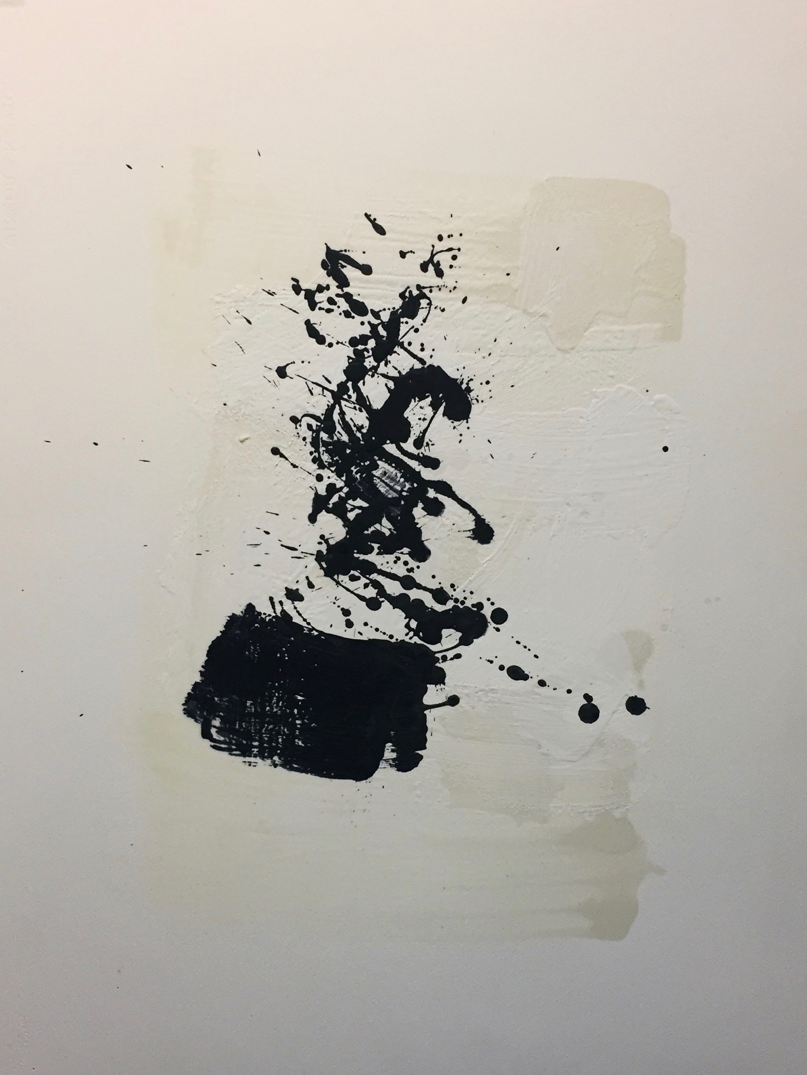
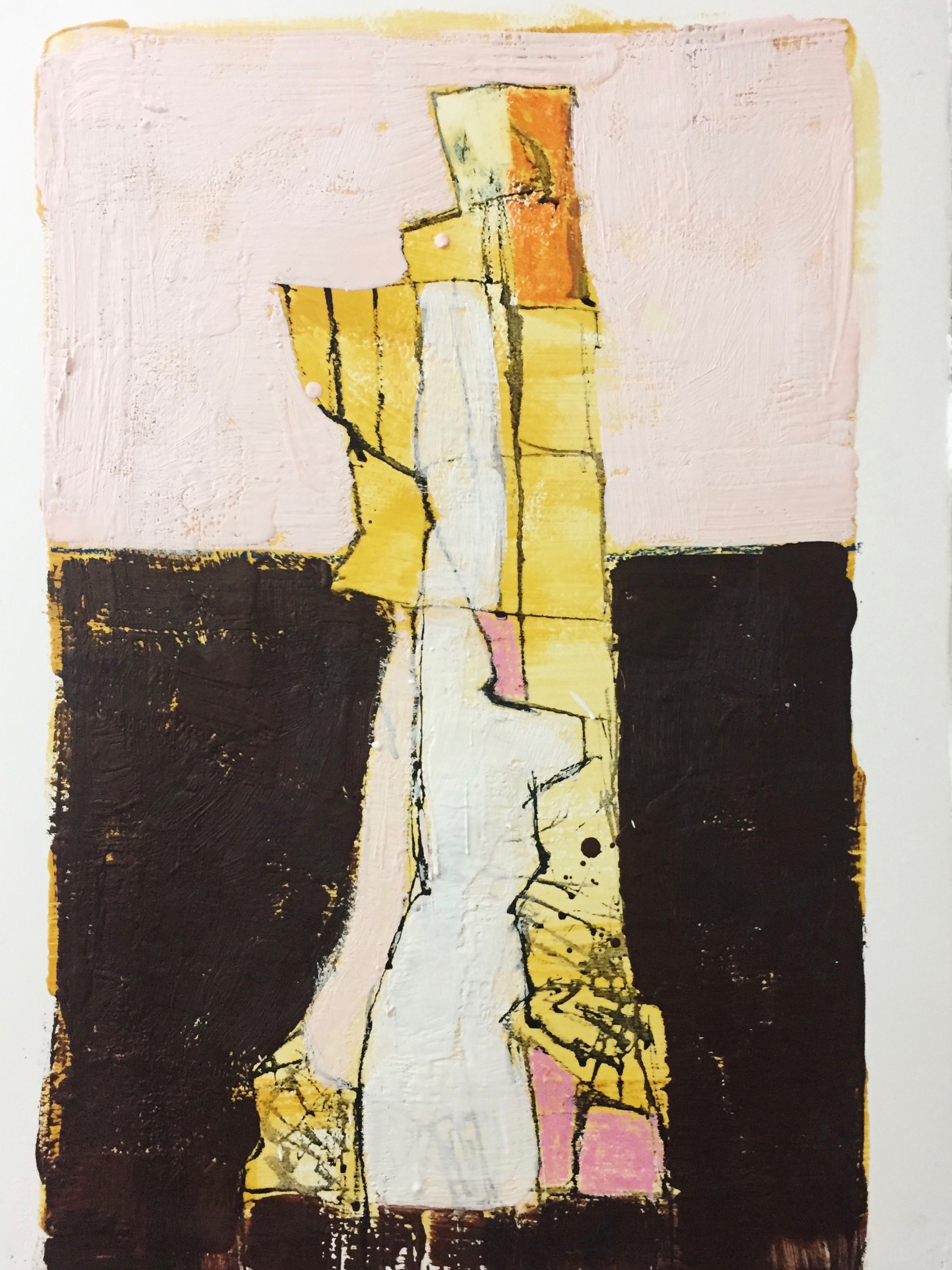
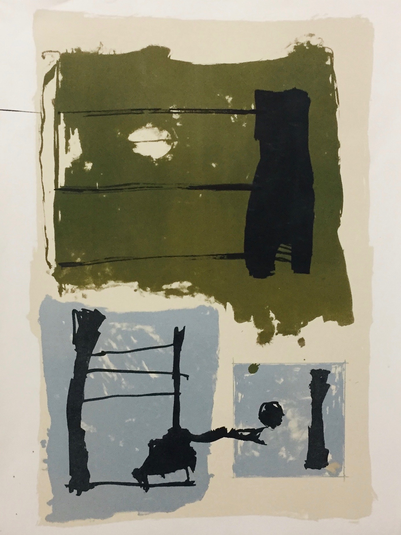
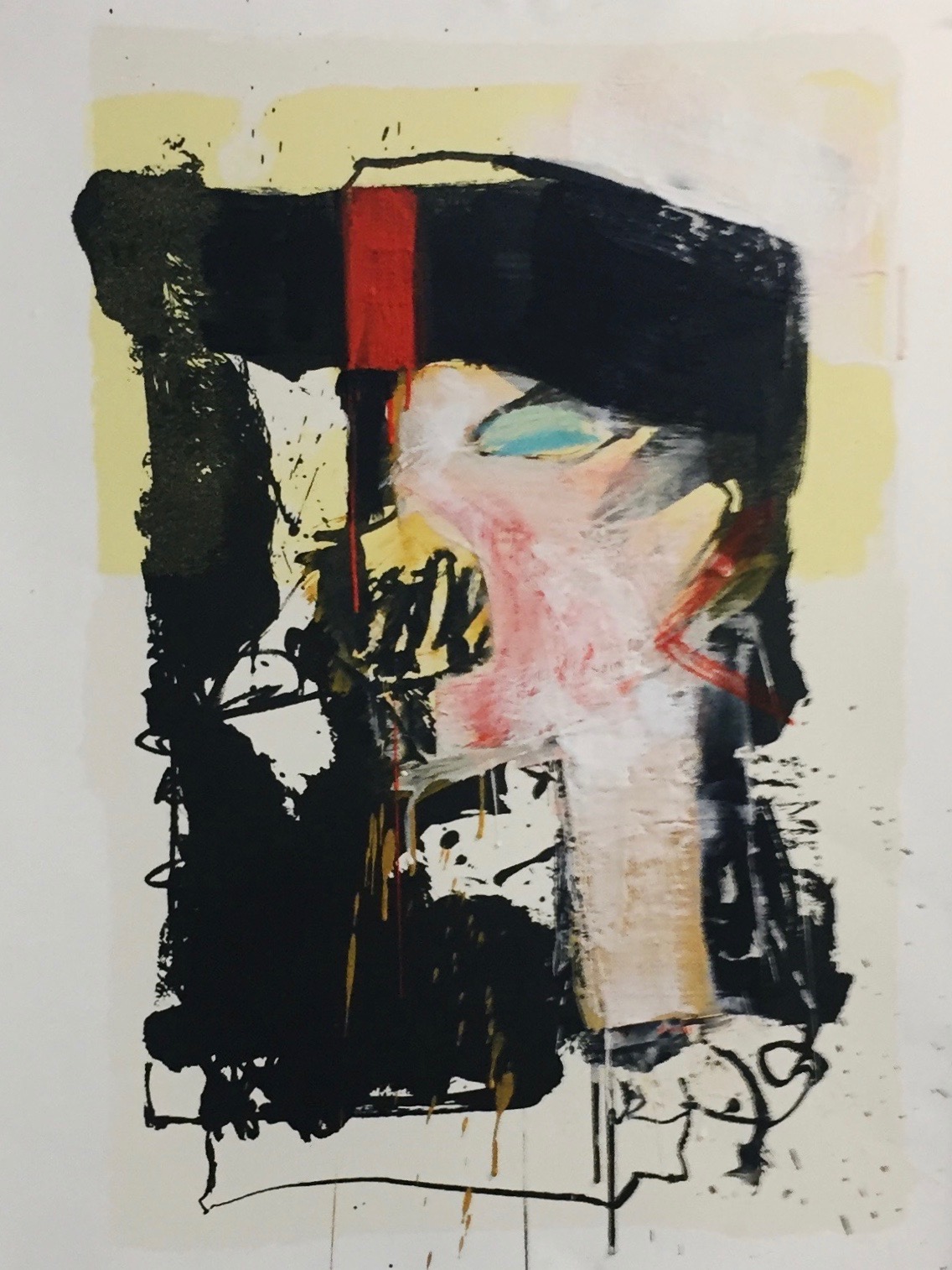
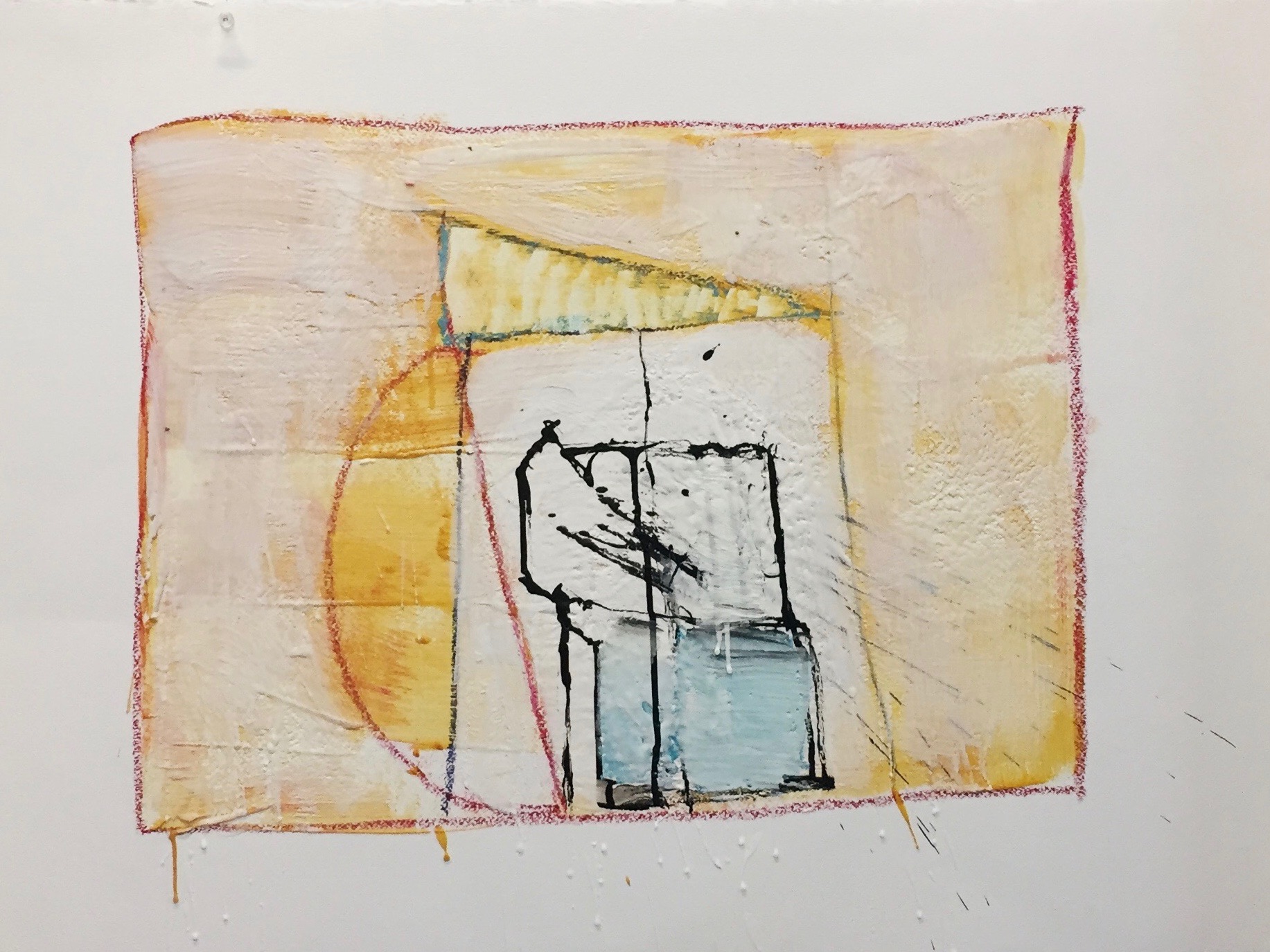
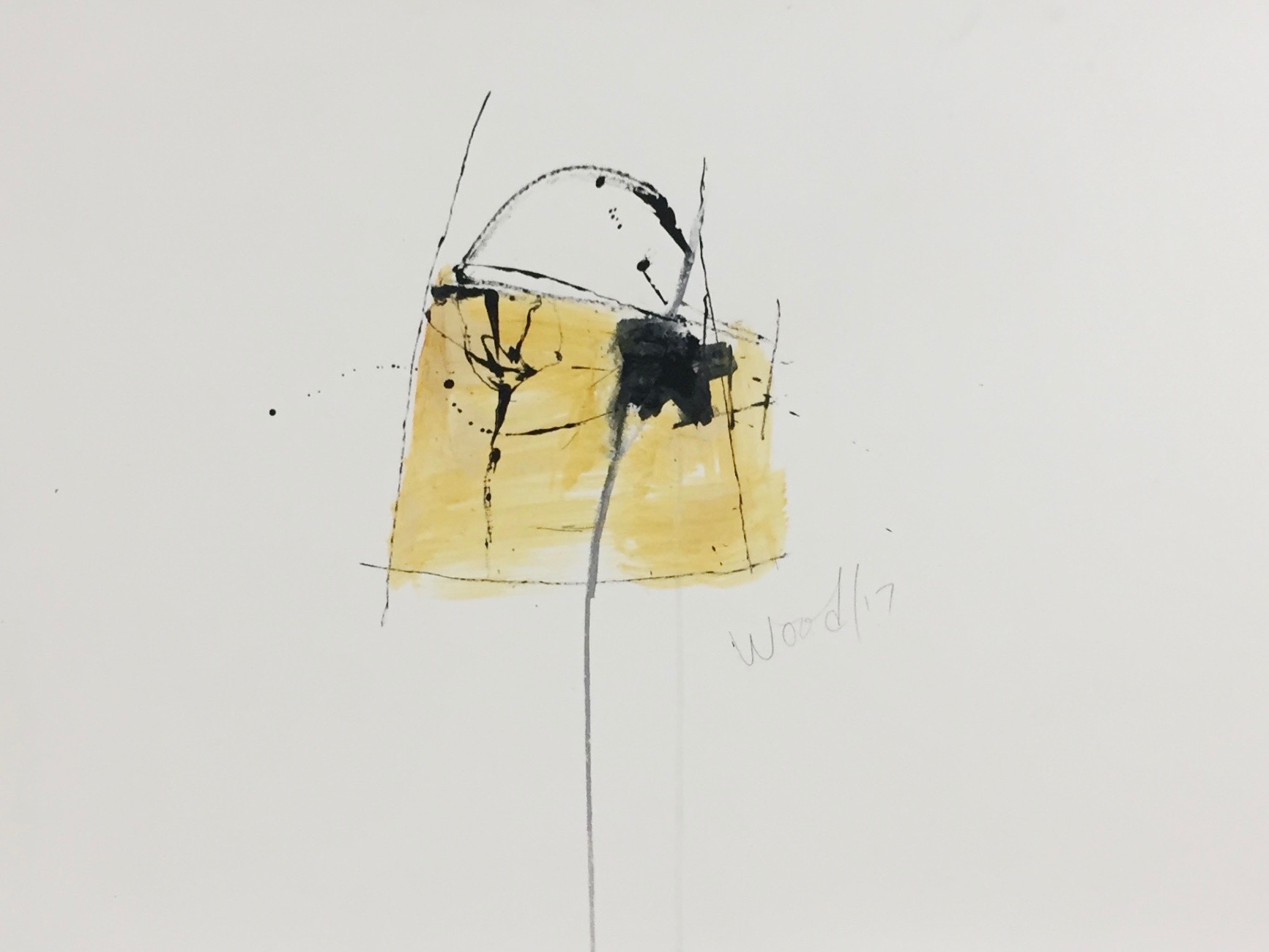
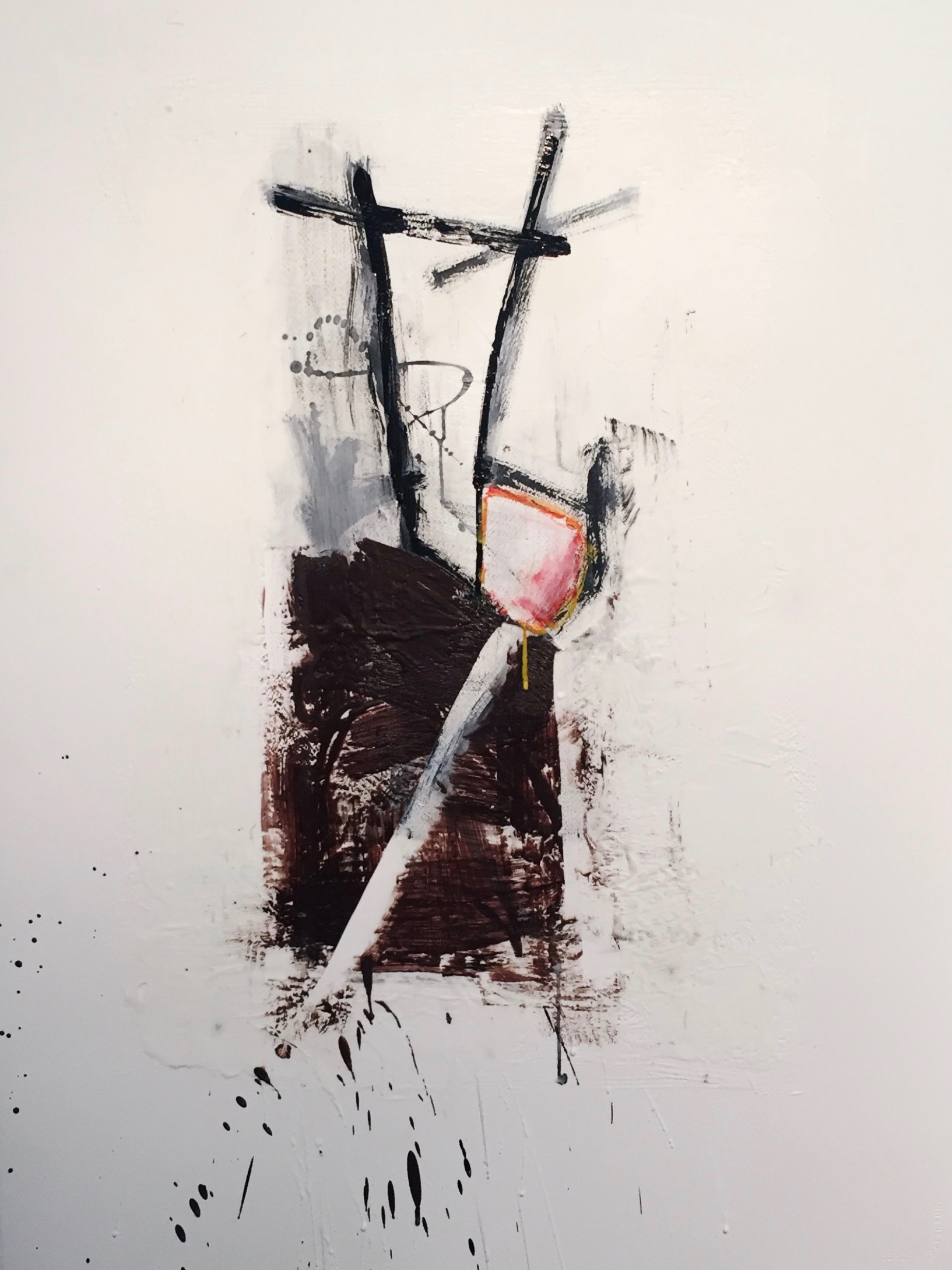
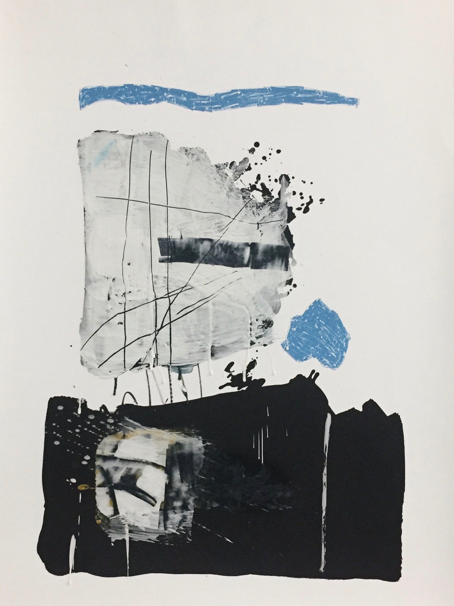
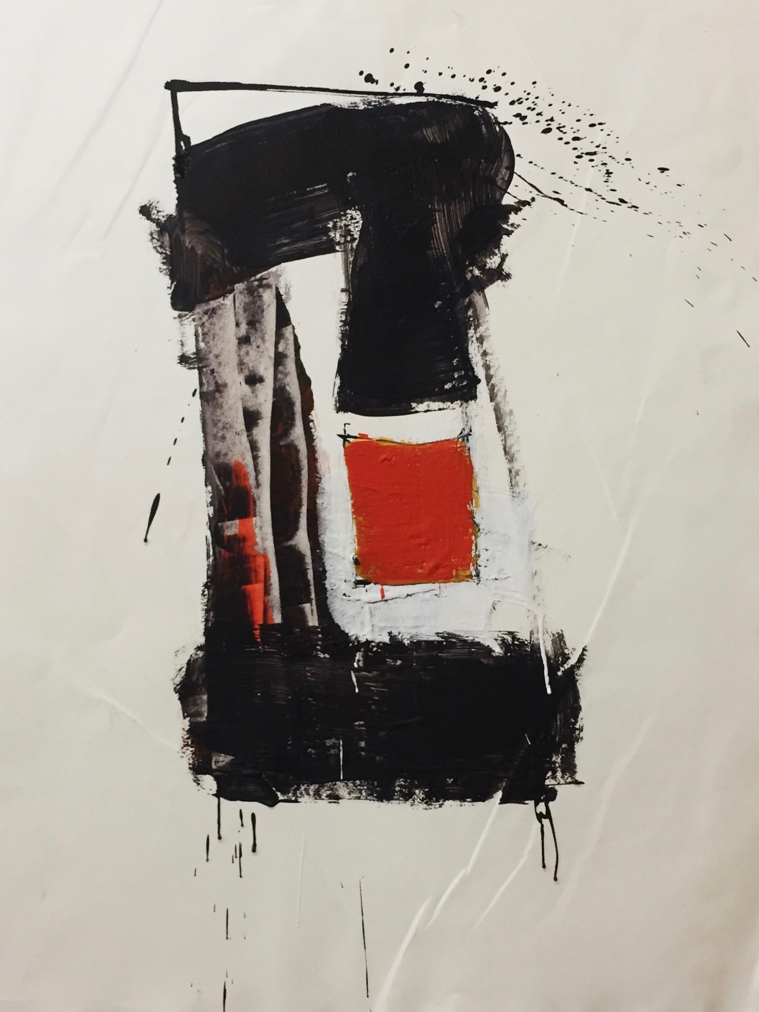
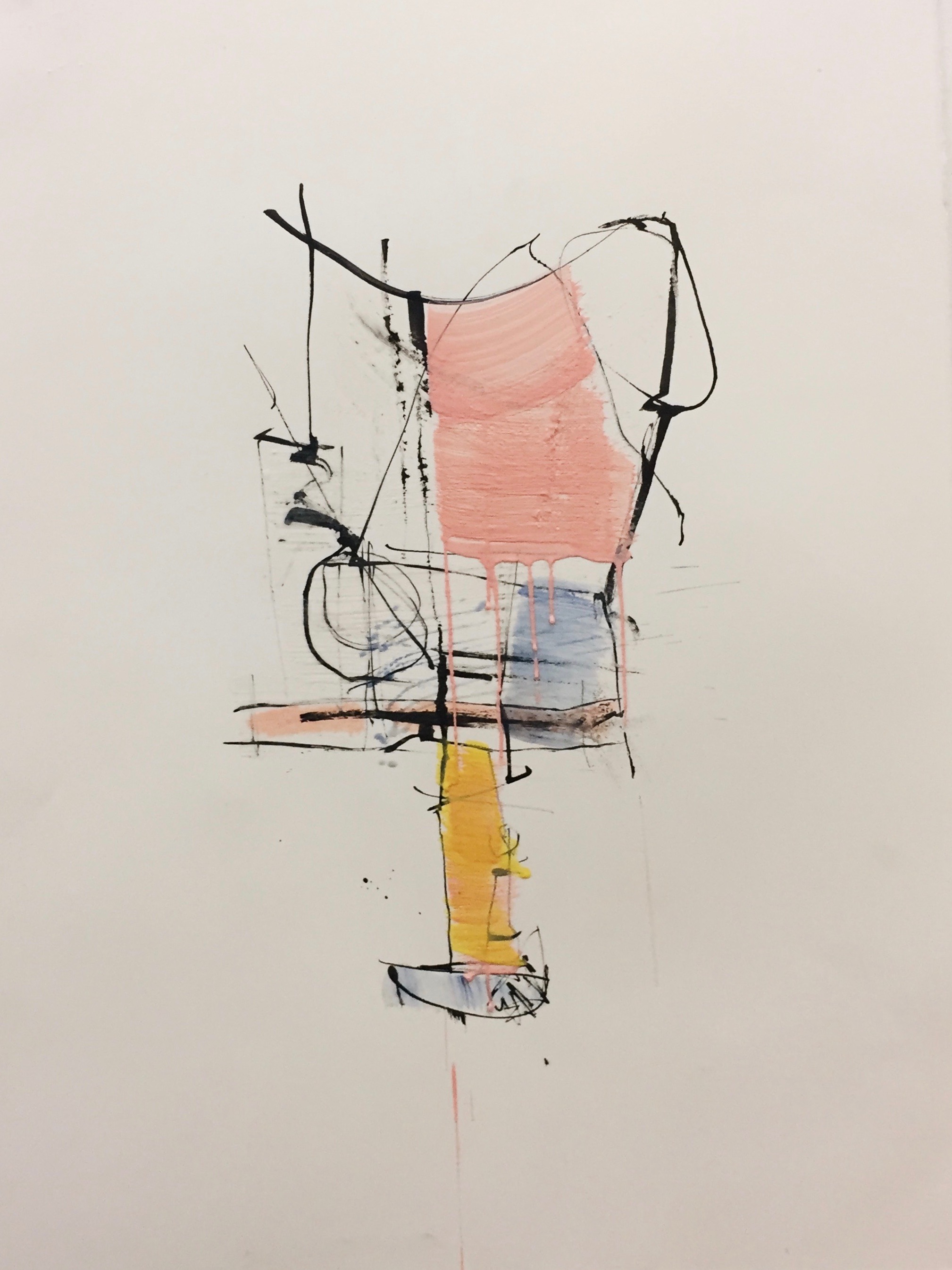
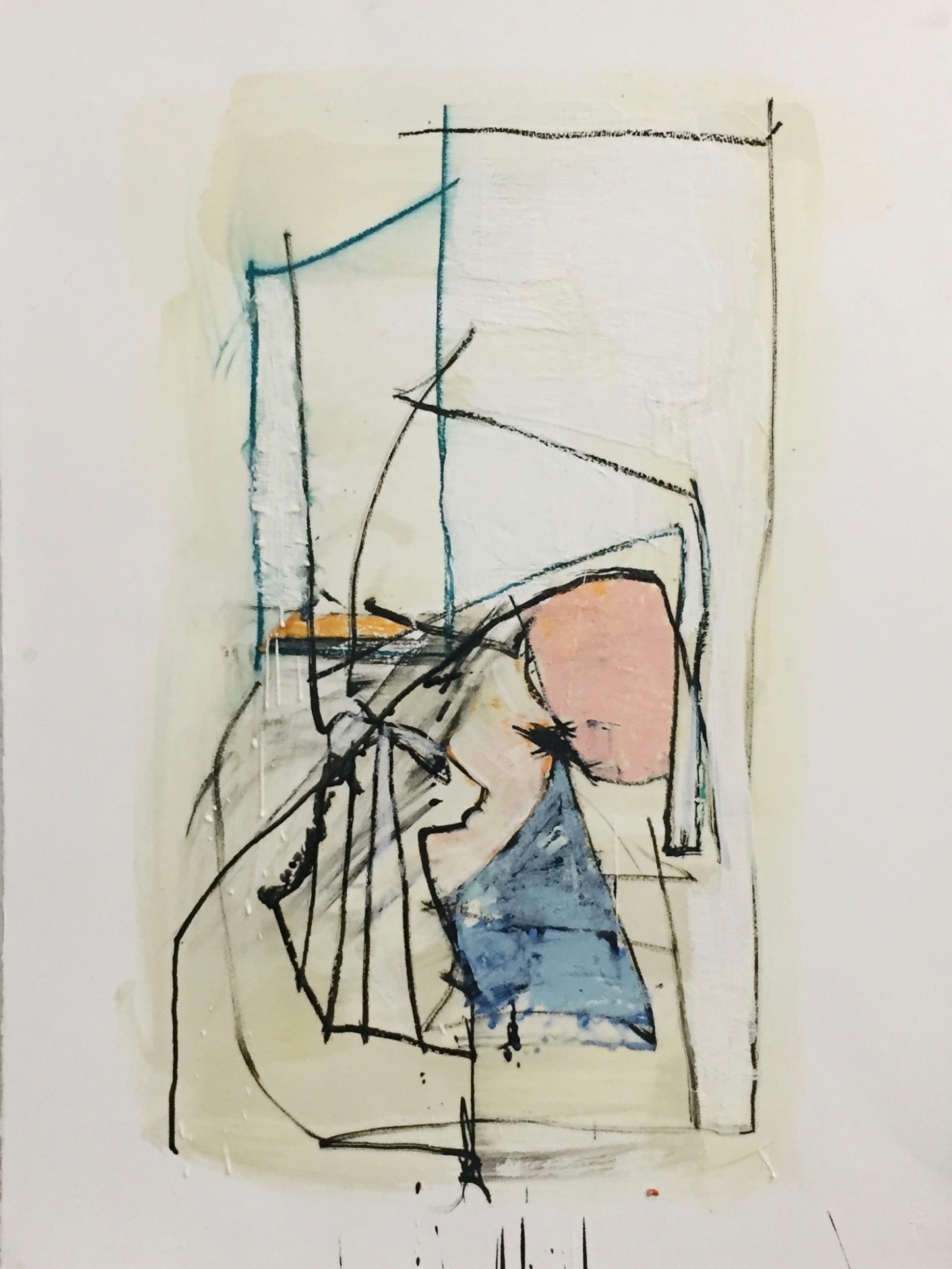
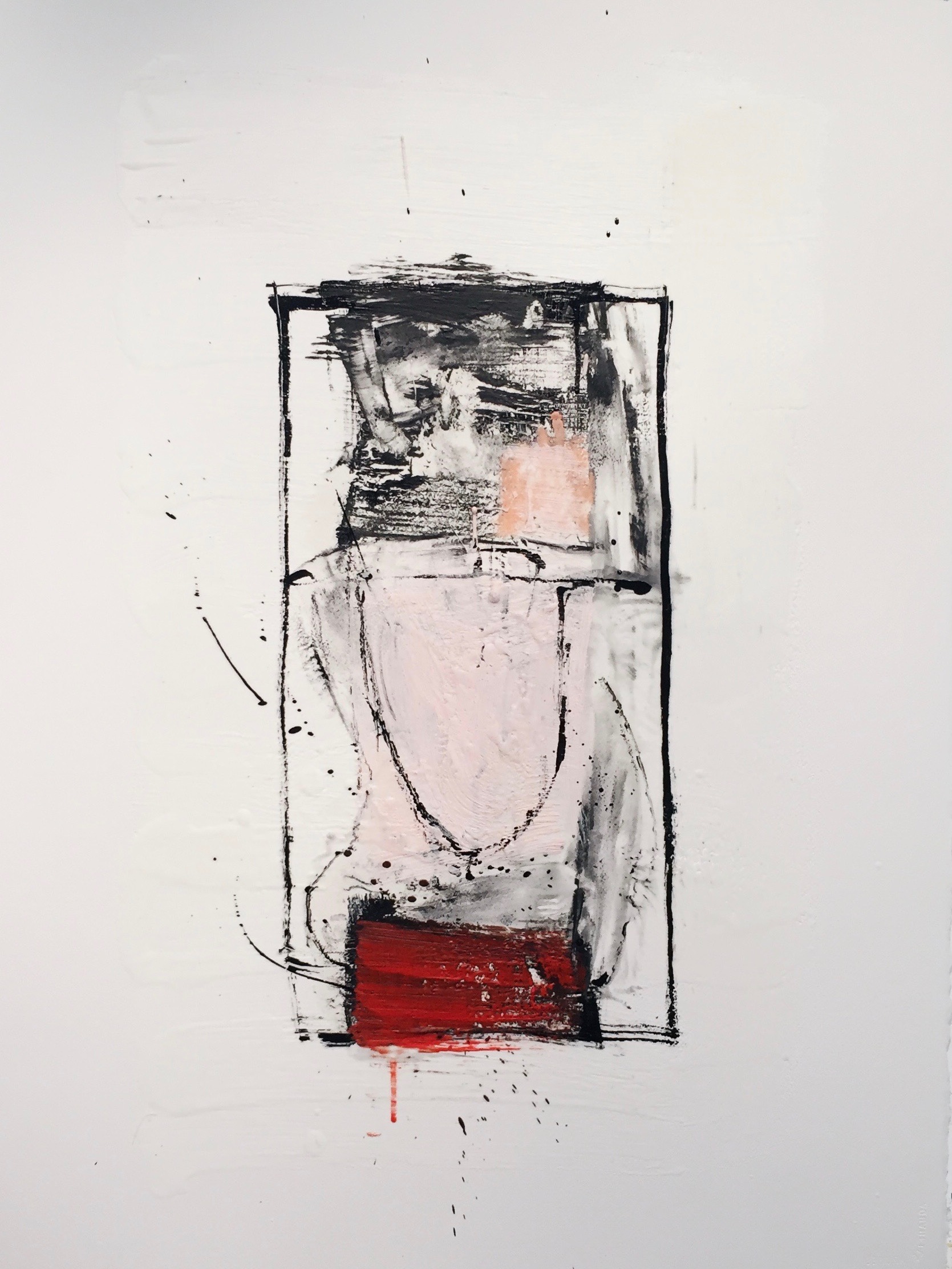
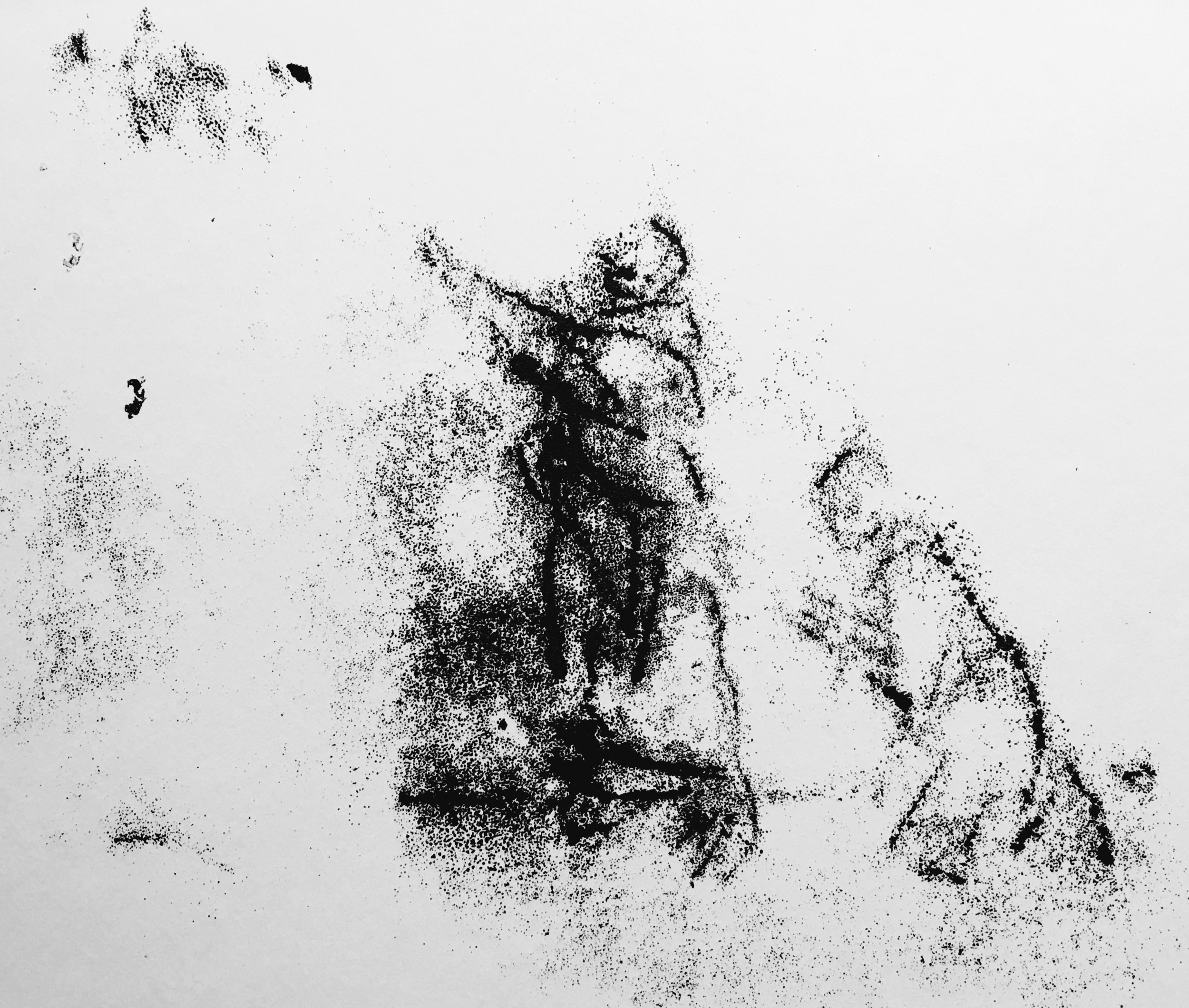
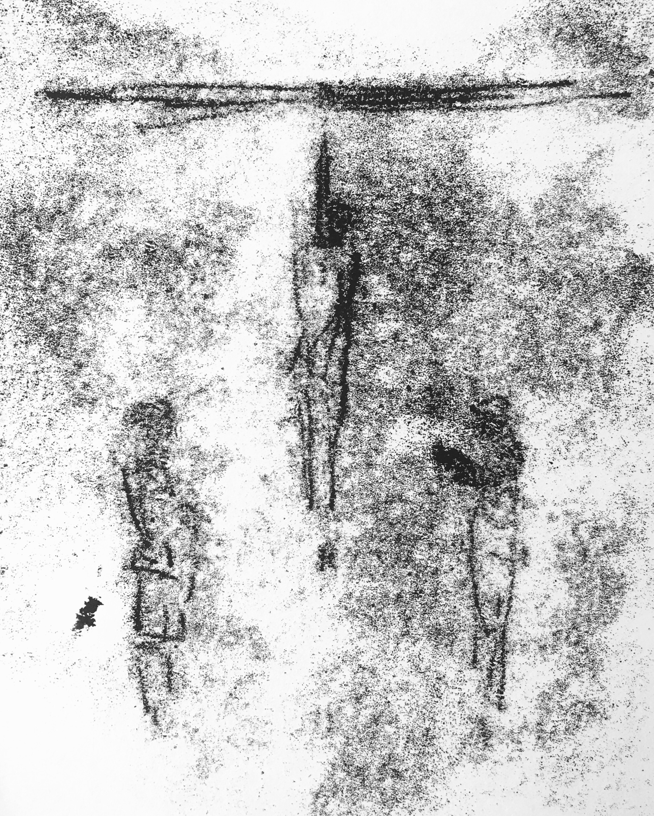
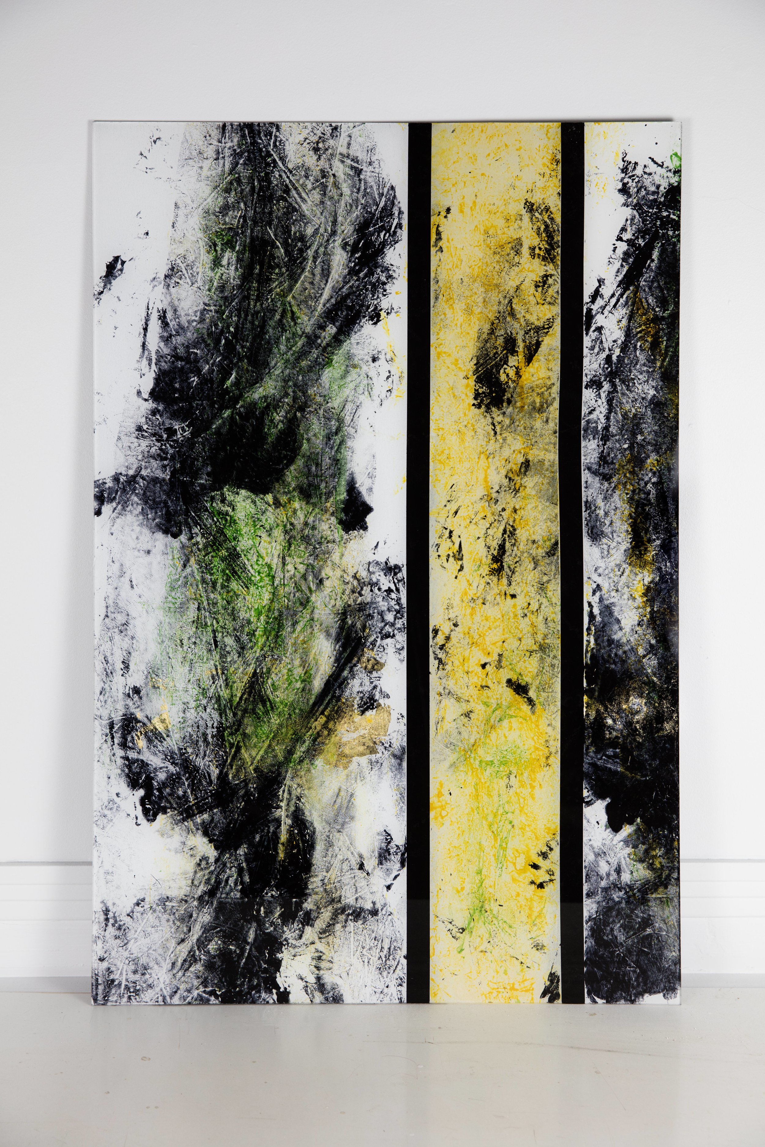
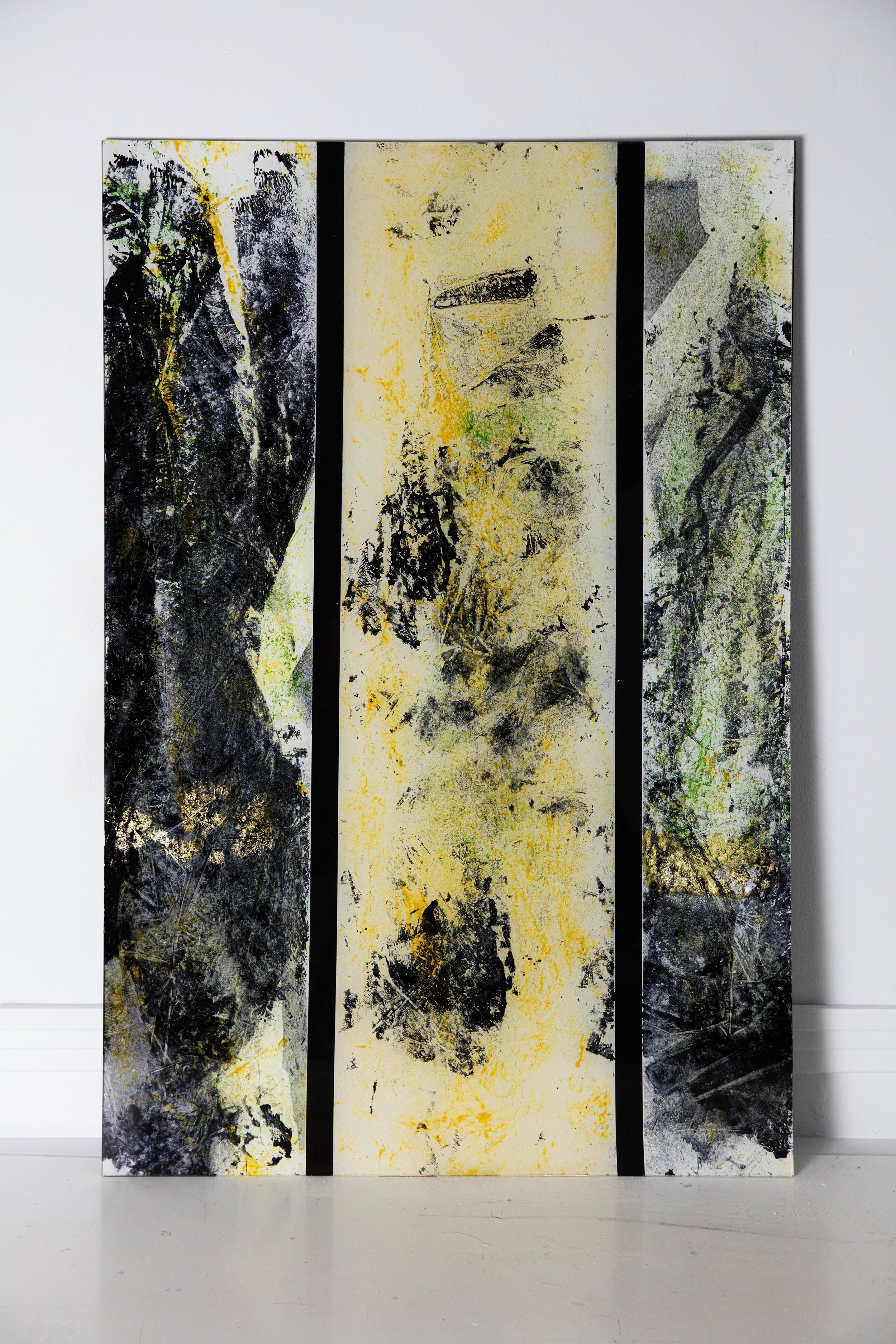
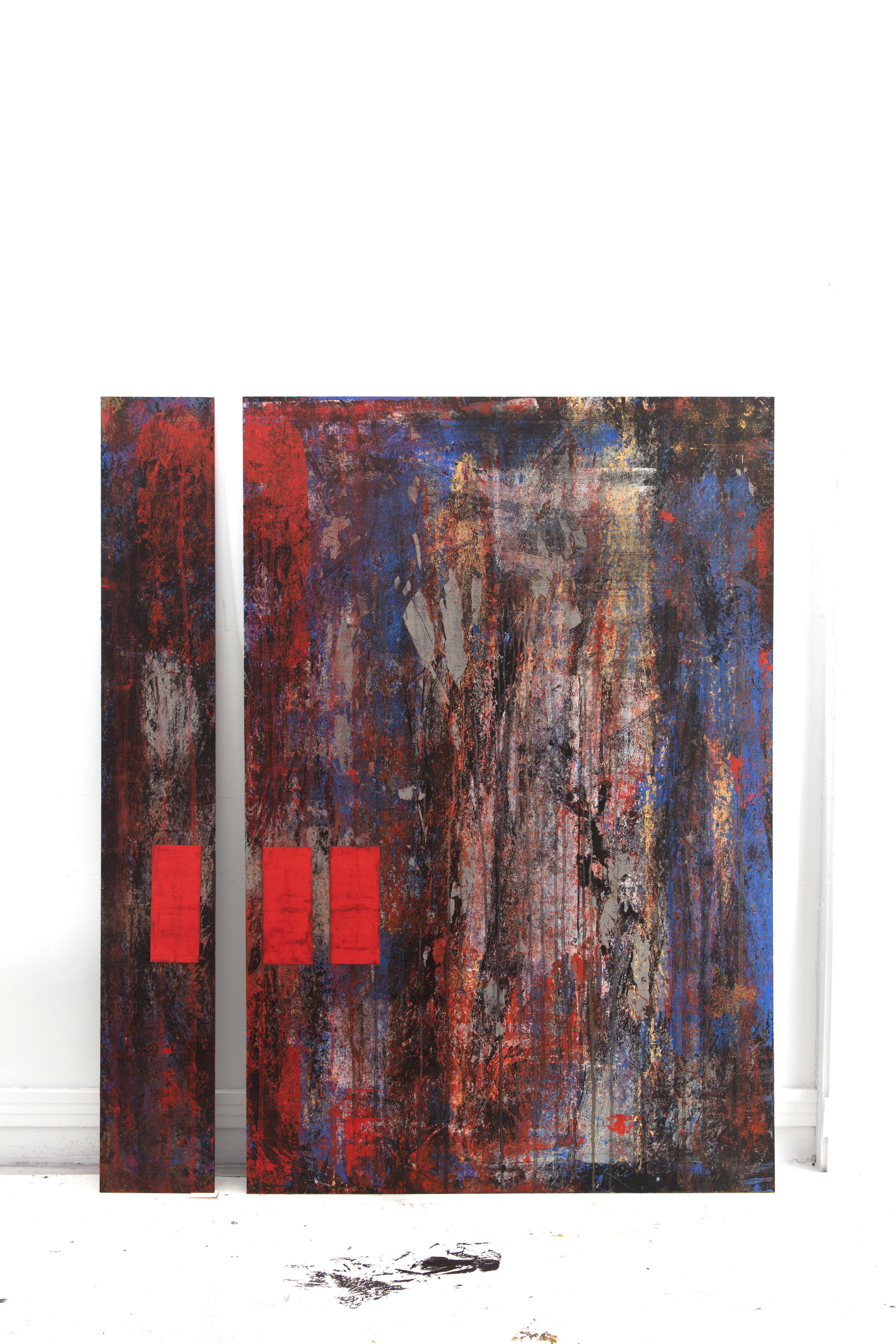
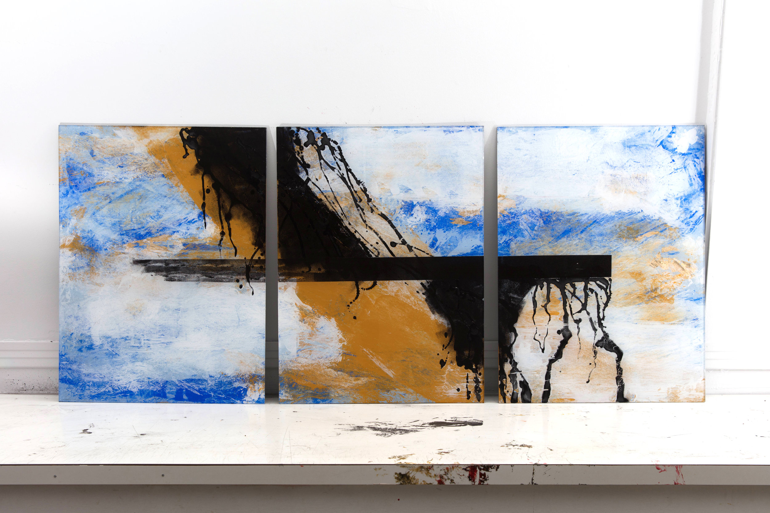
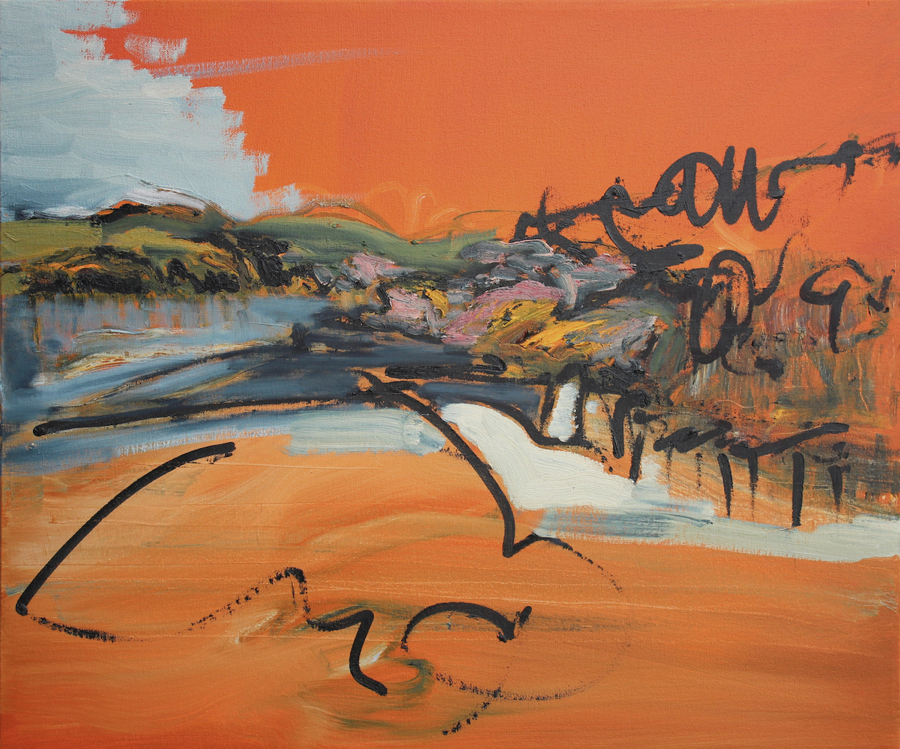
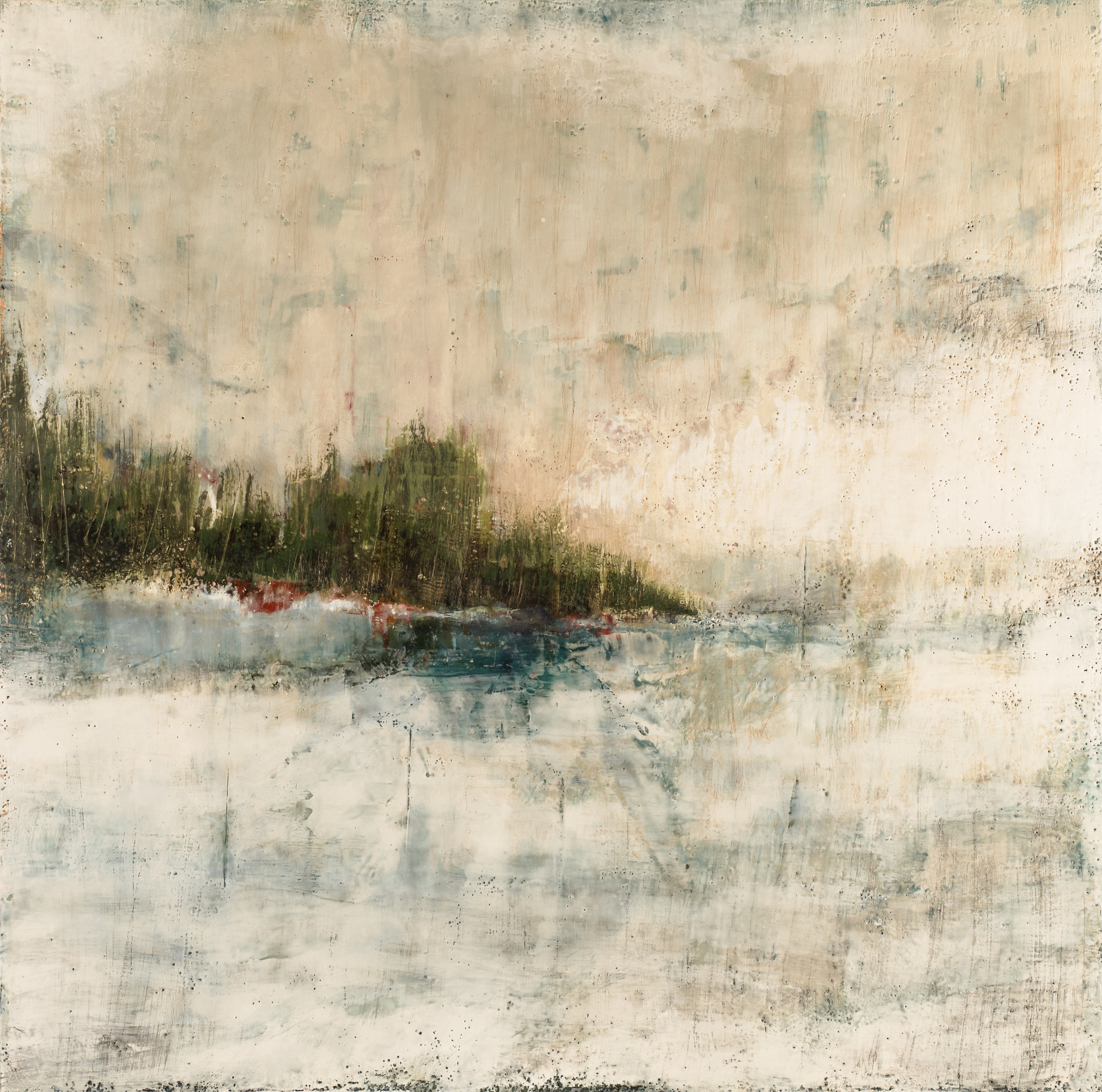
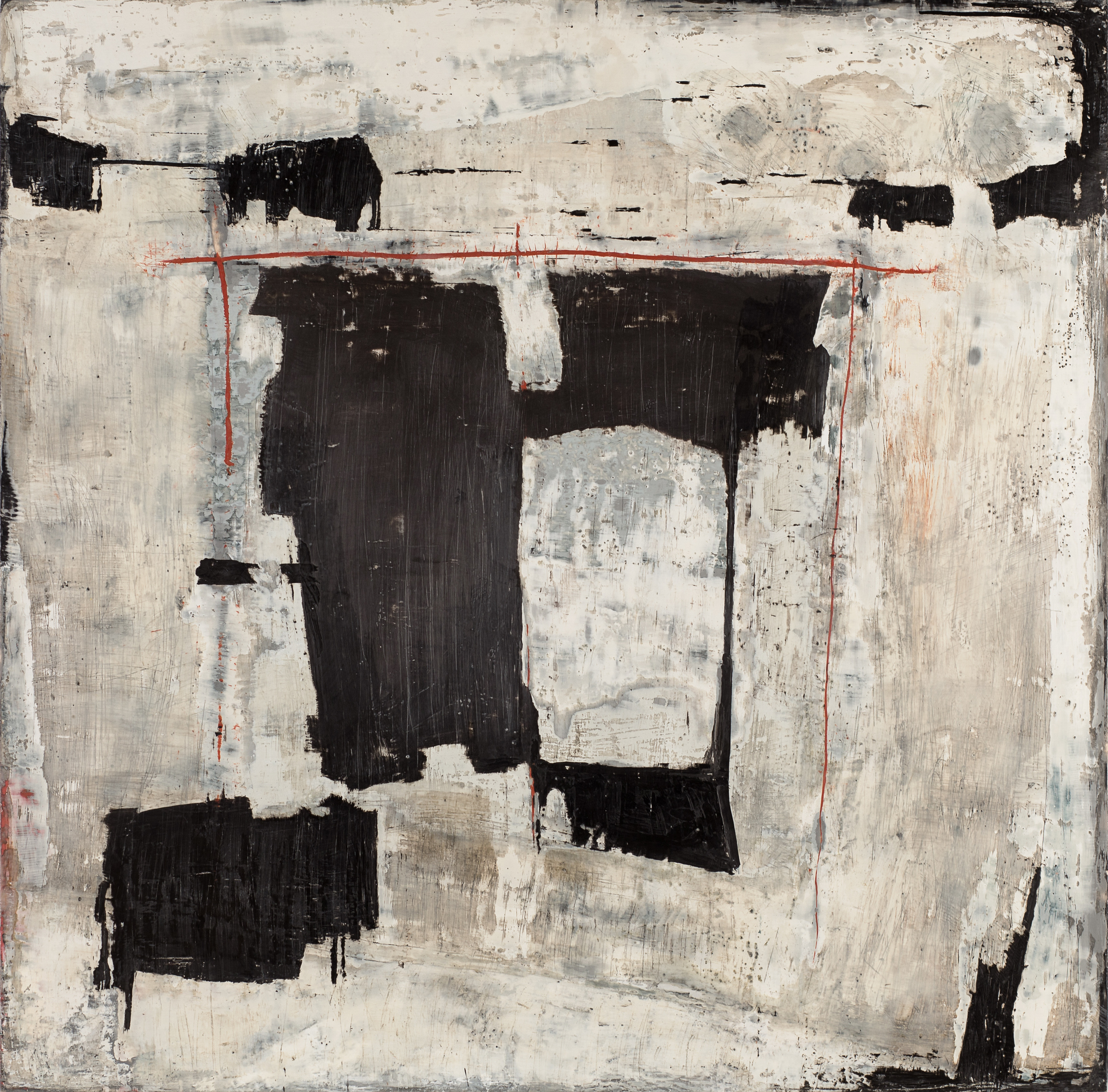
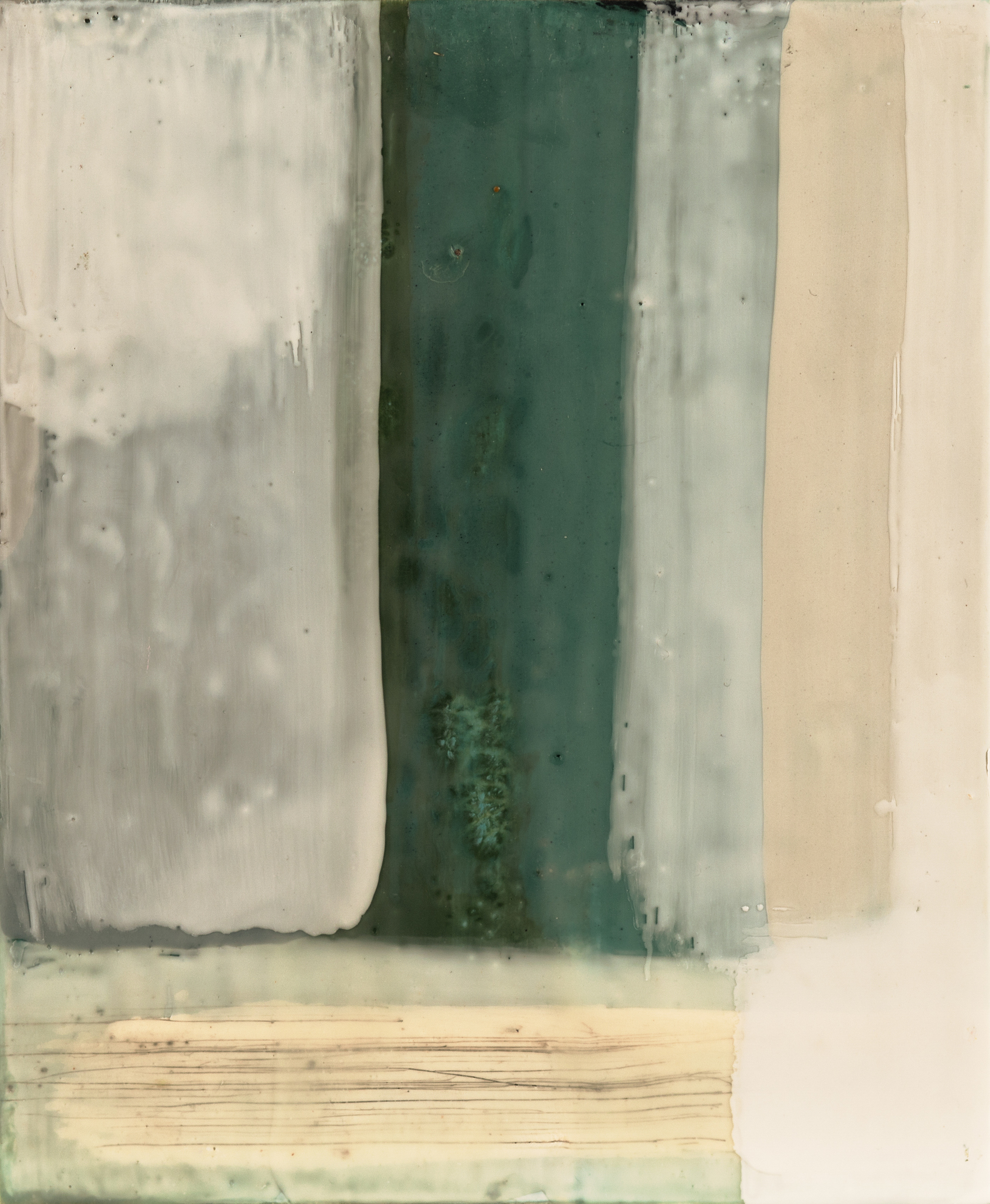
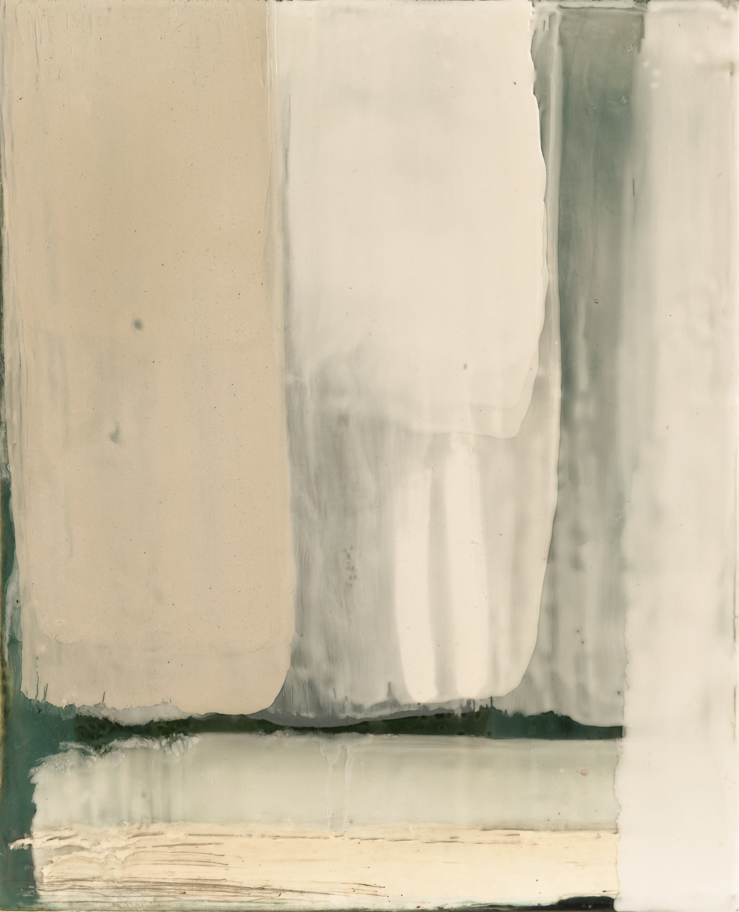
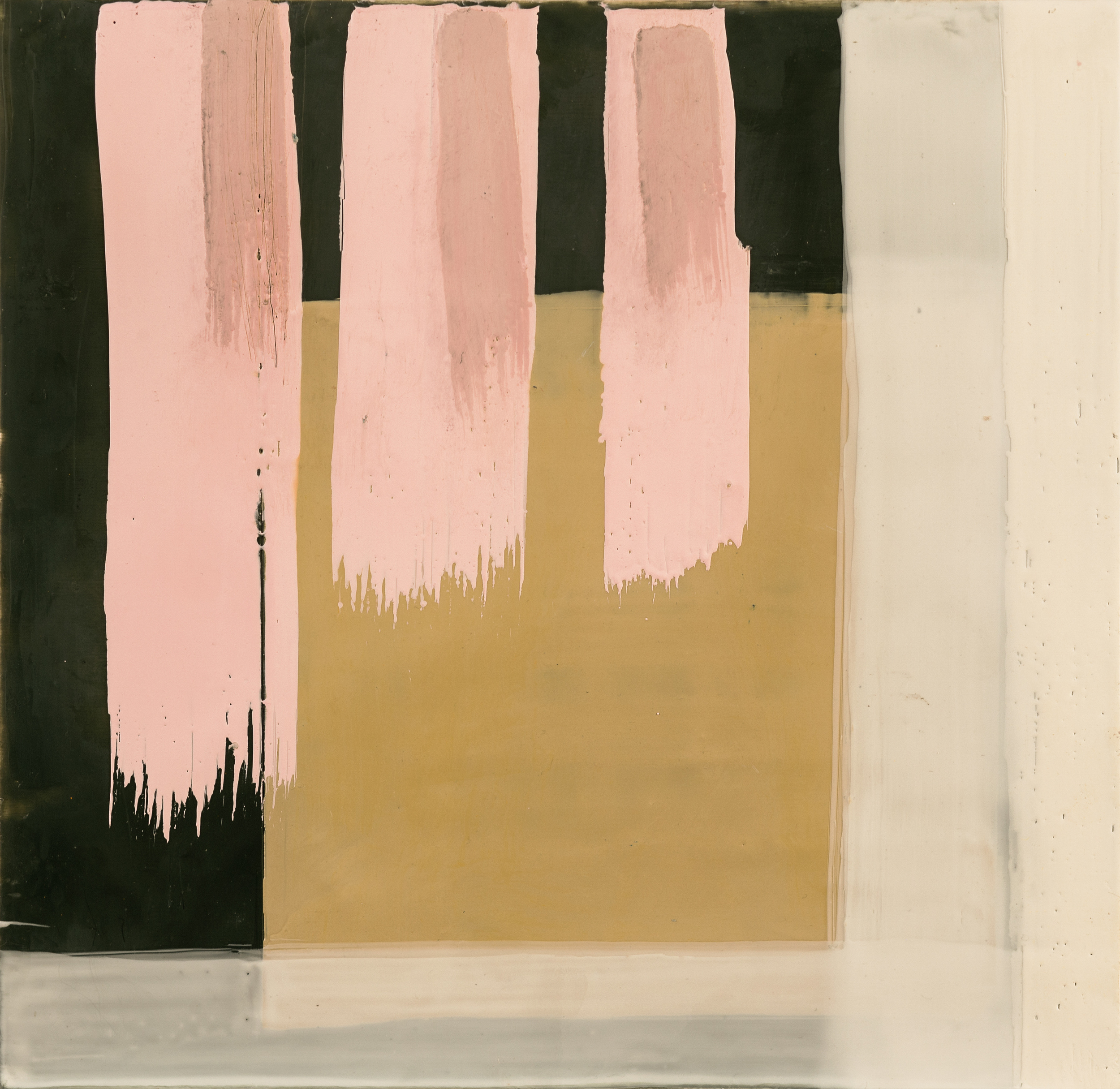
June 2nd, 2017 Keith Wood opens Non-Fiction, a new body of work showcasing Wood's mixture of bold and transparent layers of molten wax on paper. The show runs in its entirely June 2nd to 30th at Gurevich.
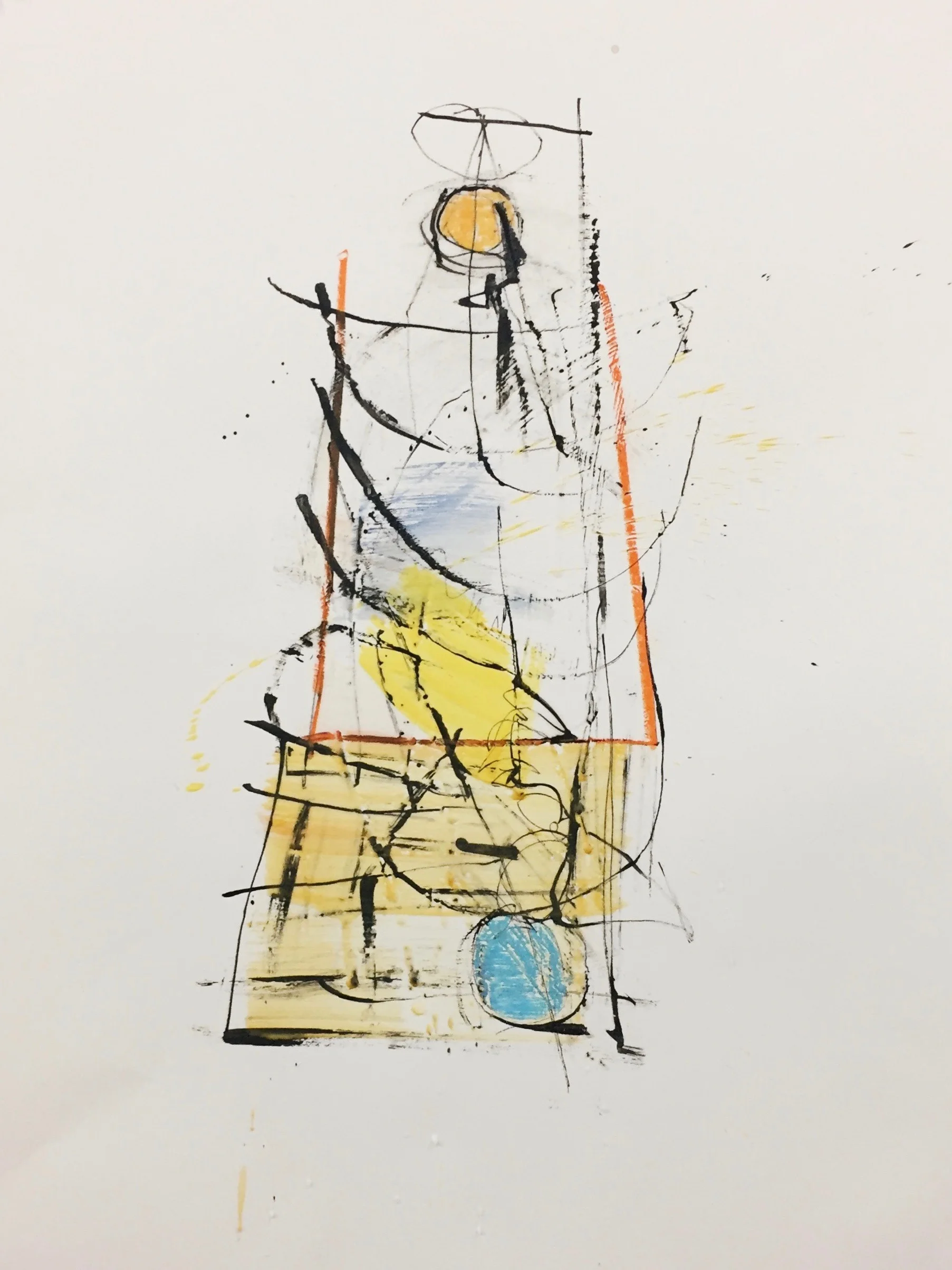
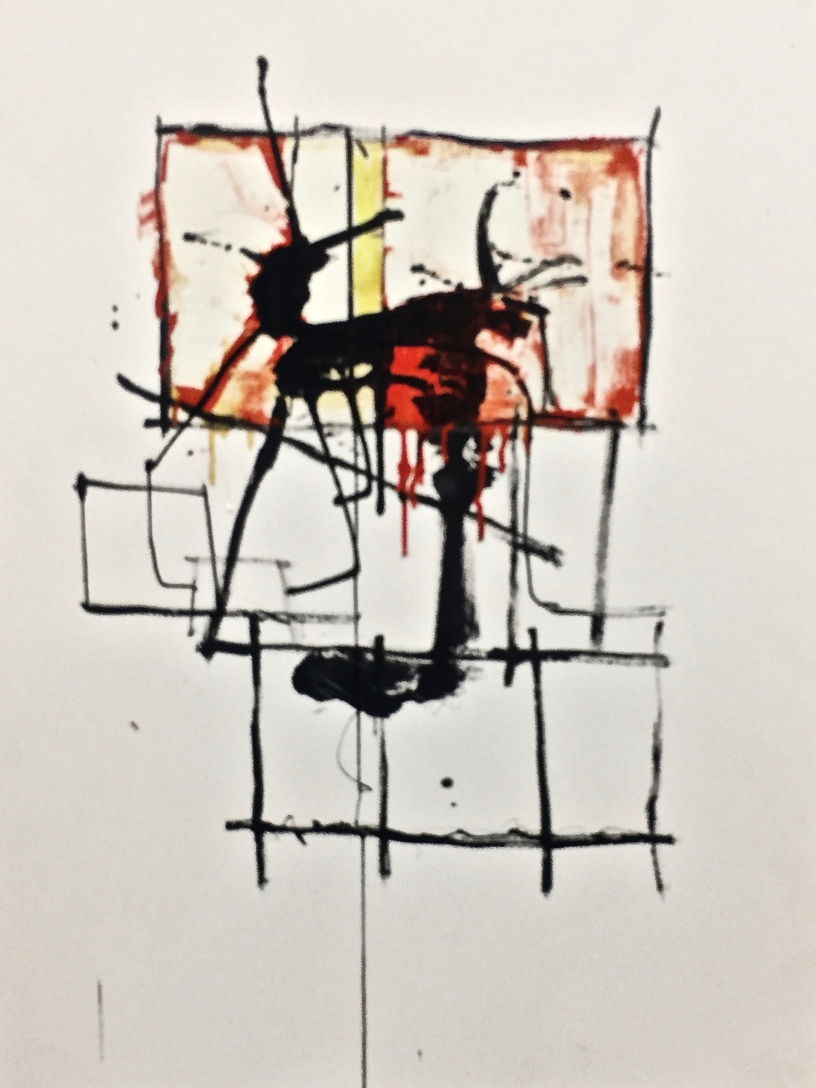
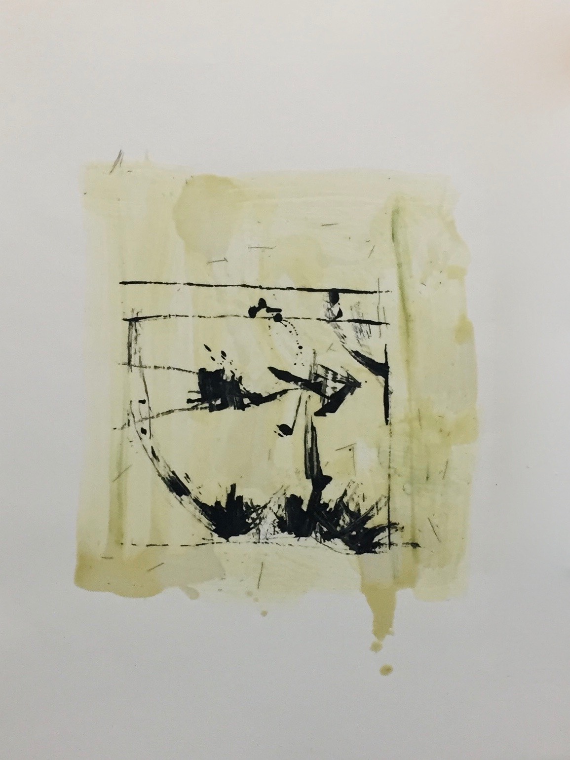
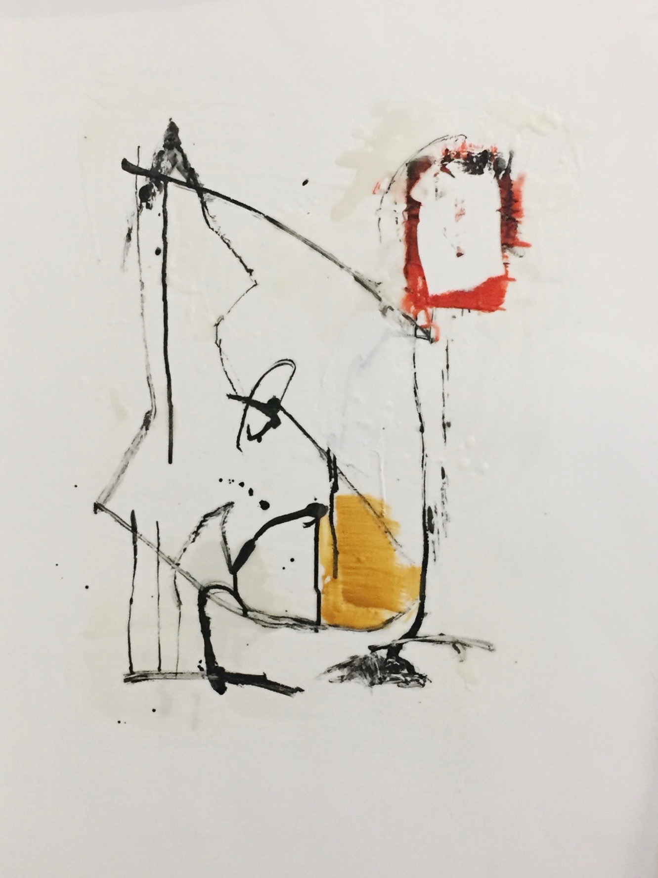
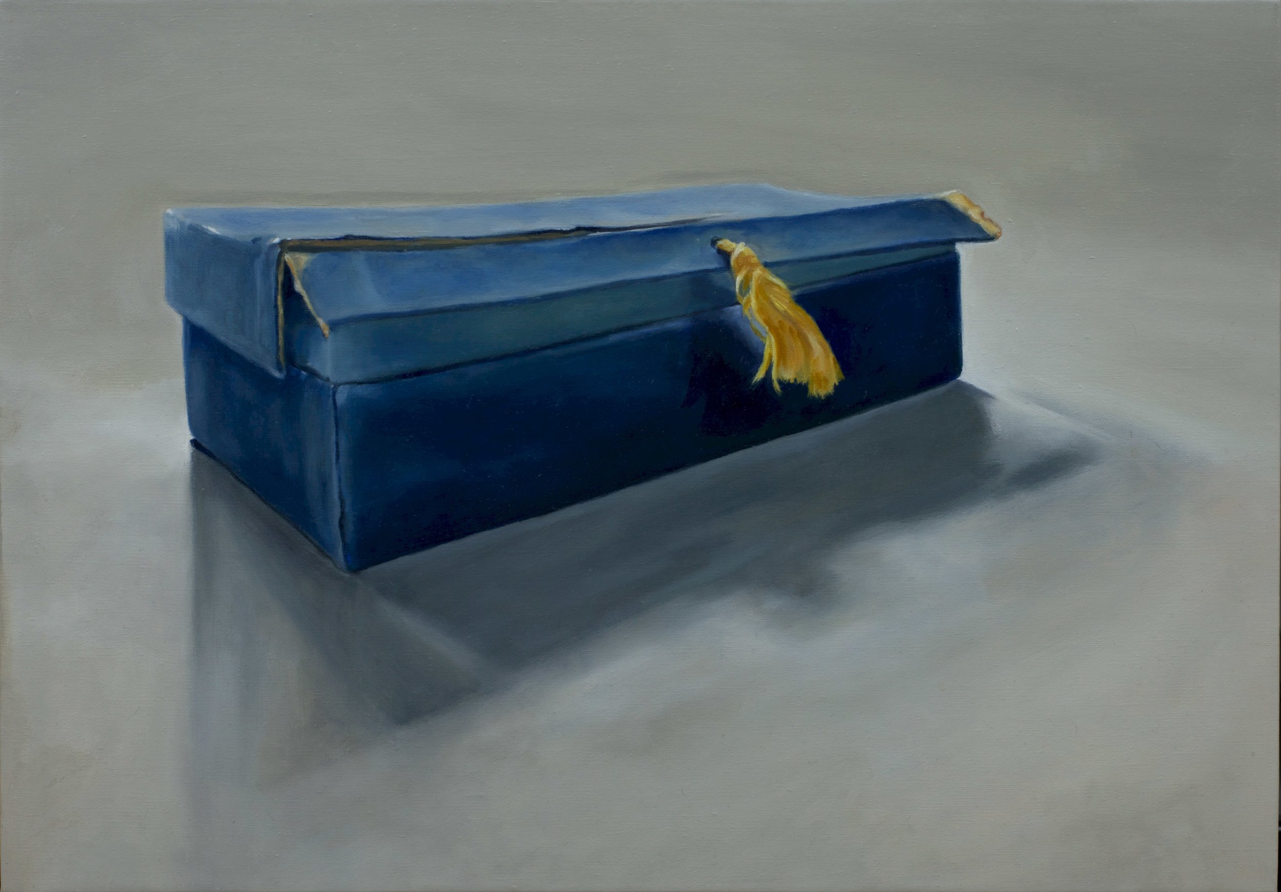
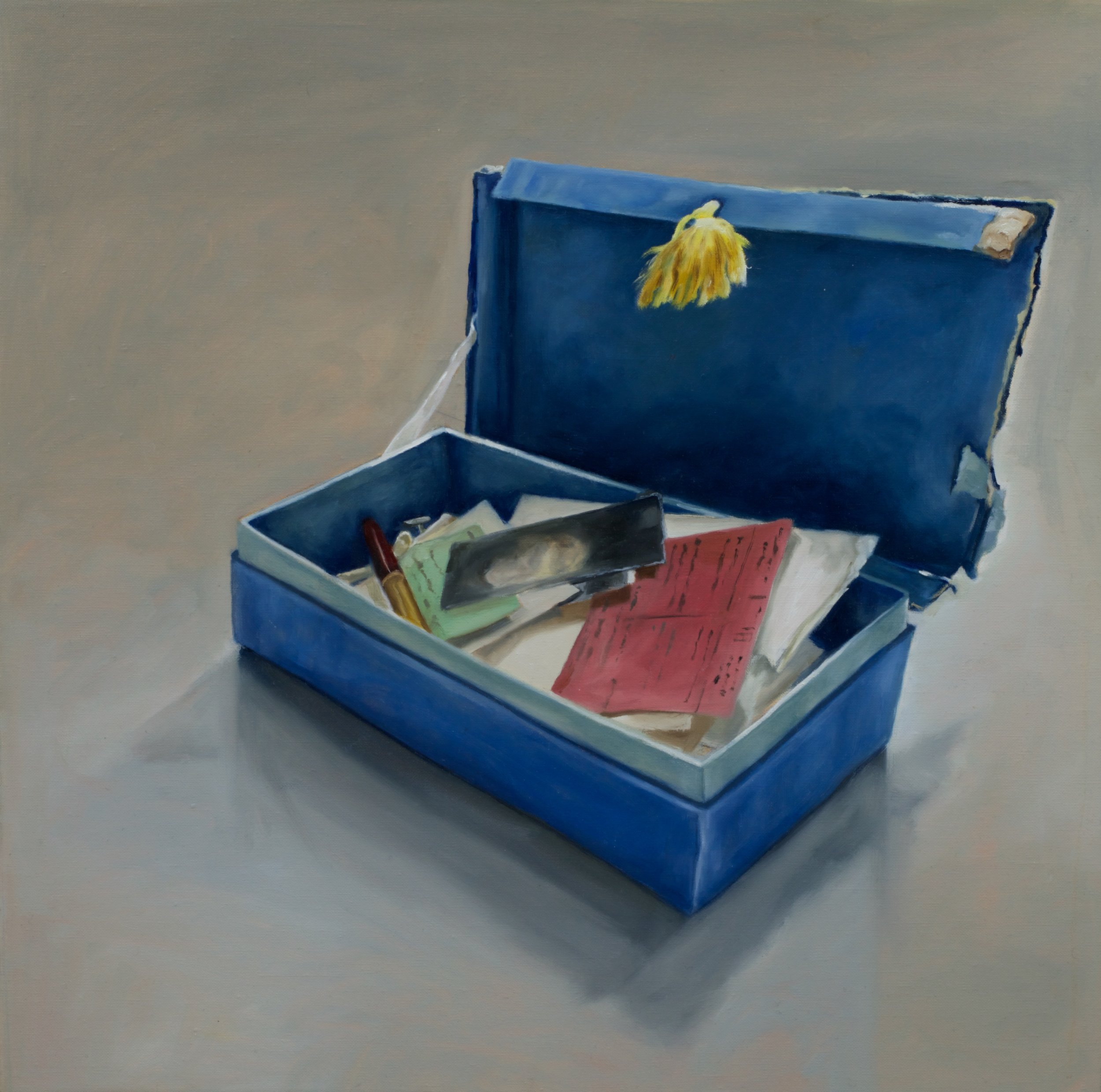
KEITH WOOD
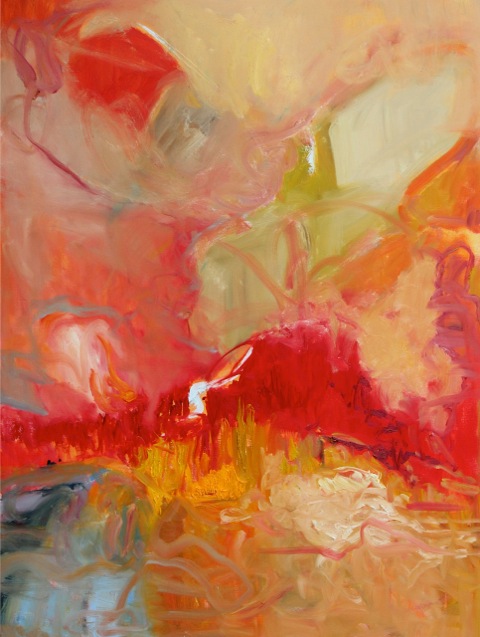
After exploring the width, breadth and depth of acrylic and oil paint for almost 30 years, in 2006 I started using the “encaustic” medium (pigmented molten wax.) I wanted to explore a new medium and apply its attributes to my work.
Encaustic is light – a key element of my work. To take advantage of the attributes of the medium it is best to work in transparent layers. Unlike oil or acrylic, the added pigment is suspended in the molten wax as opposed to being emulsified. The refraction of light through the layers of wax creates the appearance of light coming from within the work.
I work in the abstract genre, broad natural forms with evidence of the process and stages of development the work has emerged from. I rarely do preliminary sketches or drawings. If I want to capture or retain a thought I usually write it as opposed to drawing it.
Every painting has an intent which one must sense, then act on. Just as a jazz musician dialogues with his instrument, creating a work of art involves an intense dialogue with the work throughout the process.
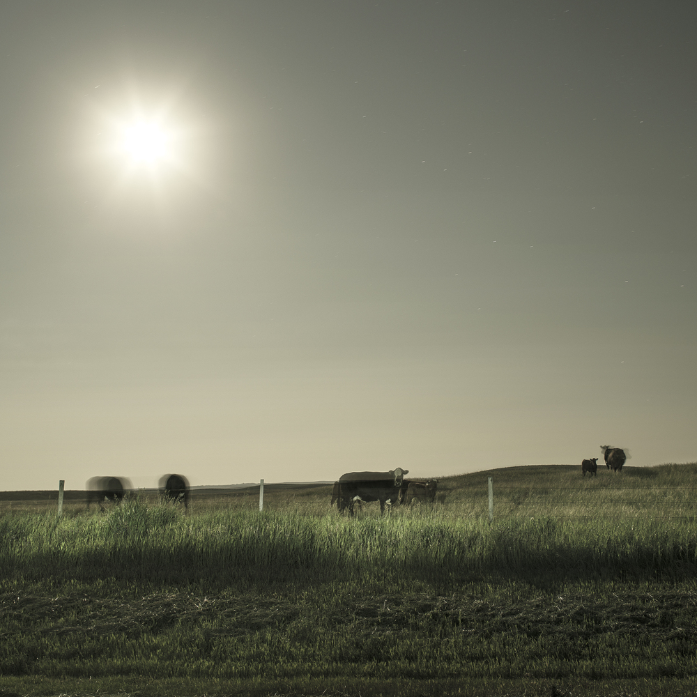
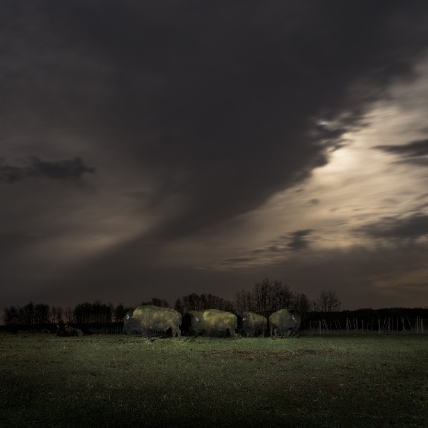
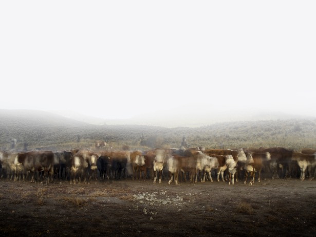
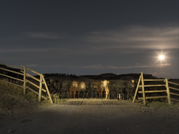
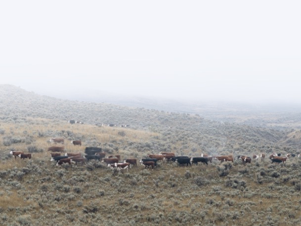
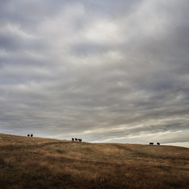
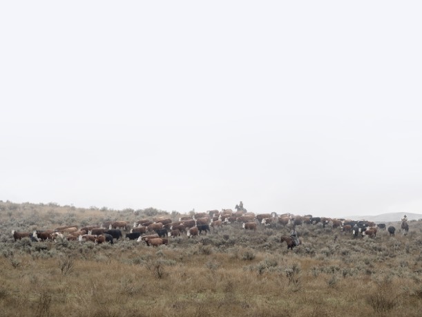
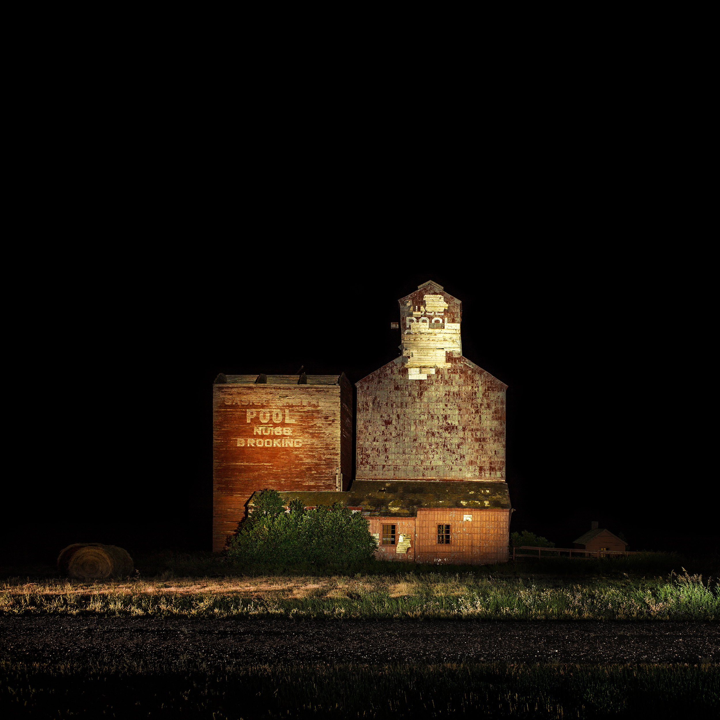
Kevin Boyle | HERD
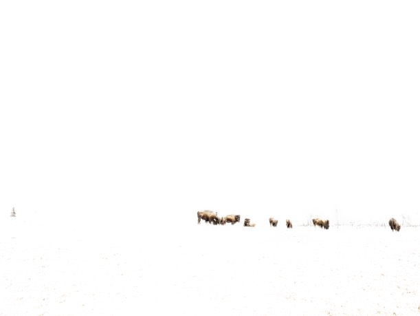
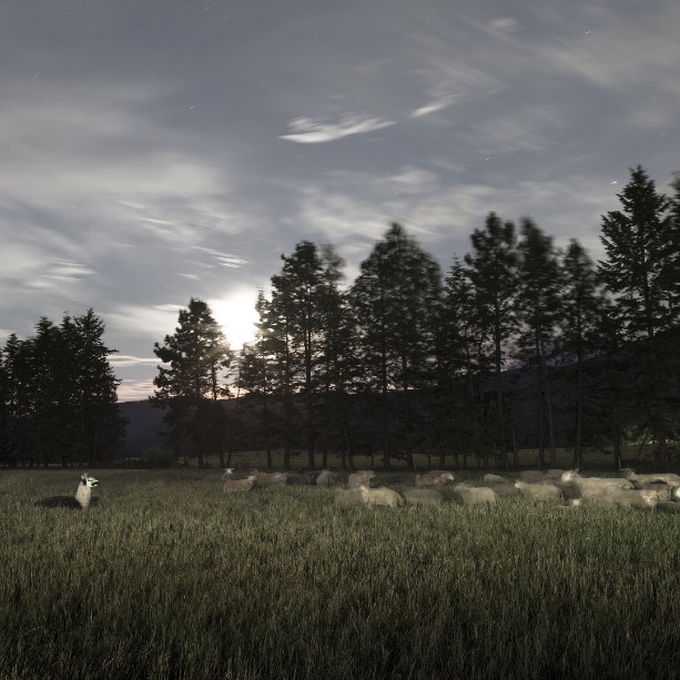
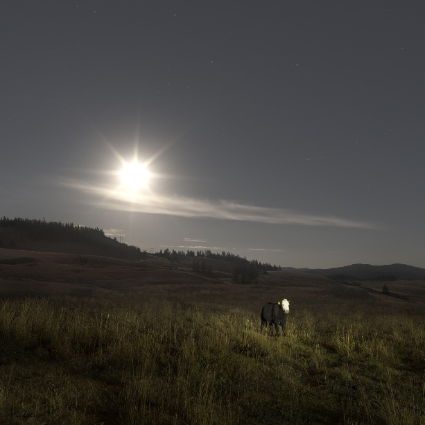
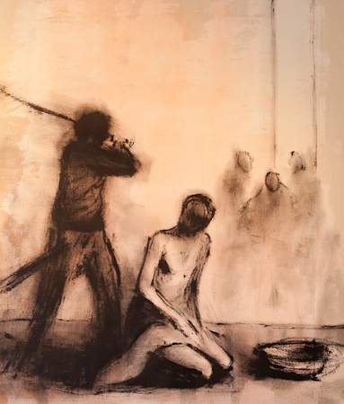
Although this series runs the risk of being misinterpreted as a bunch of photographs of farm animals, I can assure you that is not the case. Above all, these photographs are about perceptioin, community, control, and how closely related our human “herd” mentality is to that of our animal friends, if we’re humble enough to see it as such.
The first time I noticed this parallel was during a five day drive from Vancouver to Winnipeg. At about two o'clock in the morning underneath a full moon in the prairies - I drove down one of the southern, less travelled highways and out of the corner of my eye I saw black dots littering the fields around me. Curious, I pulled off to the shoulder to investigate.
Under the greenish illumination of the moon was a herd of cattle slowly walking along the fence line of the field, grazing and going about their business. There were a few bulls, some cows, and several calves. The bulls led the way, with the exception of one of them trailing behind the herd, and the cows tended to the calves. Within the confines of the farmer's field, there was a community - a natural hierarchy of responsibilities. The bulls and cows cautiously stared at me as I walked along the fence line. The calves inched closer to see what I was, until a quick "moo" from the momma brought them back to their place at her side. Every time a coyote howled in the not far distance, the bulls let out a call. Each animal had its place, and I had mine.
I observed silently for 30 minutes before finally taking their photograph.
The second time I saw it, I was in Mexico at one of those all-inclusive resorts. Planes packed with families were loaded onto buses destined for idyllic beaches. There, they would be fed, protected, and free to roam... as long as it was within the confines of the Eden-like compound, protected by 24 hour security, and serviced by staff that were trained to be invisible and stay out of your way. Follow the well labelled paths to the bars and buffets and pools.
I started to look at the world differently. I started looking at what my place in the world was. I wondered which side of the fence I was on? I sought out the invisible controls in my own life and studied them. The subtle influences of social media, the news, my job. I watched my thoughts and how these things influenced my opinion of people, culture, and religion. I watched how these things affected other people as well and I realized how deep these controls were. And all I could think of were those cattle wandering through the field. I wondered if they knew what was in store for them, and if they did, would they push through the fence and make a run for it?
The difference between us and them is that we have a choice. We can choose to see the world as it is, and how different it is from what we see on television or the Internet. We can choose to be respectful and responsible. We have the ability to see the barbed wire fences that guide our thoughts and values. We just have to look harder. We can choose to separate from the herd.
Or maybe it's just a bunch of photographs of farm animals.


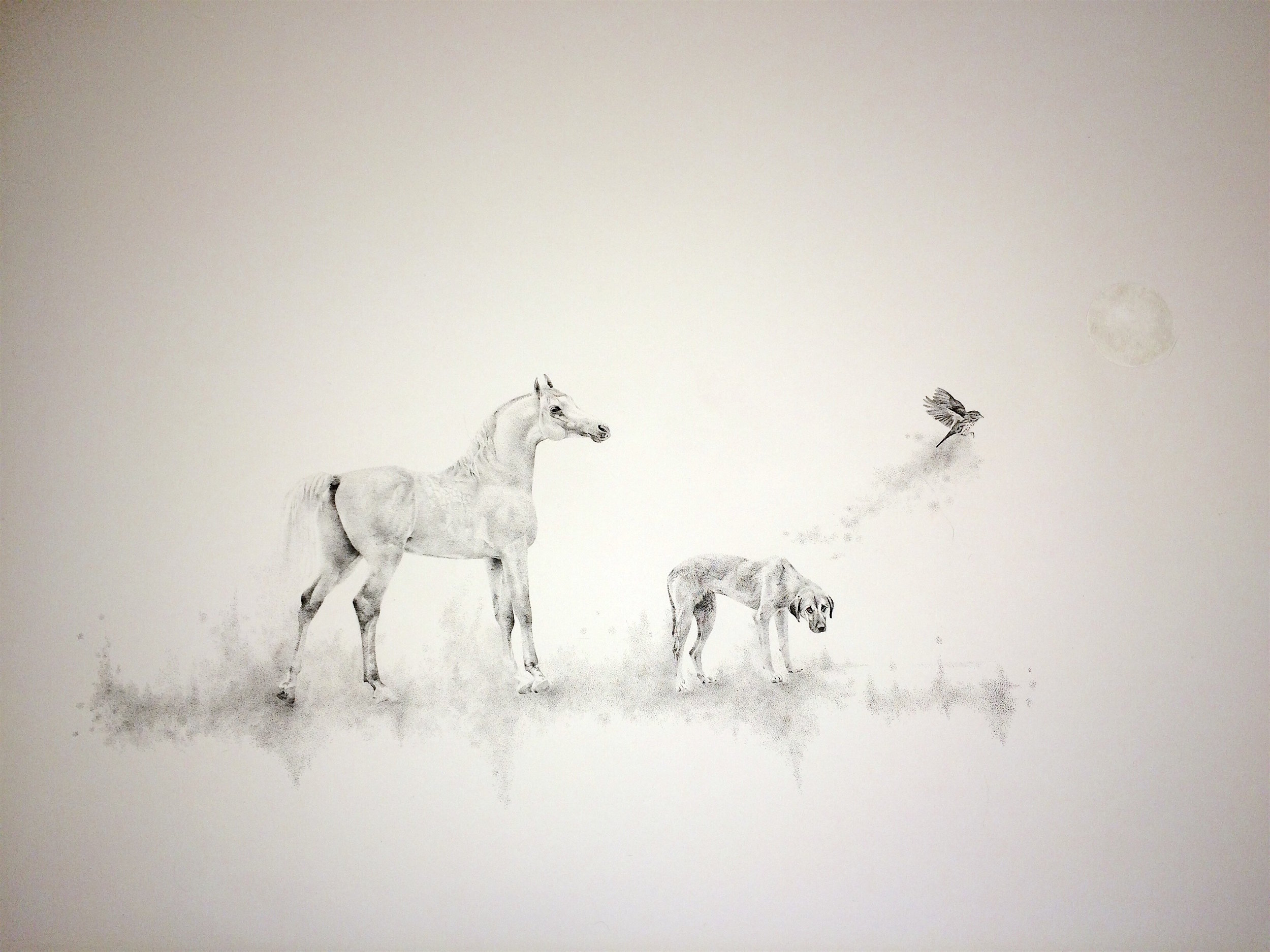
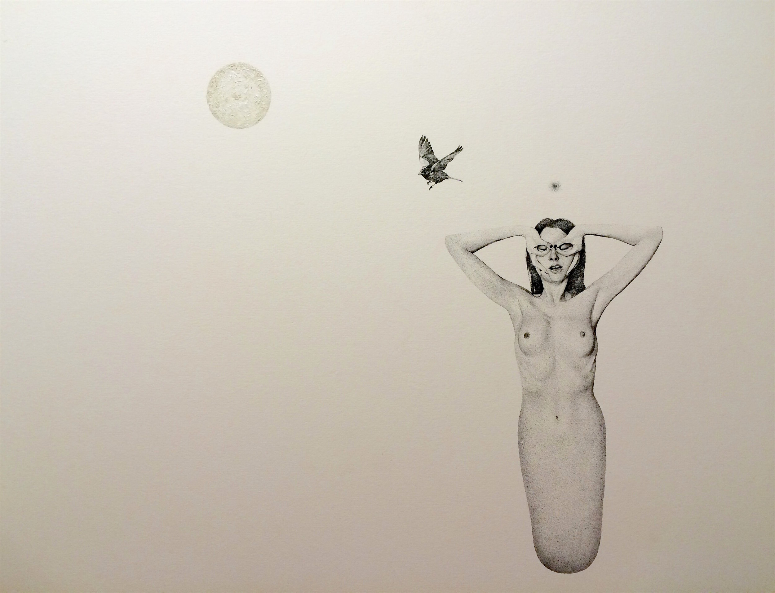
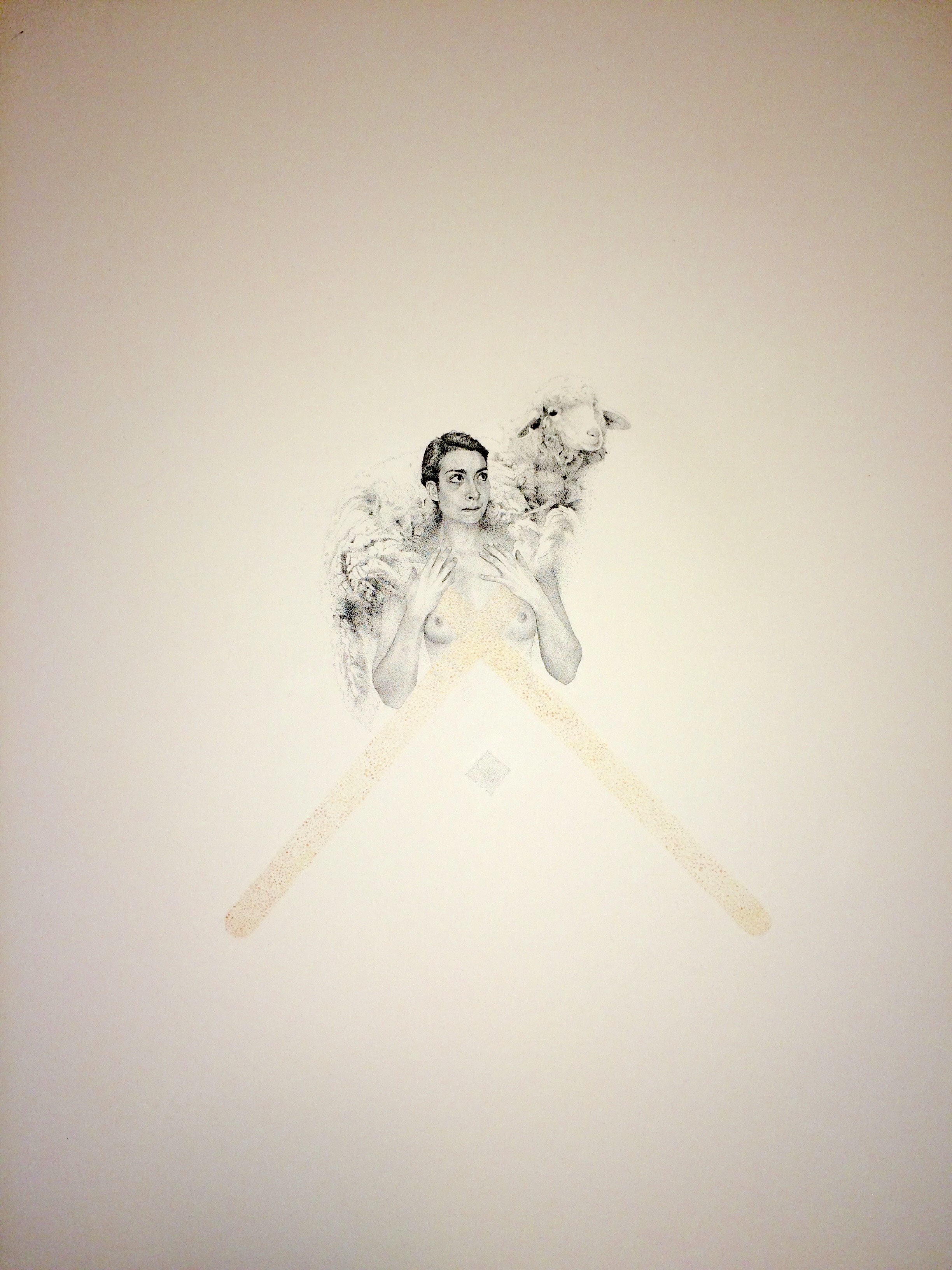
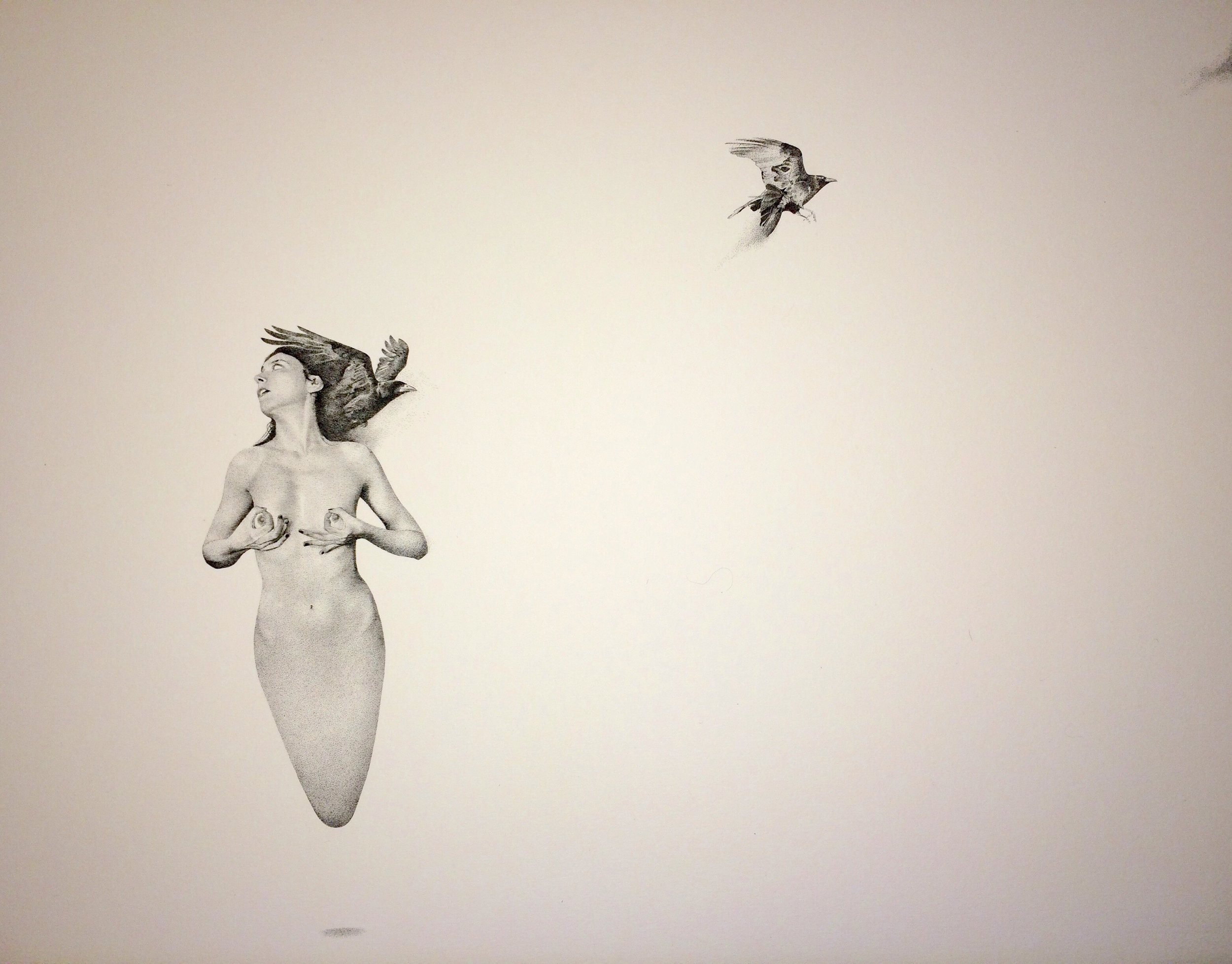
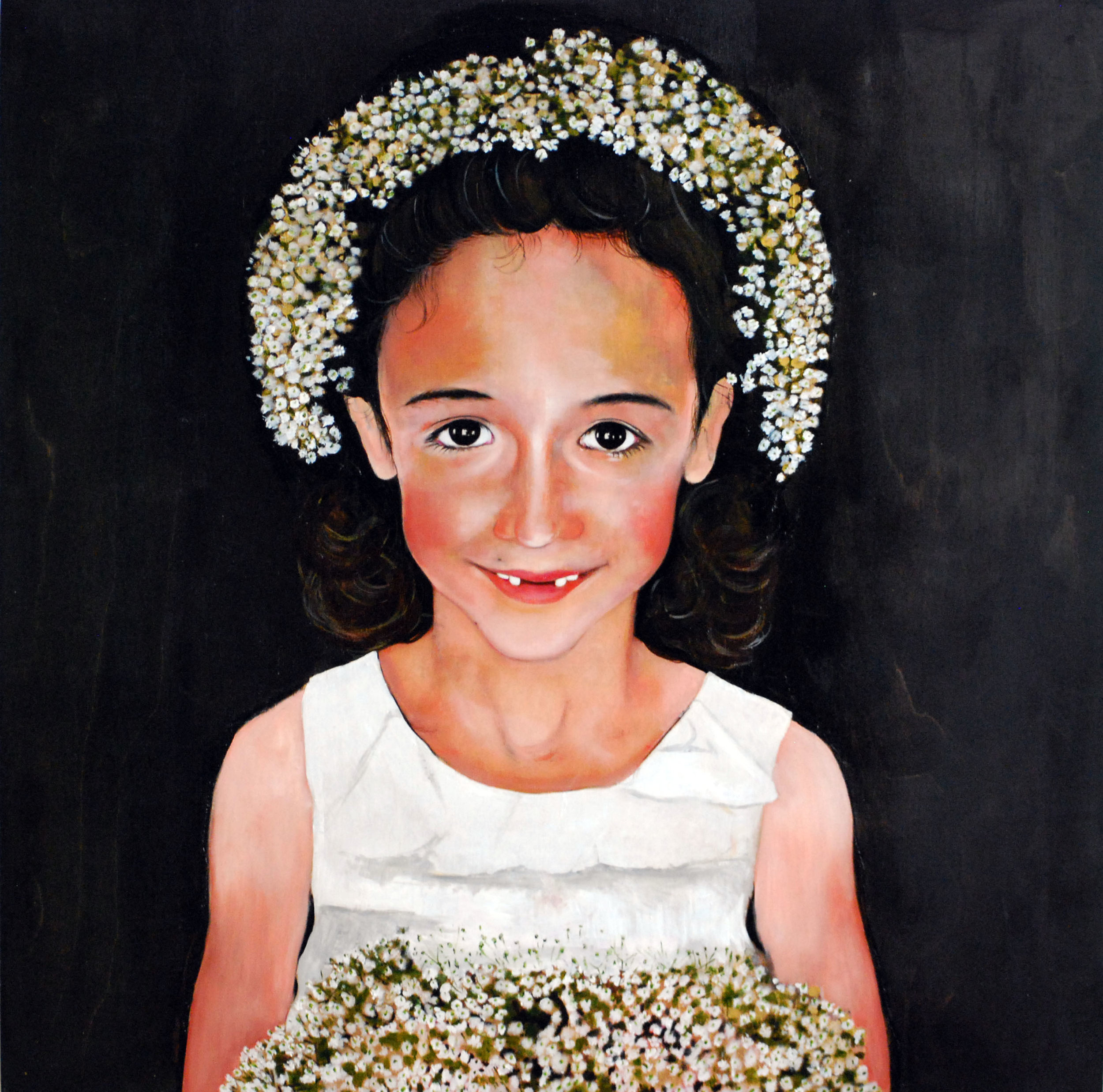
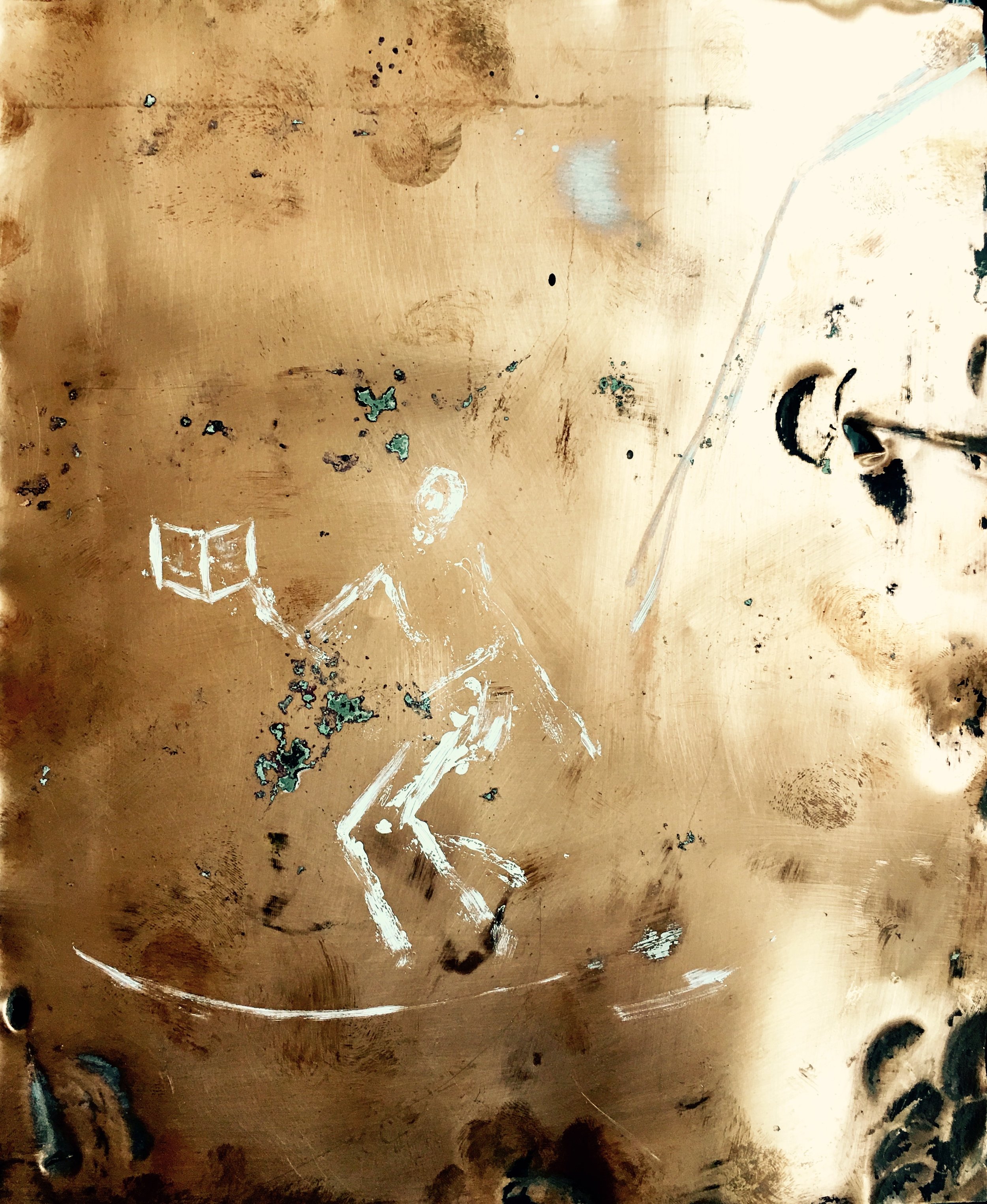
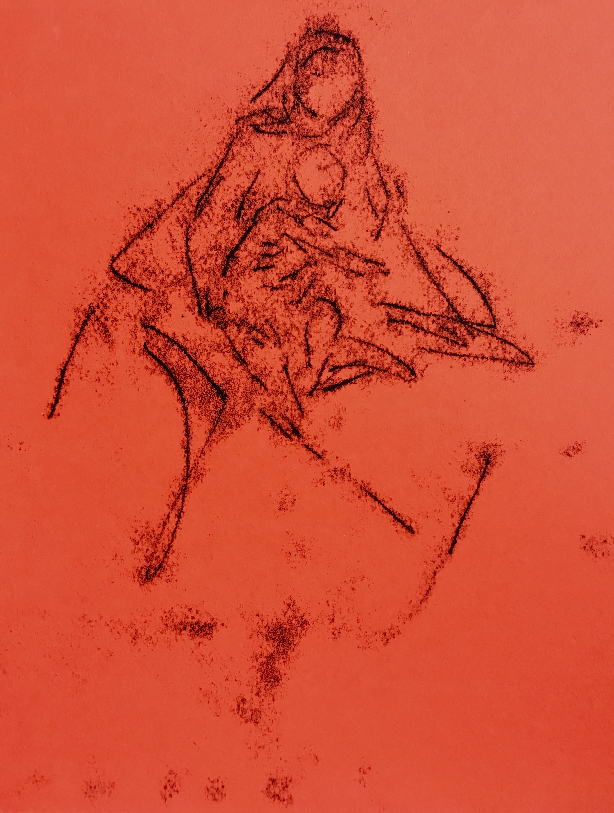
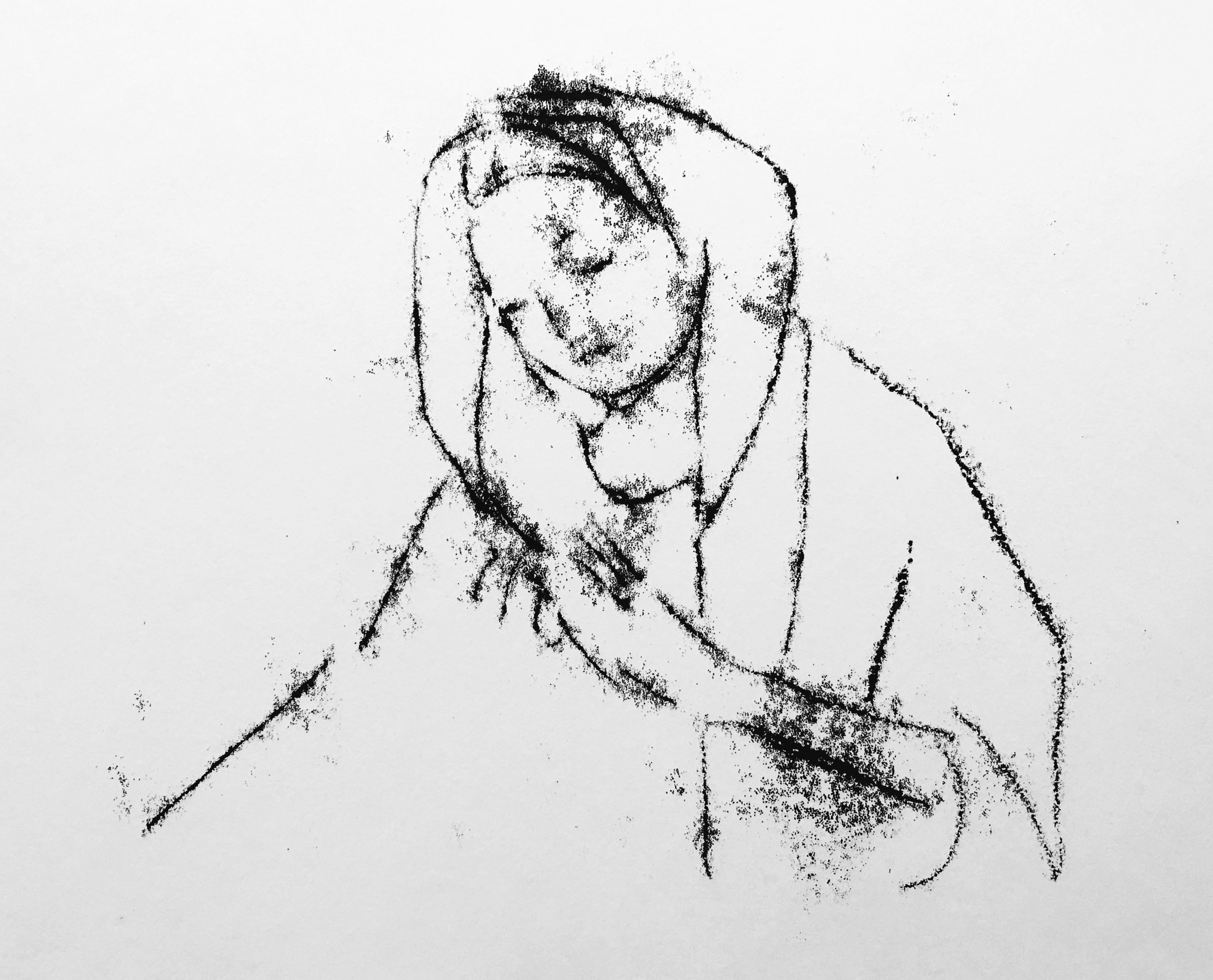
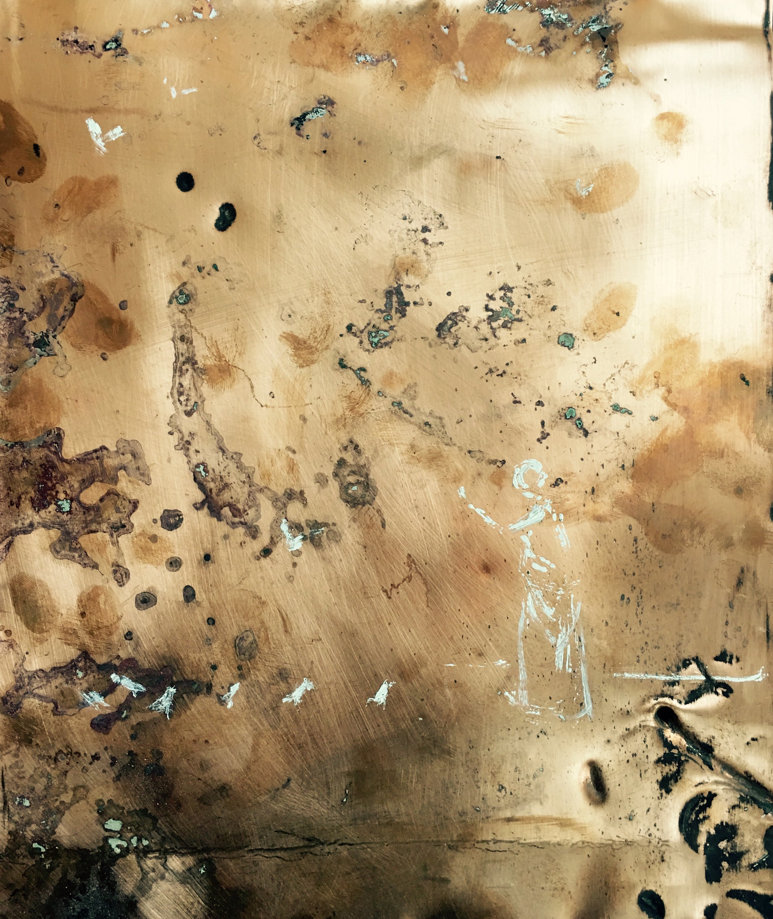
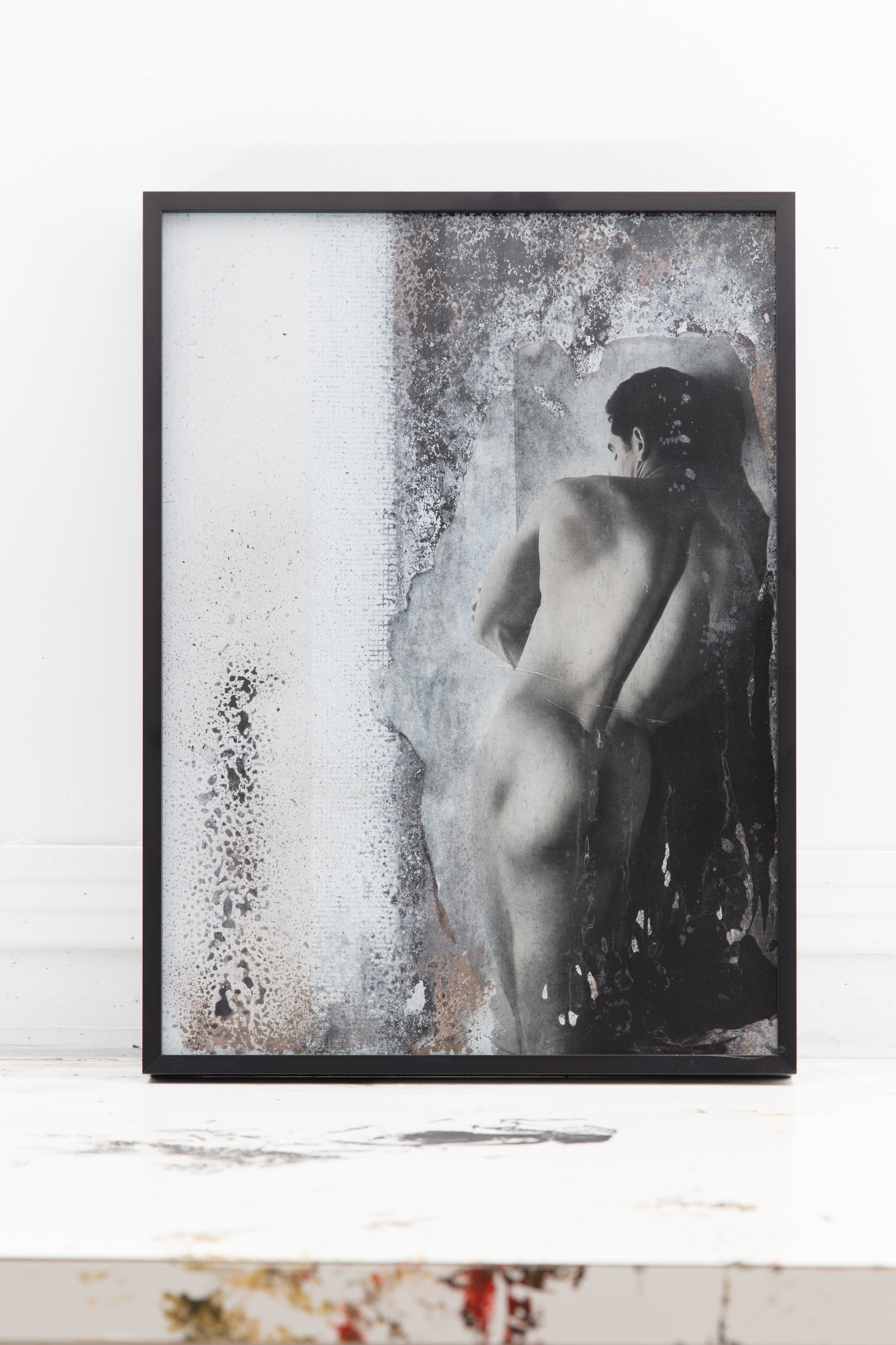
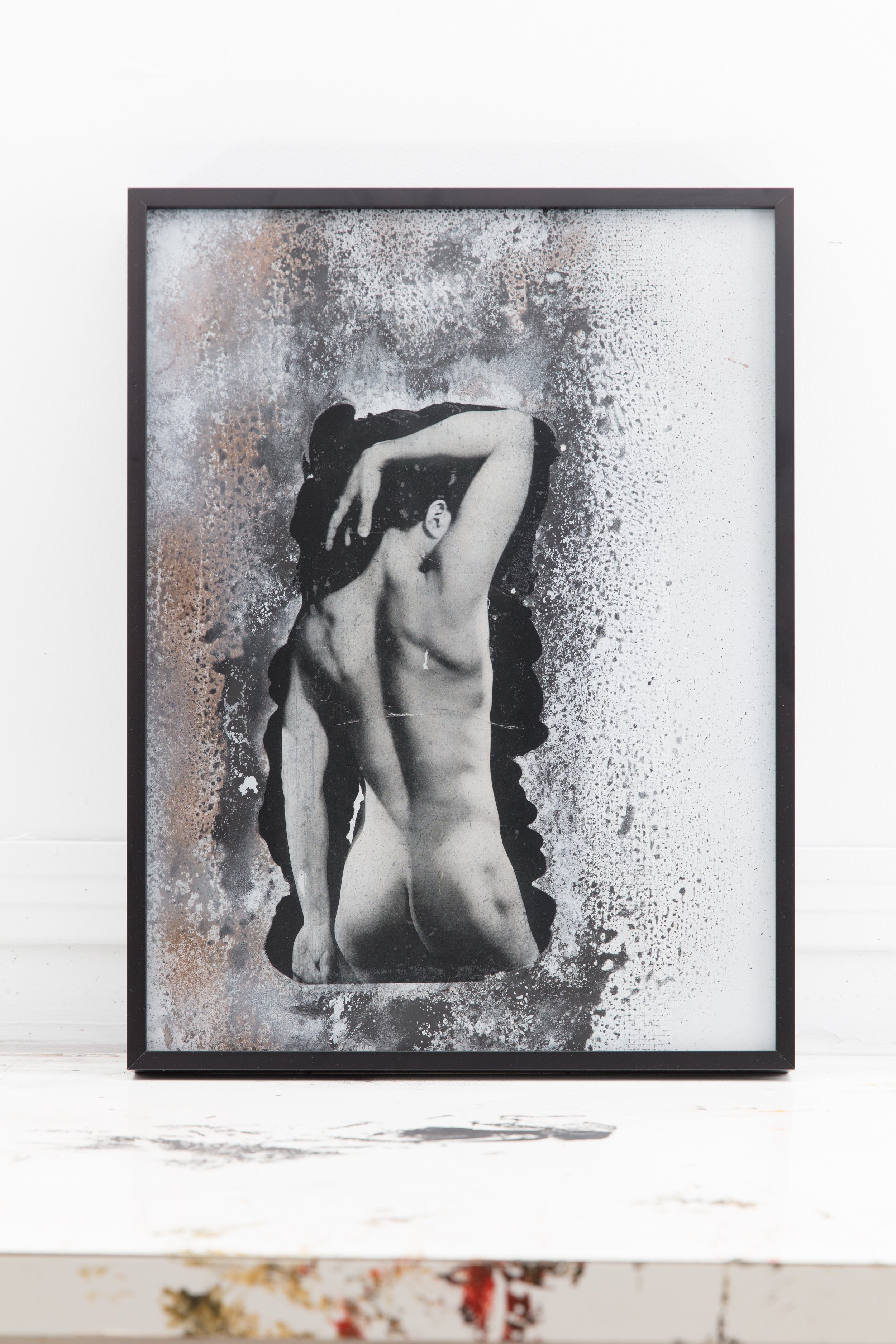
A name which literally means “the guide of souls,” the psychopomp is a perpetual shapeshifter, emerging out of different times and cultural spaces, frequently taking a new form but always serving the same primary function.
The role of the psychopomp is to provide safe passage for the souls of the recently deceased as they move out of one life and into the next. These guiding entities do not judge, they simply act as necessary and benign spiritual escorts. Appearing frequently in funerary art, psychopomps are depicted as anthropomorphic bodies or take the form of various animals and birds. These mythic beings are inexorably linked to death and thus have the capacity to evoke fear or a sense of peace, depending on the facets of their embodiment and the circumstances of their invocation.
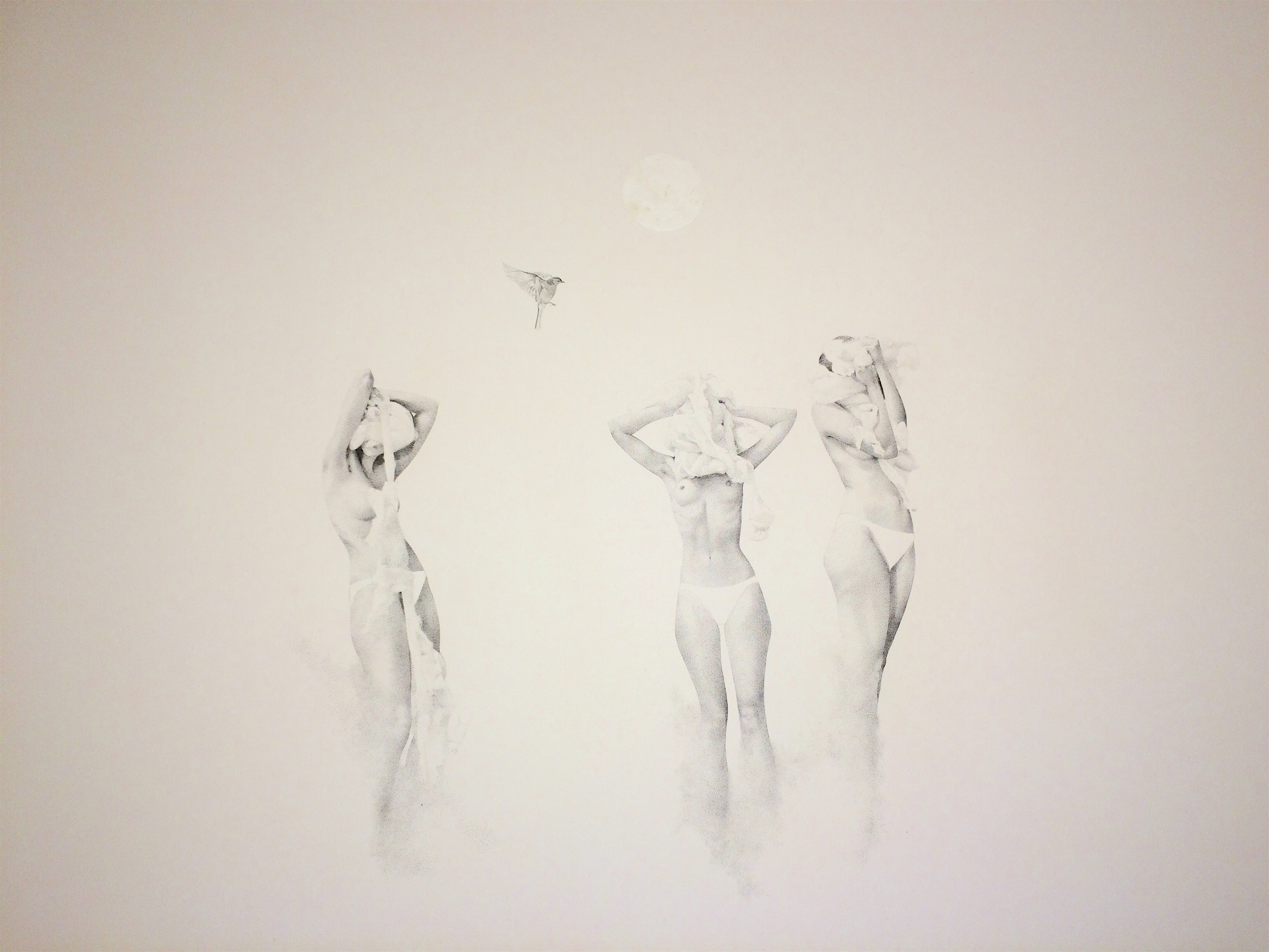
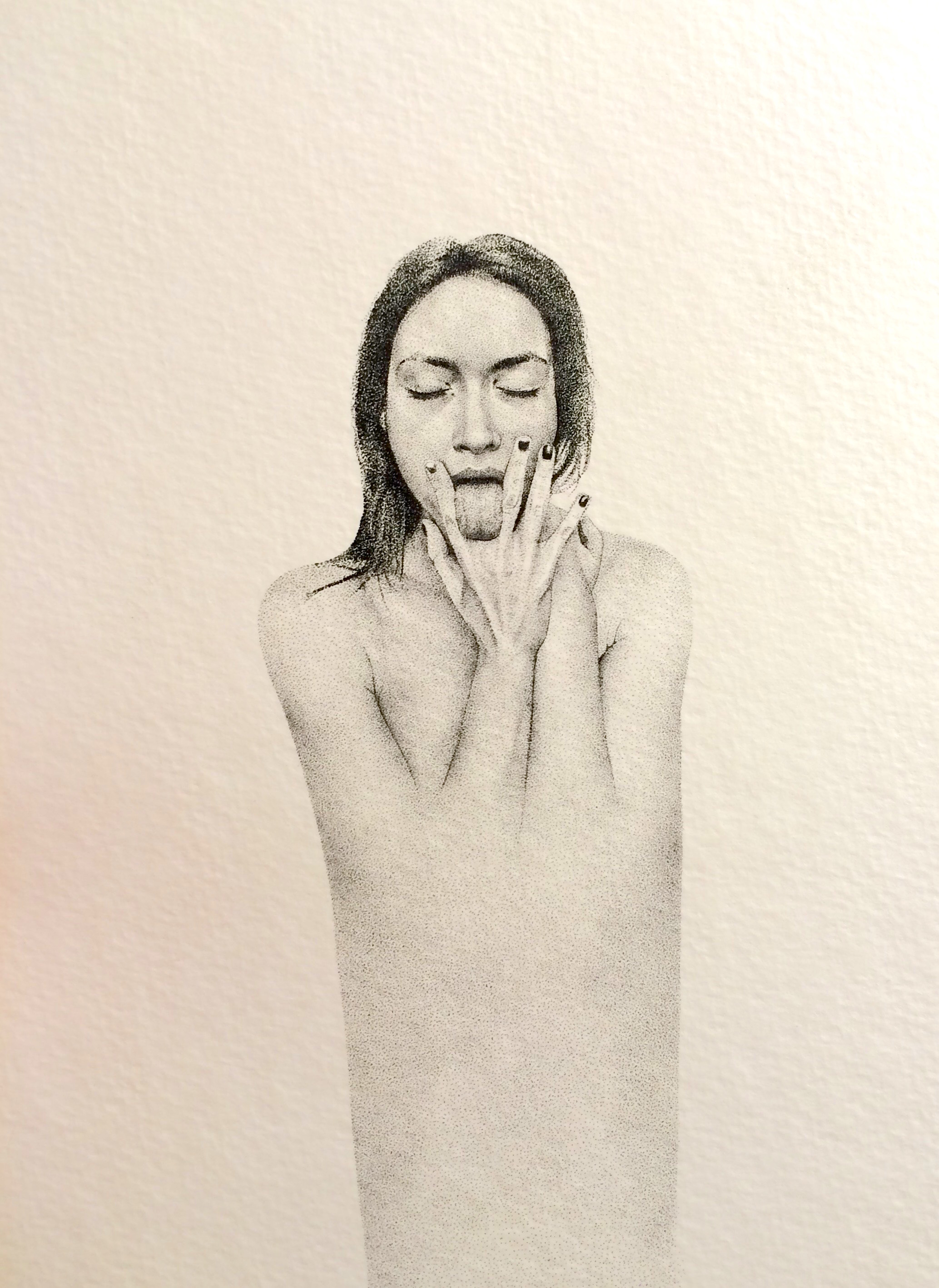
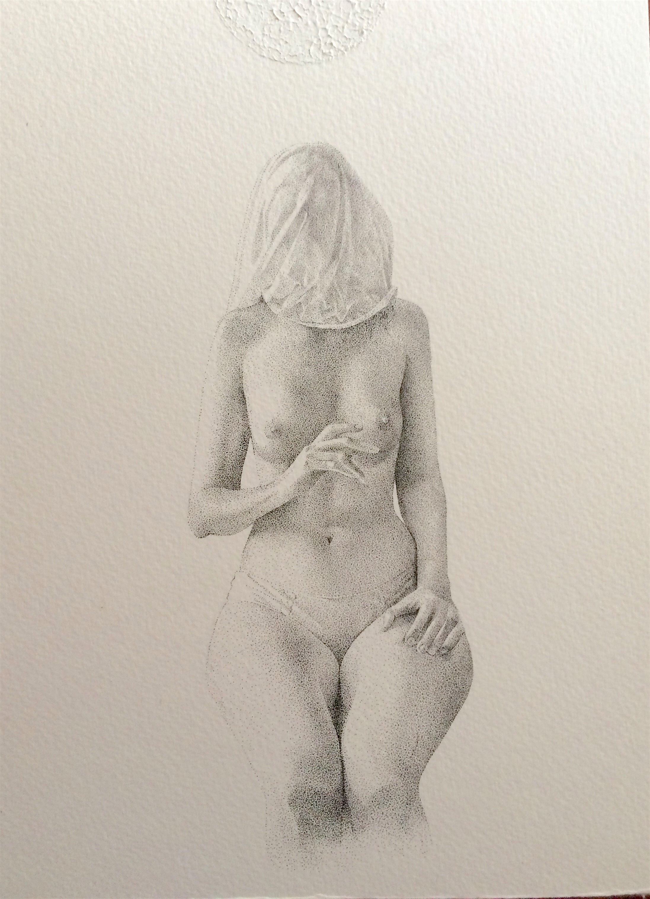
Over the course of a single life the perceived notion of the “self” dies over and over again as the mind and body moves through various traumatic or transformative experiences. The following work depicts the role of the psychopomp as adapted to fit within the evolving landscape of one woman’s life. The difference between these beings and their traditional counterparts is that they appear not only once at the end of physical life, but again and again as they are beckoned to accommodate and guide the extinguished notions of the “self” out of the present and into the past. The feminine entities depicted here represent the final stage of physical, spiritual and emotional transformation and the necessary acceptance of such. The faces of each entity reflect the face of the artist, the face of the human whose life they rise out of and belong to. Their energy encapsulates the deeply human qualities of physicality, melancholy and nostalgia, yet they are somehow divine. By their very nature, like the role of all psychopomps, these creatures are simultaneously monstrous and full of grace.
- Gabrielle Funk
. . . .
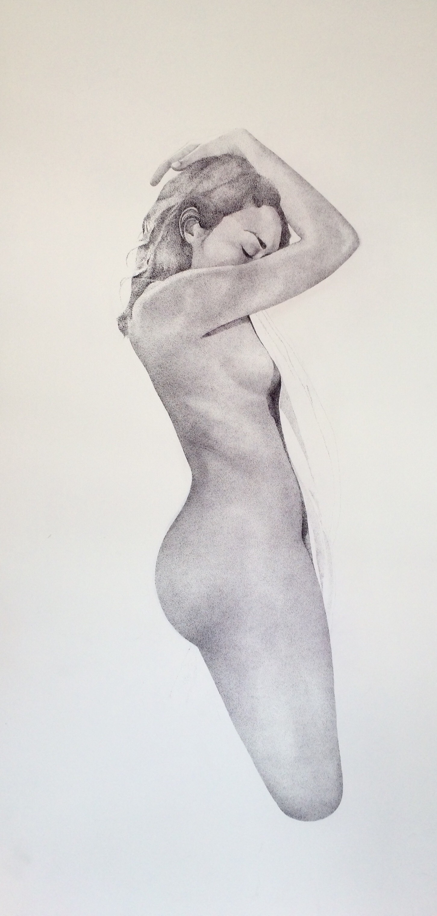
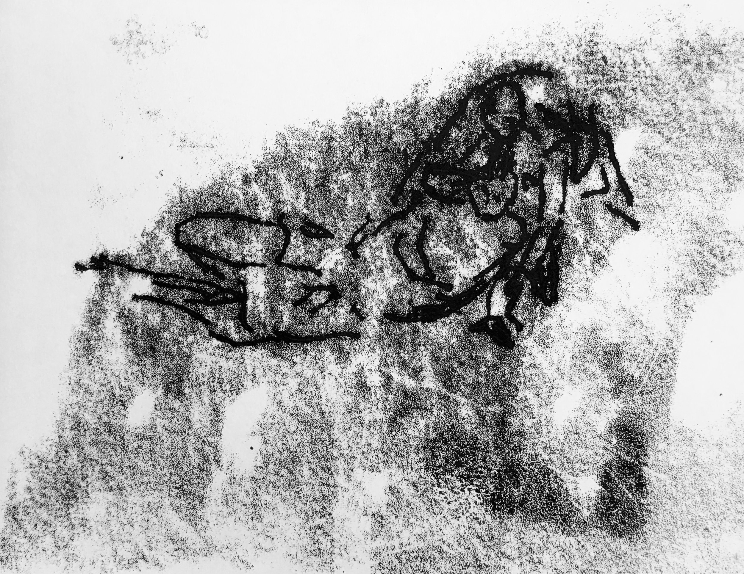
Gabrielle Funk is a Winnipeg-based visual artist, muralist, community art facilitator and freelance illustrator.
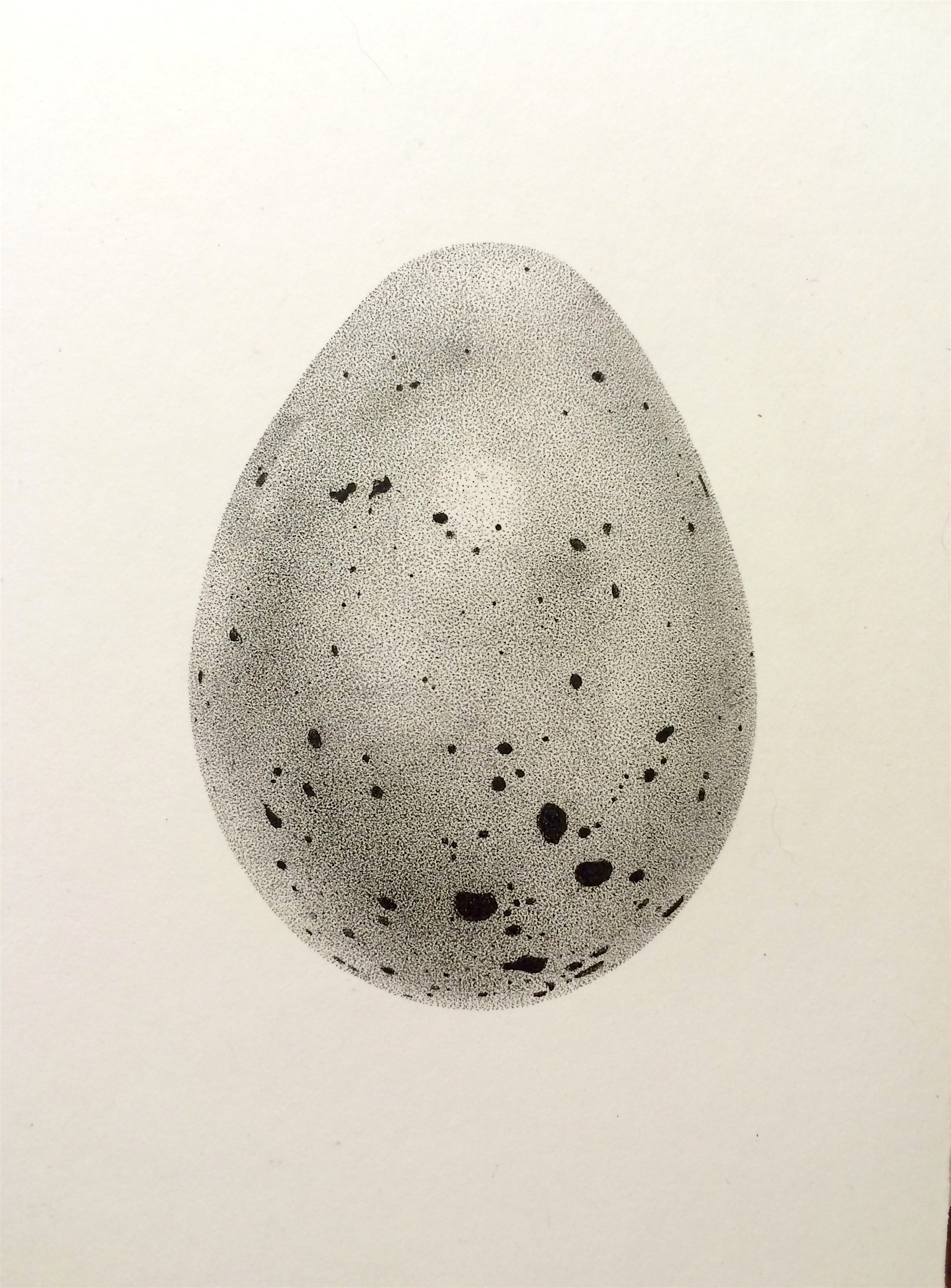
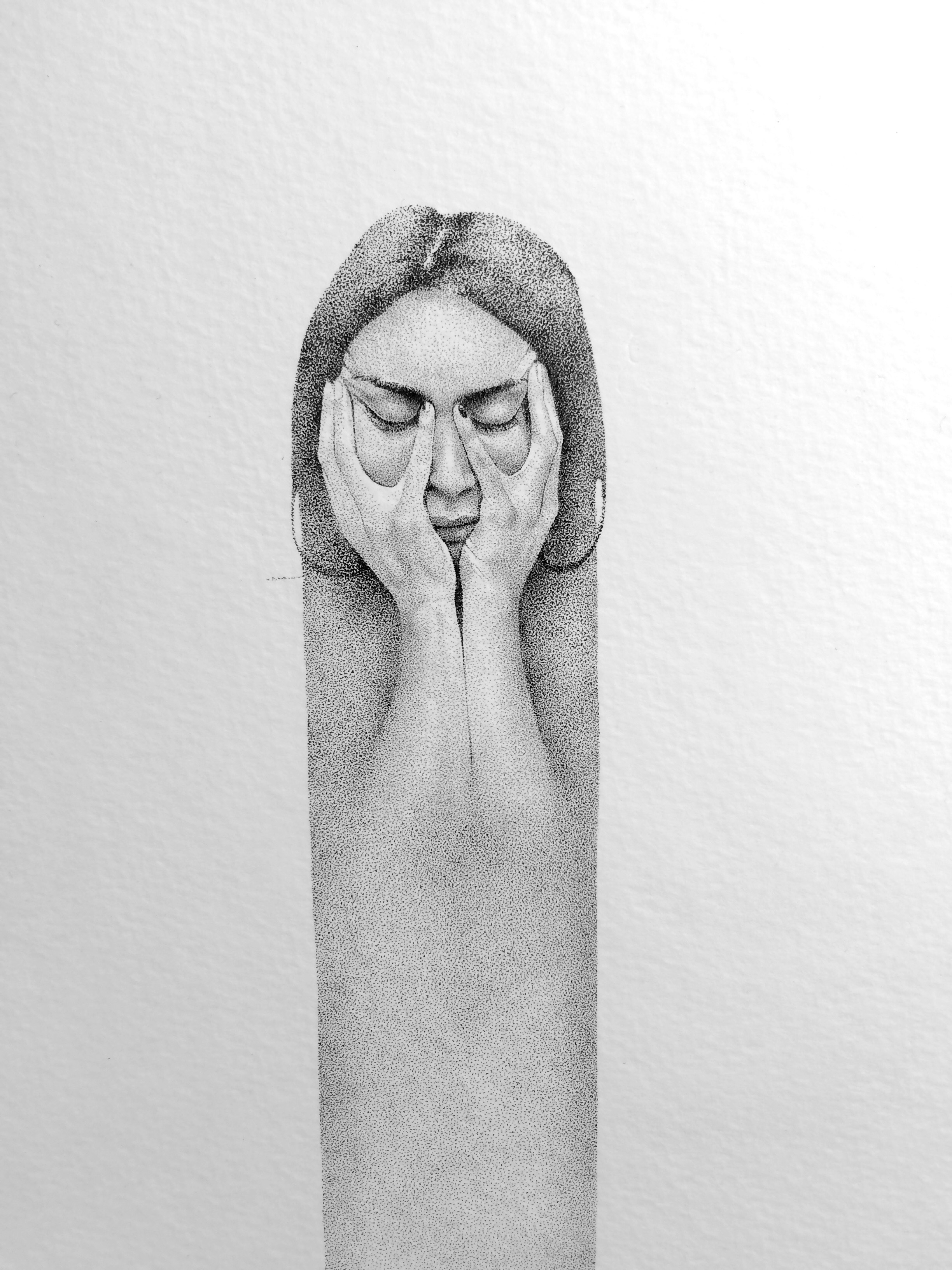
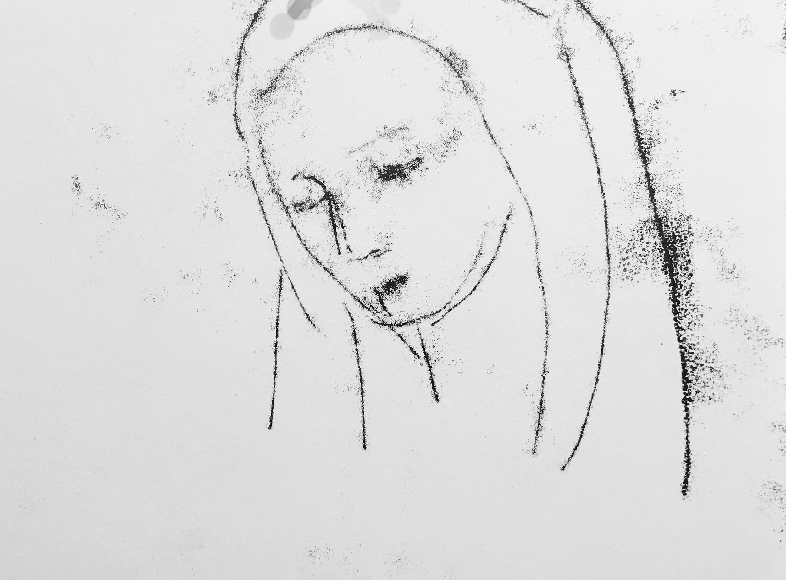
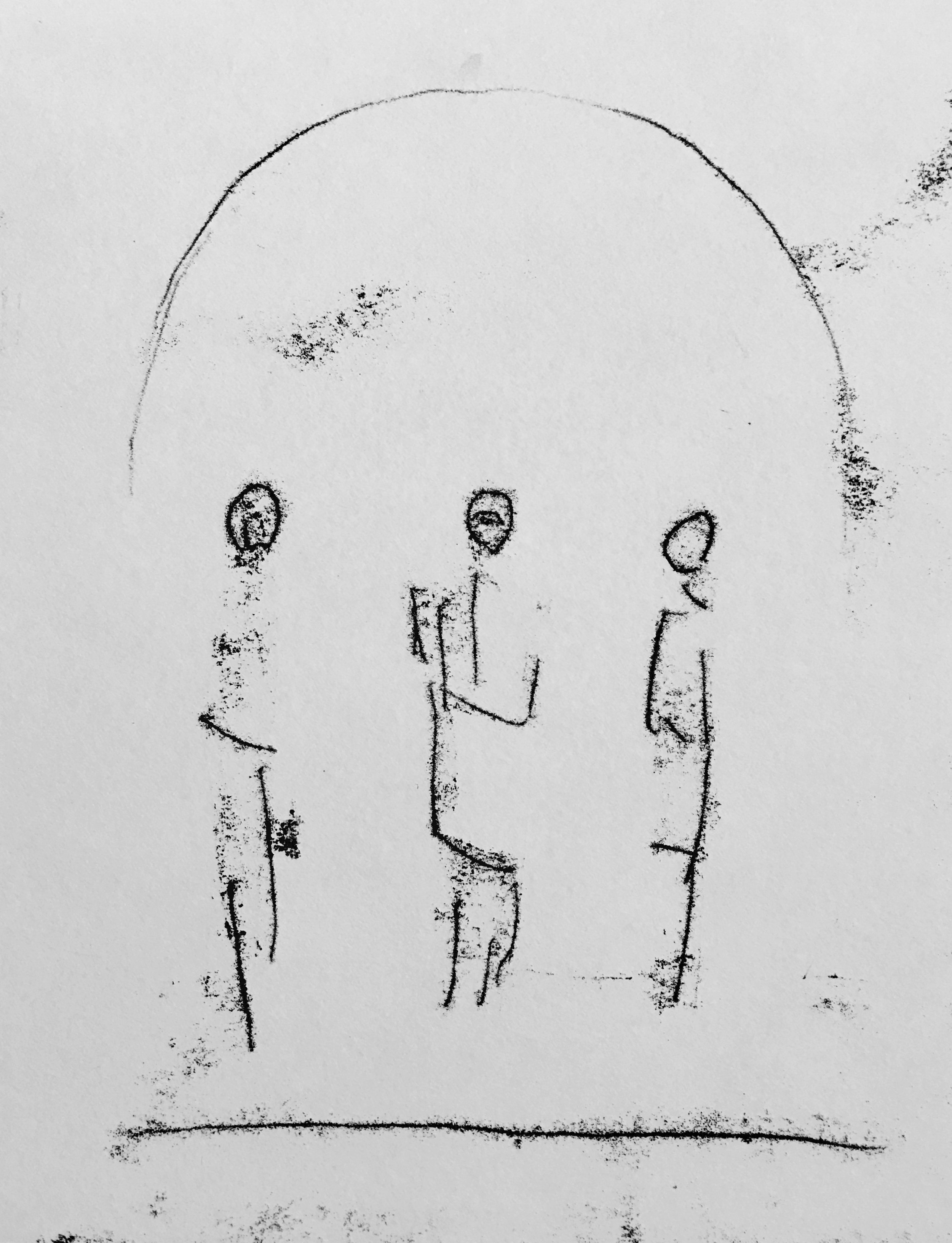
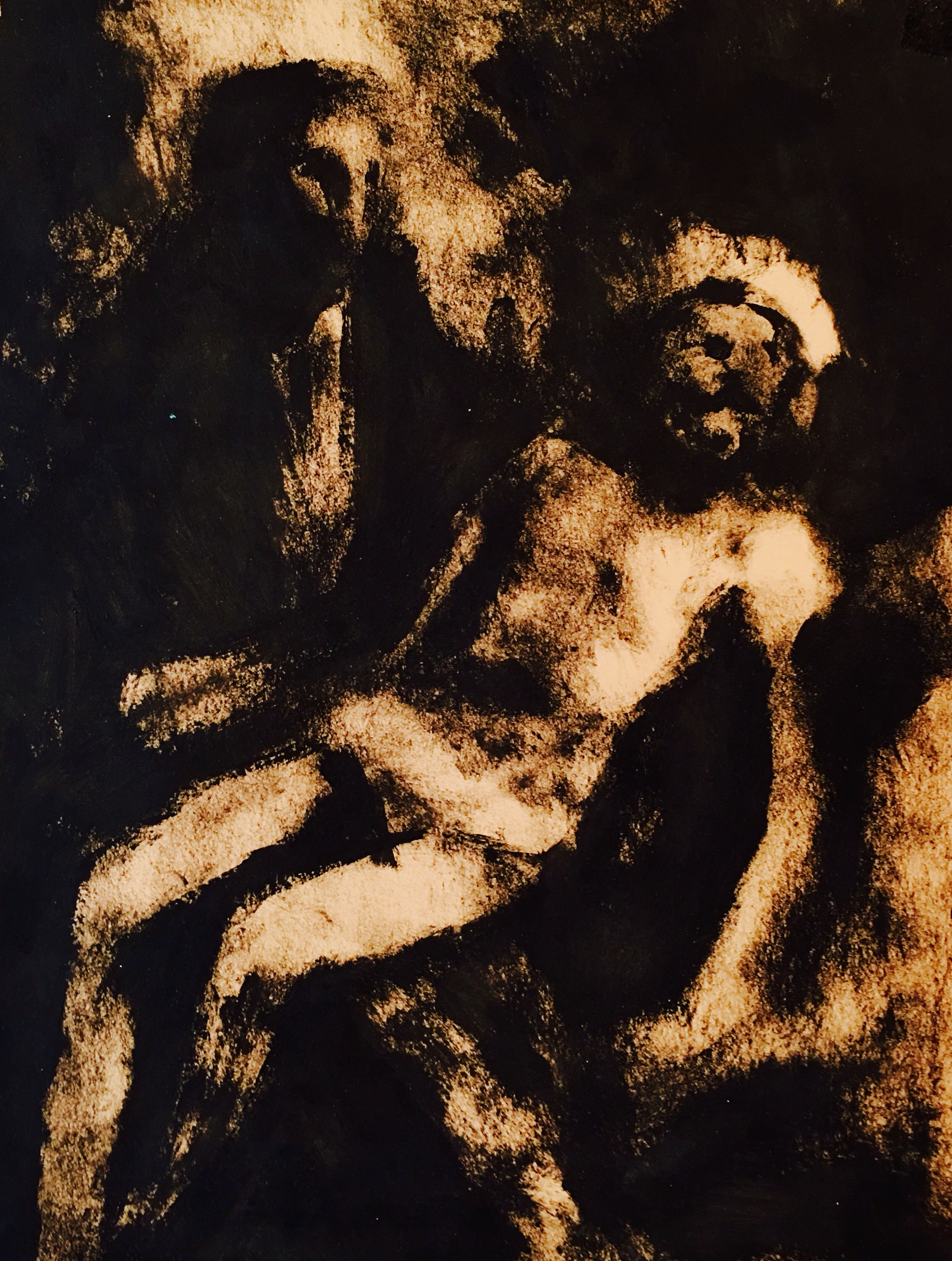
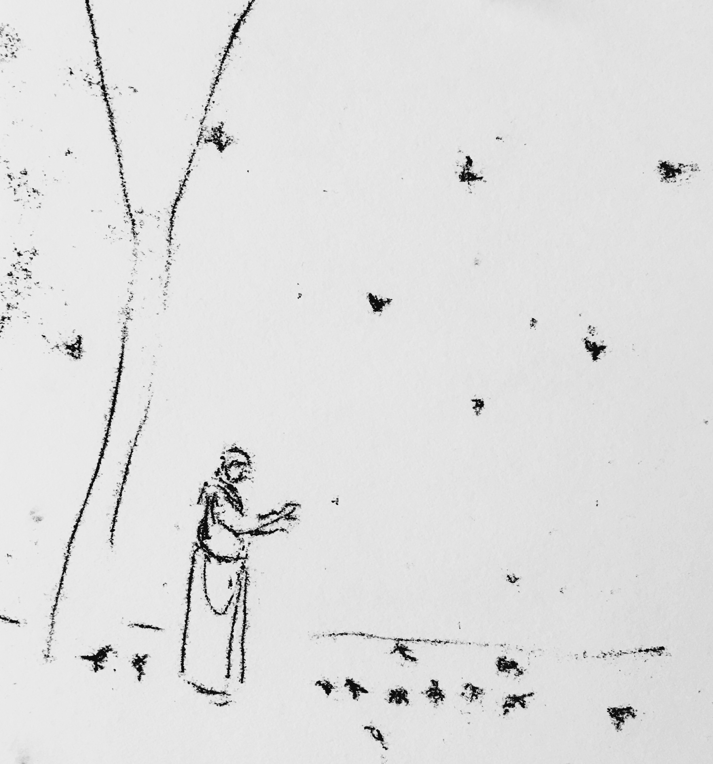
Gabrielle works primarily in two dimensional format utilizing combinations of ink, acrylic and watercolor to render delicate, pointillist female figures imbedded in sparse, abstract environments. Her figures are rendered nude, incomplete or in a state of disintegration. They often float in wide, empty space, unattached to a familiar physical landscape. These women are defined by the shapes and expressions that their bodies make and the nature of their interactions with animals, which often appear in the work engaging in symbolic physical dialogue with the women. Gabrielle's work focuses on the creation of a visual narrative told through self-portraiture in exploration of femininity as a social, physical and spiritual construct. Through this work Gabrielle aims to beckon viewers into a world laced with quiet tension and subtle admission utilizing subject matter and symbolism that is as disturbing as it is sensual, as empowering as it is objectifying and as hostile and wild as it is comforting and familiar.
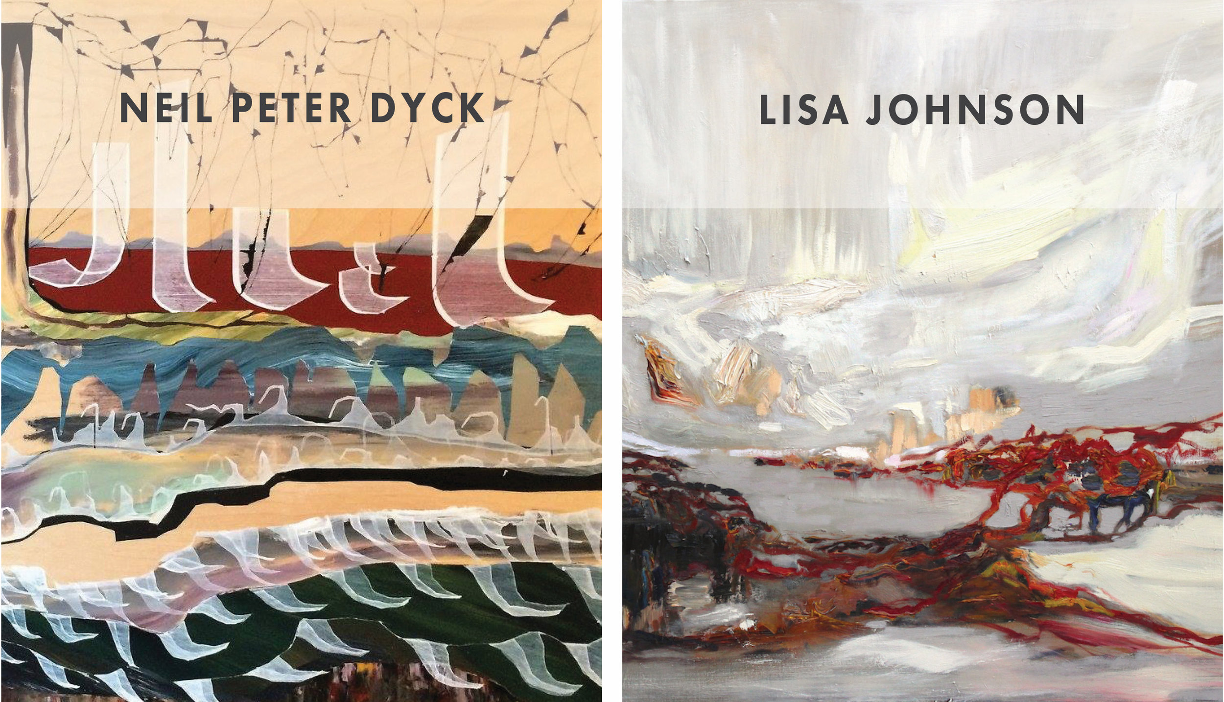
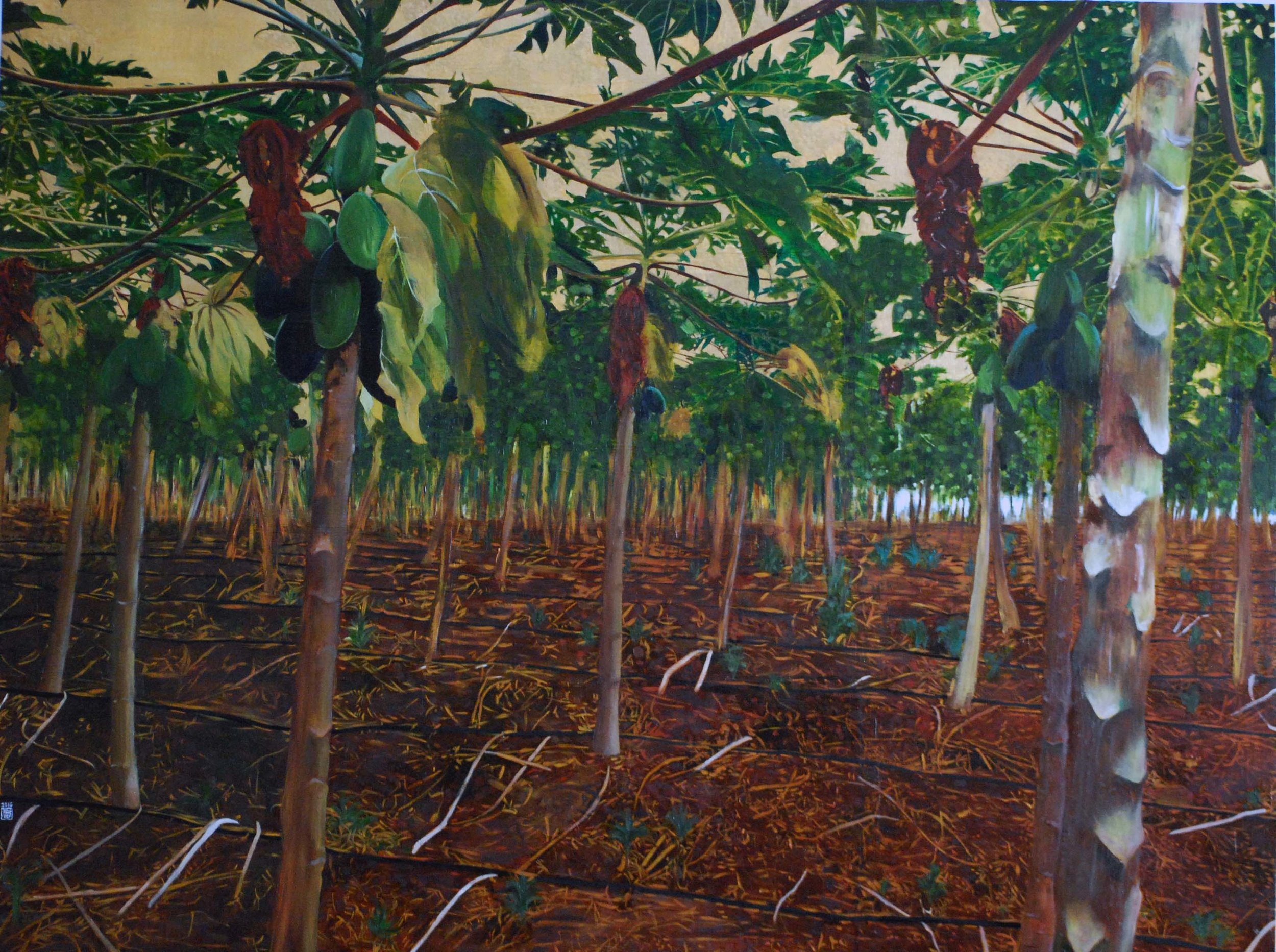
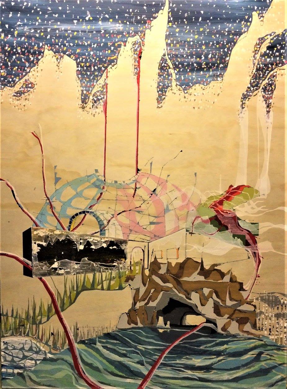
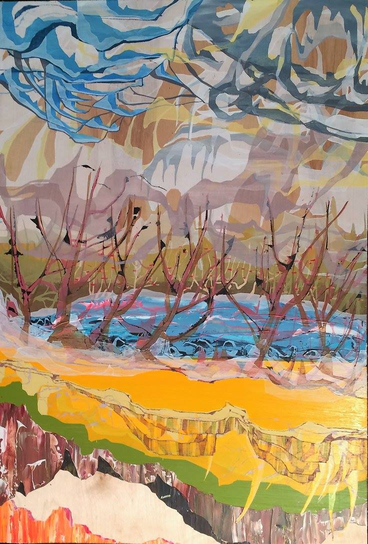
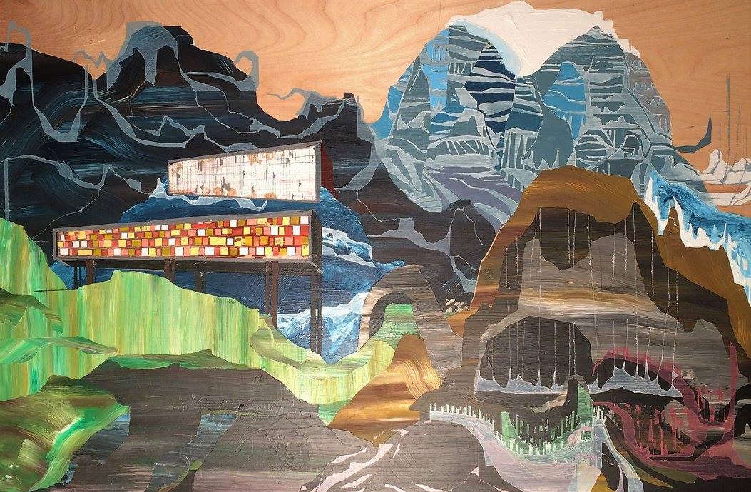
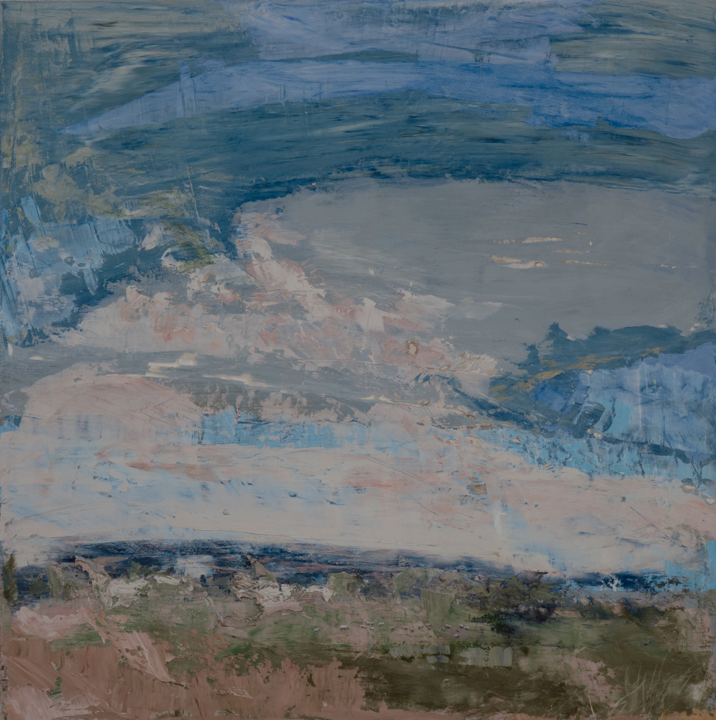
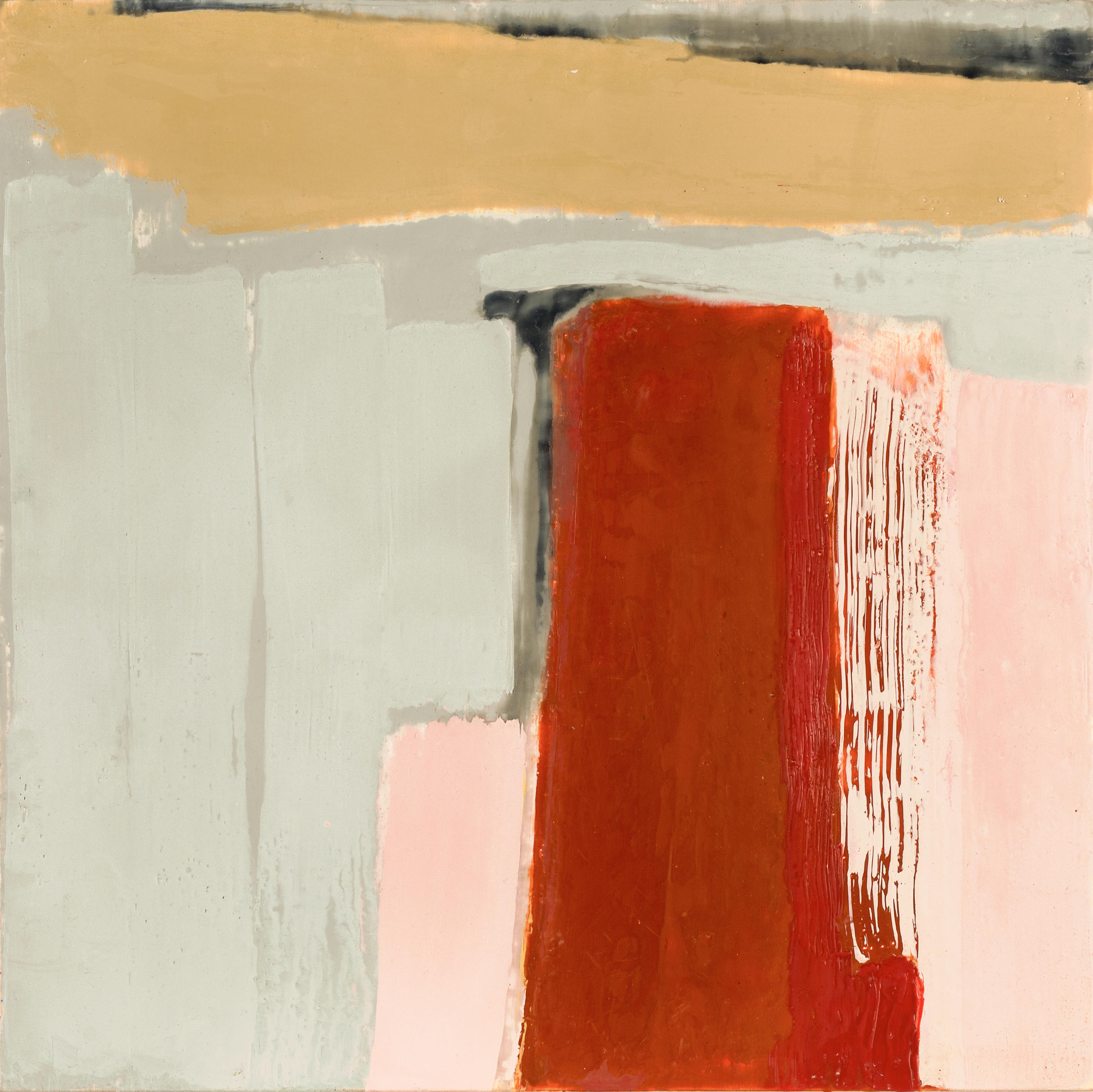
Neil Peter Dyck and Lisa Johnson's exhibition Landmarks, traces the open landscapes of the Canadian prairies to the ancient hills of Iceland. While their work depicts varying locations, the common element is that each artist captures the inner intensity of their landscape. Landmarks opens March 3 at 7:00 PM at Gurevich Fine Art.
Neil Peter Dyck's detailed paintings take us across the vast, open Canadian prairies to the rocky peaks of the West coast. Landscapes and locations where Dyck’s inspiration reverberates, juxtaposed together on his painted wood panels within layers upon layers of paint. Dyck’s dream-like, fragmented compositions are anchored in the silent observation of his own surroundings. The resulting documentation of living where he has — the west coast of British Columbia, Southern Manitoba, Winnipeg and all those places traveled in between. Built by the process of augmenting, reducing and concealing abstract forms, Dyck’s developed an expressive freedom, with calculated restraint. A multilayered execution of taping, cutting, painting and then repeating the process. The result, a body of work with incredible depth.
- Neil Peter Dyck
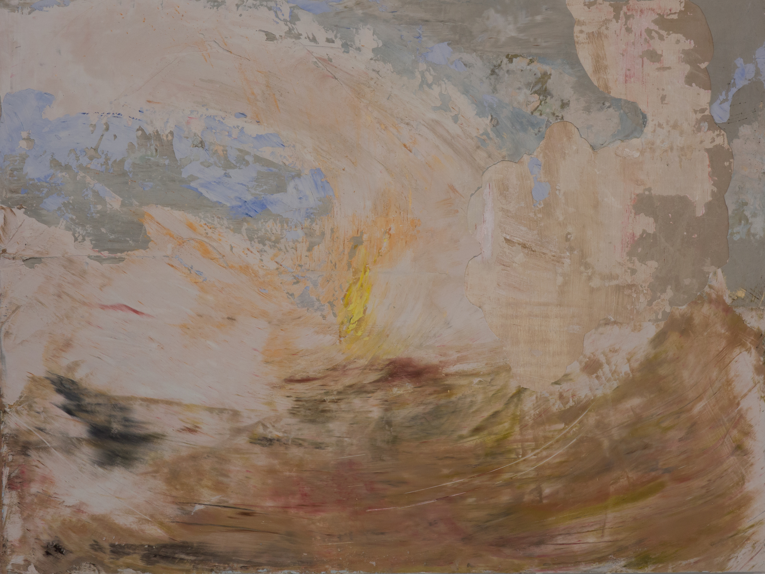
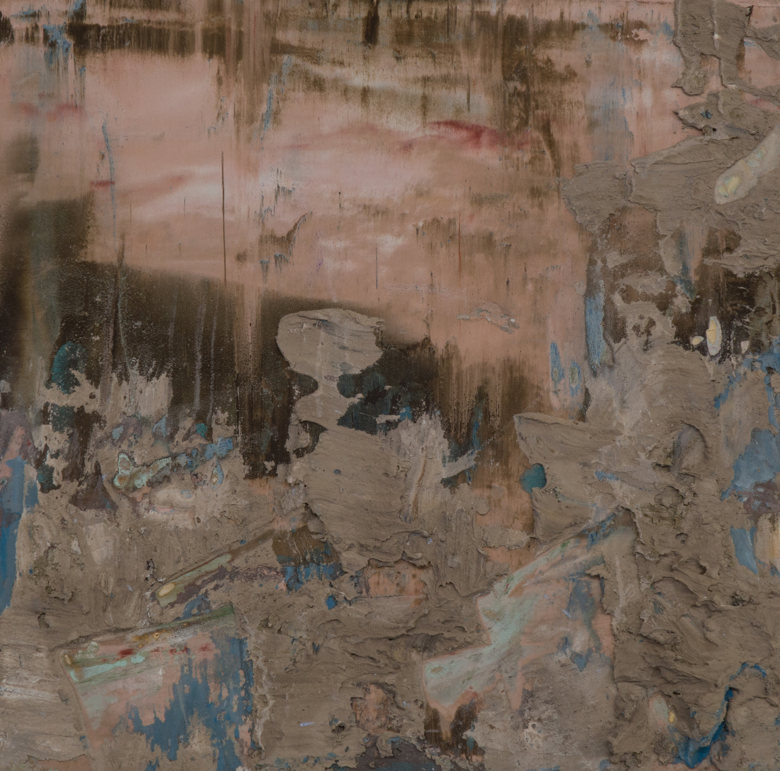
Lisa Johnson’s work enquires into space and movement within the context of landscape painting. Drawing inspiration from on-location studies to develop large studio works, her paintings weave geographic, corporeal, and abstract sensibilities through layers of atmospheric grounds and gestural mark-making. Her work speaks to the passage of time over an evolving landscape painted with spirit and musicality.
Recently, her travels took her to Iceland in addition to her usual places of inspiration in North-eastern Ontario. While pre-Cambrian geology shaped the Canadian Shield millions of years ago, in Iceland primordial forces are in full view — bubbling lava, steaming fumaroles, waterfalls, glaciers and active volcanoes. Here nature is at its most elemental, volatile and dangerous.
How geography becomes embedded in the psyche fascinates Johnson. Working in an improvisational way, fragments of experience emerge from the subconscious. For Johnson paint is a force of nature in and of itself, creating poetic worlds that speak to the relationship between the artist and the land.
- Lisa Johnson
Neil Peter Dyck
Lisa Johnson

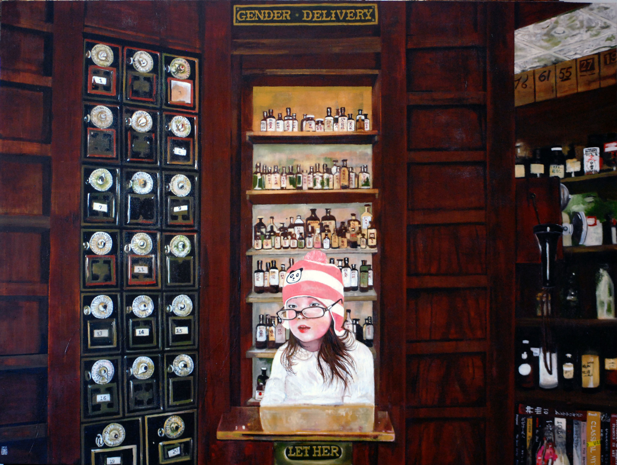
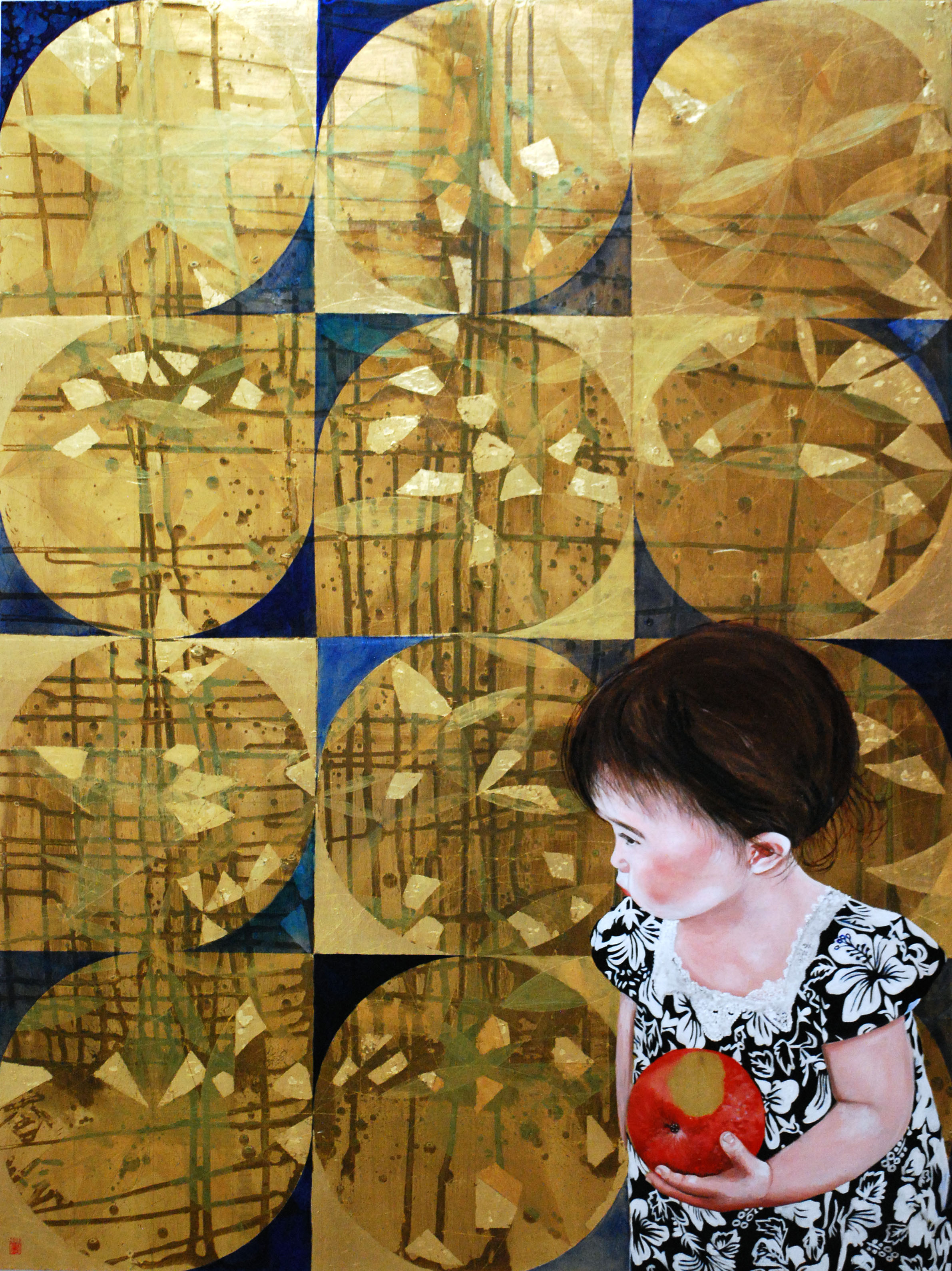
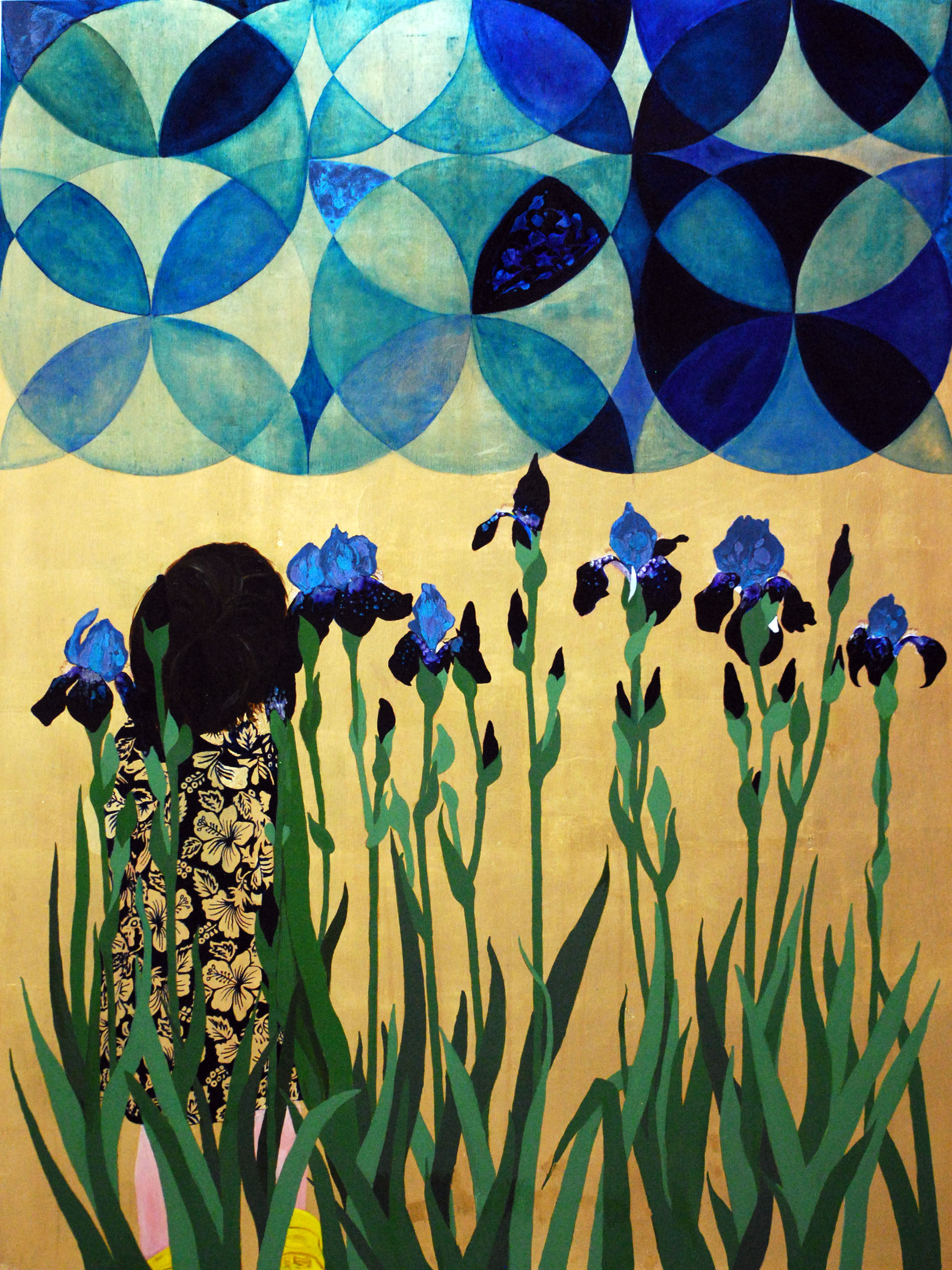
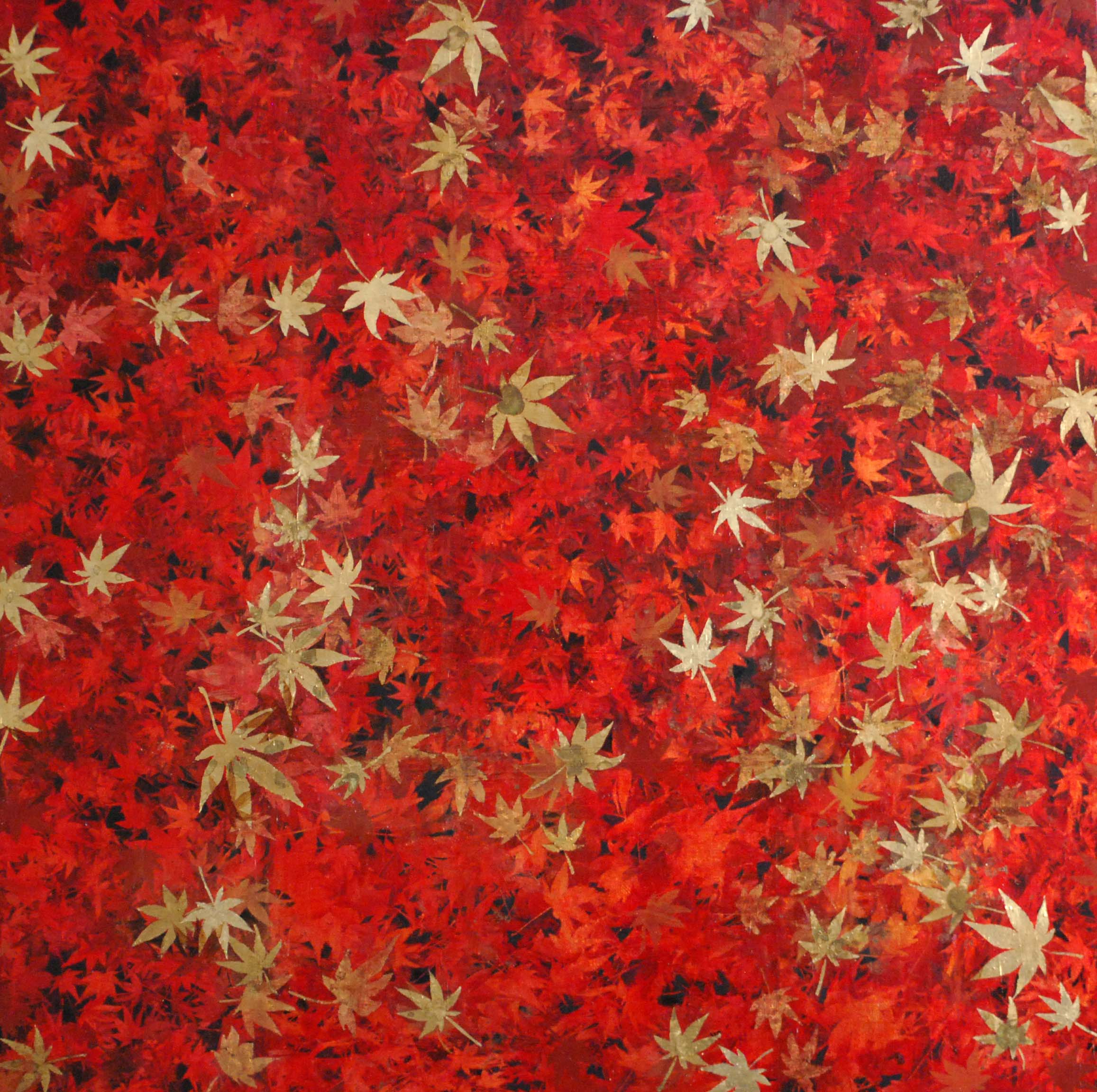
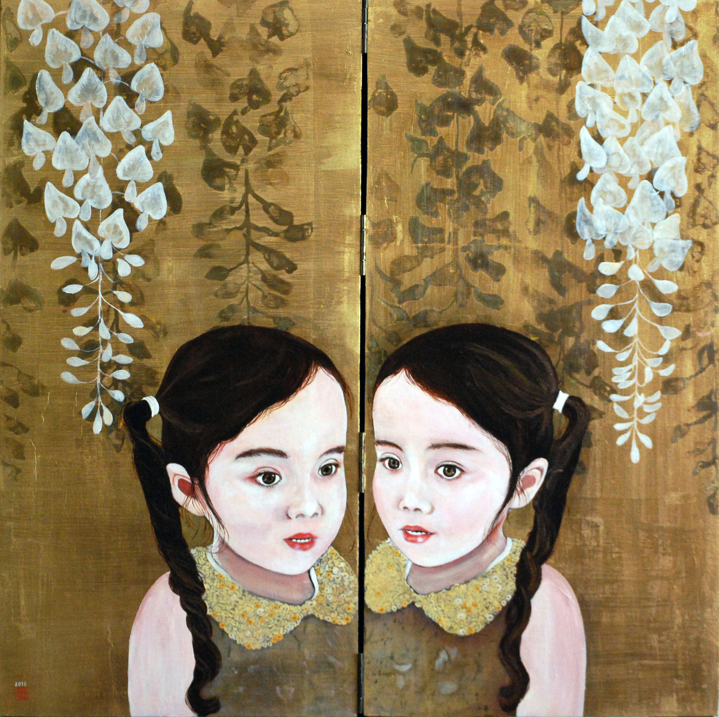
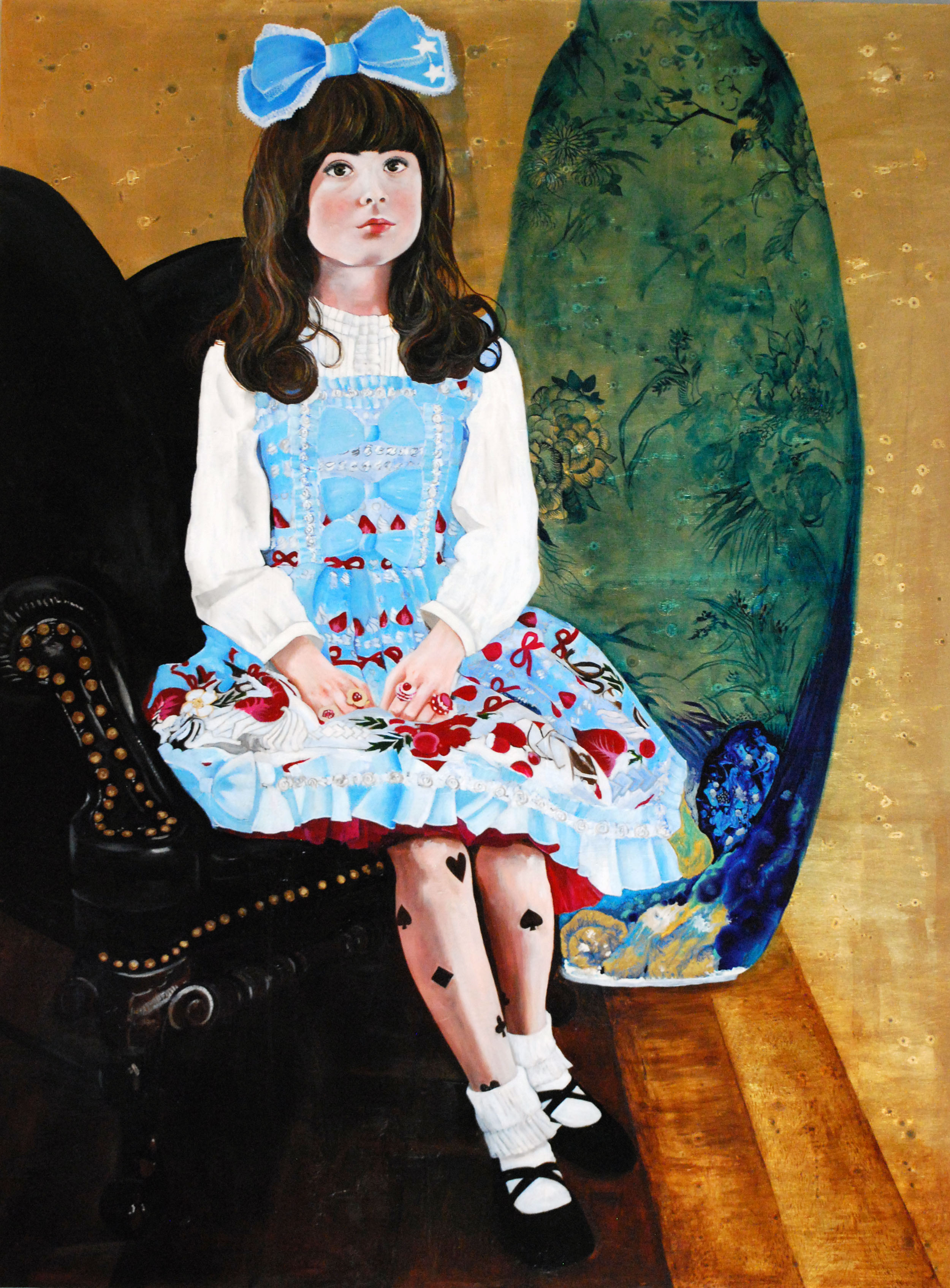
"The first signs of awakening of self-awareness, how it first manifests in a child, and onward as we mature, have been a prominent subject of my recent body of work, and my paintings ask whether cultural memory and context are mere backdrops against which we play out our lives, or they determine whom we become. I depict my subjects in their auratic, inviolable beauty, and lend them strength and presence; in return they allude to little-noticed things or to clarify untold context.
I seek an imaginative revitalization of the narrative and atmospheric potential of painting by negotiating the ability of painting to create visual worlds that are both familiar and extraordinary, rooted in everyday corporeal and spatial experiences. I begin by considering the composition and approach to colour, and rework my paintings until they reveal unforeseen meanings that exist beyond any preconceived model. As the psychological component takes over, symbols and other elements are added to bring them forward so that the paintings would further open up in a multi-vocal way.
The resulting conceptual conflict is perhaps what brings my work into focus, as the paintings become mysterious in a way that attenuate engagement. The layered meanings in my paintings emanate from a profound emotional connection to life experience that allows me to engage my interest in perception, memory and narrative with the ever-evolving, often conflicting nature of contemporary painting.
In my painting practice I have created a method of patinated gold-leaf that evokes aged or damaged Japanese folding screens which consequently brings a distinctive complexity to my paintings. This technique, combined with various applications of oil paint including suminagashi (Japanese marbling), creates visual and tactile depth on the paint surfaces that suffuse the tide of mental elaboration with the sensuality of experience."
-Kae Sasaki
Artist Statement
Blue Vessel opens February 3, 2017 at Gurevich Fine Art and is on display until February 25, 2017. Opening reception Friday, February 3 at 7 P.M.
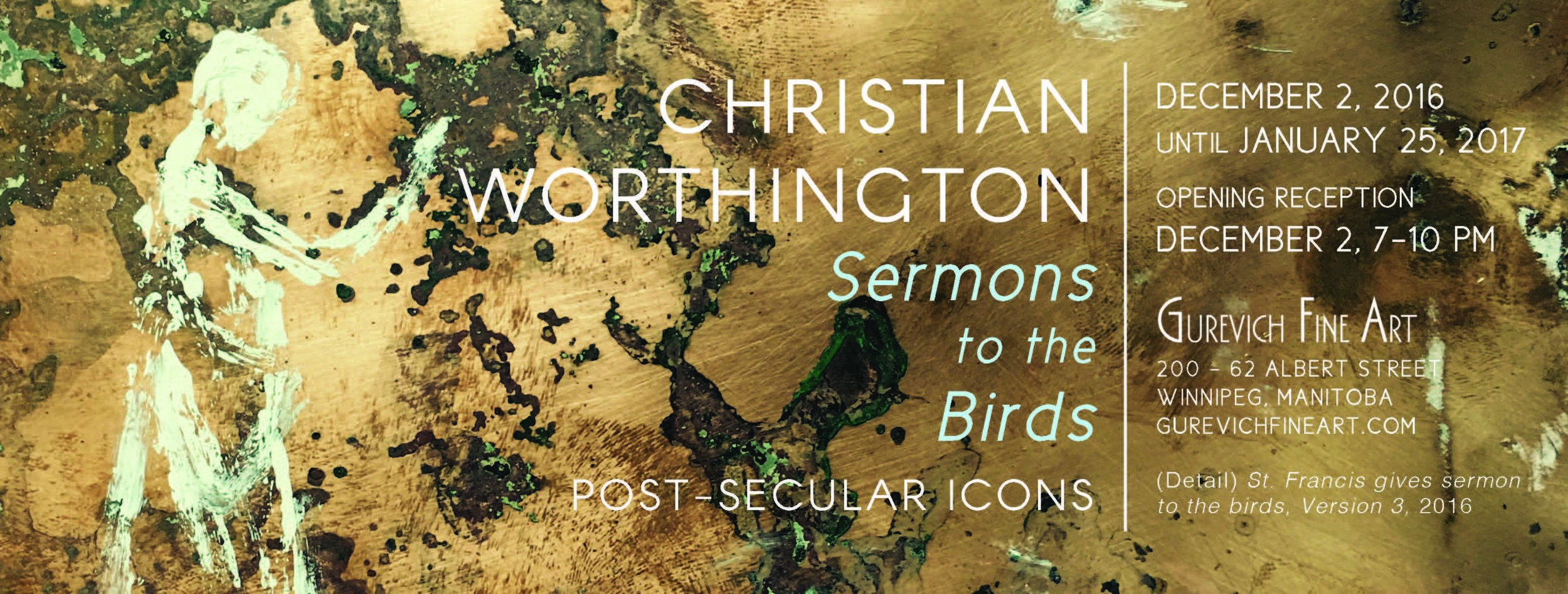
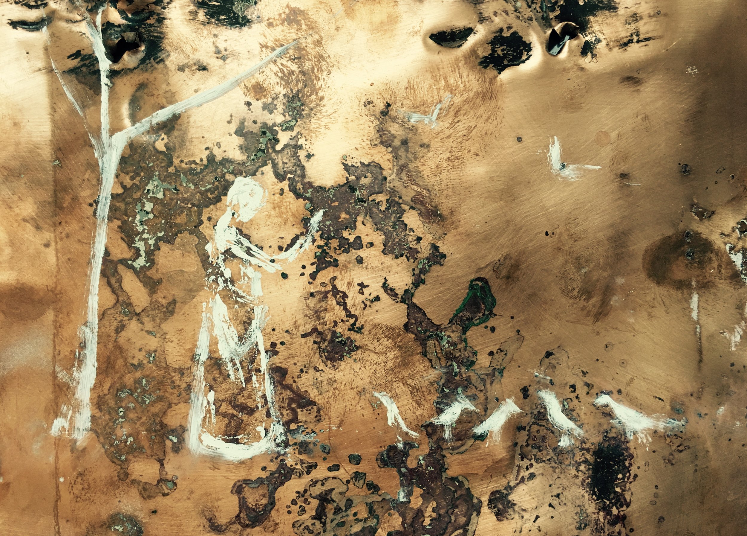
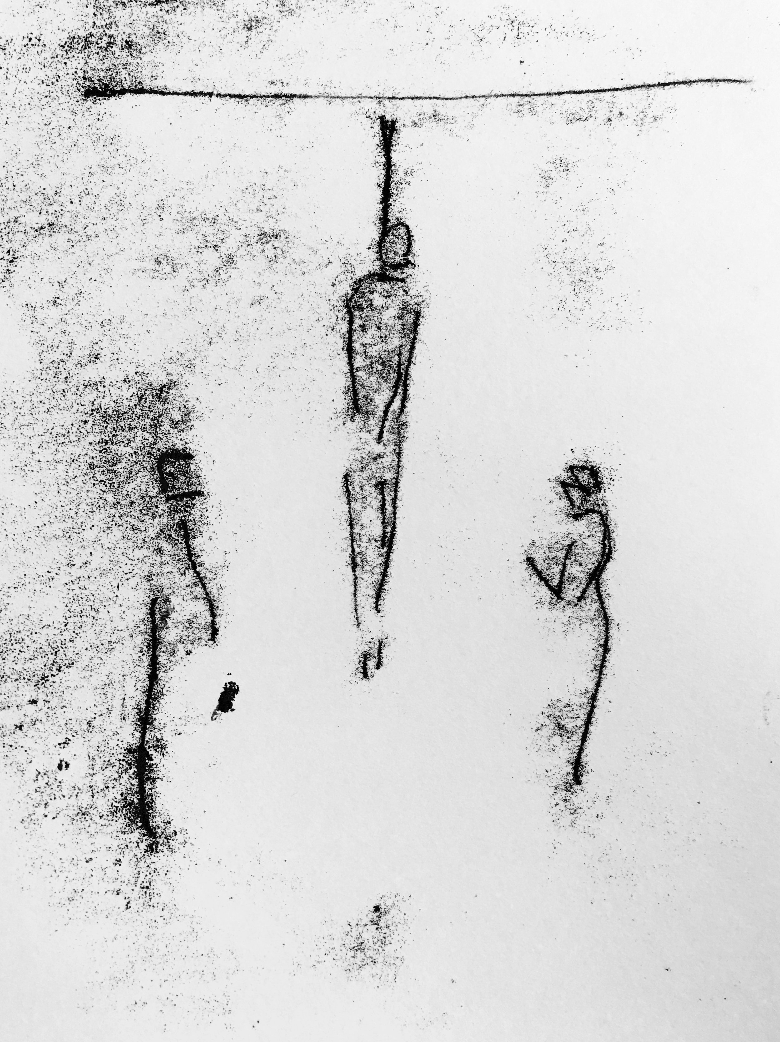
Post-Secular Icons
Opening Reception: December 2nd at 7 p.m.
On display December 2 - January 27, 2017.
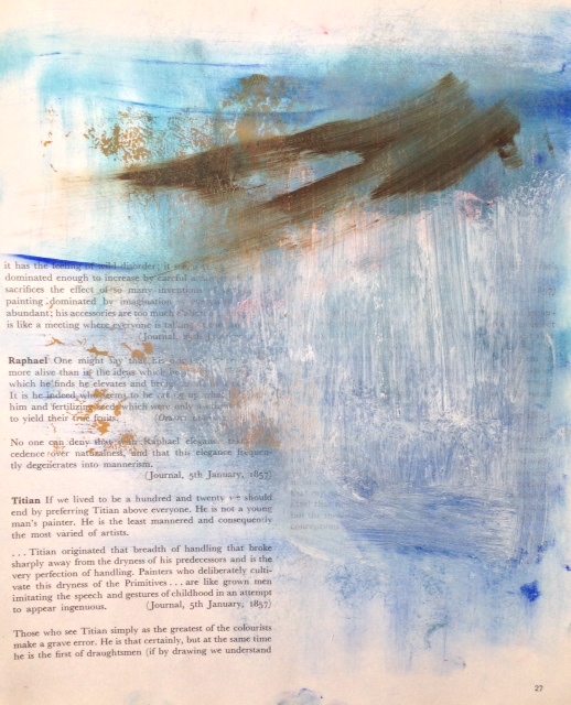
Worthington writes that “the art of the classical western tradition is now as foreign to our time as the art of ancient Egypt or Mesopotamia. We largely don’t know what any of these images or ideas represent anymore. I have come to learn that making images that reference or draw inspiration from classical art has nothing to do with preserving a visual tradition. The tradition has been completely lost...there is no tradition to preserve, I would say it was destroyed on purpose.”
Sermons to the Birds opens at Gurevich Fine Art on December 2nd and is on display until January 27th, 2017.
Religious art has a power to make our secular culture self-aware in a way it could not otherwise. Engaging with a belief that the secularist should rejoice in the post-secular icon, as it provides a profound contrast for self-analysis.

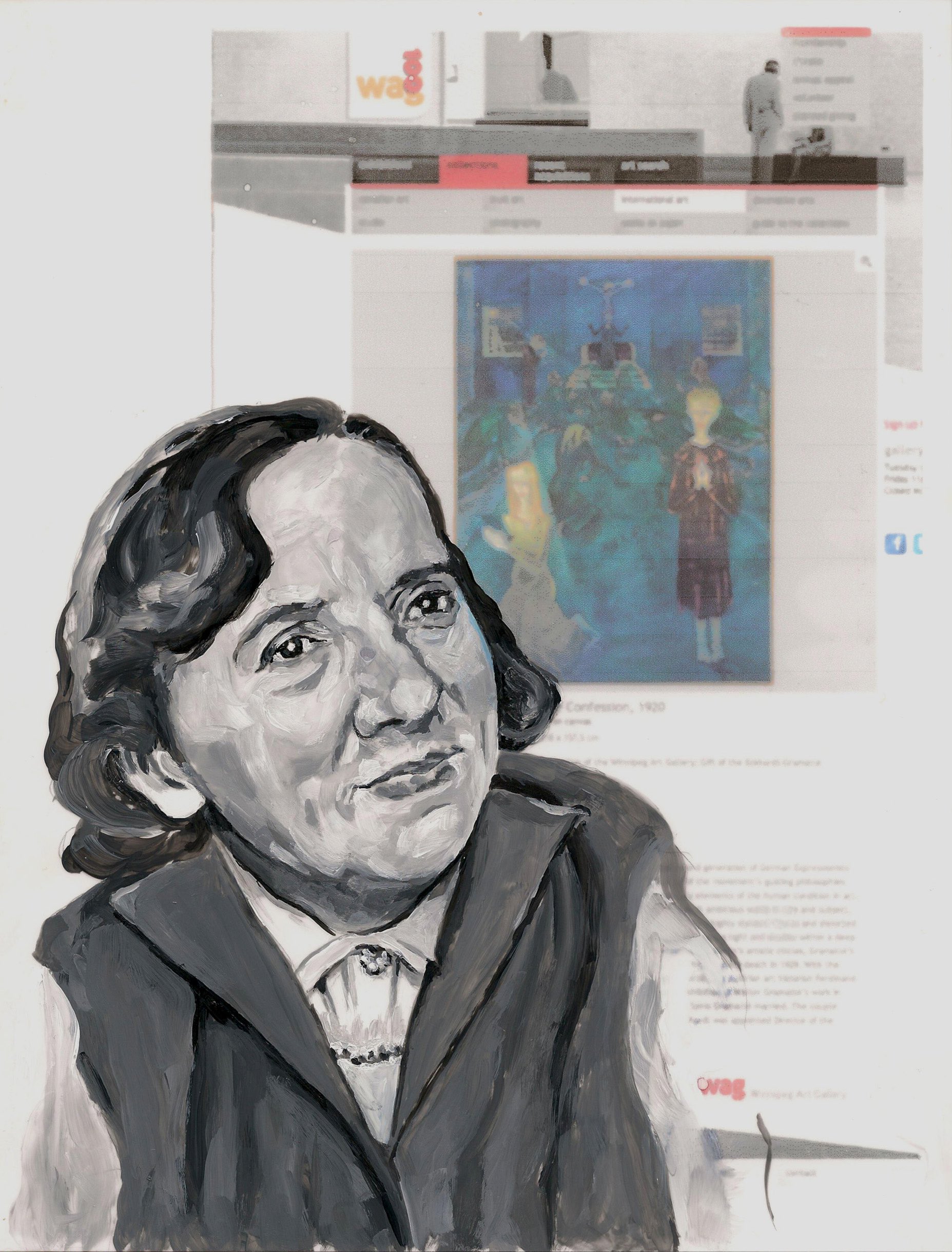
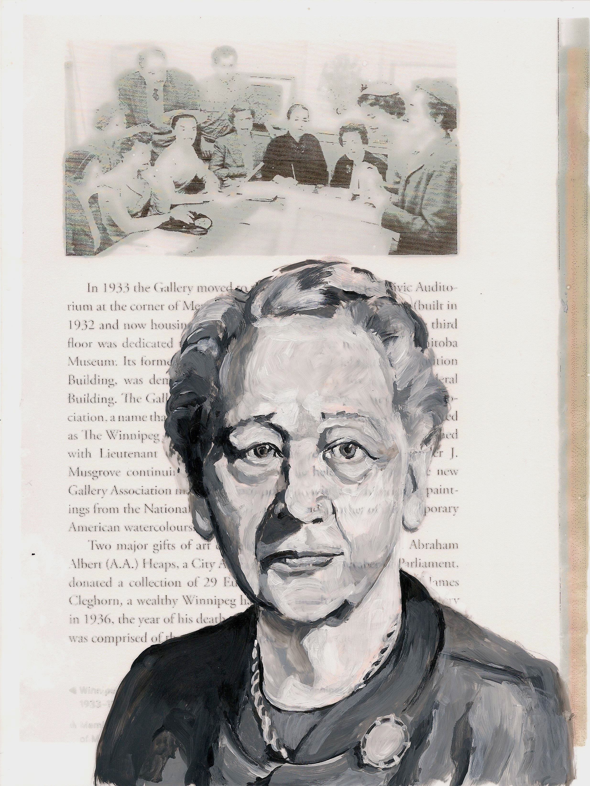
(Detail) Women of WAG: Muriel Richardson and The Women's Commitee, 2012
Artist in Attendance
. . . .
And each part of the whole falls off
And cannot know it knew, except
Here and there, in cold pockets
Of remembrance, whispers out of time.
John Ashberry - Self Portrait in a Convex Mirror
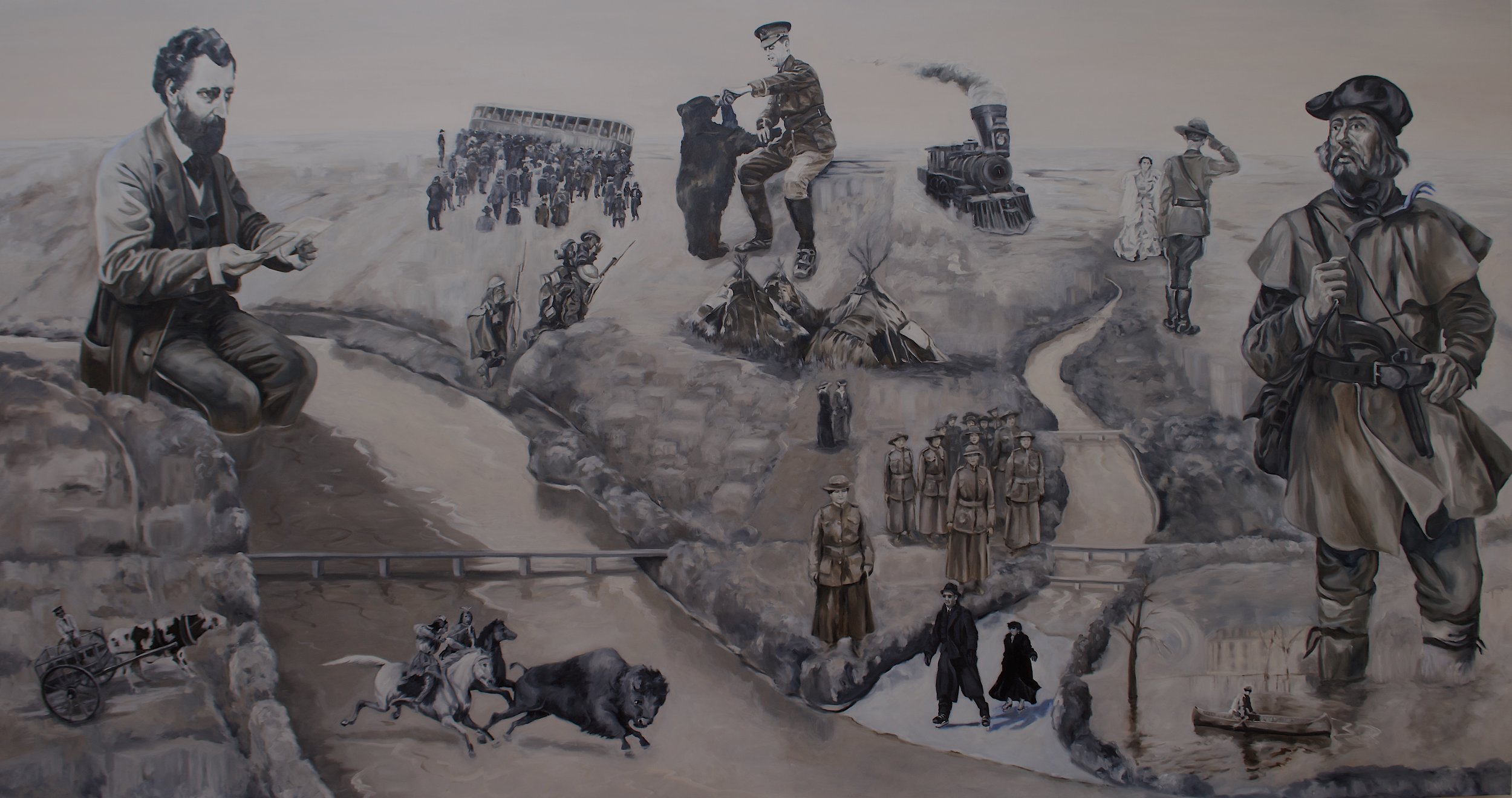
SOMETHING ABOUT WINNIPEG
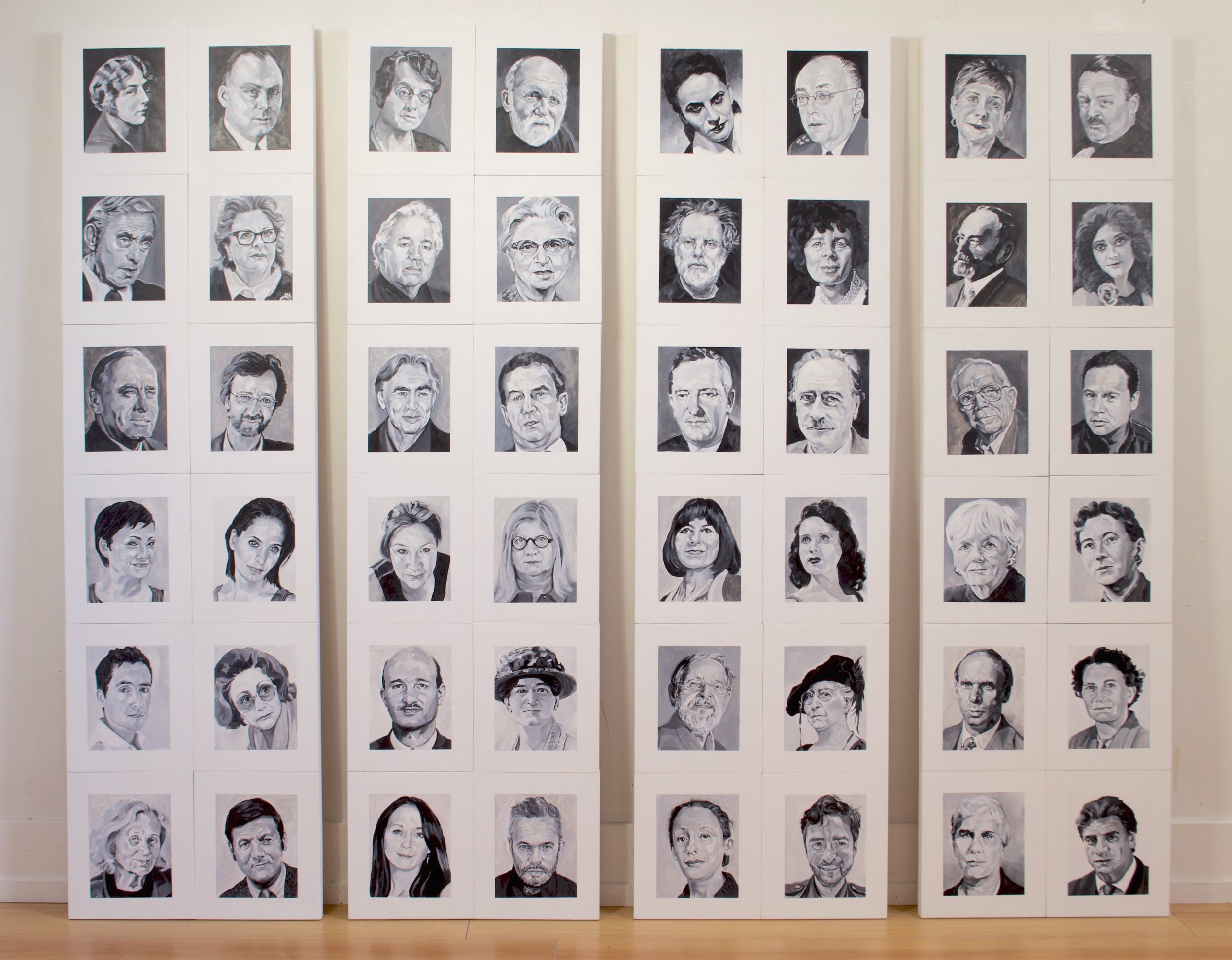
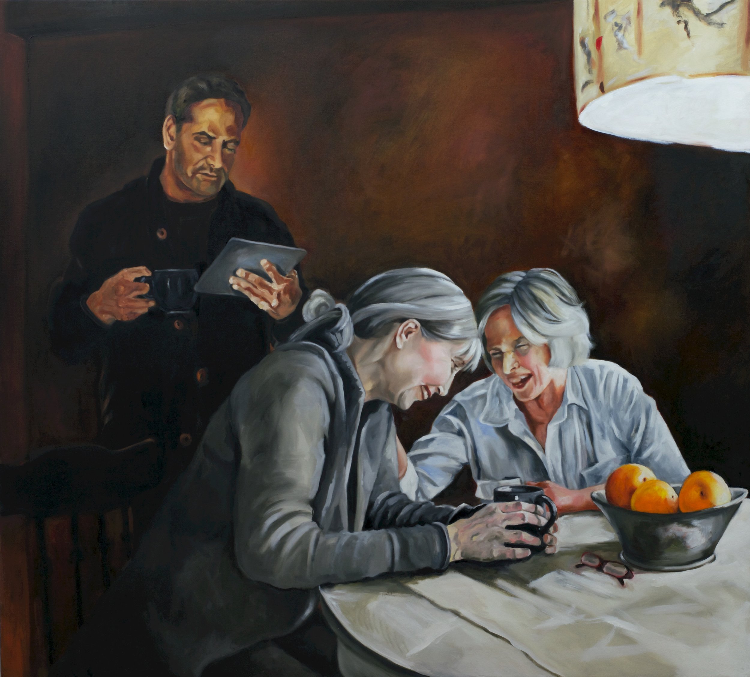
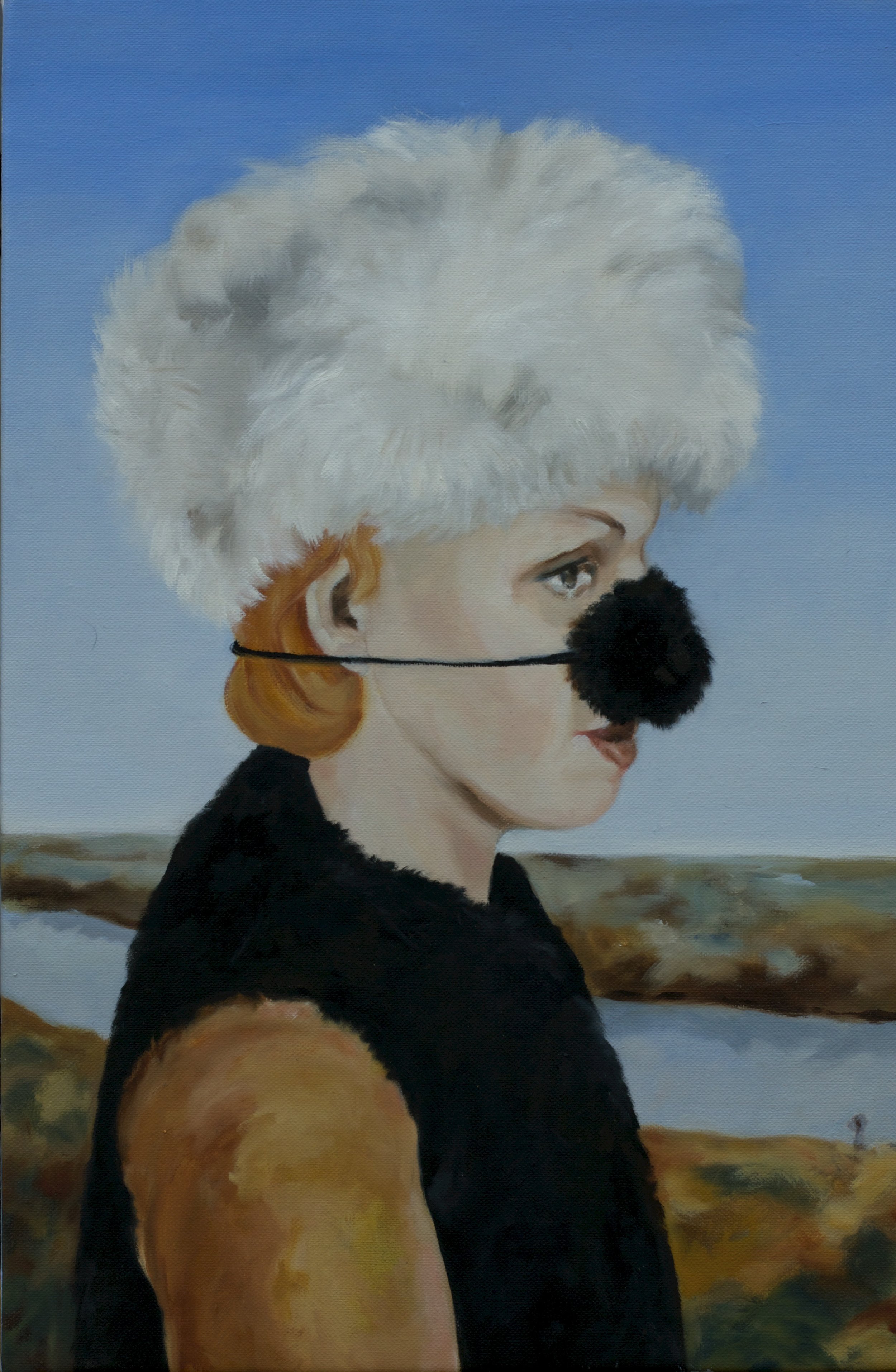
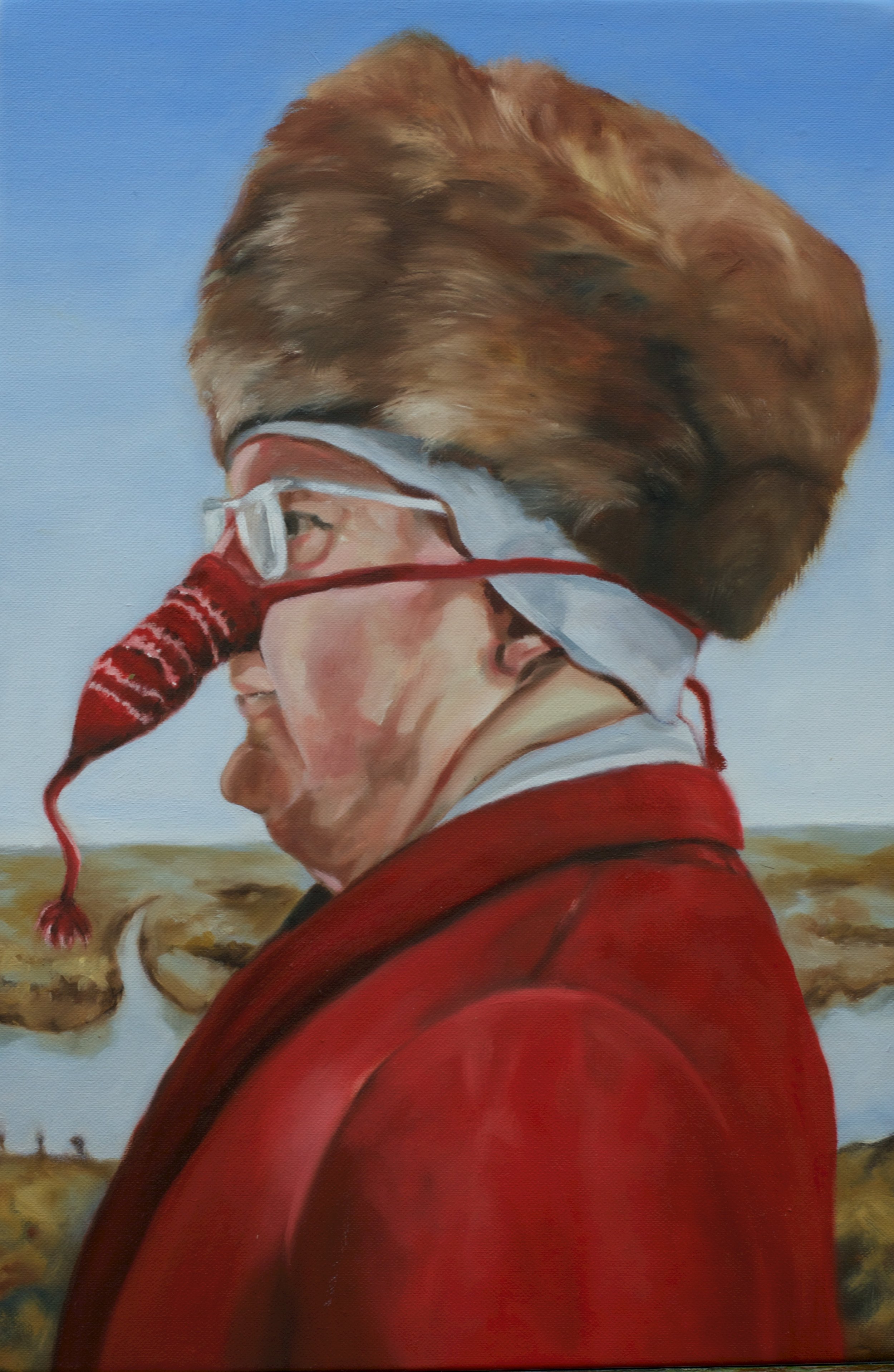
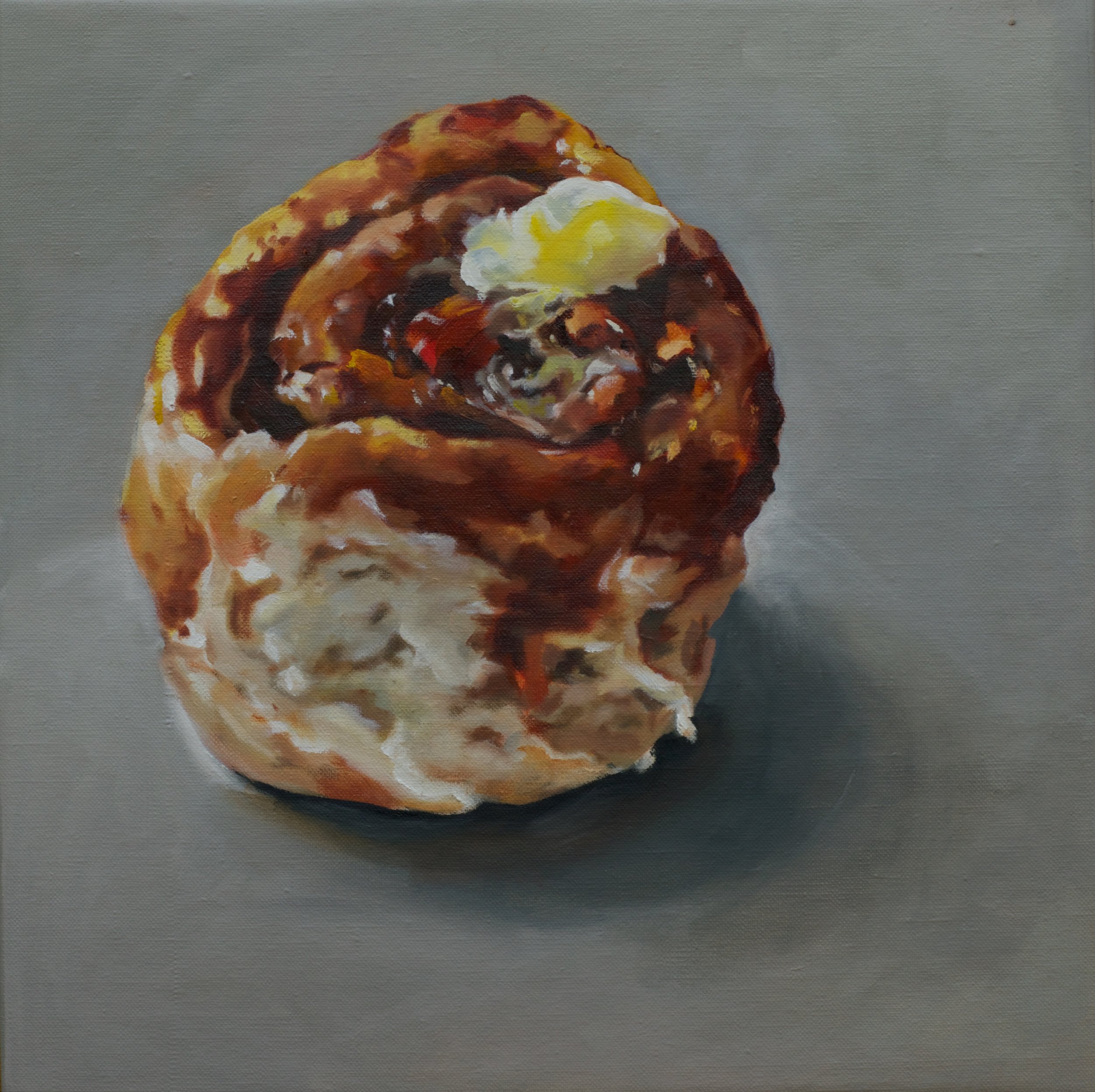
CAROLE FREEMAN is a painter of people and narrative pictures. Her imagery combines clinical study, empathy, humour, and ironic juxtaposition. Occasionally referencing Old and Modern Masters, she whimsically subverts history – art, cultural, personal - with the “zeal of a transgressive visual polyglot”.(1) Stylistically lying between classical representation and contemporary figuration, Freeman’s paintings manipulate time and space through fine detail and gestural brushwork, monochromatic and luminous colour, lightness of spirit and soulful depth.
While considering her solo exhibition for Gurevich Fine Art, Freeman, a Winnipeg émigré, felt compelled to make it be ‘something about Winnipeg’ – memories of growing up, family and friends - inspired by friendly people, bleak winters, brief summers, big skies, Winnipeg culture, history, and geography. In her Toronto studio, Something About Winnipeg evolved into over 80 pictures depicting Freeman’s investigation, acknowledgement, and surrender to “Peg’s” enduring influence and significance, and the mark it left on her psyche.
Her subjects, from the everyday (a cinnamon bun, nose warmers) to the unexpected (a pirate, a thief, a Mountie, a princess) enchant, and populate Freeman’s imaginative, capricious, and poignant retelling of historical and personal stories of her hometown. From the monumental to scaled down moments, Winnipeg people, still life, and landscape, Freeman’s paintings express both singular allegories and one continuous metaphorical narrative that raise questions of time, place, and personage, with some answers in cryptic, playful, or emotive titles. In the long run, Something About Winnipeg became Freeman’s “self portrait in a convex mirror”.
As source material, Freeman employed personal and found photographs for access to subjects and the creation of this body of work, as well as the distillation of works by Piero Della Francesca, Manet, Sargent, Richter, and Margaux Williamson. In the words of former art critic for the Globe and Mail, Gary Michael Dault, Something About Winnipeg, is Freeman’s “epic undertaking…the Summa of a city… the jewel in the crown”.(2)
1. “Carole Freeman’s Selections 2012 -2016”, David Saric, Artoronto.ca, August, 2016.
2. “Surprise Appearances”, Gary Michael Dault, Arabella, Summer, 2016.


OPENING RECEPTION October 7th at 7 p.m.
ON DISPLAY October 7th, 2016 - October 28th, 2016
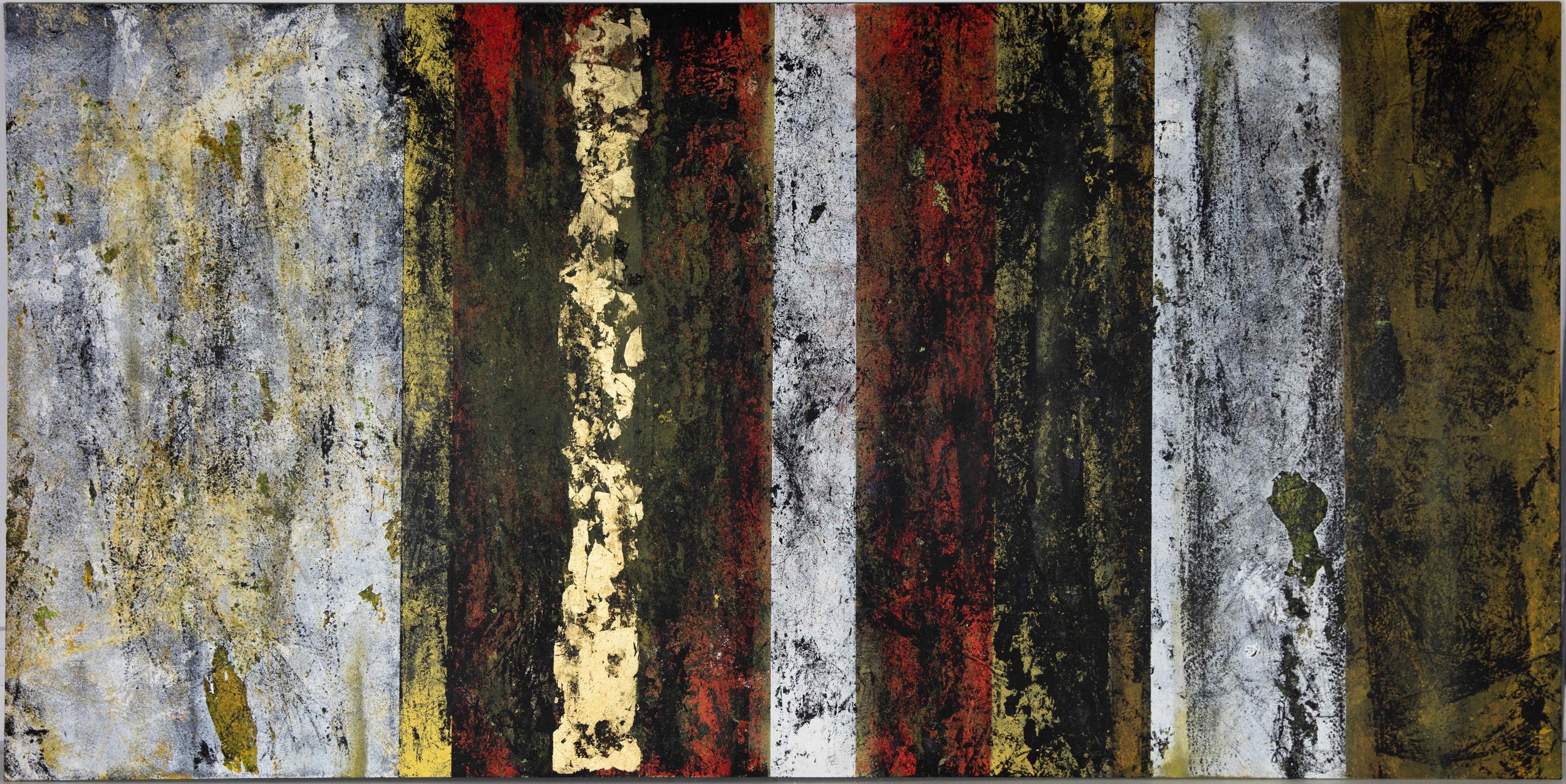
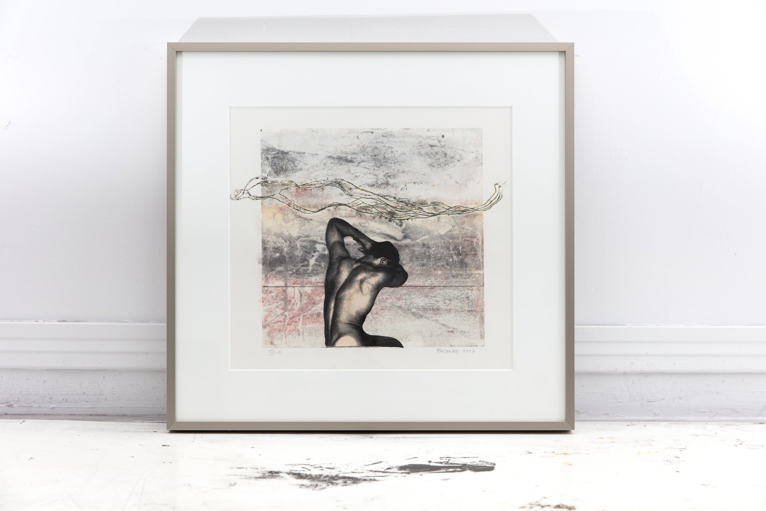
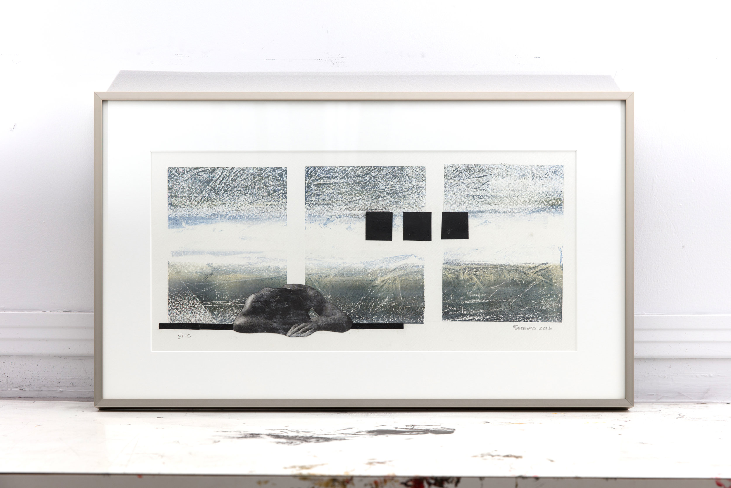
Gridlock - a complete halting or breakdown of an overloaded system.
Gridlock fairly sums up where I found myself for far too many months. As with most individuals, this difficult period of time was brought on by a life altering event. One of my solutions to dealing with gridlock was to begin a series of paintings which somehow illustrated this feeling of overload. Through creating marks and patterns on the substrate, working with new and previously used colours, and allowing my emotions to influence choices in this body of work, it became part of a positive solution to finding my way through the maze and making a new start.
Experimentation with various mediums and material is essential to the work I create. In this work I explore abstraction with fluctuating marks, colours, layers, textures, image transfers, monotype, shape and form that unite in the realization of expressive, abstract composition.
. . . .
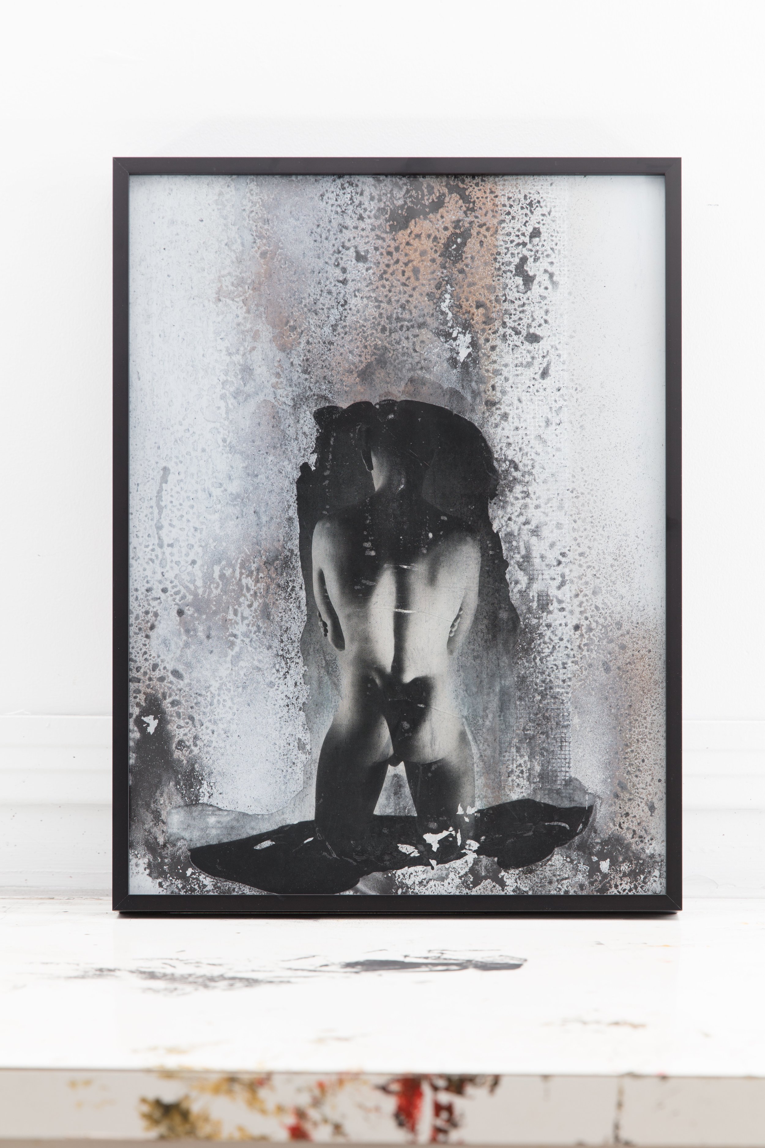
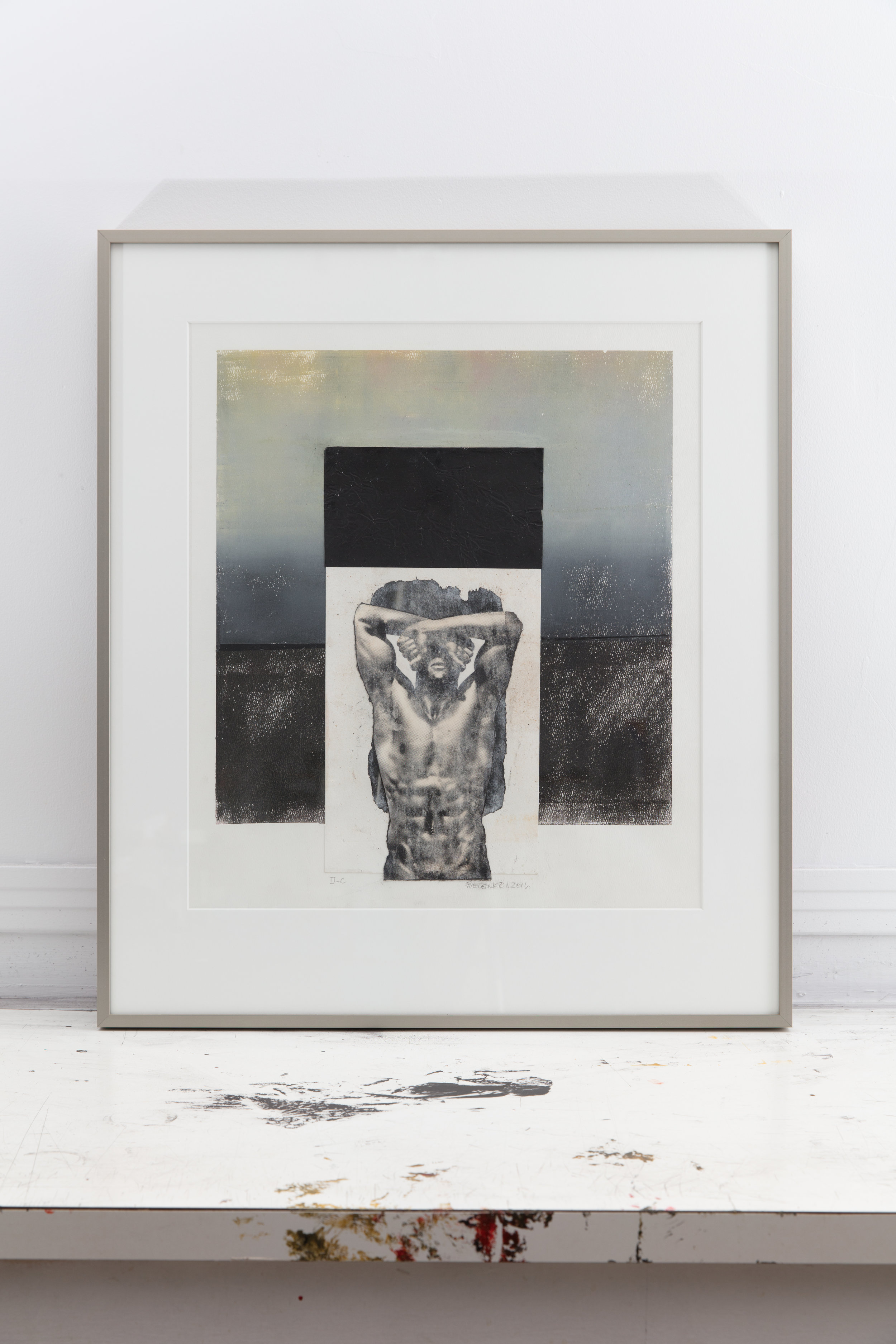
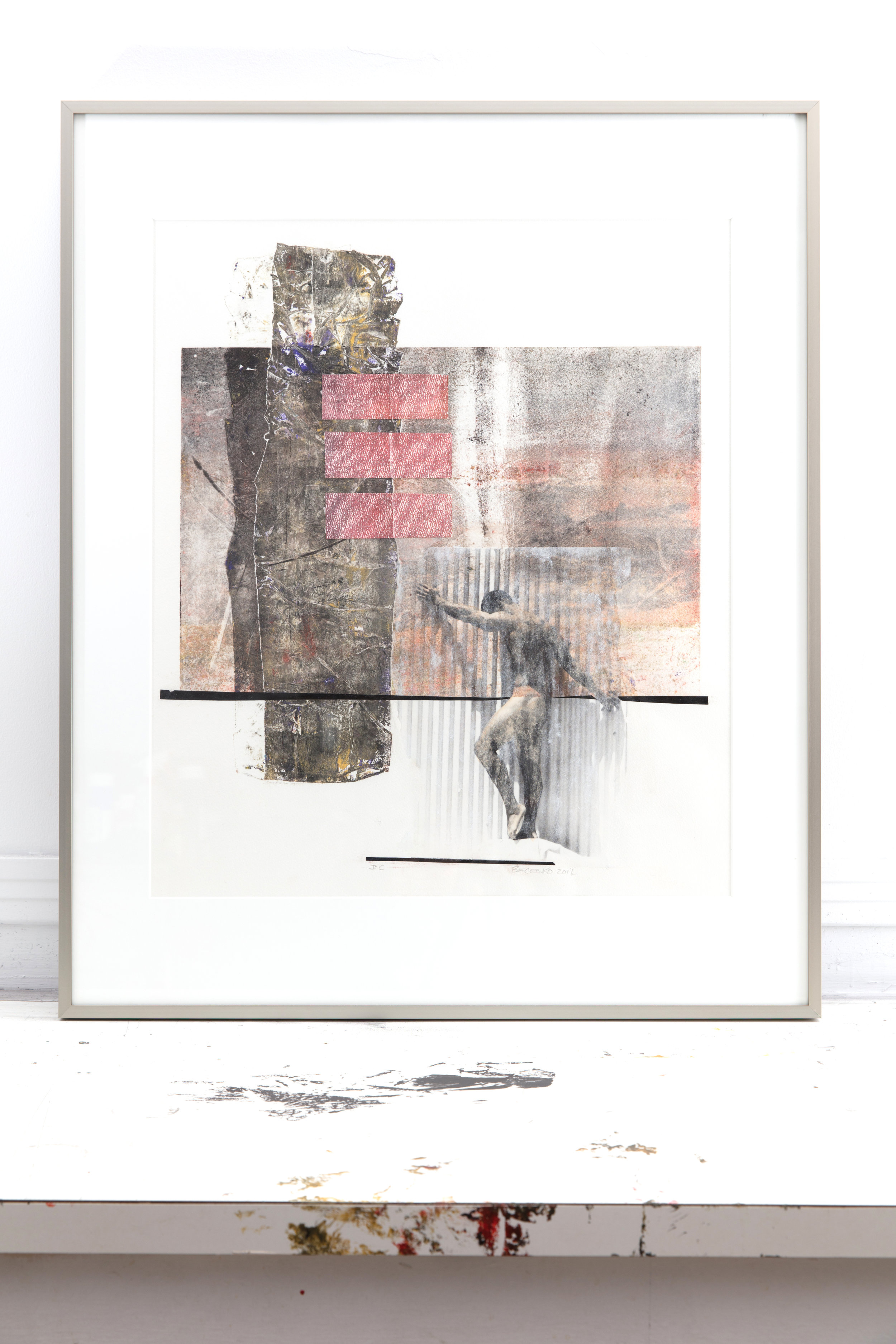
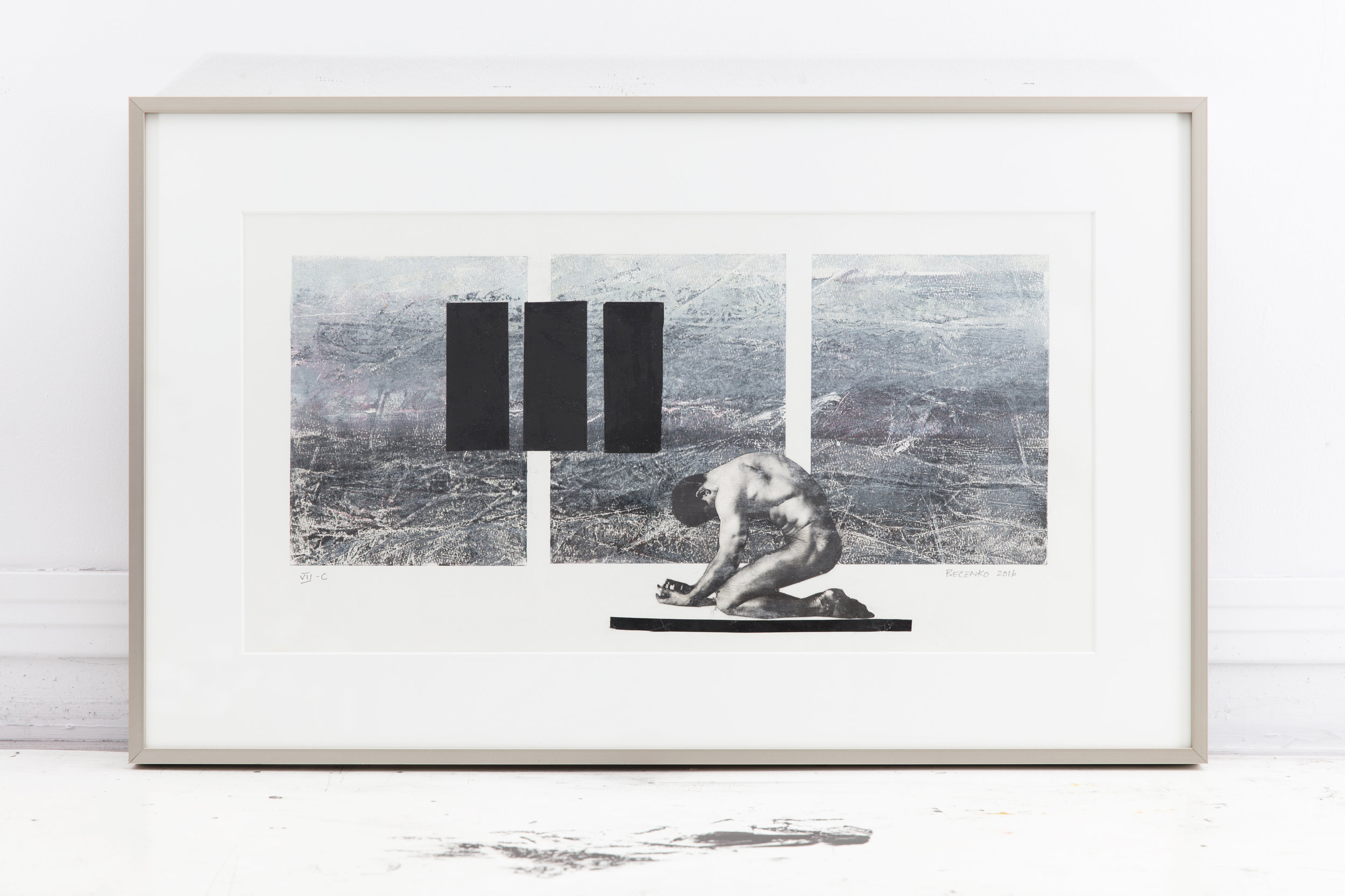
Edward Becenko’s abstract compositions capture the essence of image through colour, depth, texture and form. Using acrylic, pigment, water colour, gauche and other innovative media; Becenko’s abstract variations range from works on paper, image transfer, collage, to medium and large scale paintings on panel.
To Becenko, the fusion of art and design allow him to express his complex ideas and concepts. Skillful in his use of adaptation, by continually shifting his materials and media, Becenko works to perfect the meaning behind each piece. Each new layer becomes a statement about the human condition. The layers of feelings, emotions and images guiding his work. This process resulting in the luminescent quality, allowing both the expression of order within chaos.
. . . .

On Display: September 29 & 30, 9am-6pm, October 1, 11am – 9pm

Looped Video Installation
In Two Days at the Falls, Isabell Spengler juxtaposes two identical 360-degree pan shots of the iconic Niagara Falls in a double projection. One of the shots was filmed when Spengler visited the falls for the first time and found them partially frozen. The other was made before her trip in a three-dimensional model that Spengler built in her studio and that represents a distillation of all the ideas and ascriptions from illustrations, texts, interviews, films and digital replicas that have contributed to her personal image of the place. In her juxtaposition of video images of the fictive and real Niagara Falls, Isabell Spengler examines the interaction between reality and imagination, between popular culture and private perception and between the monumental and the everyday in the context of the present ubiquity of media technologies.
Commissioned by the Goethe-Institut Toronto & Images Festival Toronto & Trinity Square Video Toronto as part of the European Media Art Network Exchange with Australia and Canada 2015. Supported by the Culture Programme 2013 of the European Commission and the Goethe-Institut.
Presented in partnership with WNDX.
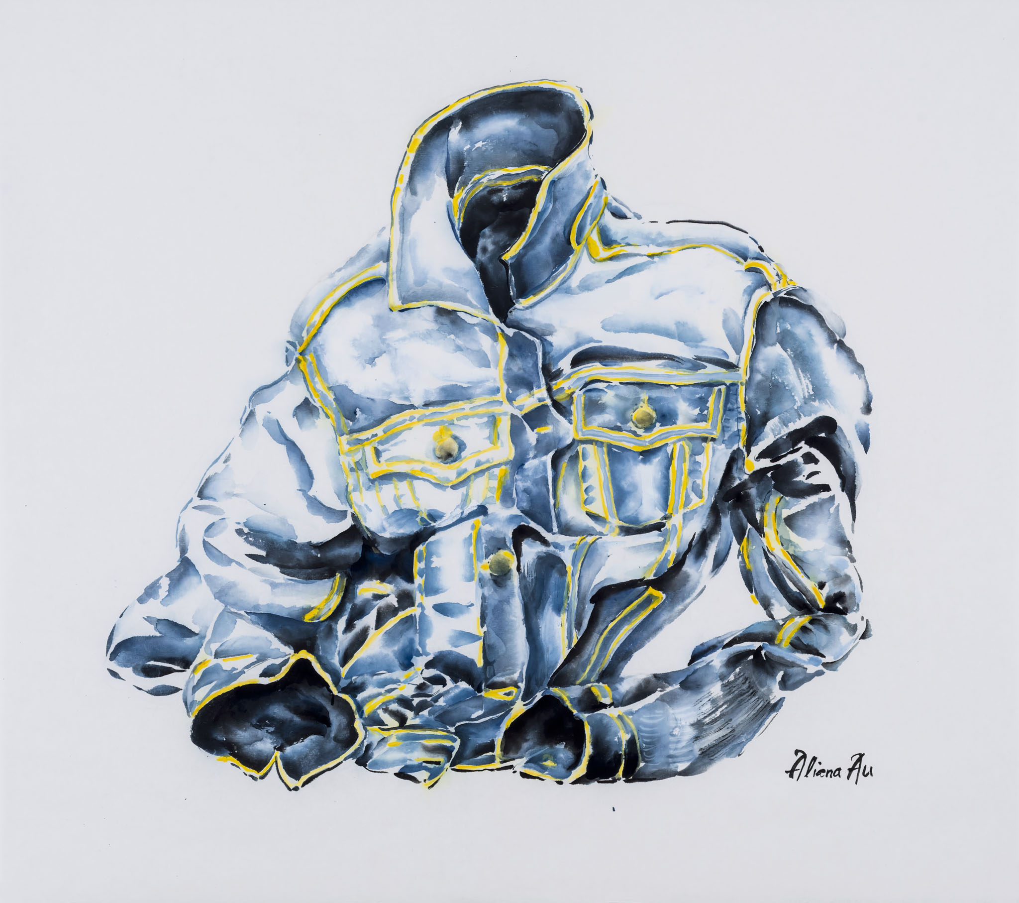
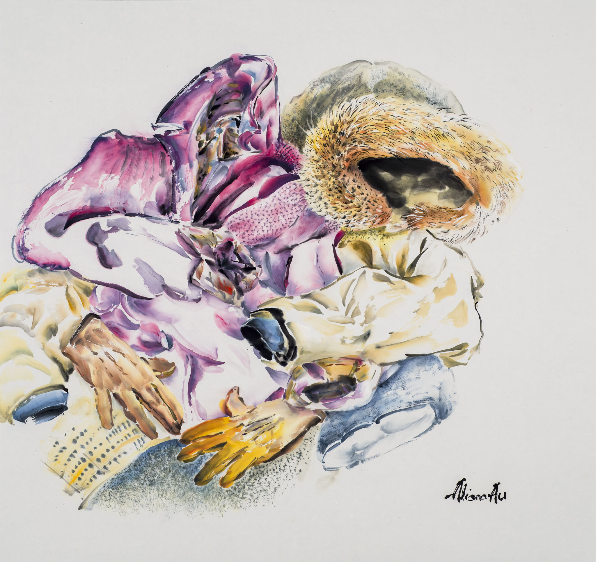
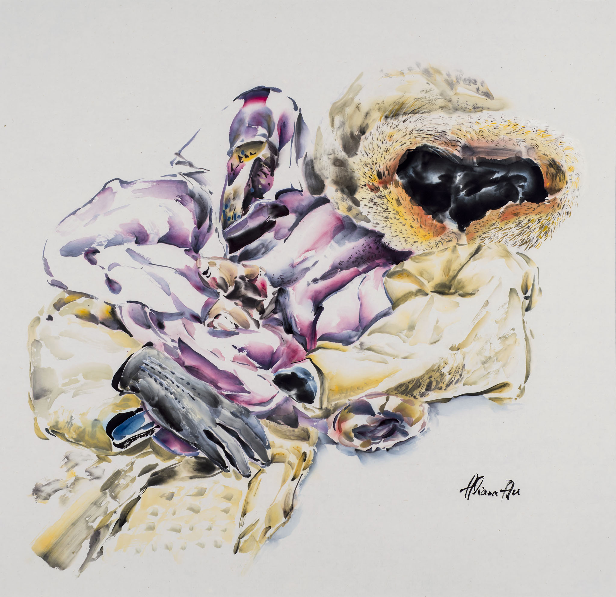
" In my grandfather's house, clothes were frequently left in such a way that the life force seemed to have existed in their form.
My clothes were the ones that were from my father's childhood. I had never met my father, but I felt a strange kind of closeness to him, perhaps because of his clothes which I wore."
Quotes are from the Artist Statement, OCCURRENCES: FOUR MANITOBA PAINTERS. The Winnipeg Art Gallery, 1981.
Working in a free, fluid manner bereft of controlling lines, Aliana Au's brushstrokes create realities seemingly devoid of change and time. As a painter, Au draws from her own life experiences and a deep well of memories — core emotions that are unwashed by time: the intimacy of family; storytelling; and the unscathed feeling of belonging. With no reservations about letting areas of paper show, Au employs an impressionistic effort, allowing the free space to evoke the light and transparency of each piece in a poetic and elegiac fragility.
The use of rich indigos, fluid blacks, bold yellows and open space meet and then dissipate to create the feeling of timelessness. The juxtaposed touches of colour and paper are woven together with various types of brushstrokes. Effortlessly, Au embraces an intuitive but meticulous style that is in search of harmony rather than a strict replica of reality. Painting is essentially a conversation with time — the crumpled denim a tribute to the remembered and missing pieces of her childhood. It is this unity of reflection and time that projects in Au’s paintings the sense of eternity she desires.

Opening Night: August 5th, 7:00PM
On Display: August 5th - August 27th
Gurevich Fine Art proudly presents TEN, an exhibition to celebrate the tenth anniversary of Gurevich Fine Art, highlighting the artists from Gurevich’s private collection of contemporary art.
Many of the pieces showcased have been acquired over the last few years and are on view at Gurevich Fine Art for the first time. The exhibit opens August 5th at 7 P.M. and will feature work by Andrew Beck, Bette Woodland, Gabrielle Funk, Kieth Wood, Neil Peter Dyck and Kae Sasaki among others.
TEN promises an opportunity to catch a glimpse inside the works of Winnipeg’s foremost artists and emerging talent. The collection will host over 30 artworks; work of various sizes some striking, some intimate. They represent various styles ranging from cubist to postmodern traditional to graffiti. All are examples of exceptional artistry.
This is an exciting opportunity for viewing or adding important pieces to collections.
This exhibit is on display at through August 27th.

OPENS JUNE 3, 7pm
ON DISPLAY UNTIL JUNE 25
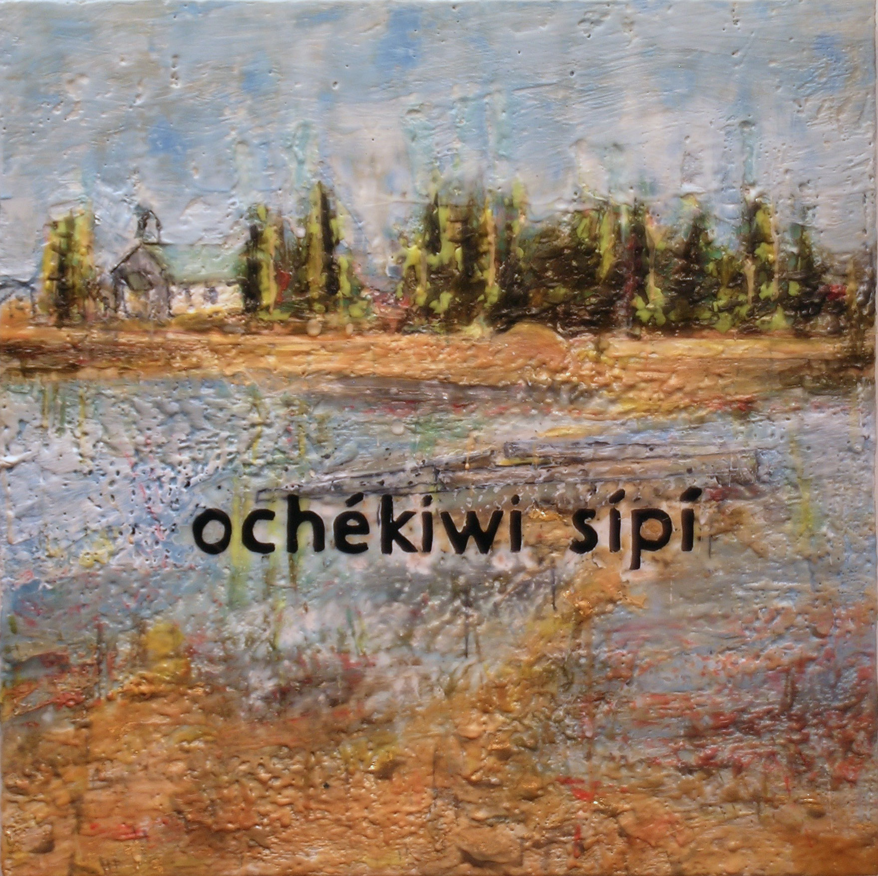
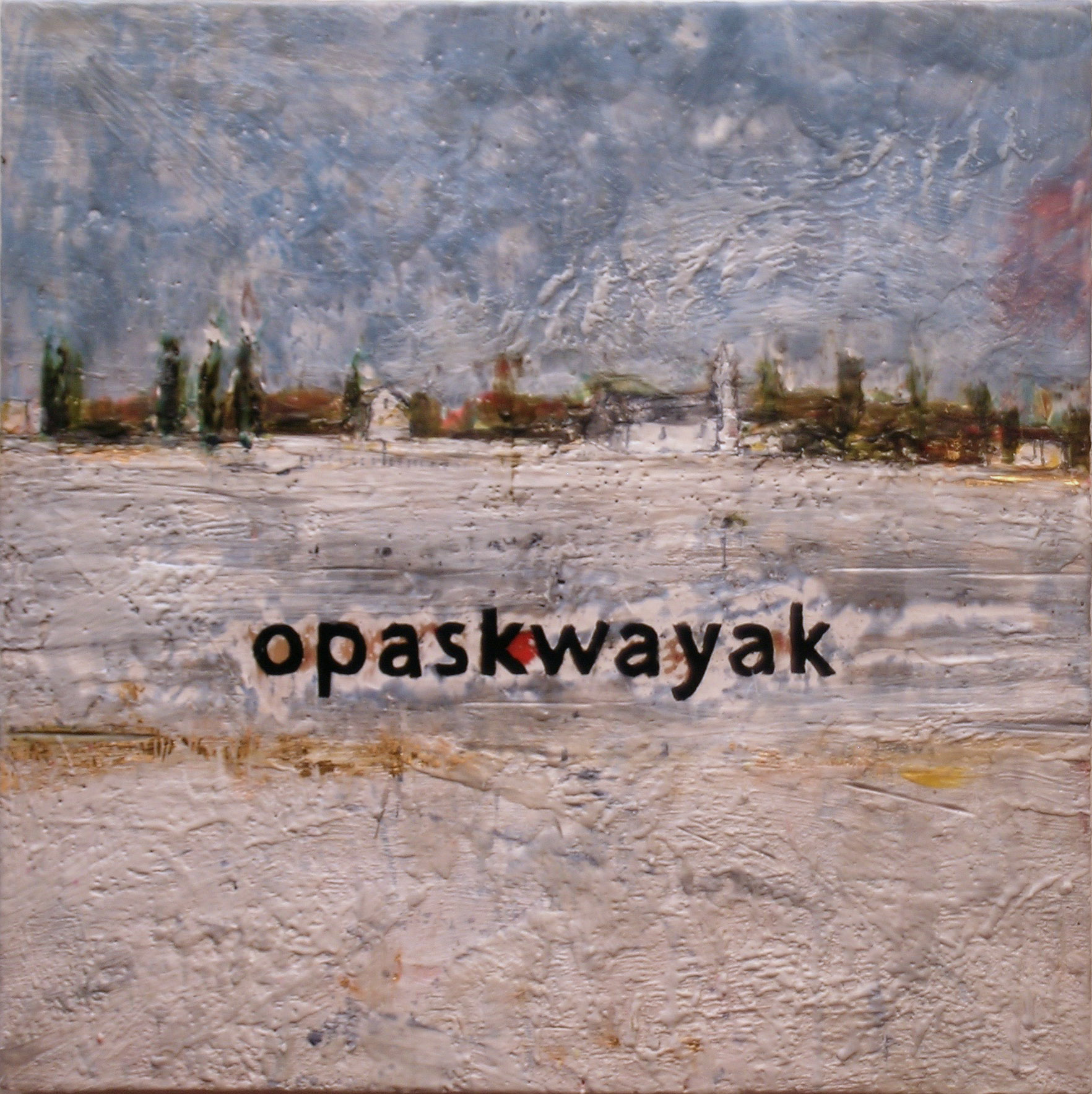
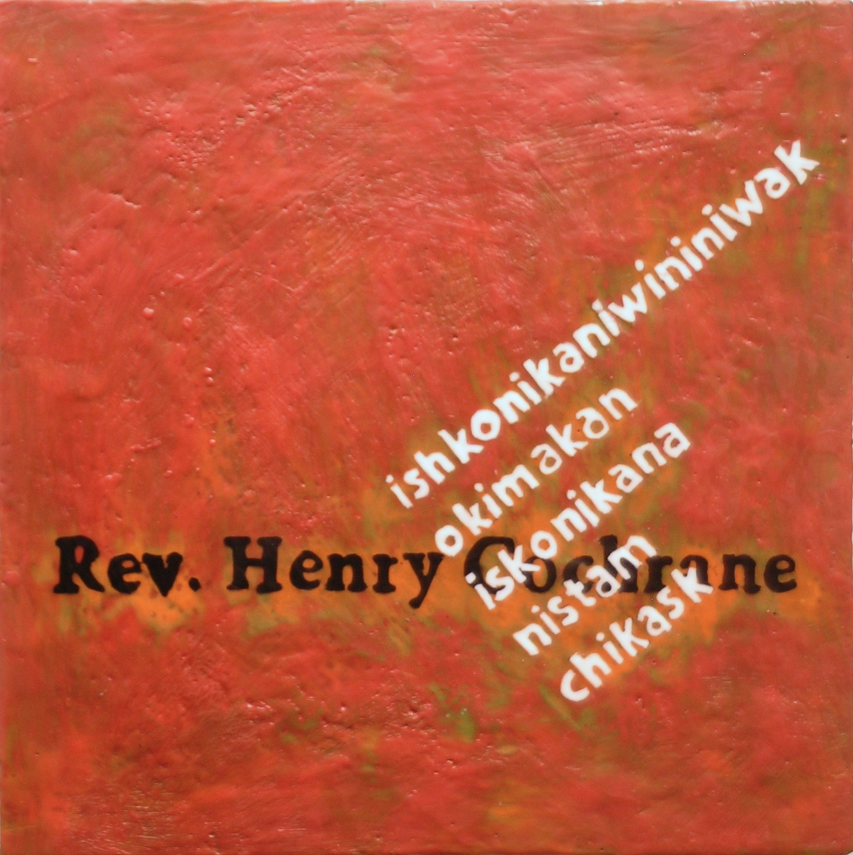
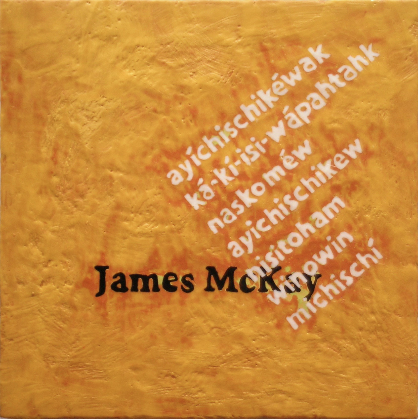
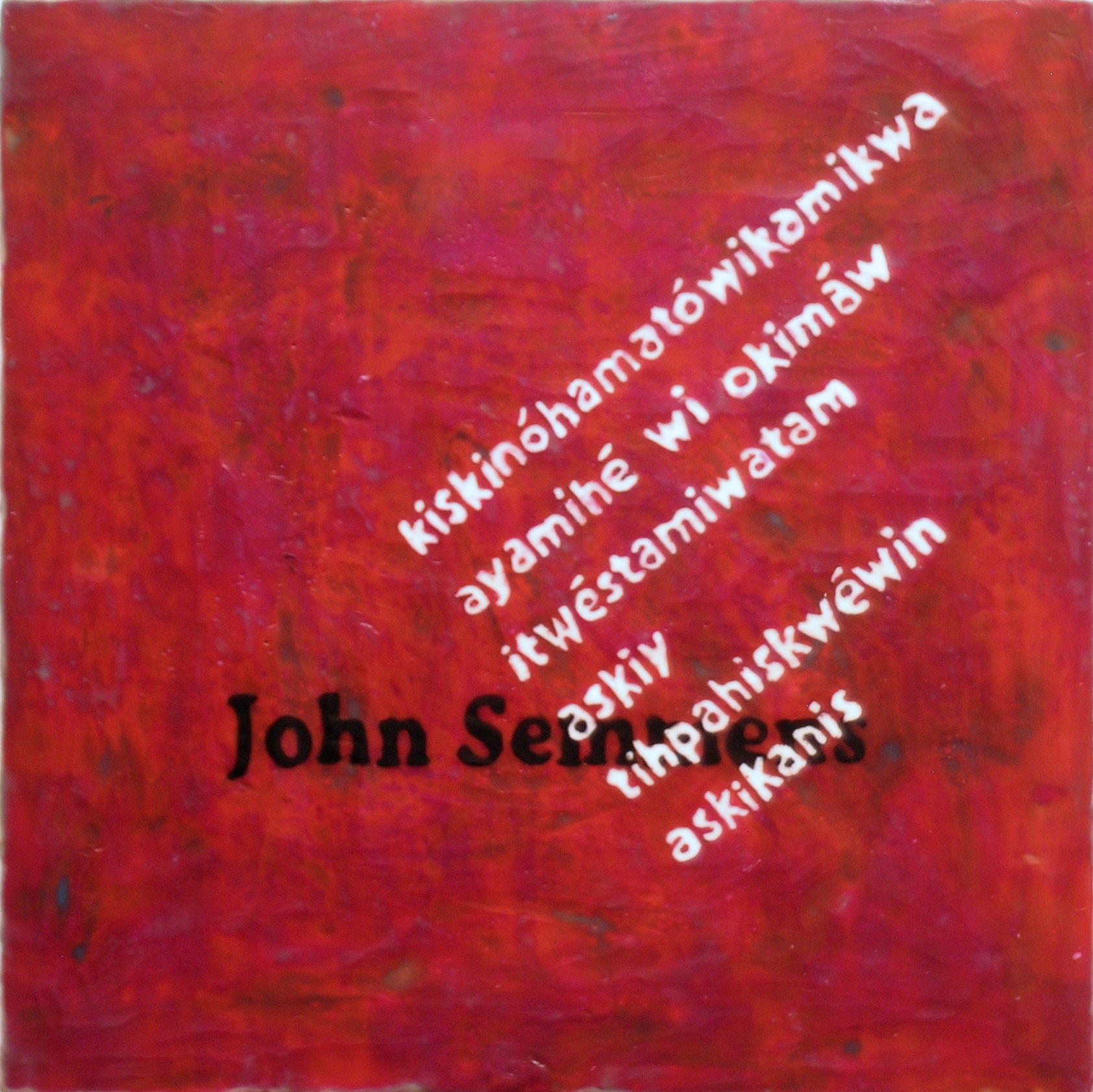
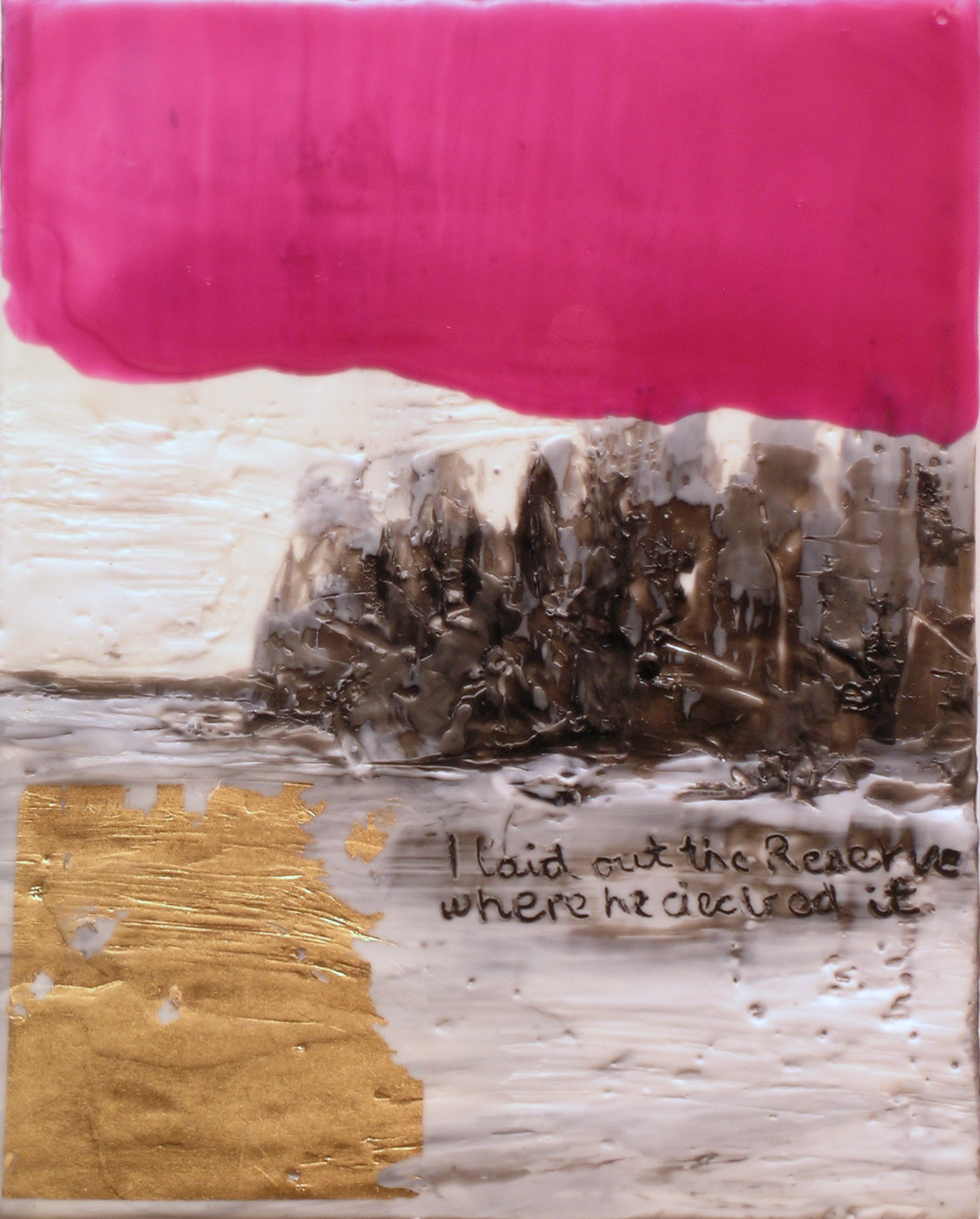
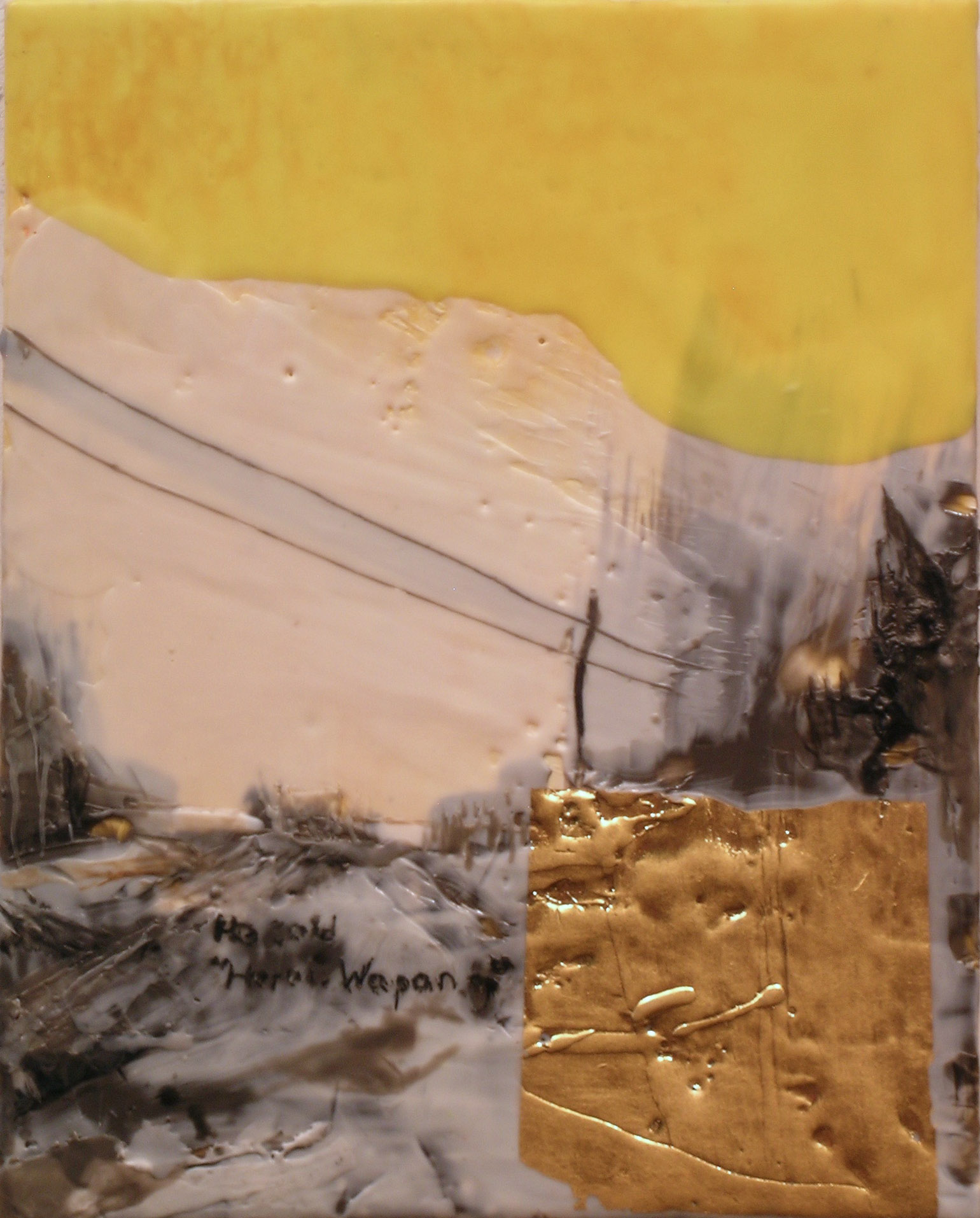
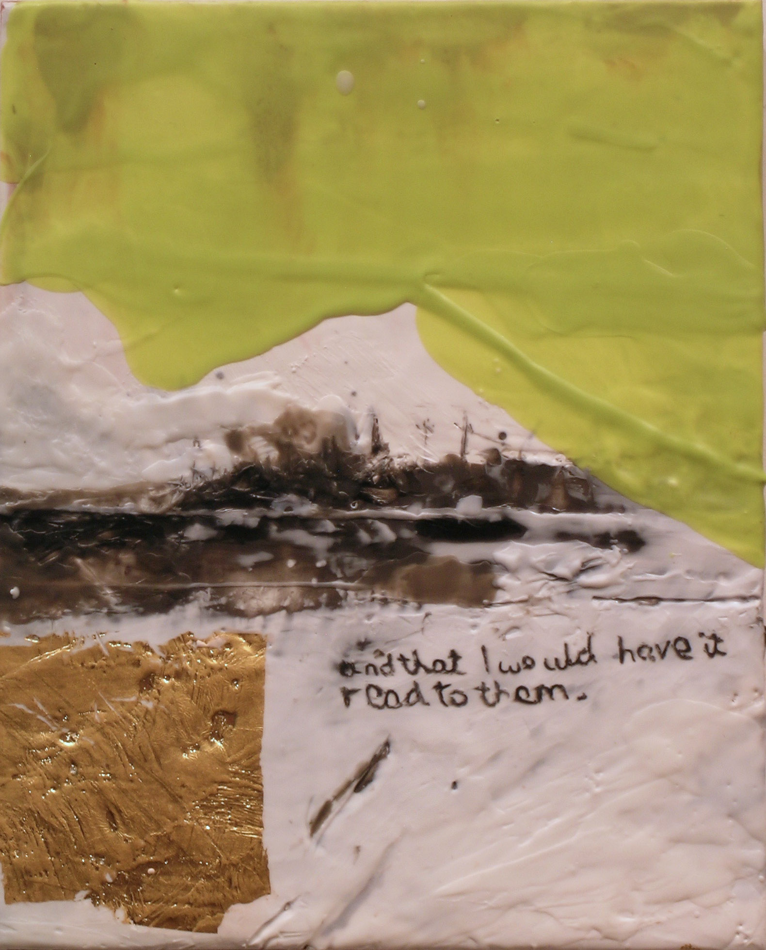
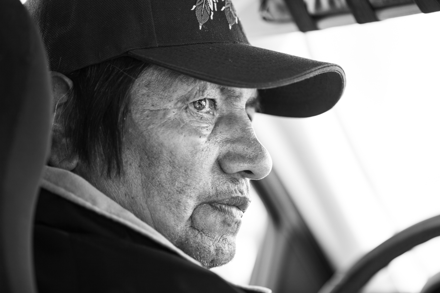
Two well-known Winnipeg artists have partnered for an exhibit which provides both strong political commentary and visually stimulating artwork. KC Adams and Tim Schouten will pair their paintings and photography in aski nipay (land and water).
Metis artist Adams’ striking portraits are influenced by her travel to northern Manitoba communities during the summer of 2015.
“I was moved by the people who are walking the path of their ancestors, using their knowledge and power to protect the land and waters in their community. They face resistance from developers, Manitoba Hydro, government and sometimes even their own people,” Adams says.
Adams’ intent as a social practice artist is to capture, through her portraiture, the strong spirit and resilient and compassionate nature of these people.
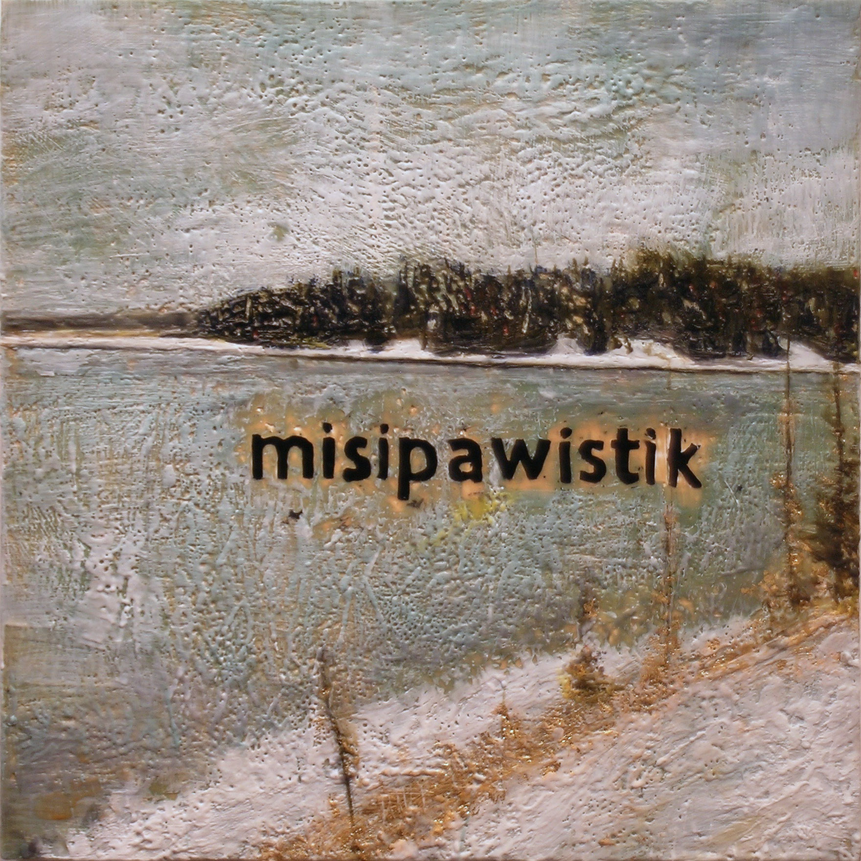
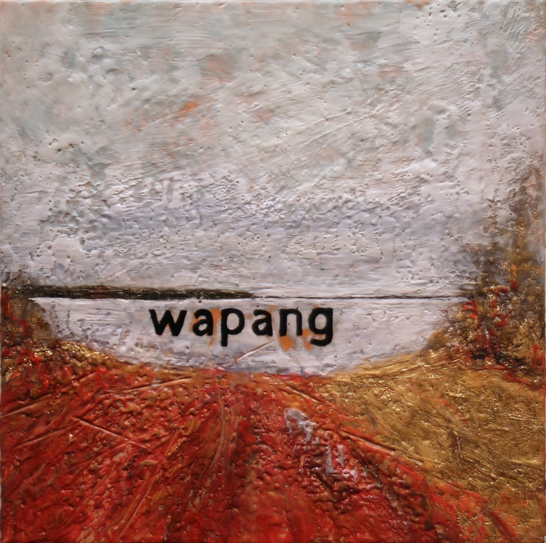
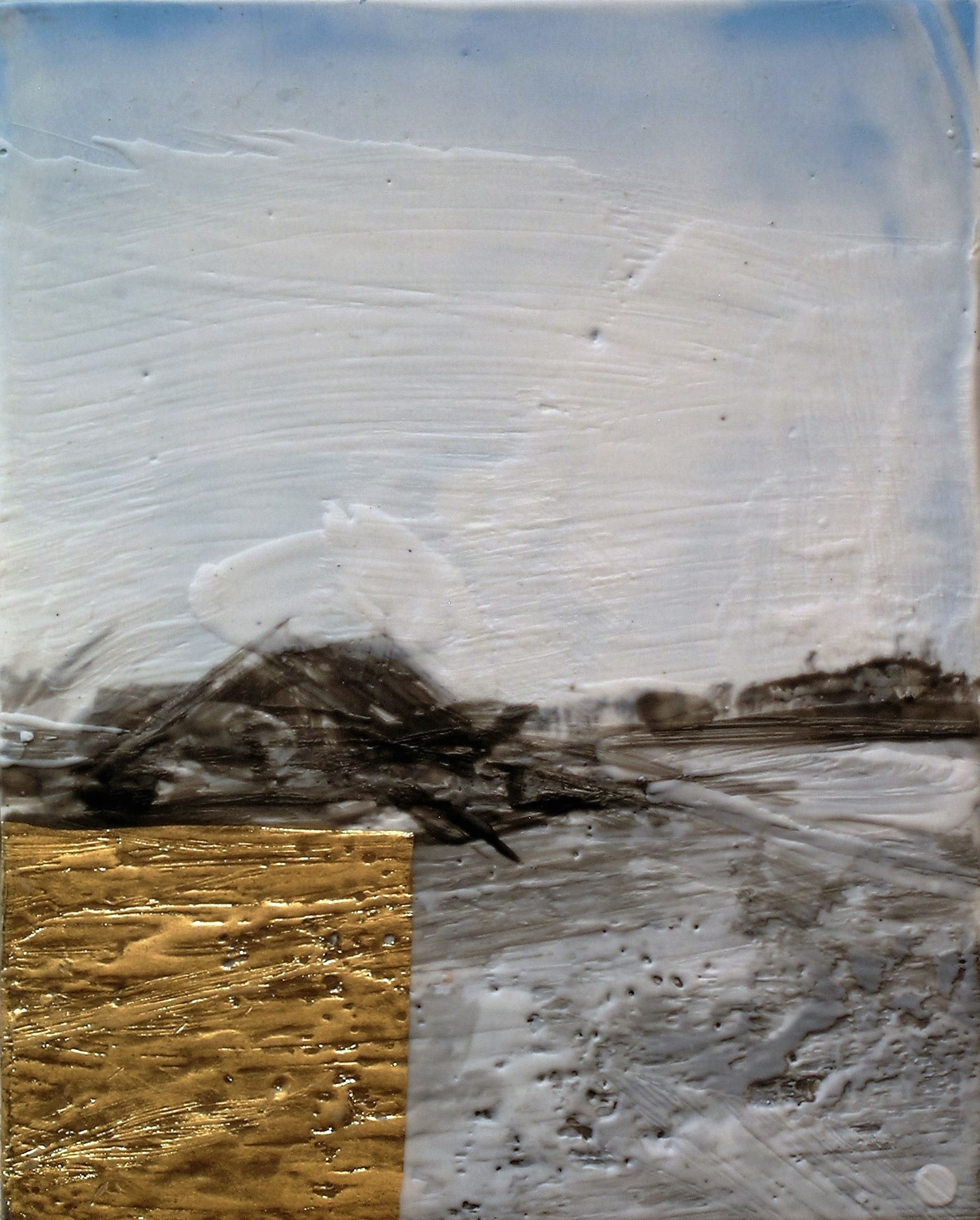
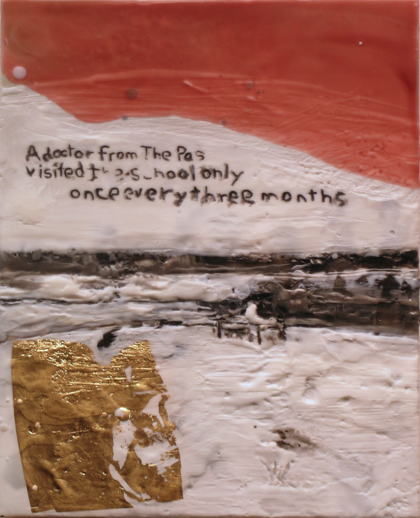
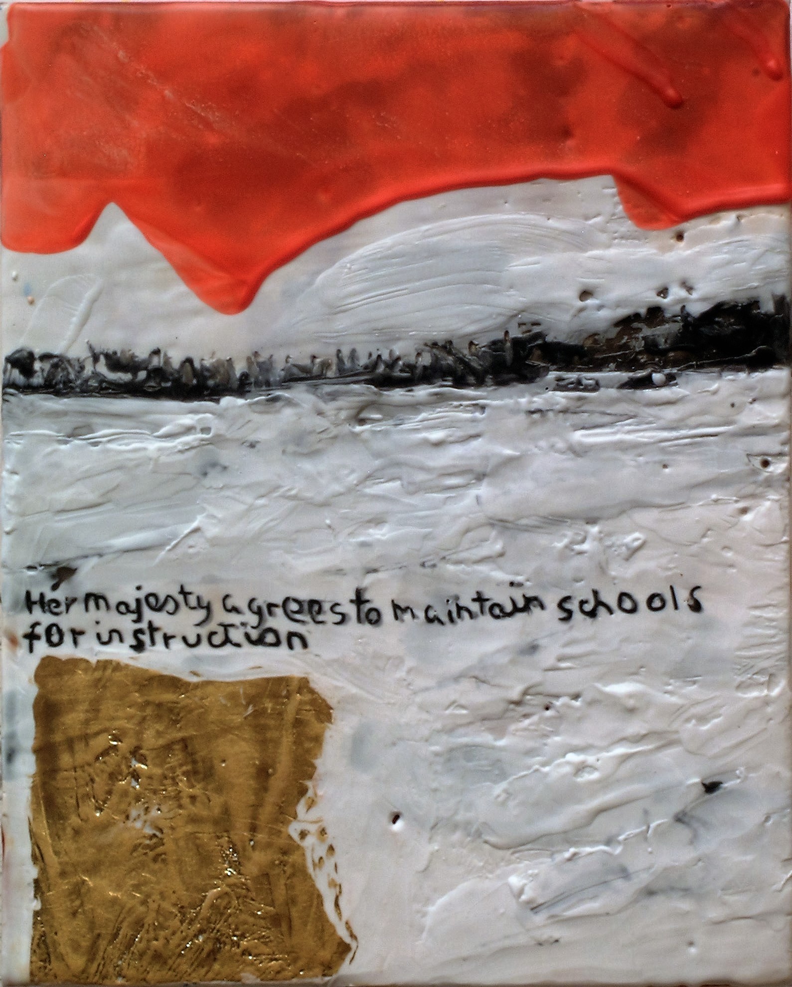
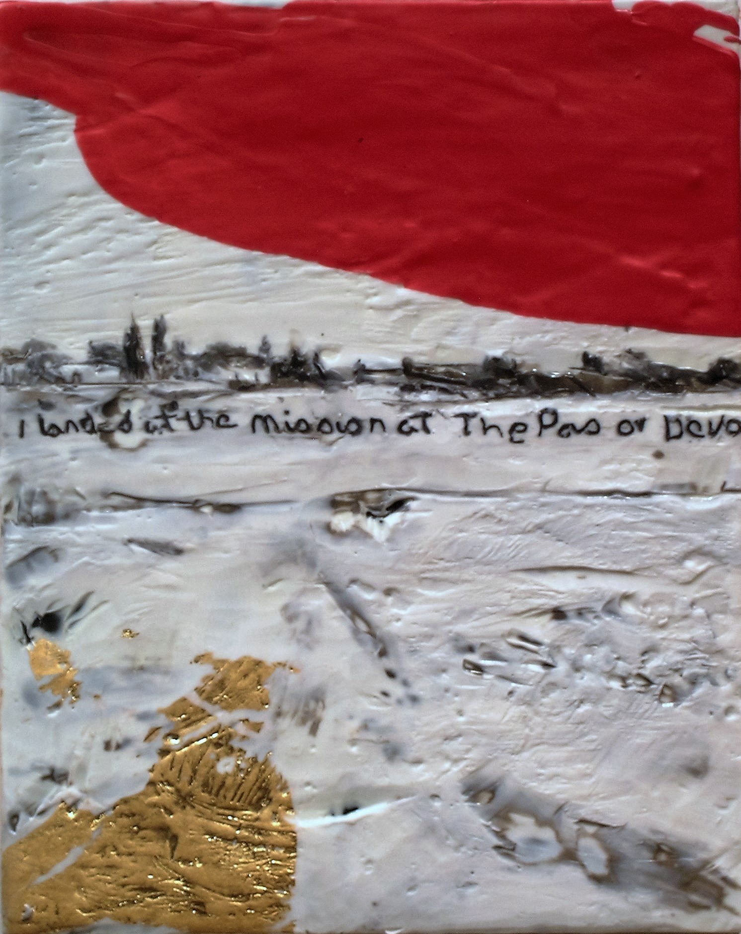
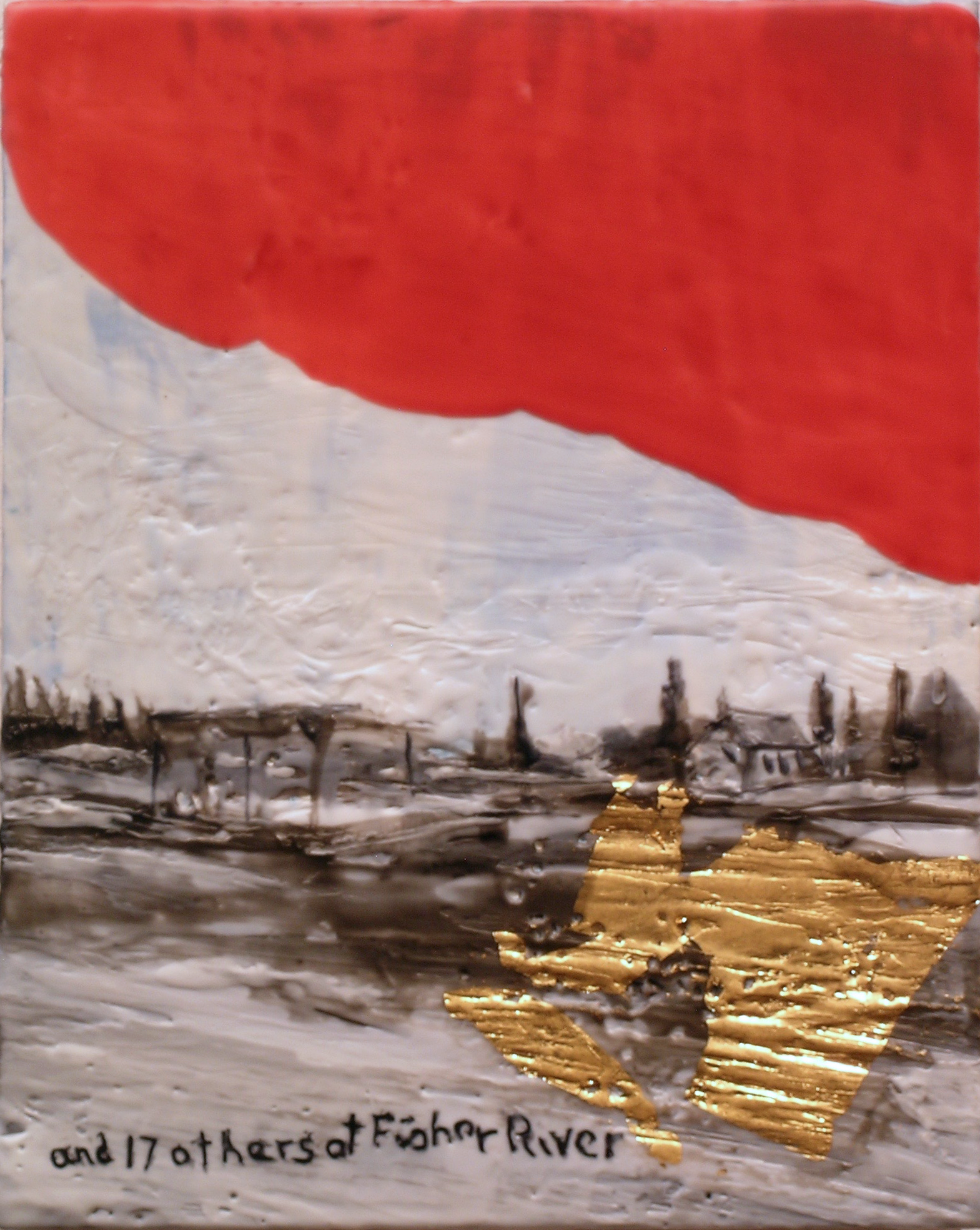
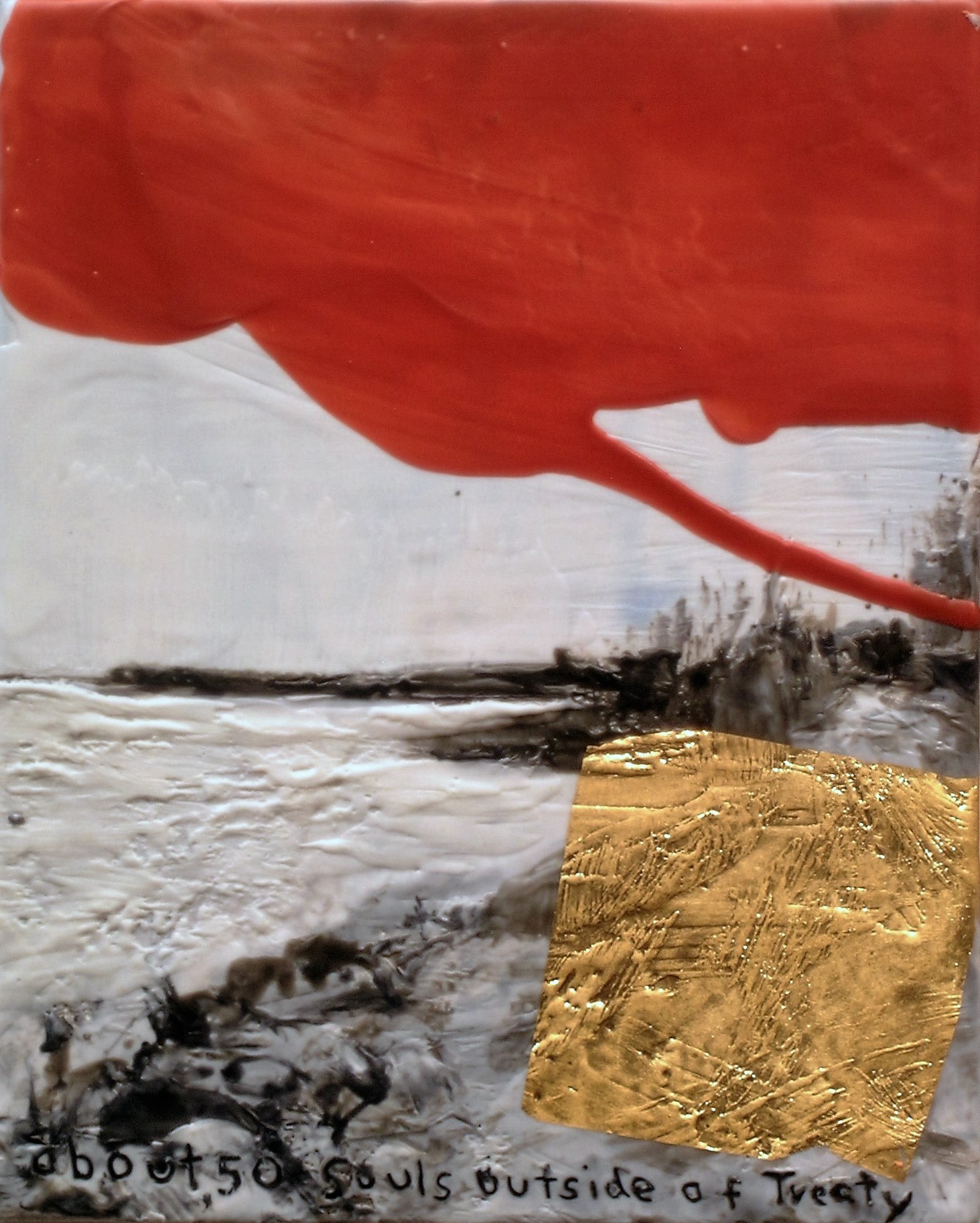
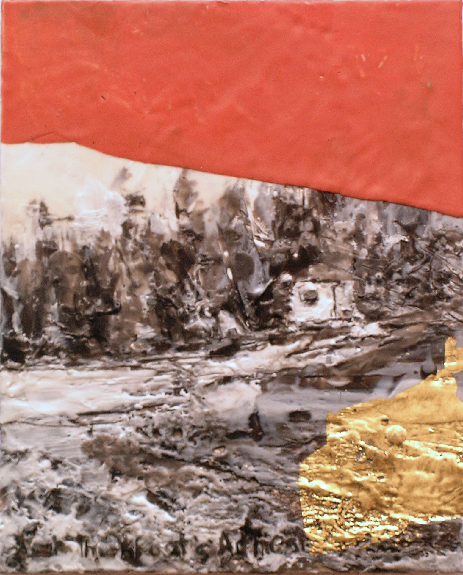
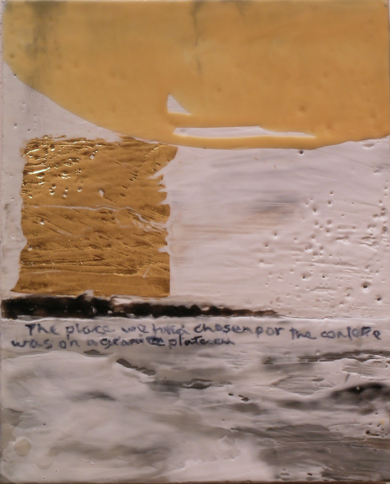
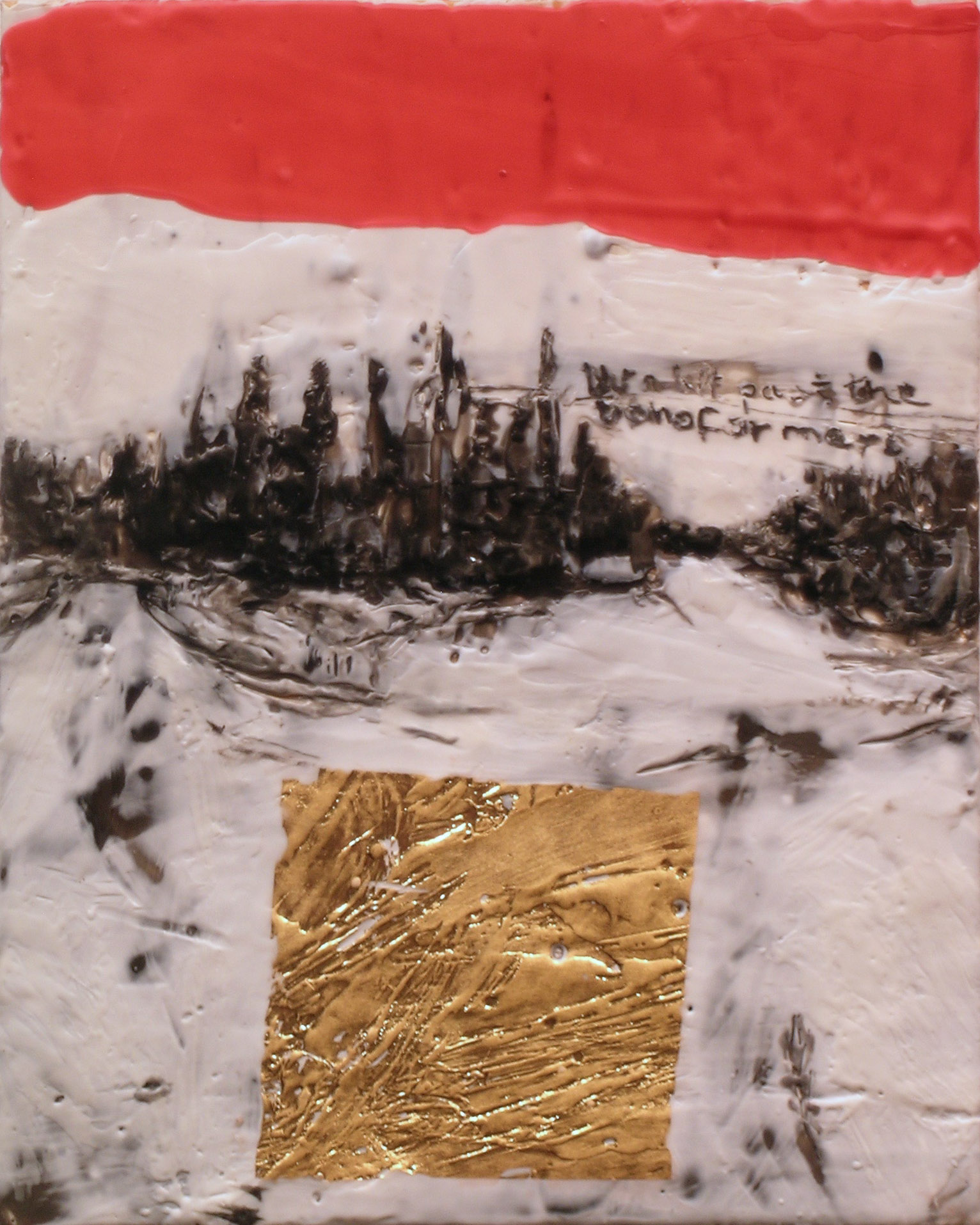
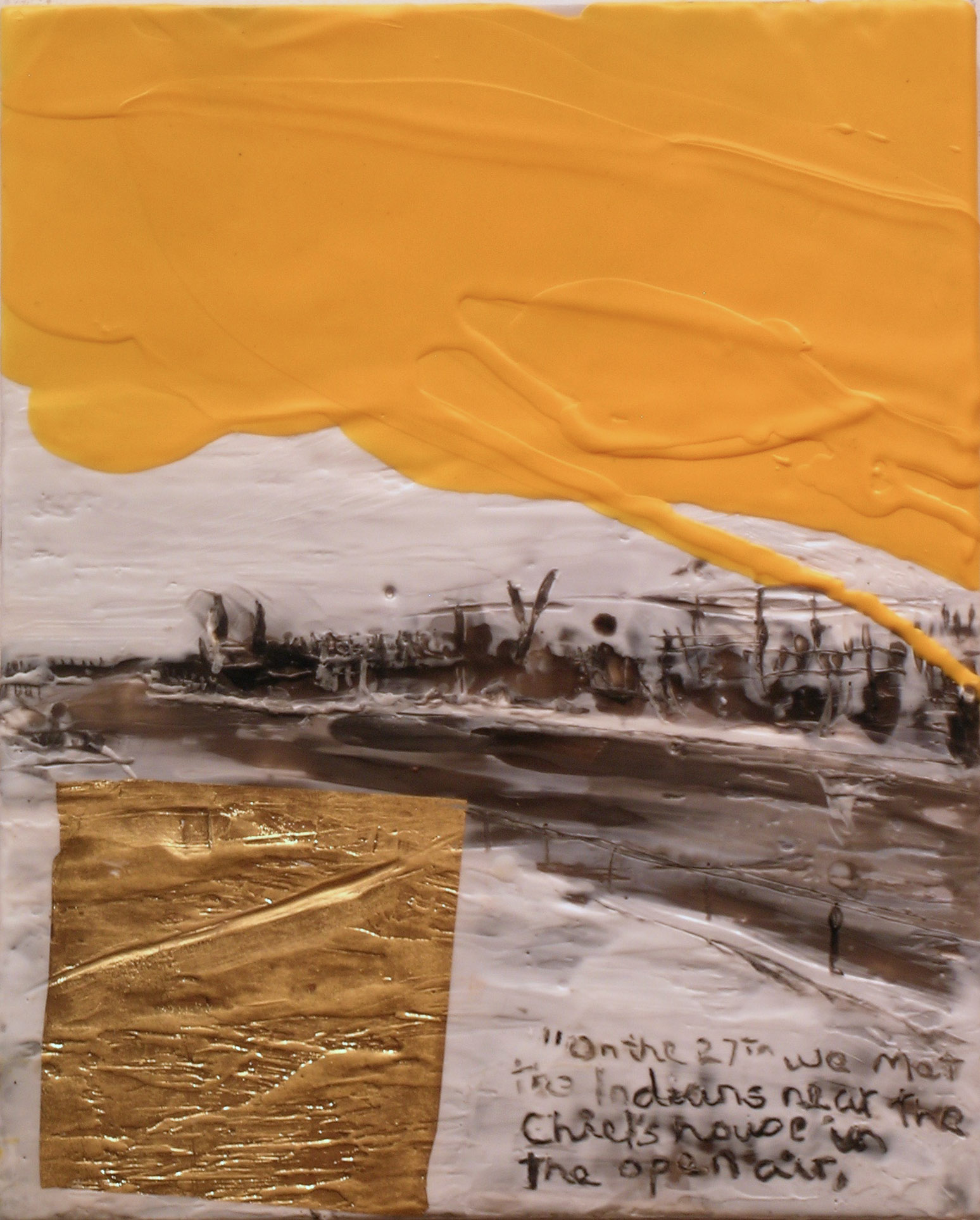
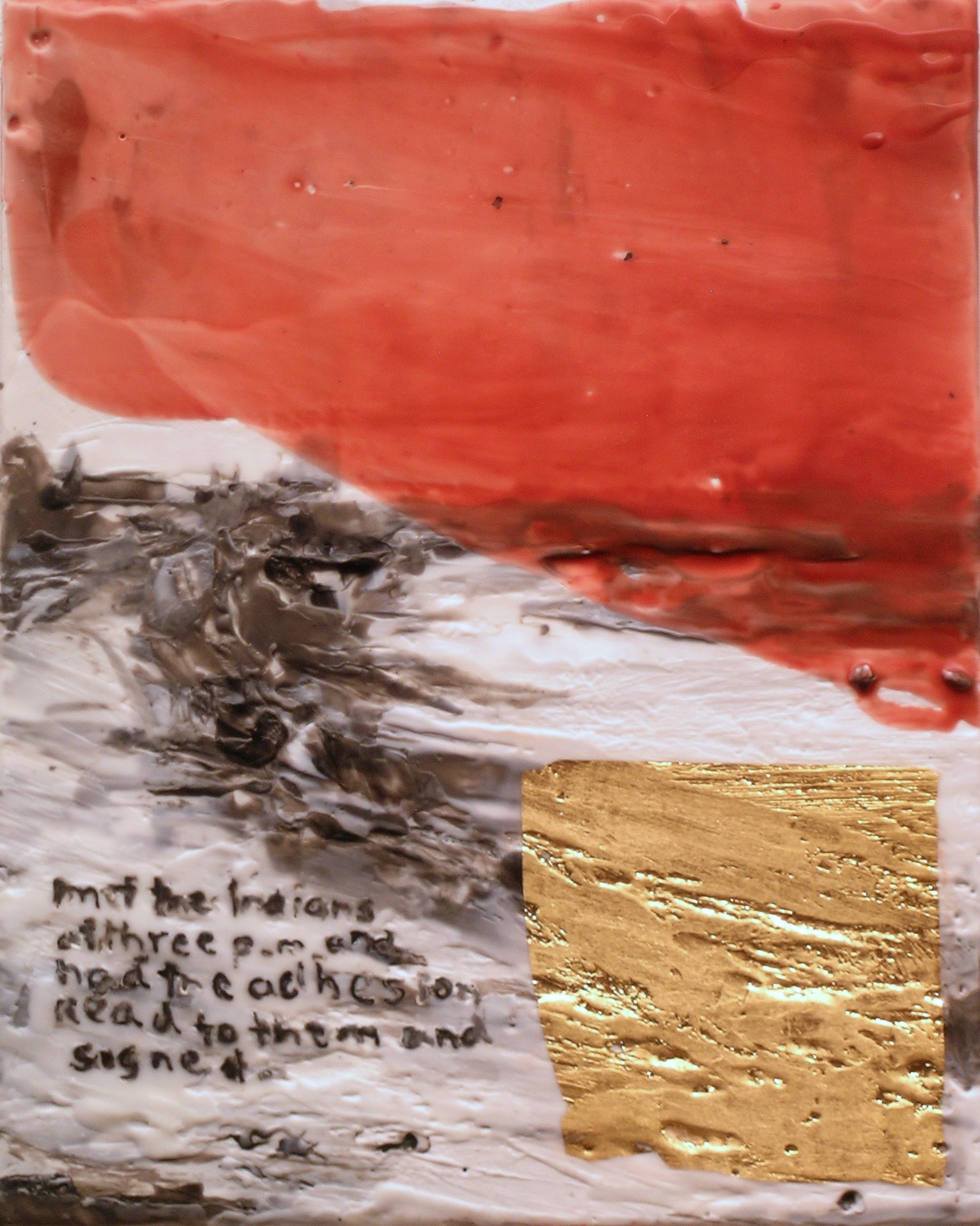
Schouten’s colourful encaustic paintings perfectly complement Adams’ photographs. His work continues a long-term research-based project, The Treaty Suites, in which he is investigating the signings of Treaties 1 to 11 in Central Canada, and also providing a response to the Final Report of the Truth and Reconciliation Commission of Canada.
“Language is at the heart of the treaty process and its failings in this country. My work reflects on the history of treaties and on the vitality of indigenous languages,” Schouten says. “My encaustic/ hot wax medium carries the weight of this history through a layering and reductive process.”
Schouten’s paintings incorporate both Cree and English text, in an effort to highlight the urgent need to preserve and promote indigenous languages in Canada. Though he himself is not an indigenous artist, like Adams, his work was energized by travel to four places where Treaty 5 was signed.
“Adams and Schouten’s work naturally fits together,” says gallery owner Howard Gurevich. “The photographs and paintings complement each other both in an impressive visual display, but also a thought-provoking insight into an extremely significant piece of Canadian history.”
Tim thanks the Manitoba arts Council for their support of this work

![KCA-014 Ki-tah-pah-tumak aski ethinewak [keeper of the land] Shirley, O-Pipon-Na-Piwin Cree Nation, 2016, AP.jpg](https://images.squarespace-cdn.com/content/v1/5138d7b8e4b033fc626da7e7/1465075346109-TKO9VZ5D7K32975JZFZ1/KCA-014+Ki-tah-pah-tumak+aski+ethinewak+%5Bkeeper+of+the+land%5D+Shirley%2C+O-Pipon-Na-Piwin+Cree+Nation%2C+2016%2C+AP.jpg)
![KCA-015 Ki-tah-pah-tumak aski ethinewak [keeper of the land] Leslie, O-Pipon-Na-Piwin Cree Nation, 2016, AP.jpg](https://images.squarespace-cdn.com/content/v1/5138d7b8e4b033fc626da7e7/1465075352083-D5XM65Q1H8YAL85Z2DZV/KCA-015+Ki-tah-pah-tumak+aski+ethinewak+%5Bkeeper+of+the+land%5D+Leslie%2C+O-Pipon-Na-Piwin+Cree+Nation%2C+2016%2C+AP.jpg)
![KCA-016 Ki-tah-pah-tumak aski ethinewak [keeper of the land] Gord, Nisichawayasihk Cree Nation, 2016, AP.jpg](https://images.squarespace-cdn.com/content/v1/5138d7b8e4b033fc626da7e7/1465075359178-FGXORNJCSQ4XY347YI3S/KCA-016+Ki-tah-pah-tumak+aski+ethinewak+%5Bkeeper+of+the+land%5D+Gord%2C+Nisichawayasihk+Cree+Nation%2C+2016%2C+AP.jpg)
![KCA-017 Ki-tah-pah-tumak aski ethinewak [keeper of the land] Kathleen, Nisichawayasihk Cree Nation, 2016, AP.jpg](https://images.squarespace-cdn.com/content/v1/5138d7b8e4b033fc626da7e7/1465075361566-BDFYWM14ZMWB4QR56JKK/KCA-017+Ki-tah-pah-tumak+aski+ethinewak+%5Bkeeper+of+the+land%5D+Kathleen%2C+Nisichawayasihk+Cree+Nation%2C+2016%2C+AP.jpg)

Winnipeg’s art scene may know Shelley Vanderbyl from her Memory Tales series – familiar childhood stories set on playing-card-sized matteboards. The process of creating Memory Tales sparked Vanderbyl’s fascination with seeing her paintings, not just as representational images, but as objects; their distressed edges evoke the feeling that the palm-sized pieces exist with their own history. Instead of fighting the dust being created as she sanded down these edges, she smoothed it back into areas of the oil paint, creating matte surfaces in her works. From this launching point, Vanderbyl’s latest exhibition, Fresco, extends this focus onto a vast new scale and into a medium mined from her own past, drawing again on themes of time and memory.
Vanderbyl’s paintings aim to build a material language about hope. Her frescoes are fuelled by hope: she takes risks and experiments with her work, trying things that could potentially ruin a piece in order to keep growing herself as an artist and expand the boundaries of her painting practice. Her fresco work stems from her time as a drywall taper: working with plaster in harsh environments has inspired her to concentrate deeply on plaster’s response to her tools.
“The experience doing my drywall taping causes me to see my artistic practice as a layered, rather than linear, process. Some of these layers are created through discoveries of hope in my own life, being able to mine something good out of difficulty,” Vanderbyl says.
Even the materials she uses add more meaning to her work: mud from a riverbank where she sat collecting her thoughts on a particularly discouraging day and marks from the charred branches of her favourite apple tree, whose growth she had been using to track the years her family spent in one home during her husband’s military career.
“Fresco showcases Vanderbyl’s growth as an artist and bravery to work in new styles and textures. The exhibit invites the viewer to have a conversation with the work, interacting on a deeper level of self-reflection,” says Howard Gurevich.
Vanderbyl’s paintings are inspired by places she’s lived and travelled and others’ stories. It’s these stories, strung together, that create the relationship between the viewer and the painting. When these paintings exist in spaces occupied by people, Vanderbyl hopes they will both comfort and listen, offering messages of hope and assurance.
Fresco opens May 6 at 7pm and runs until May 28.

Opens April 1, 7pm
On display until April 30
Sue Gordon’s encaustic paintings are created through layering and careful excavation of her chosen medium of beeswax: slowly negotiating what becomes the final piece of work. While in the past, Gordon’s work was comprised of horizon lines with distance and clean sightlines, her latest work is made up of sightlines that are compromised or obscured, even walled completely. This exciting new work will be on display in Gordon’s exhibit, Surfacing at Gurevich Fine Art.
“I spend as much time building up layers of wax and pigment as I do scraping them away,” says Gordon. “In some cases, I build an entire landscape only to excavate it, with just traces of the original composition remaining in the final piece.”
Gordon’s encaustic works are composed of beeswax, resin and pigment. The paint is kept on a heated palette and applied to an absorbent surface. It’s then heated again to fuse the paint. While it is a highly sensitive and temperamental medium, Gordon’s work showcases the medium’s ability to record physical texture, while also retaining its fluidity.
Her new series references both brick and concrete surfaces, while others speak about bodies of water, depth and the sense of being submerged.
“Surfacing showcases the intricacies of encaustic work, making evident the hours of time it takes to bring each piece of work to life. The exhibit is representative of Gordon’s expertise in the medium and invites the viewer to a deeper understanding of Gordon’s workflow and thought process.”

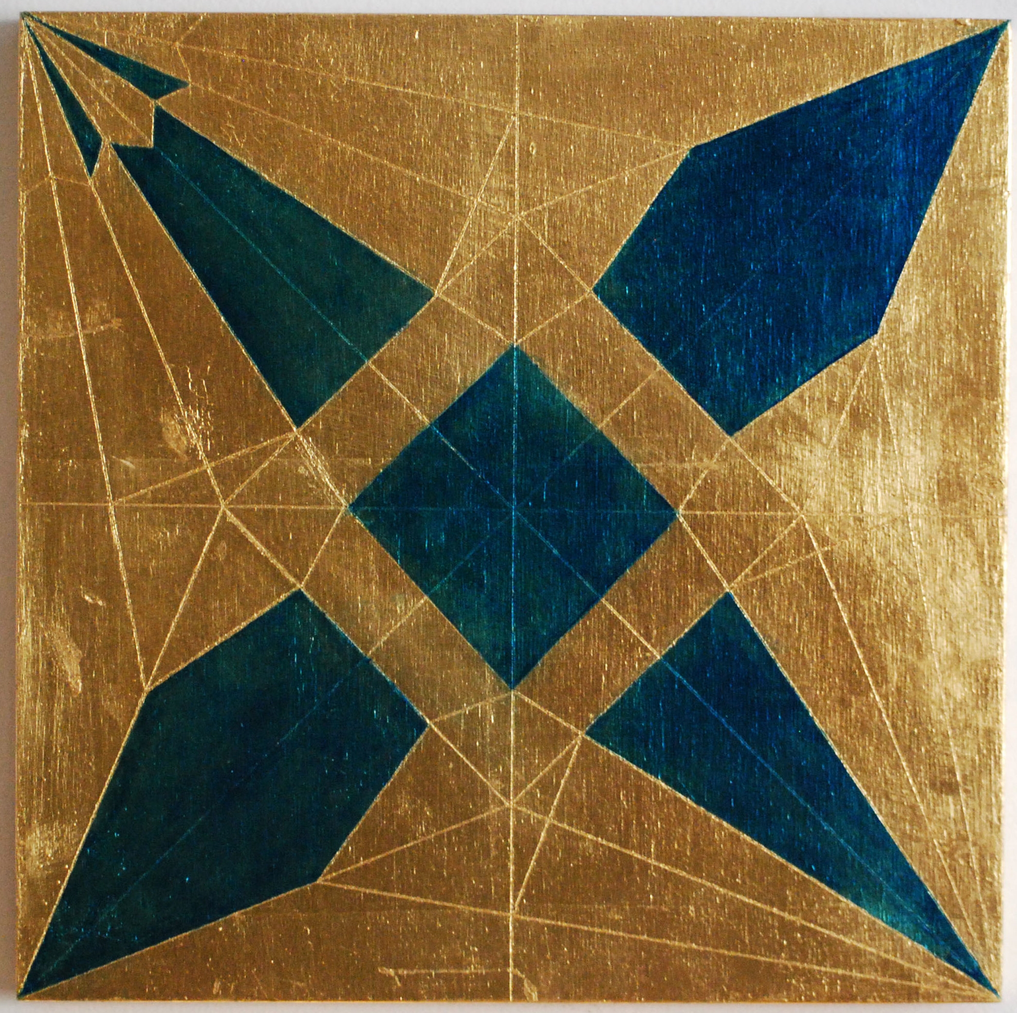
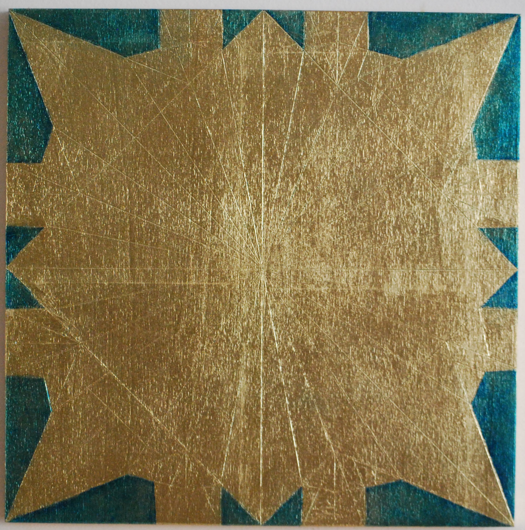
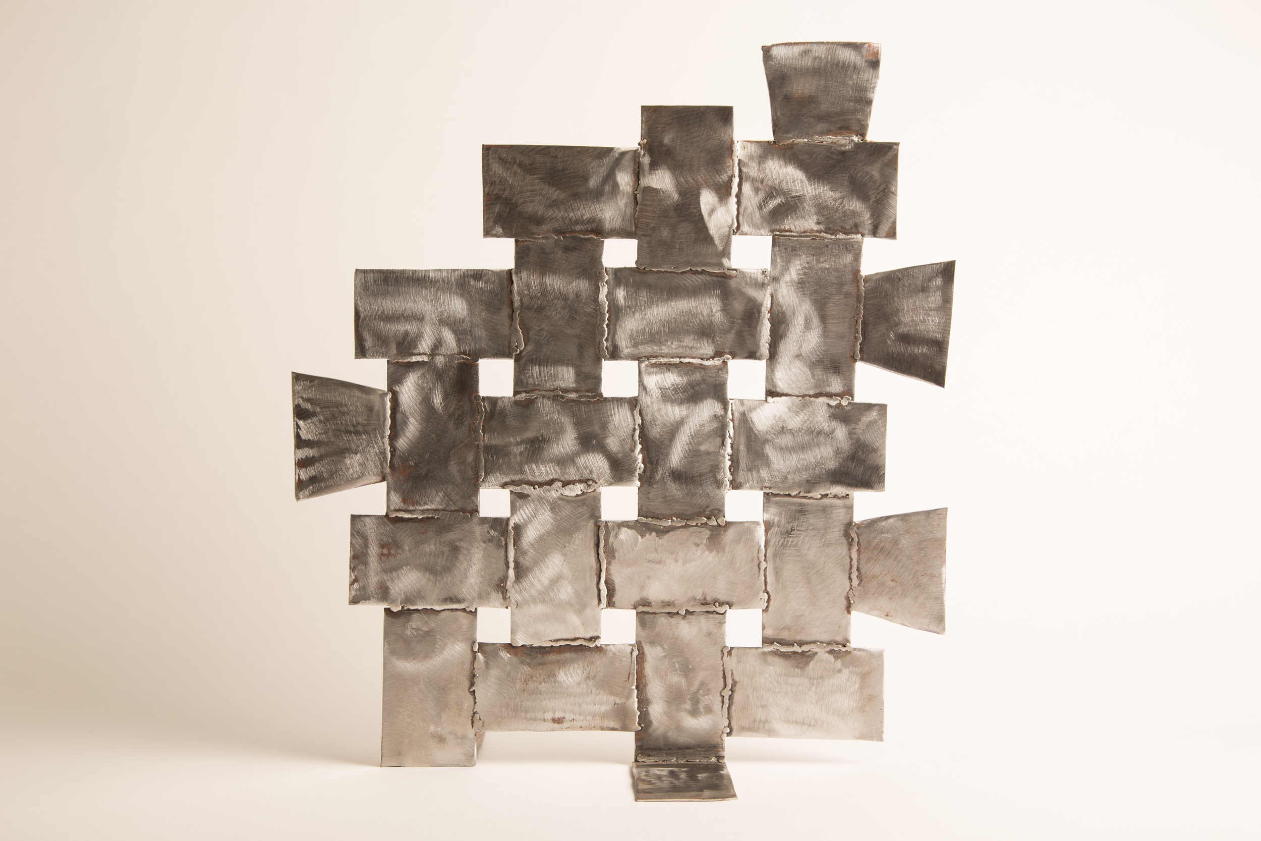
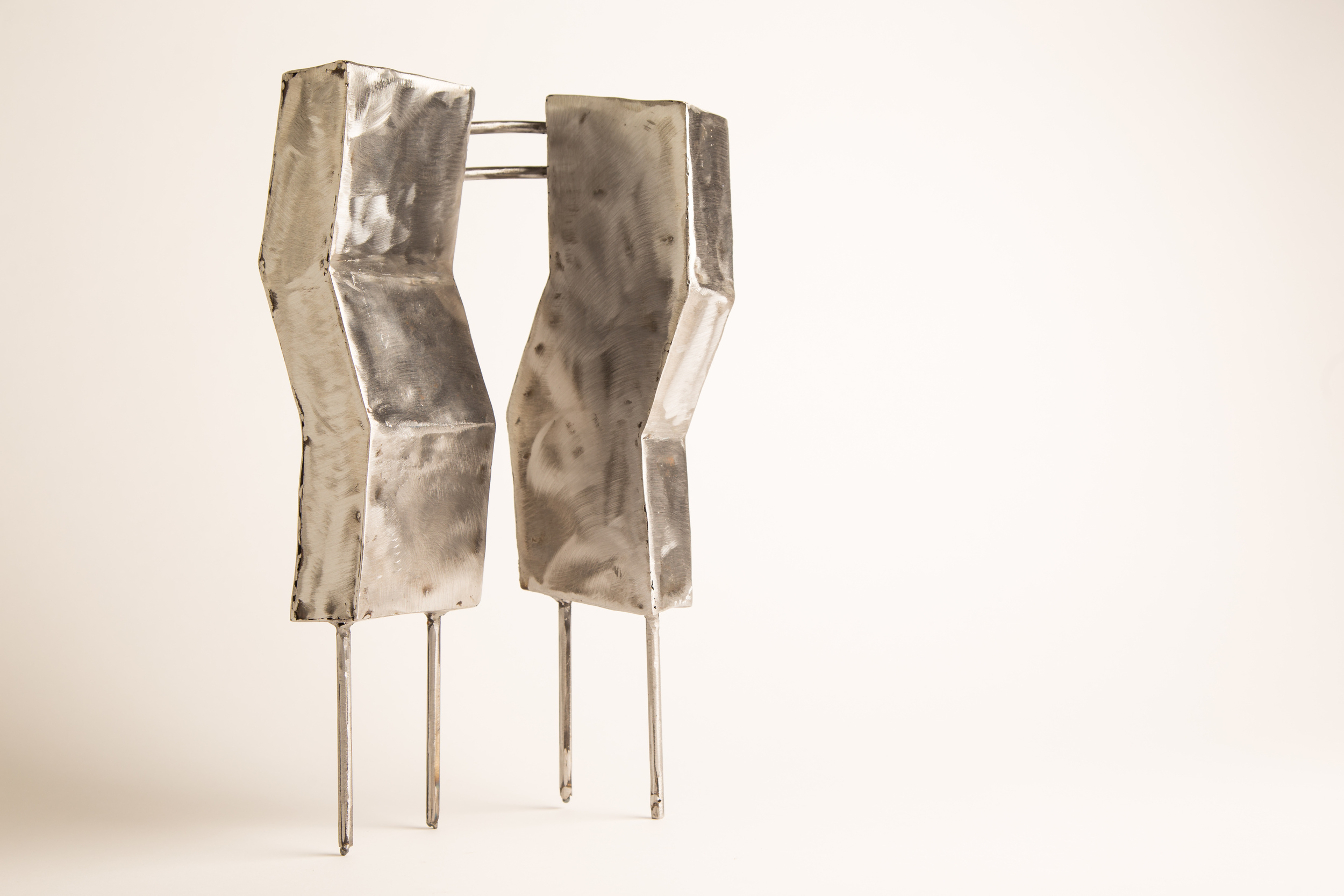
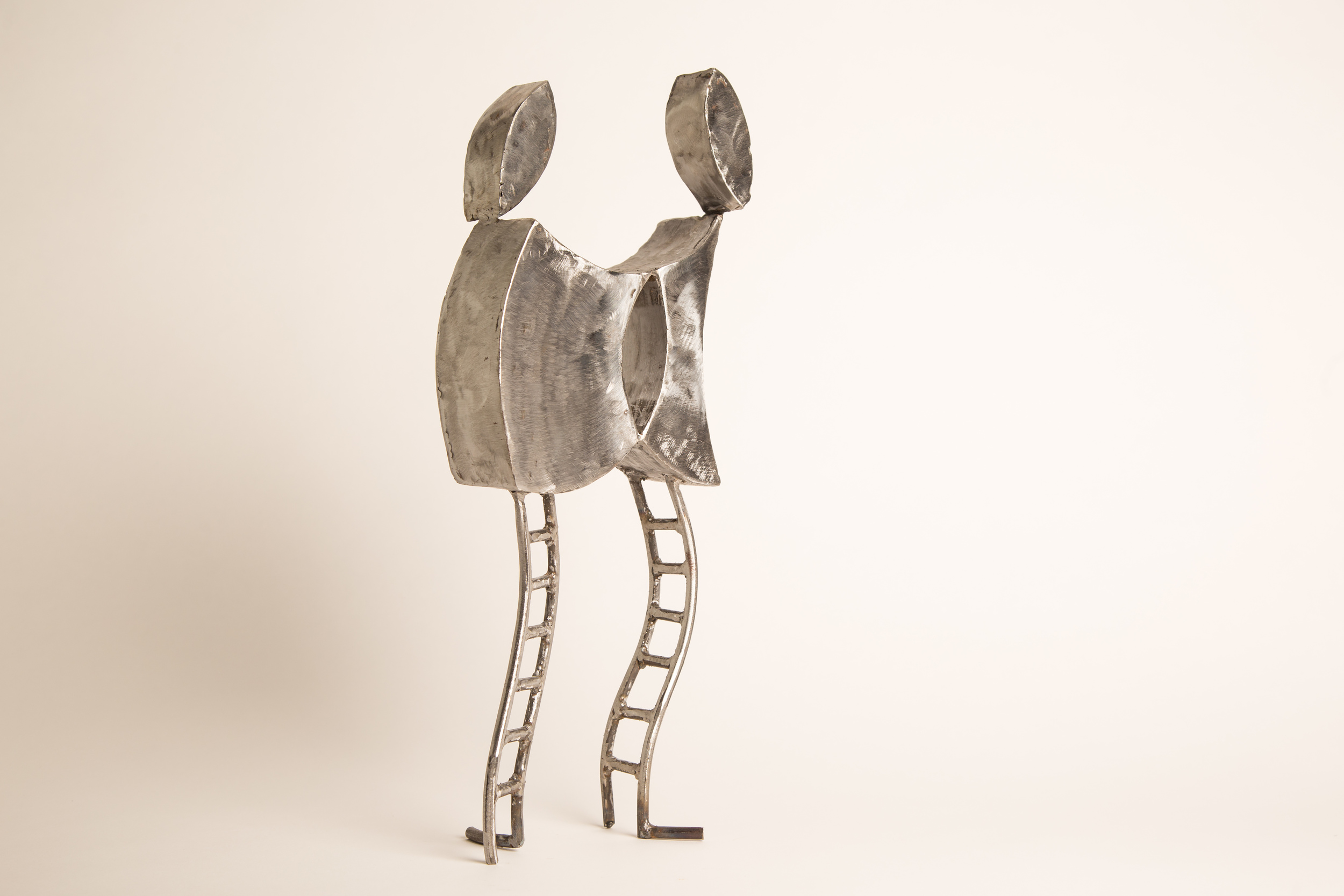
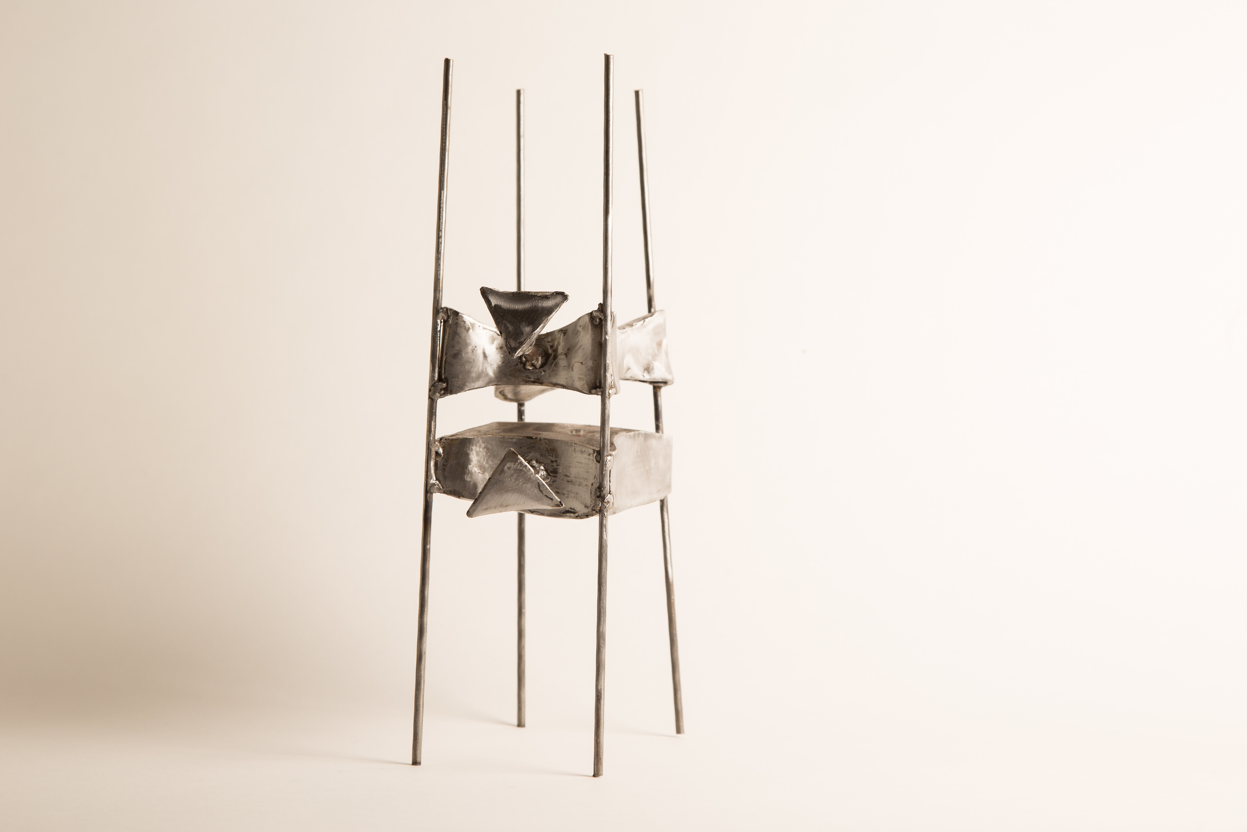
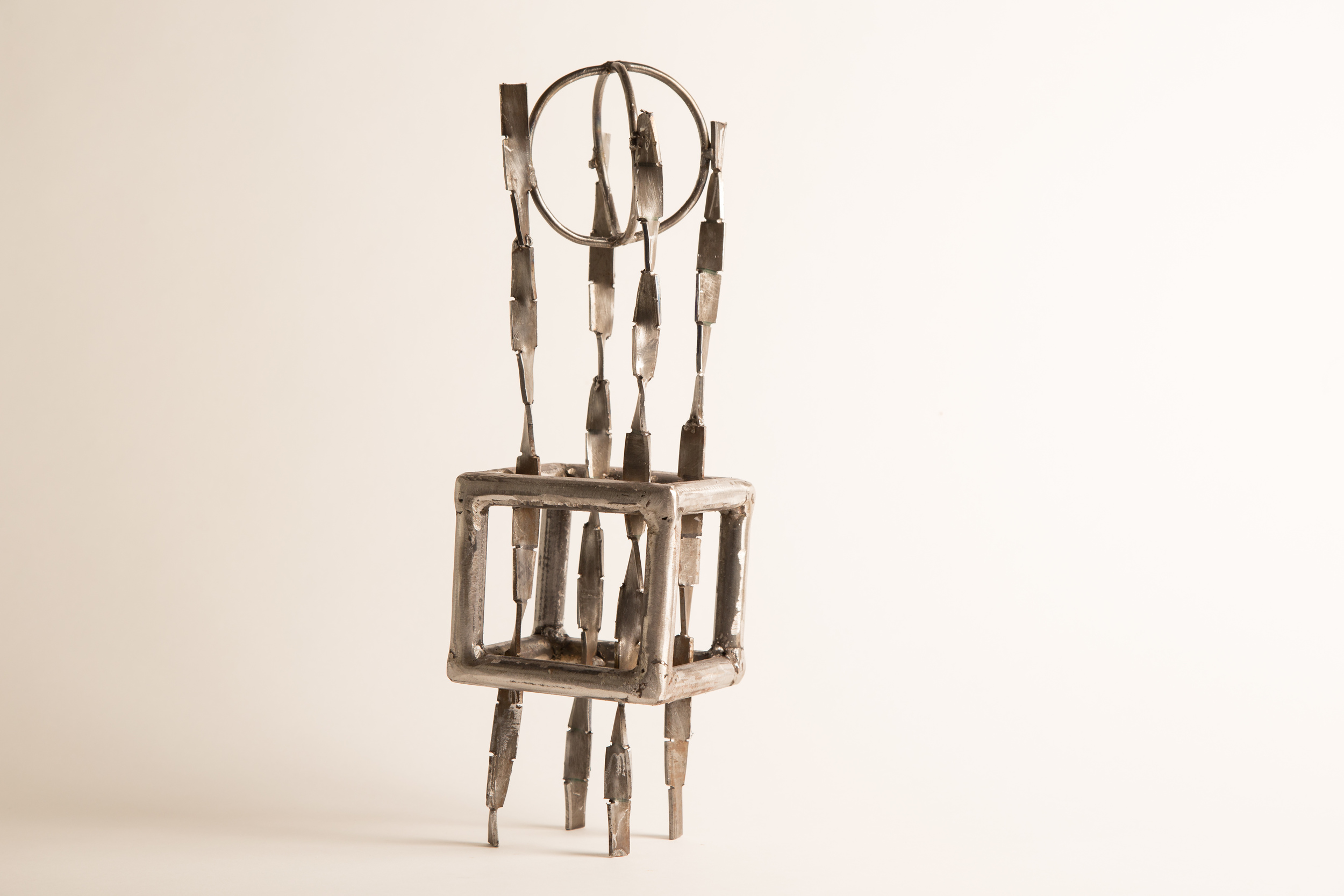
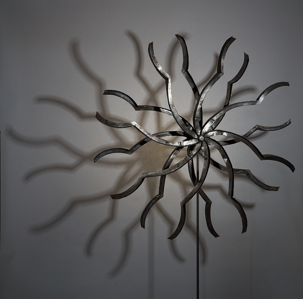
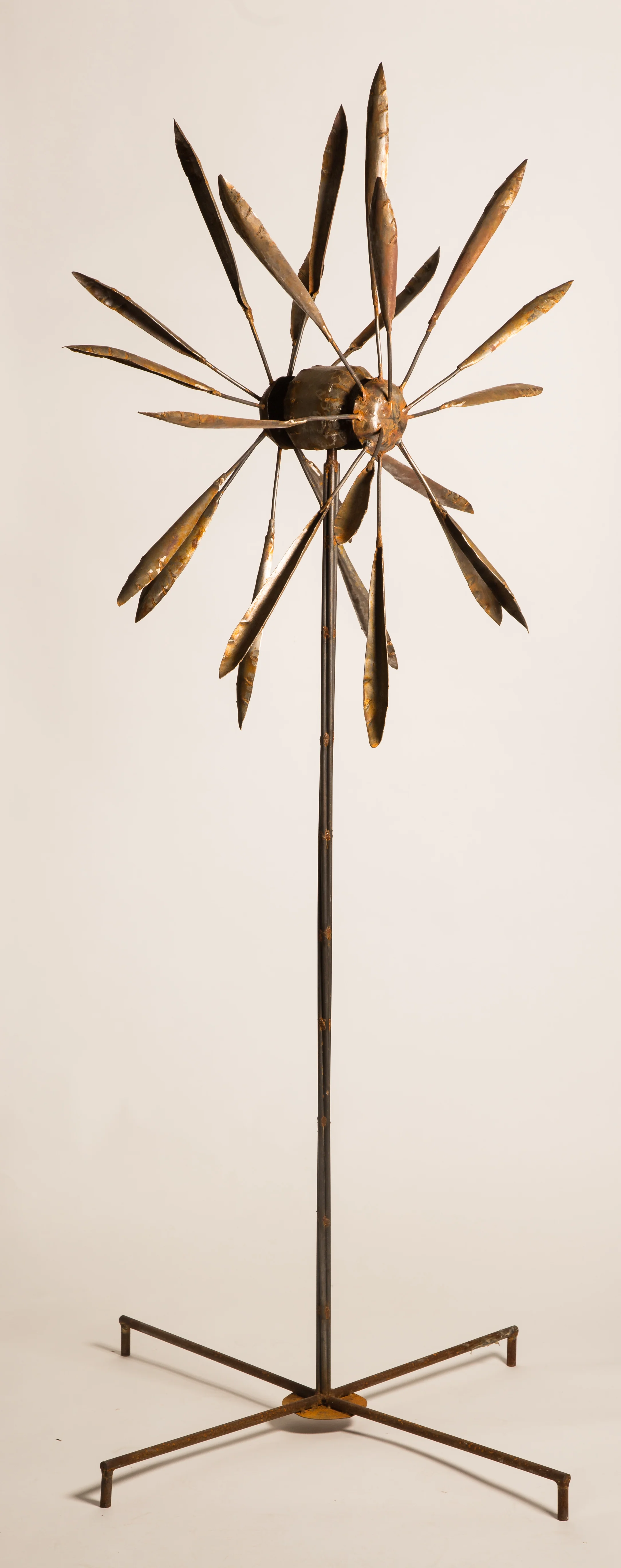
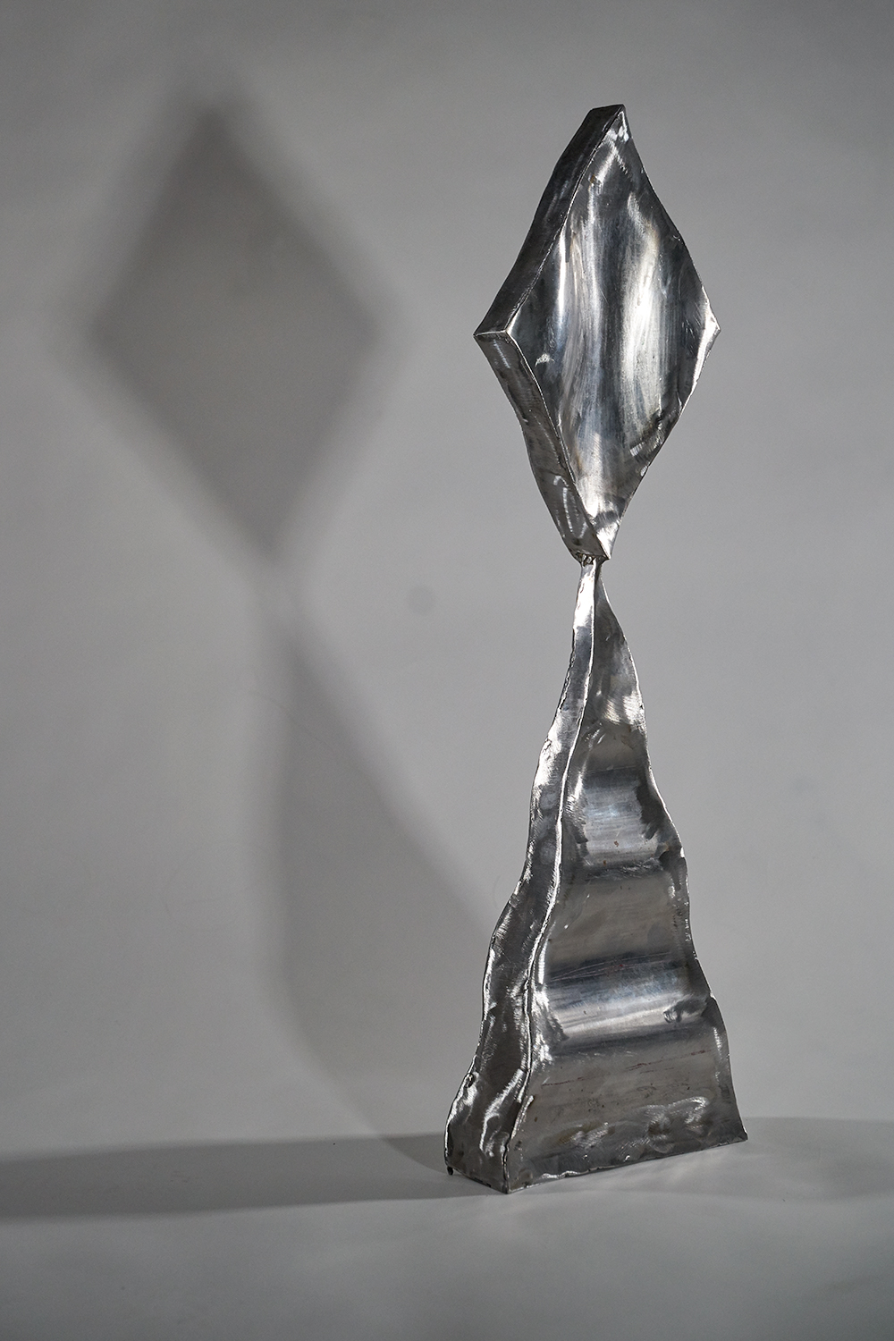
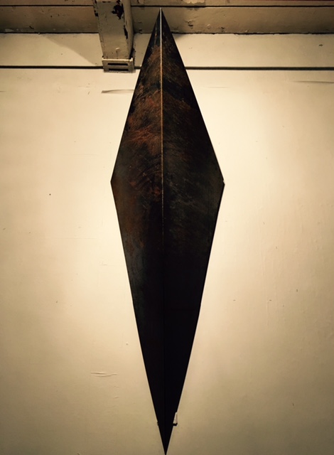
Andrew Beck’s sculptures are given life through the inspiration he finds in his work designing sets for theatre and dance. His art provided the backdrop for hundreds of moving sculptures in countless performances. Now Andrew is taking centre stage. In his latest exhibit, Future Forms at Gurevich Fine Art, Beck’s sculptures with their literal and implied movement are the stars.
“Out of all the visual arts, sculpture has an especially interactive relationship with its viewers. The objects exist beside us in three-dimensional space. This extra dimension means the art relies less on understanding the conventions that have been codified in two-dimensional art and is a closer imitation of the human form,” says Beck.
Future Forms seeks to render the steel sculptures as fluid and reflective, and in doing so project a sense of motion. Each of Beck’s sculptures can be described as kinetic. The sculptures in the show are conceptions of interaction between the human and the super mundane, giving the viewer the ability to see dimensions we normally wouldn’t see in art.
In his Two Figures series, Beck has worked to simplify the plane so the viewer can compare and contrast the two figures, and consider the interplay of the two objects. Each sculpture’s surface has been ground and polished so that the reflecting light helps to create movement.
In the Whirligig series, the sculptures explore pattern, edge and the formation of evolving shapes. The changing configurations produce a mesmerizing effect. The intention is reinforced by the fact that the sculptures are wind-driven, bringing a silent solemnity to the interplay of light and pattern.
“Future Forms brings a whole other level to art viewing and hones in on the bond the viewer can make with the sculptures,” says Howard Gurevich, owner of Gurevich Fine Art. “The exhibit showcases the ability of sculpture to act as meditative objects and is truly representative of Beck’s multi-talent.”
Future Forms opens March 4 at 7:00 pm and is on display until March 26

OPENS: FEBRUARY 5, 7PM
ON DISPLAY UNTIL FEBRUARY 27
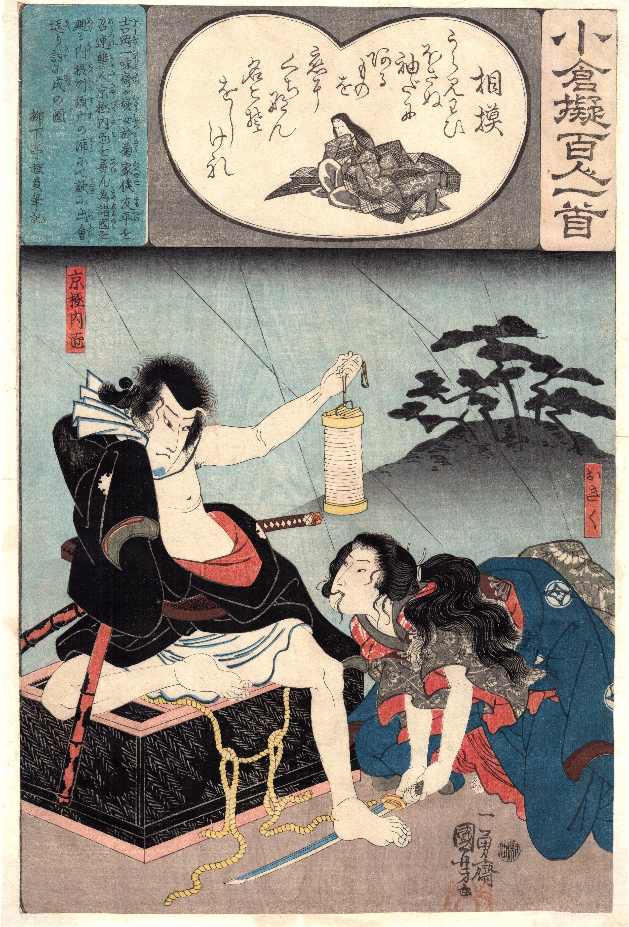
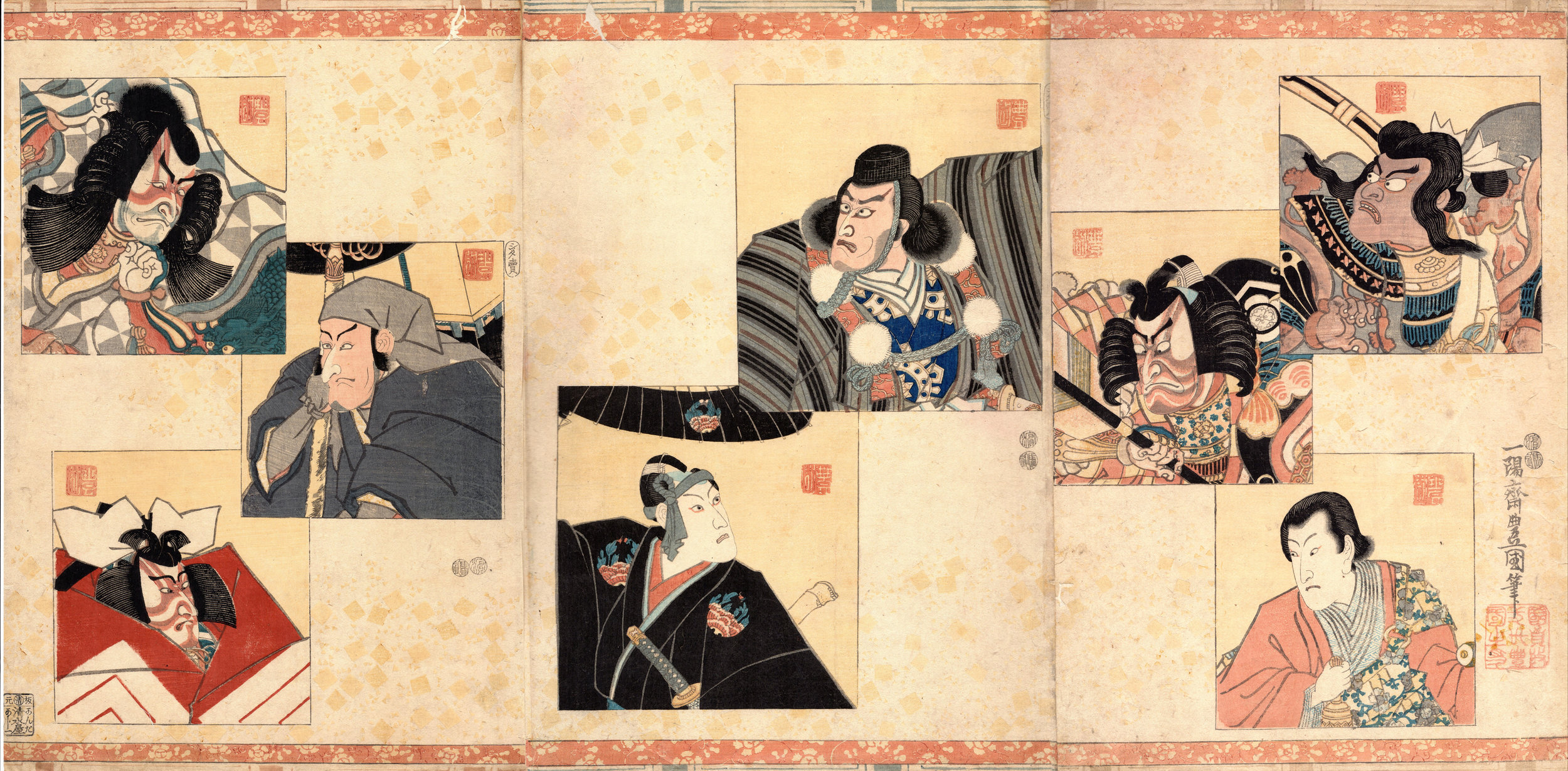
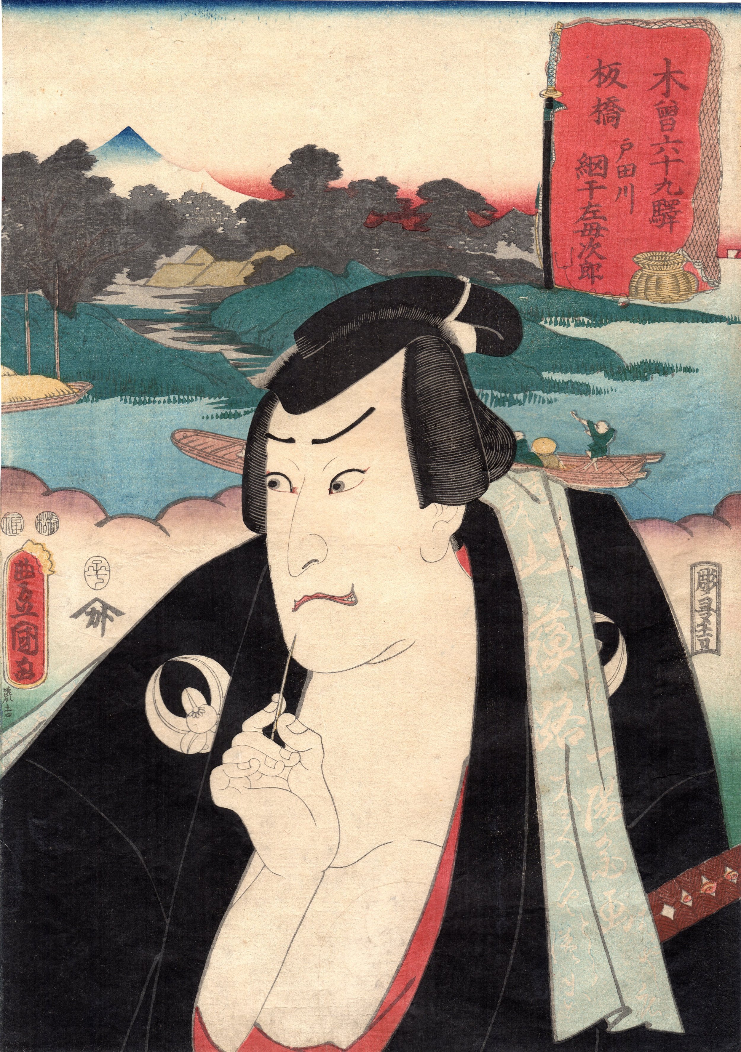
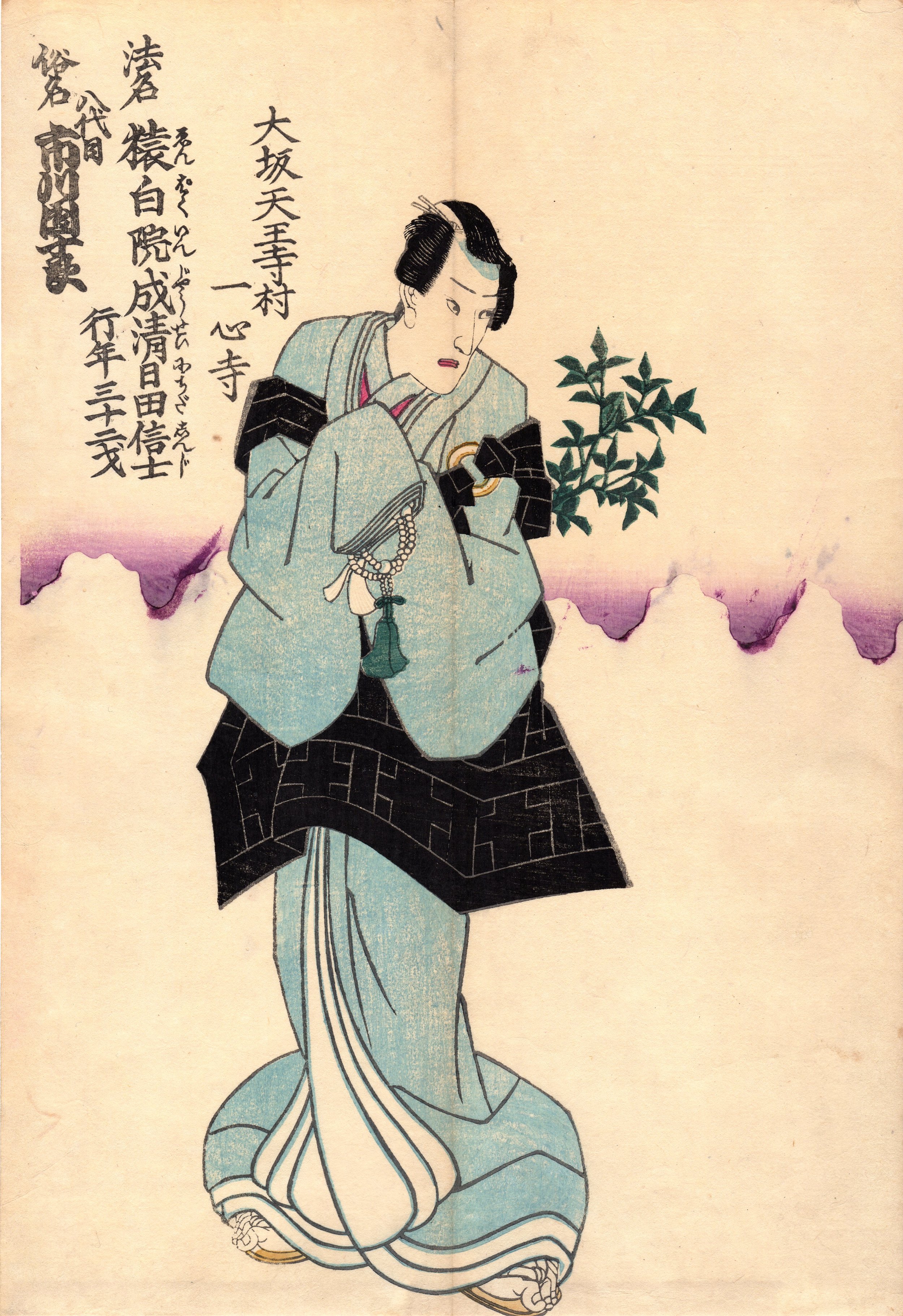
Gurevich Fine Art pairs a collection of centuries old works with modern-day prints in an impressive art history lesson that is the gallery’s latest exhibit, 500 Years of Prints.
It is an exposition of secular and religious works that illustrate the varying techniques and applications of printmaking over the last 500 years. The comprehensive exhibit, curated by art historians Claire LaBrecque (Art History Professor, University of Winnipeg) and Jim Bugslag (Art History Professor, University of Manitoba), and GFA owner Howard Gurevich, features etchings, engravings, lithographs, monoprints, rare books and more. Examples date back to the early 15th century and every era up to today. 500 Years of Prints showcases works of historical artists such as Piranesi, Picasso, Durer, Phillips and Bergman, alongside GFA’s own artists including Diana Thorneycroft, Edward Becenko and Christian Worthington.
The exhibit brings together a remarkable collection of prints from the University of Manitoba, the University of Winnipeg, as well as several private collections and Gurevich Fine Art. It will encompass the entirety of GFA’s four galleries.
LaBrecque says, “It is an opportunity to view modern and historical work together and gain some perspective on how techniques and imagery have remained consistent and how they have changed.”
“The show is truly an art history lesson in itself. It’s not often that we are able to see a show this wide in scope, with such diverse work,” says Bugslag.
“The fact that we are able to showcase private collections of never-before-exhibited historical prints is a rare opportunity for our gallery visitors.” Gurevich adds.
The exhibit will feature a number of original prints available for purchase. Gurevich Fine Art would like to thank the University of Manitoba, the University of Winnipeg and the private collectors for their contributions to make this exhibit possible.

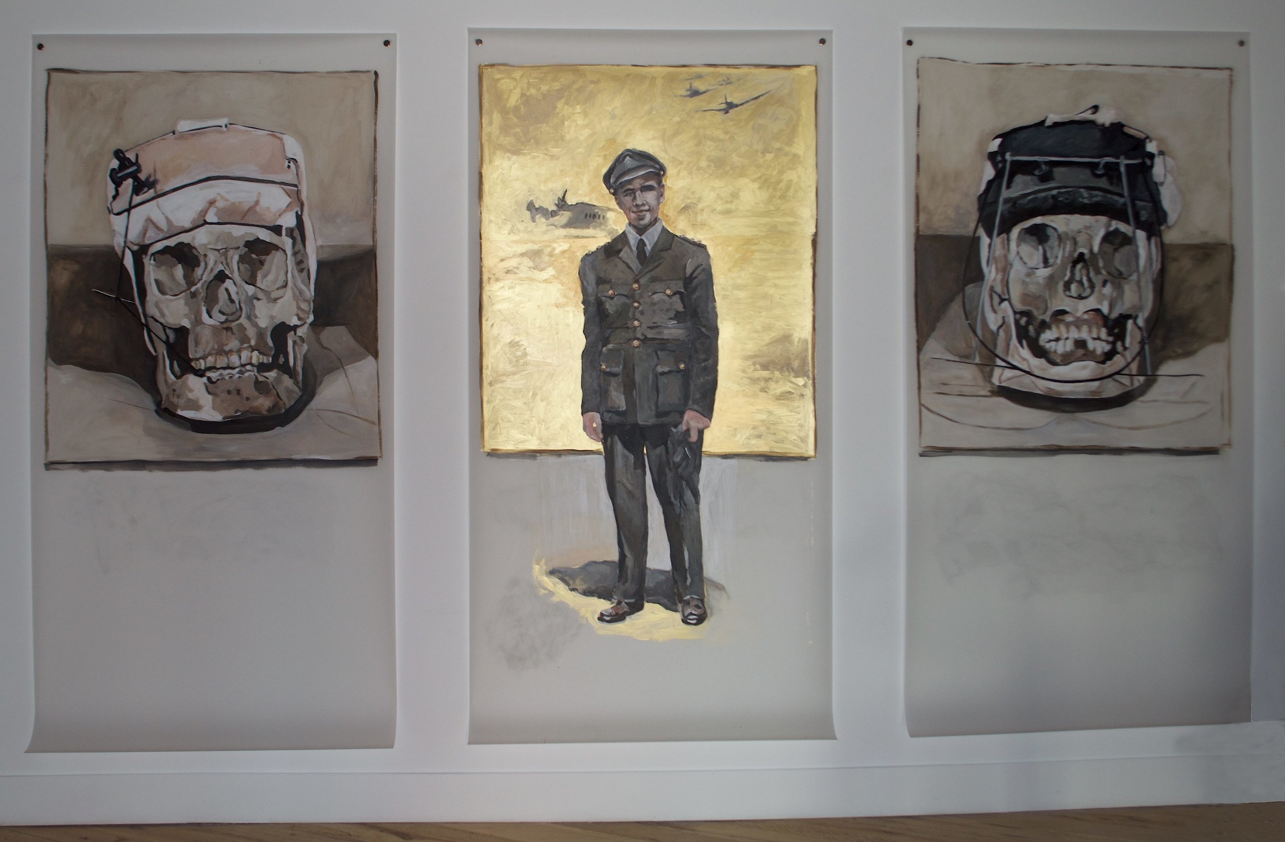
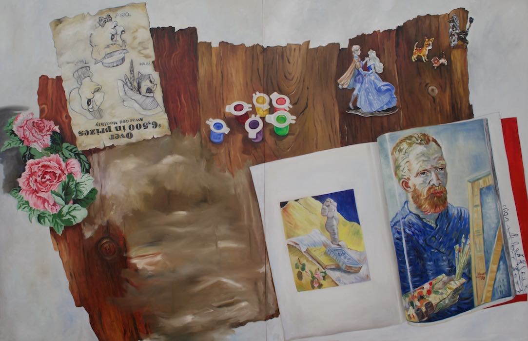
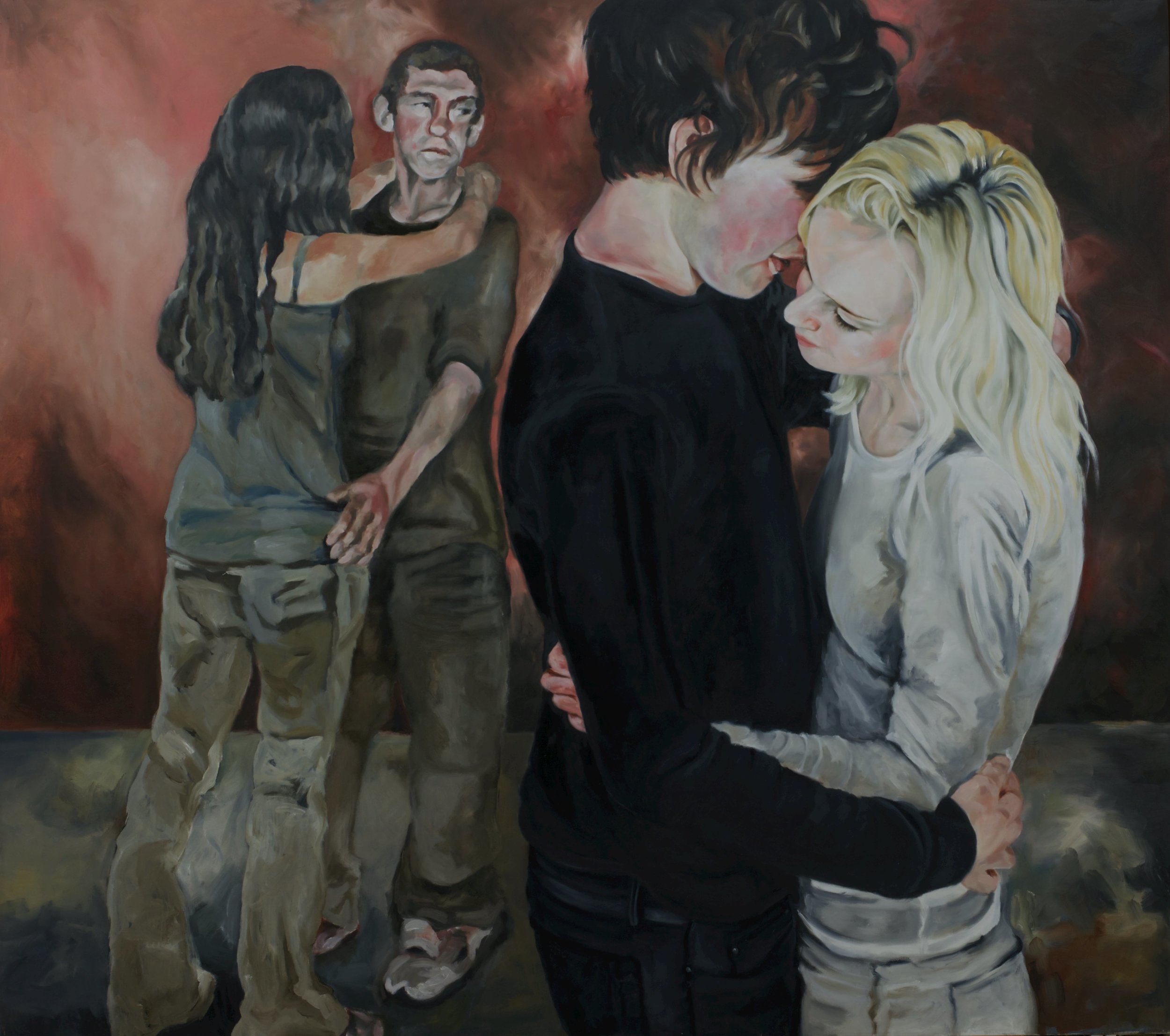
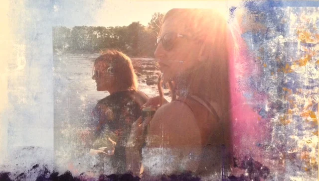
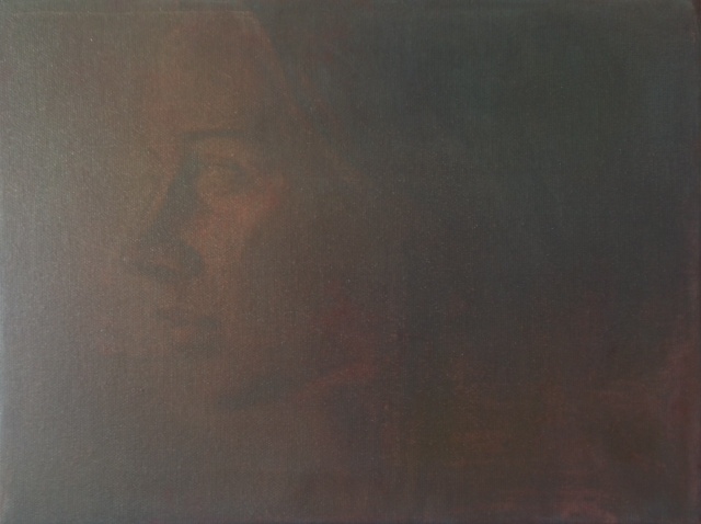
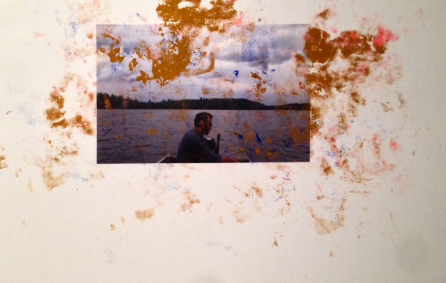
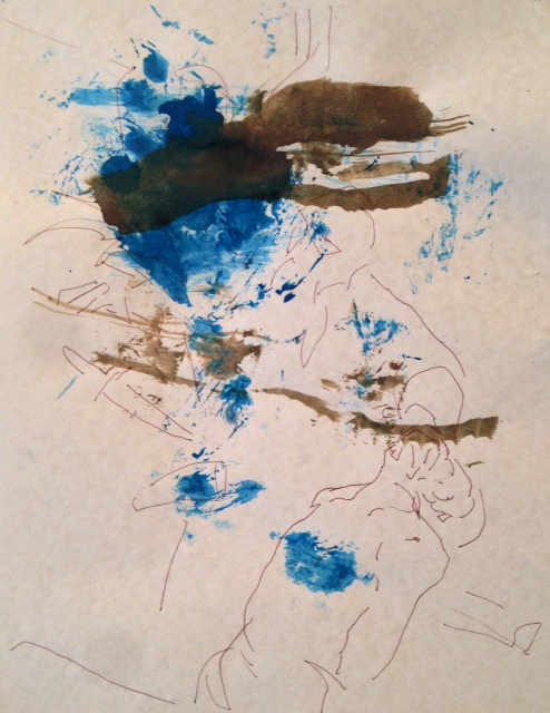
Twenty-six pieces of artwork, three galleries and one year of production: this is “2015”, the largest and most ambitious show yet for Christian Worthington. 2015 is an up-close and personal insight into Worthington’s process over a single year.
2015 showcases Worthington’s multitude of talent and will encompass three of Gurevich Fine Art’s galleries. The show will display large-scale paintings measuring 10 x 7 feet in Worthington’s signature soft, glowing style, highly finished portraits and sculpture made of industrial grade steel, drawings in various mediums and paintings made over photographs and other found material.
The artworks in the show will be grouped in cycles, following Worthington’s workflow over the course of the year. Many pieces will be accompanied by a descriptor of when and how the art was made.
“It’s the biggest solo show I’ve done, but it’s also the most intimate. It’s the most transparent in how it shows the viewer how I think and develop ideas, and how they develop momentum,” says Worthington.
“I want the viewer to follow my work through the year and make their own connections: to see how a small drawing done in February will manifest itself in a painting or sculpture done in August,” he says.
Howard Gurevich, owner of Gurevich Fine Art says, he’s impressed by the breadth and depth of Worthington’s talent and excited to present it.
“2015 is truly a behind-the-scenes look at an artist’s process. The work and its quality alone is commensurate to the amount of space we’ve given it,” Gurevich says.
2015 opens at 7:00 p.m. on December 4 and runs until January 30.
TO REQUEST A CATALOGUE OF THE WORKS, PRICES OR ADDITIONAL INFORMATION, PLEASE CONTACT US AT SALES@GUREVICHFINEART.COM OR 204-488-0662

OPENS: NOV. 6, 7pm
ON DISPLAY UNTIL NOV. 28
While art exhibitions are typically prefaced with an artist’s statement, for Robert Sim, the statement is simply his work, not his words.
Most of the works in this exhibit were created from memory, though a few were created directly from life, and a few from photographic references.
Sim takes artistic liberty with each of these pieces and alters little things here and there. Sometimes elements are added, subtracted or rearranged to emphasize different features of the scene. In other paintings, the colours are changed to give a different impression of the scene.
“For example, in Road South, a work done from my memory, all of the telephone and hydro poles in the actual scene were removed, as were the road signs and a railway crossing. Some colours were changed – like the snow, which was a greenish blue in reality – became white in the painting. Each of these changes were made to give a general impression of winter in southern Manitoba,” Sim says.
The process is much the same for works directly done from life and from photographs. Each of these changes are done to make the painting stronger and more captivating to the viewer.
Artistic License demonstrates the artist’s ability to take a real-life scene and alter it ever-so-slightly to create a work of art. The exhibit is sure to resonate, perhaps with a changed perspective, with viewers feeling strong ties to Manitoba landscapes.
TO REQUEST A CATALOGUE OF THE WORKS, PRICES OR ADDITIONAL INFORMATION, PLEASE CONTACT US AT SALES@GUREVICHFINEART.COM OR 204-488-0662

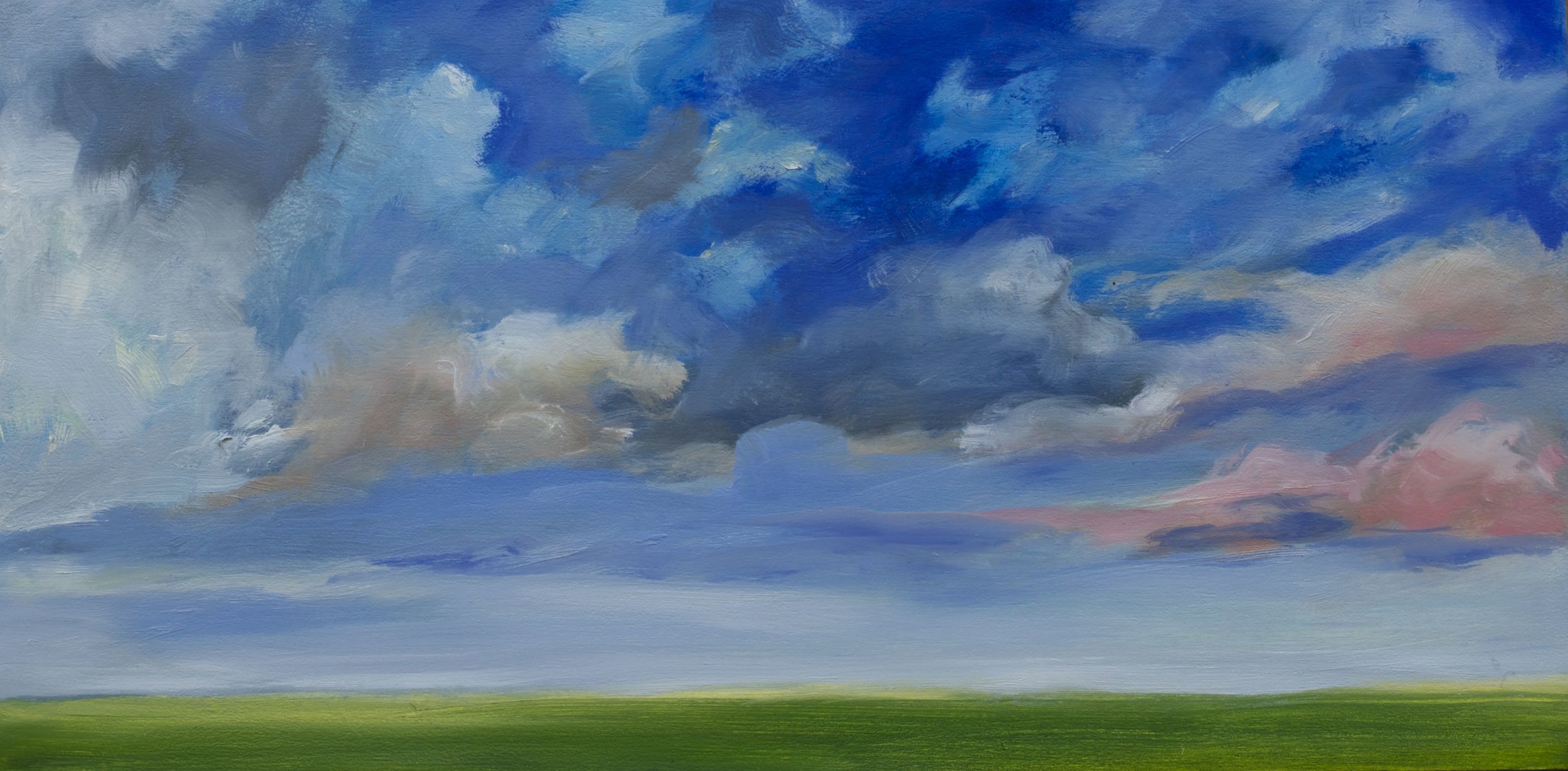
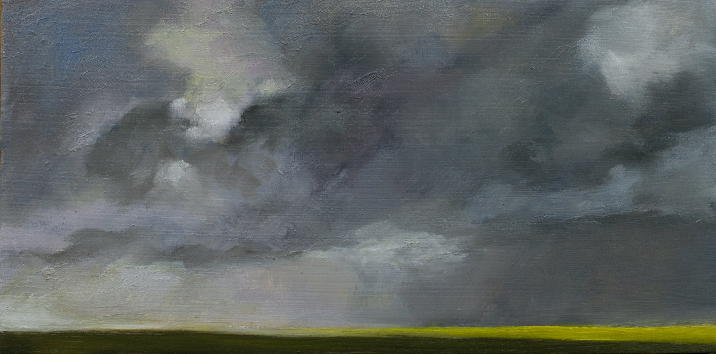
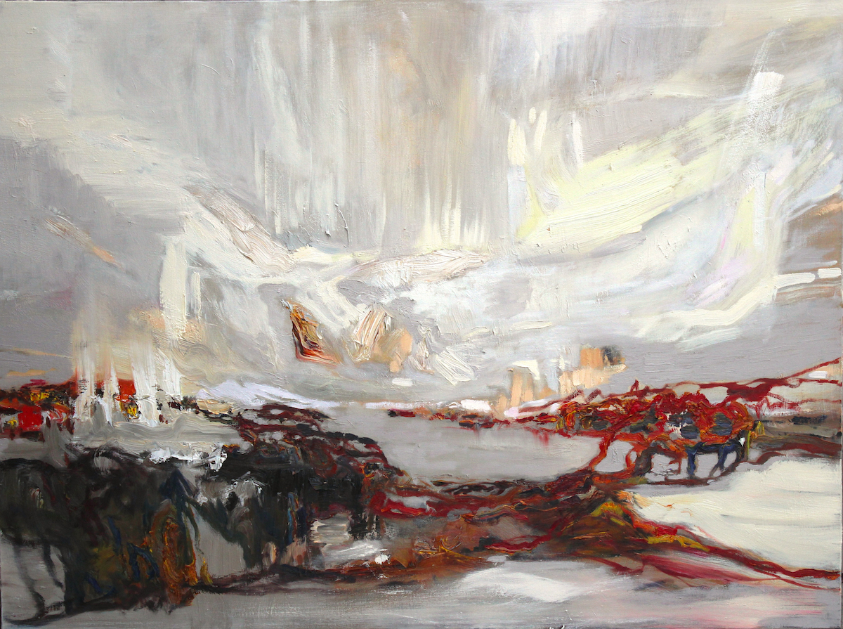
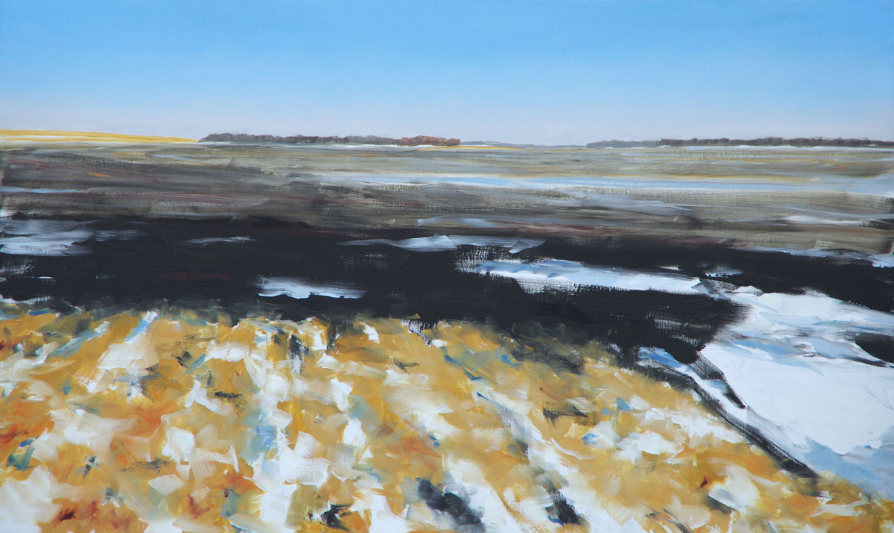
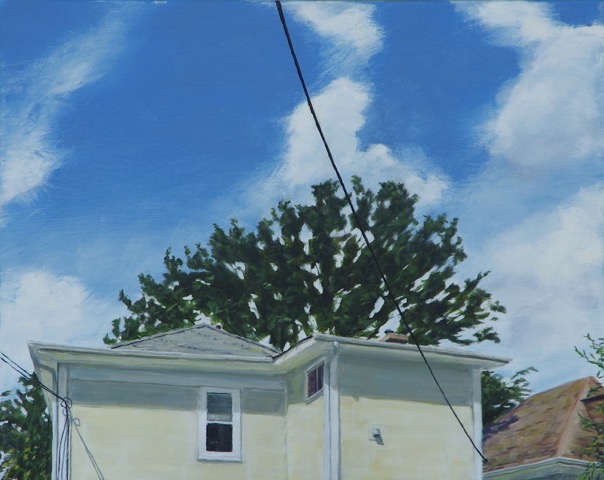
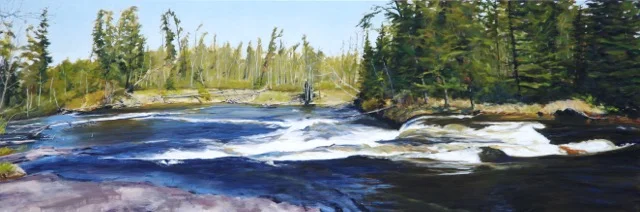
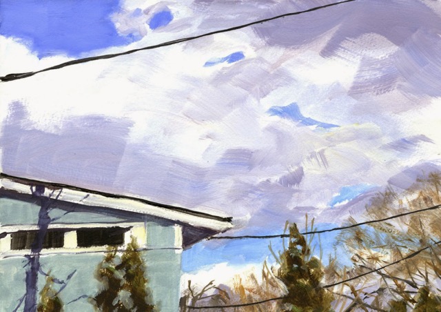
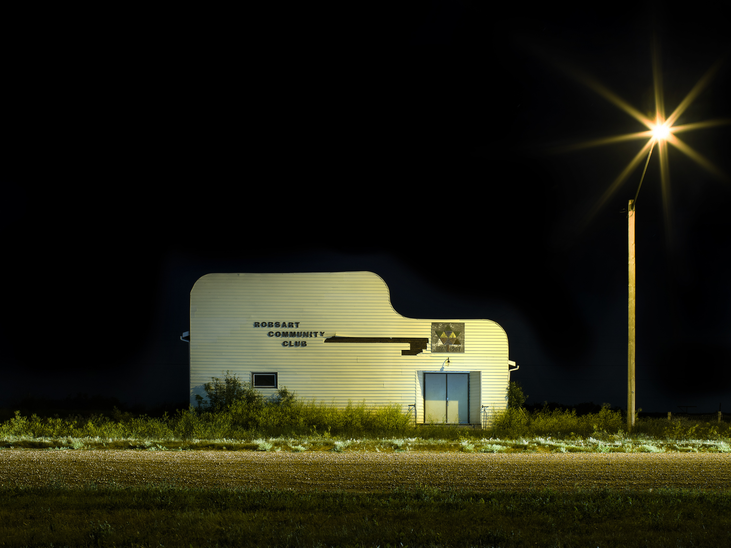
Kevin Boyle, Lisa Johnson and David Tycho’s work is inspired by vast prairies, the rocky shield and urban cityscapes. While their work depicts varying locations, the common element is that each artist captures the inner intensity of the landscape. A Sense of Place opens Oct. 2 at 7:00 pm at Gurevich Fine Art.
B.C.-based artist Kevin Boyle’s DaySleeper series explores prairie landscapes, and is centered on his fascination with darkness and his relationship with the night. It was after his father’s passing, when he returned to his prairie home on a two-day marathon of coffee, open road and photography, that he saw the beauty of the prairies in the dark, and the DaySleeper series was born.
“I found a freedom that the day never seemed to deliver; a peace and quiet in the air while most people slept. I want to show you with light that there is beauty in the darkness,” Boyle says of his work.
Ontario-based artist Lisa Johnson explores the experience of landscape and how we find meaning through a sense of place -- for Johnson, it's mostly her home in the Canadian Shield. Johnson begins her artistic process with painting and sketching on location. Afterwards, in the studio, she works on larger, more abstract pieces that allow the memories and spirit of the places to emerge.
“My work is a painterly response to nature – the paintings are not views of landscapes as objects, but immersions into an experience of place– a “landscape of the mind,” says Johnson.
B.C.-based artist David Tycho’s contribution to A Sense of Place explores the physical, formal and psychological elements of cities. Some of his works can be interpreted as positive, brightly coloured renderings filled with optimistic vitality and nostalgia, while others are darker, more somber depictions of sterile, deserted concrete canyons and a sense of isolation and alienation.
“For me, the intriguing aspect of cities is the co-existence of these seemingly disparate characteristics: the yin and yang of urban existence,” says Tycho.
A Sense of Place is an exploration of varied landscapes and the meanings they hold. Each artists’ work comes together intriguingly in a show that stimulates the viewers to see home in a new way.
TO REQUEST A CATALOGUE OF THE WORKS, PRICES OR ADDITIONAL INFORMATION, PLEASE CONTACT US AT SALES@GUREVICHFINEART.COM OR 204-488-0662.


